5/13/26

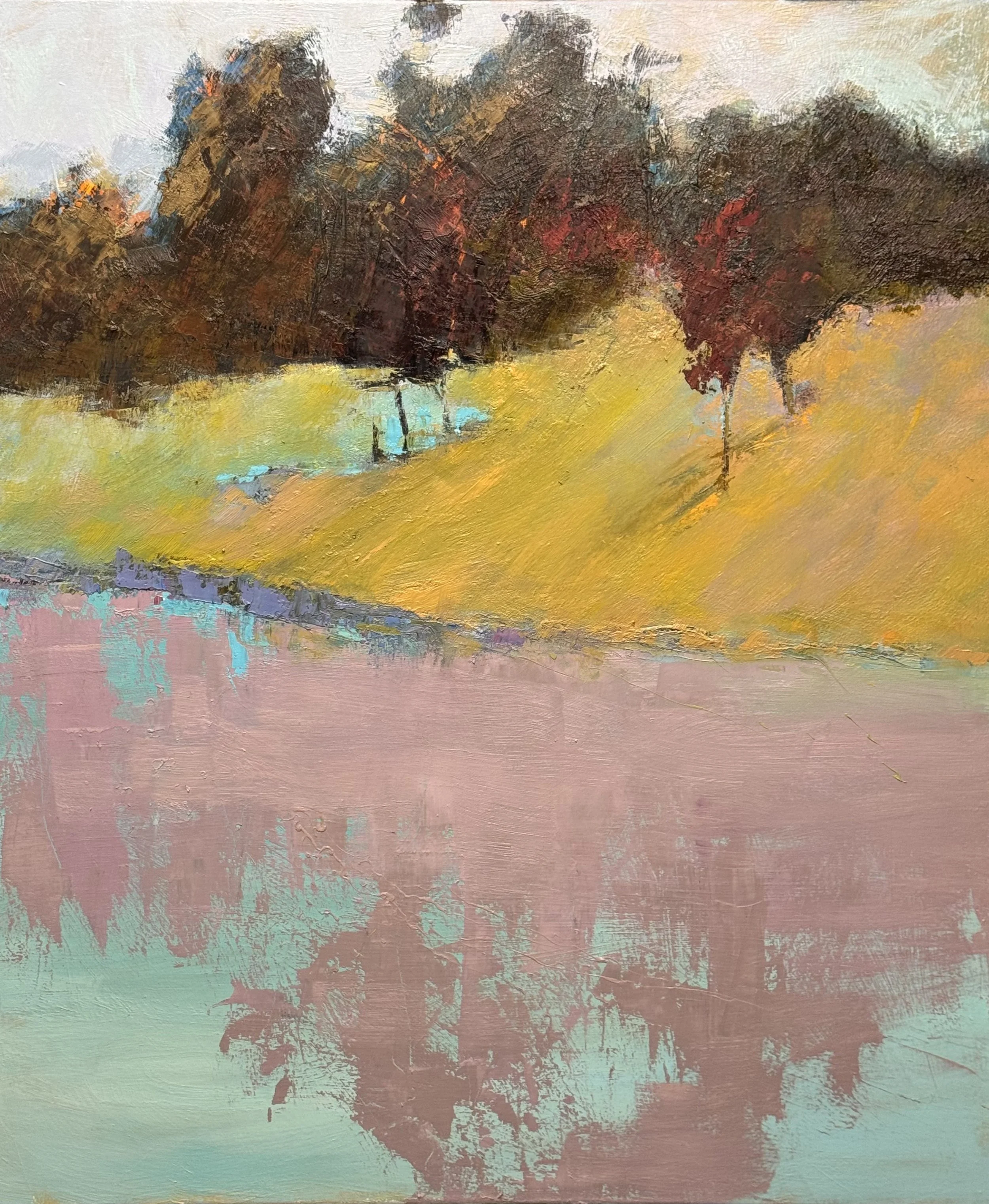
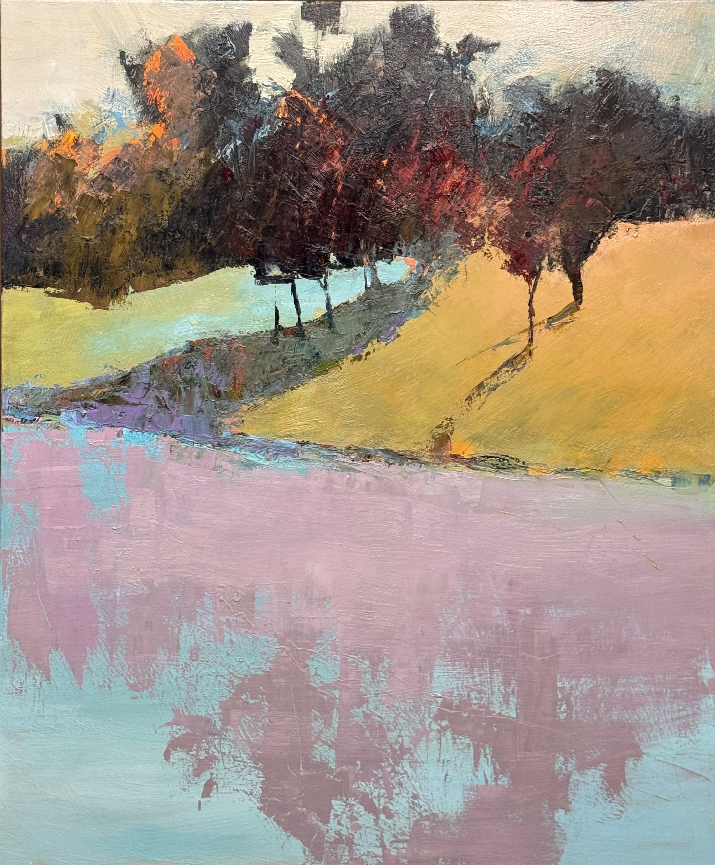
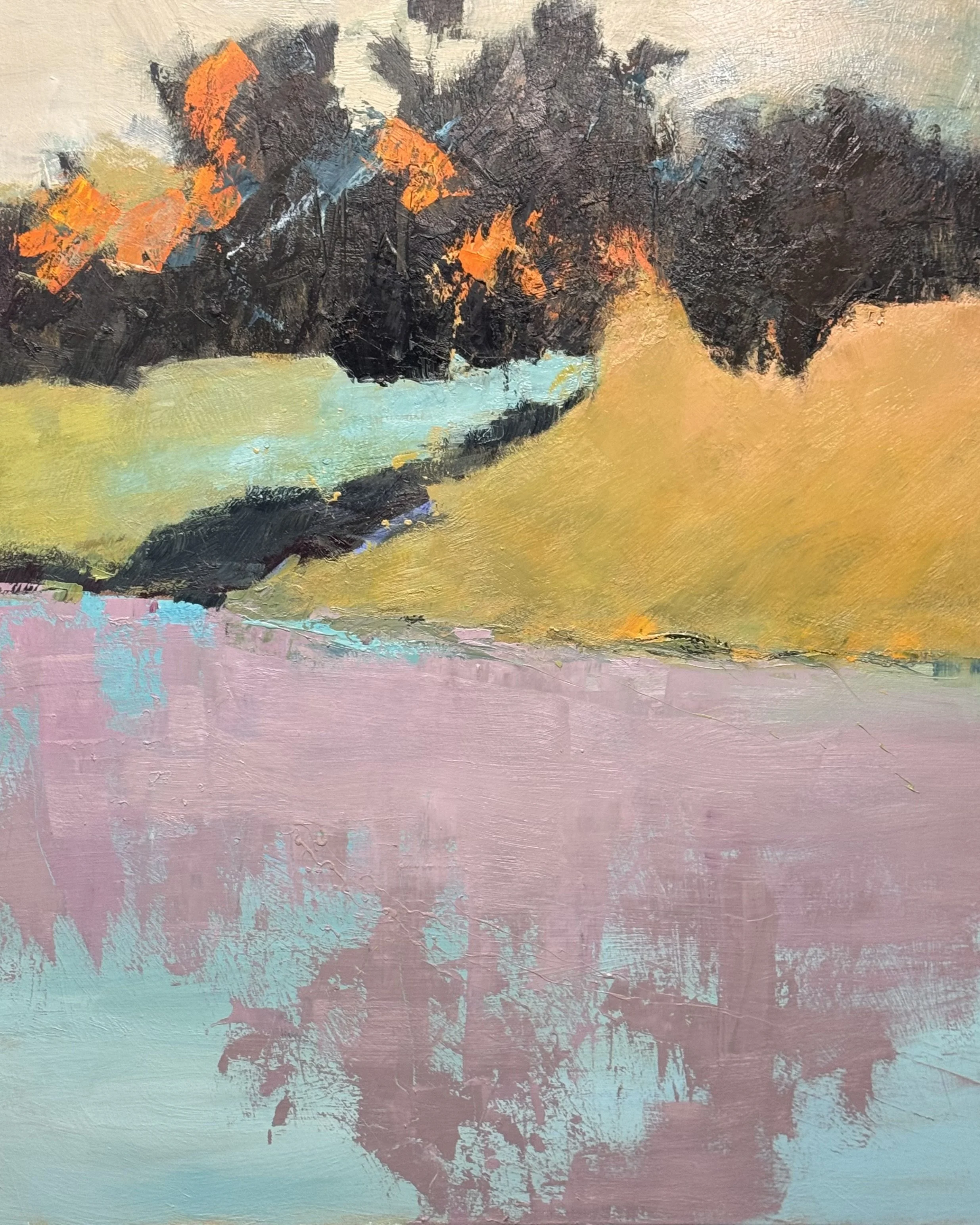
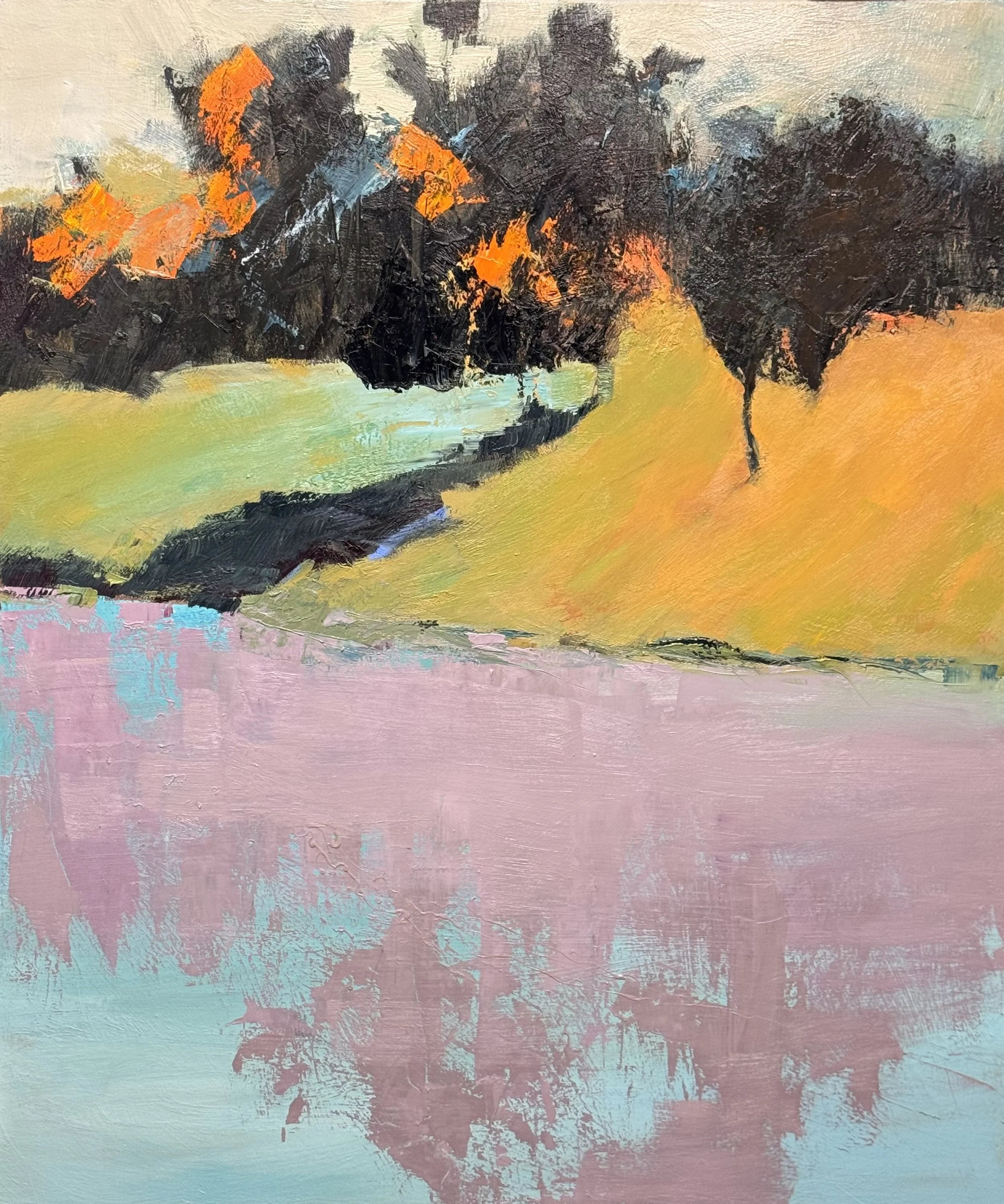
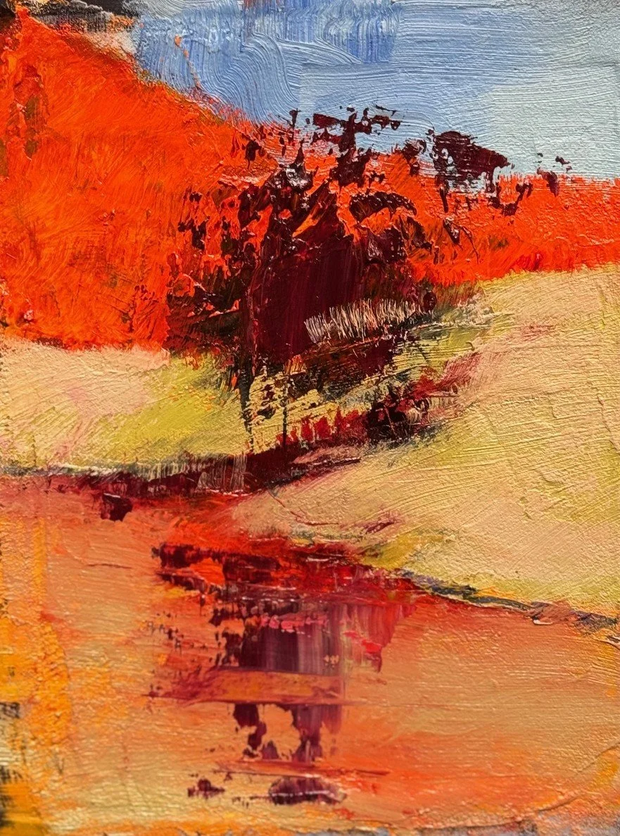
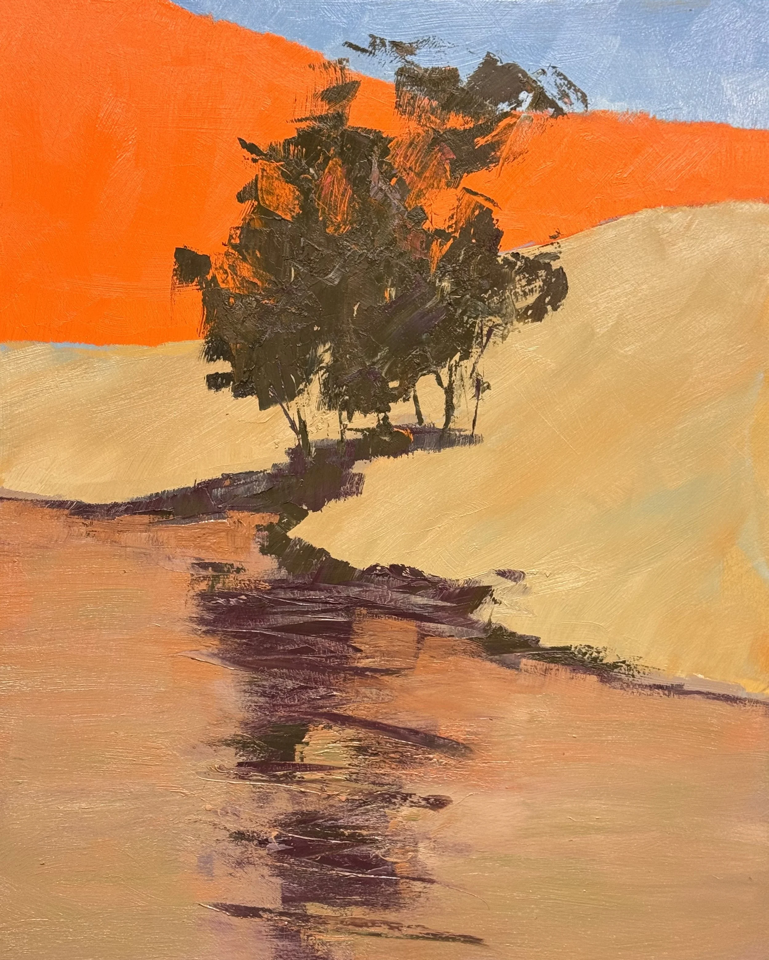
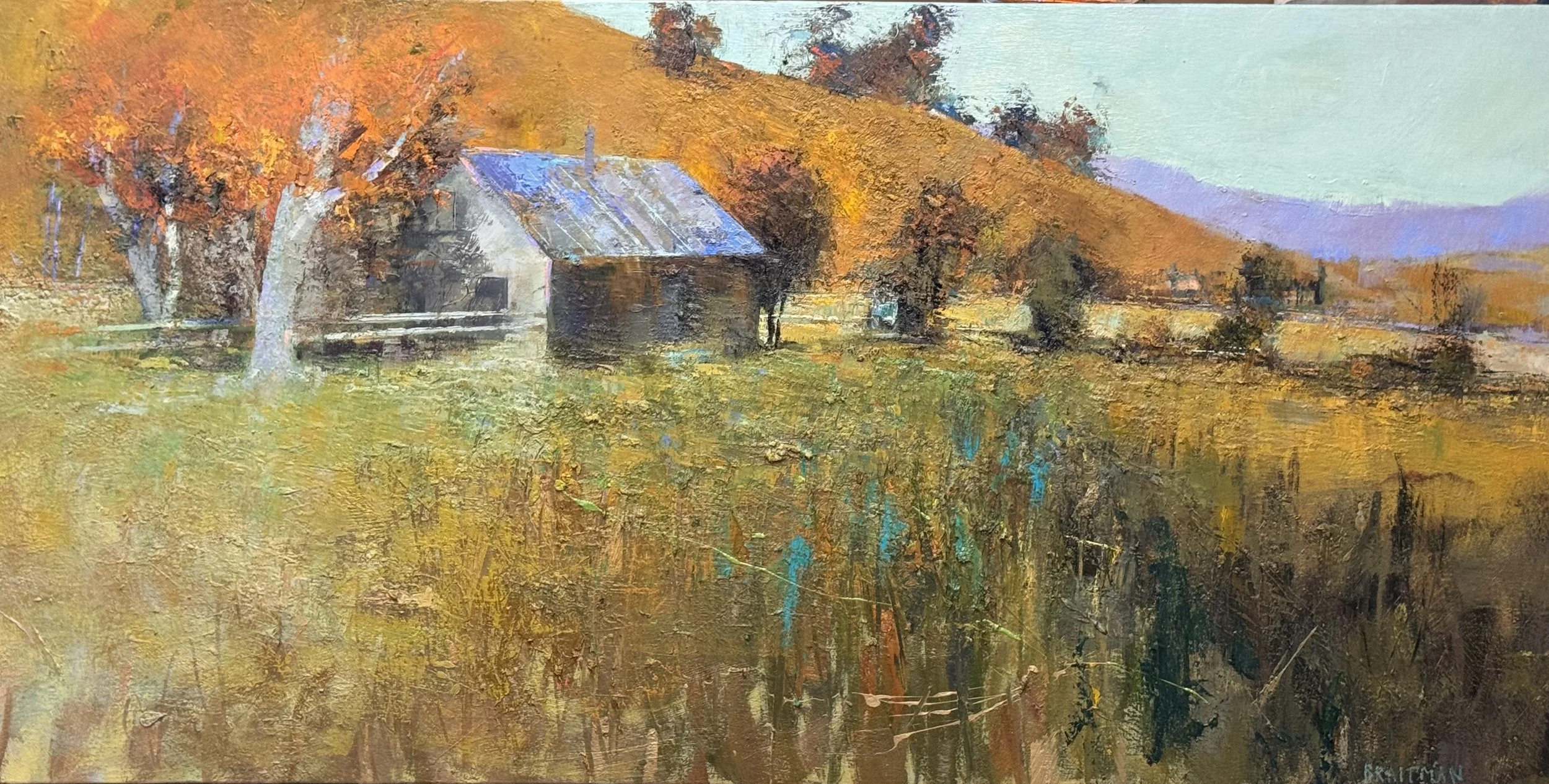
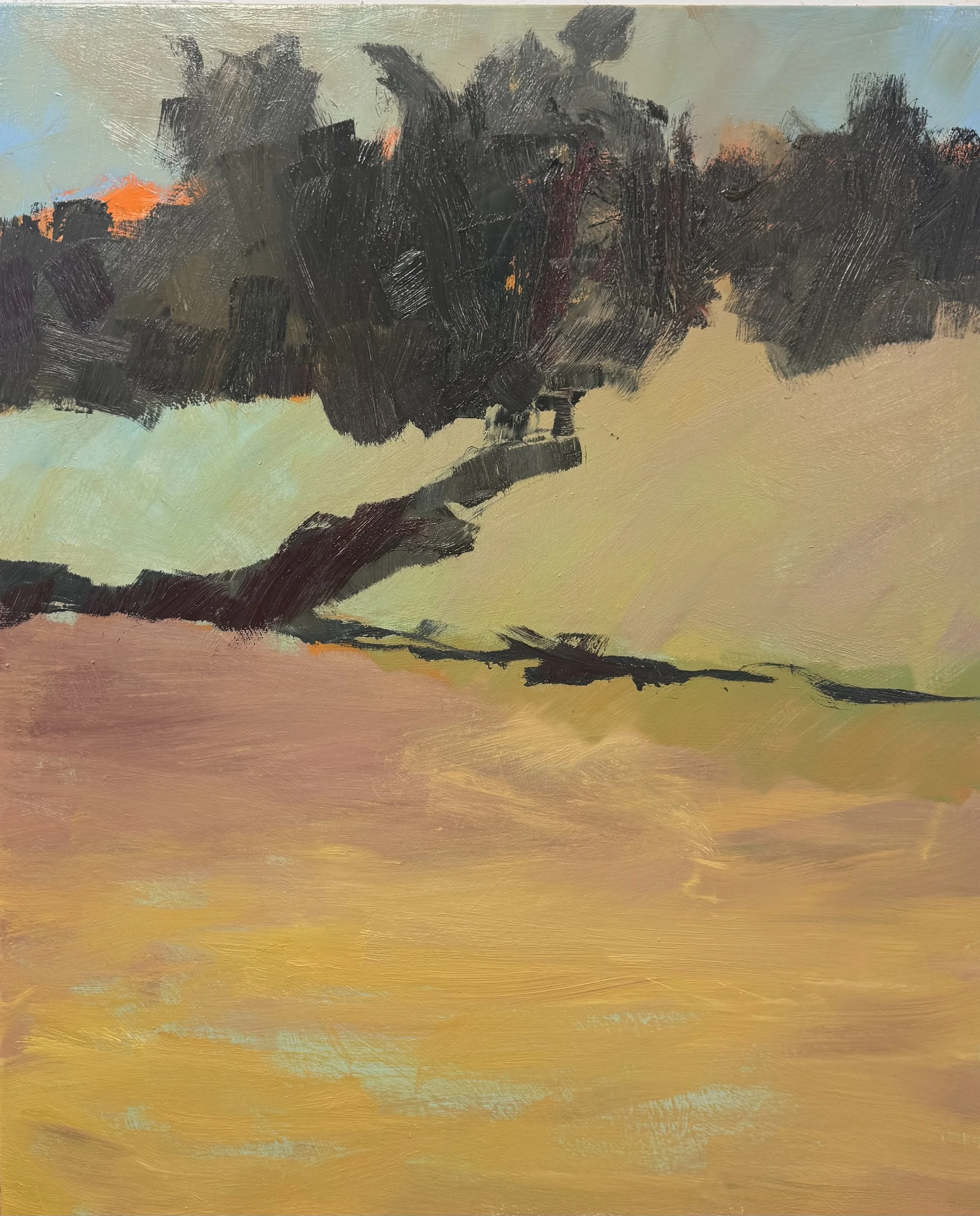
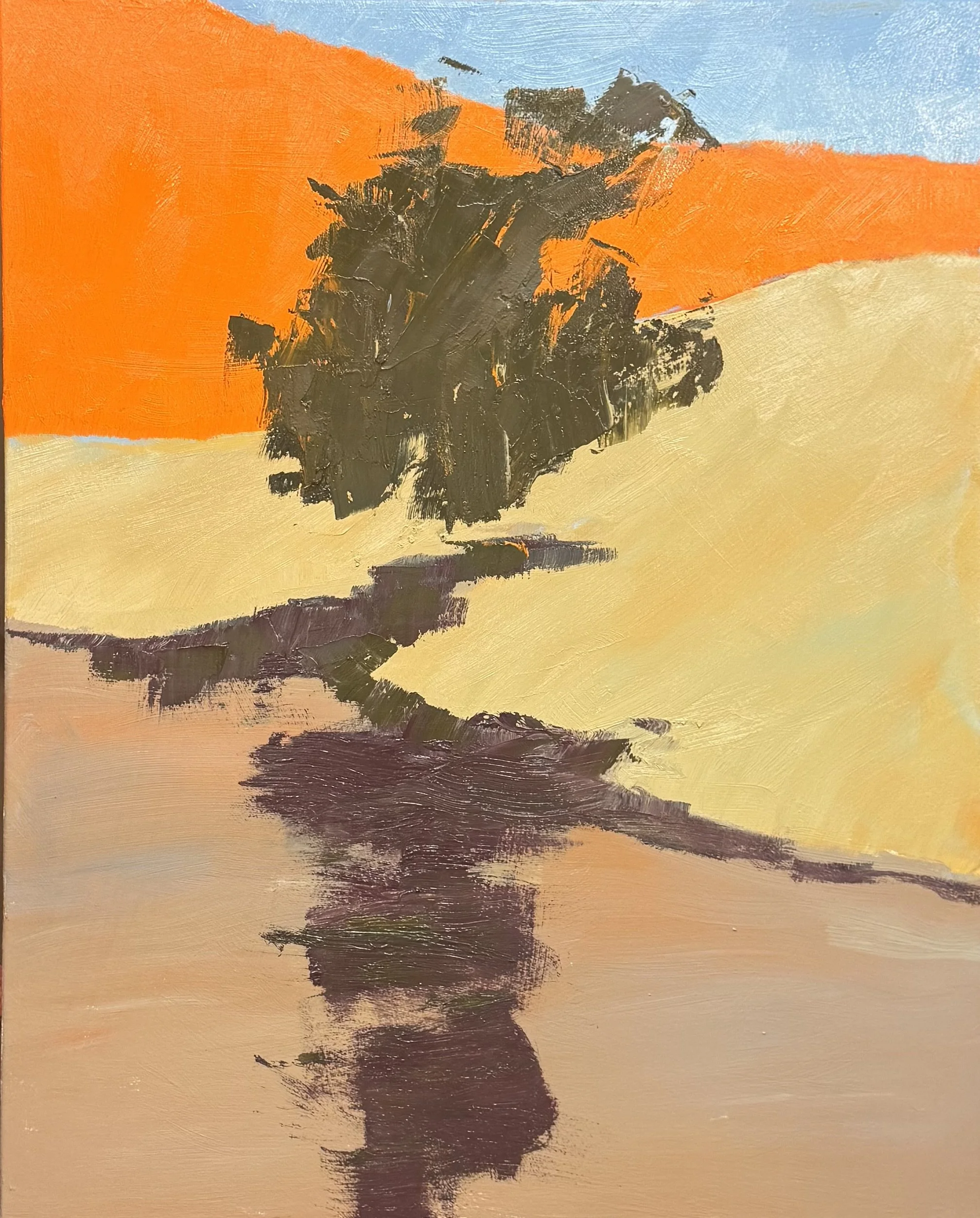
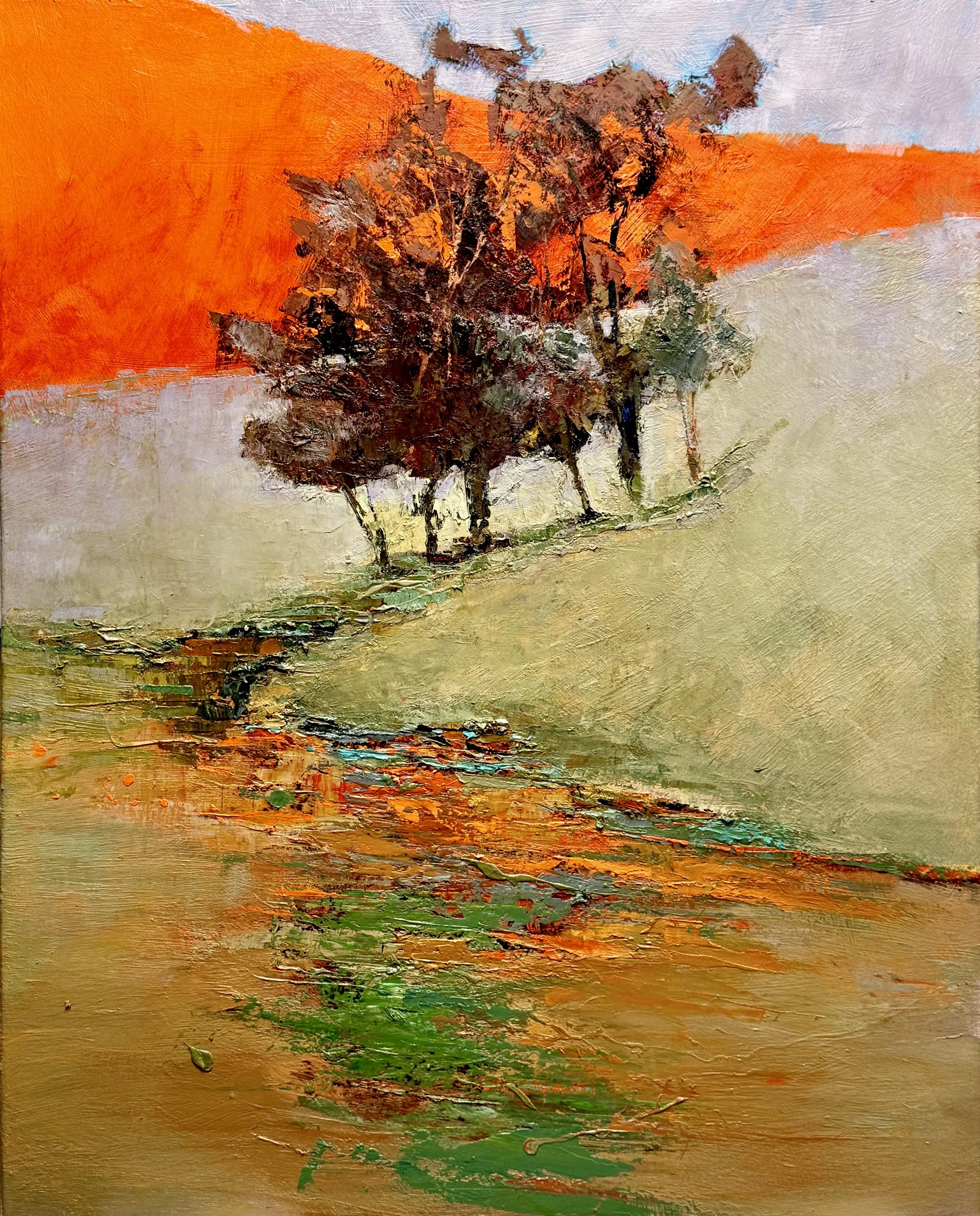
I am one day away (I think) from finishing both of these pieces. They are both very exciting and both are embracing the warm and cool palette simultainously employing a complementary color relationship.

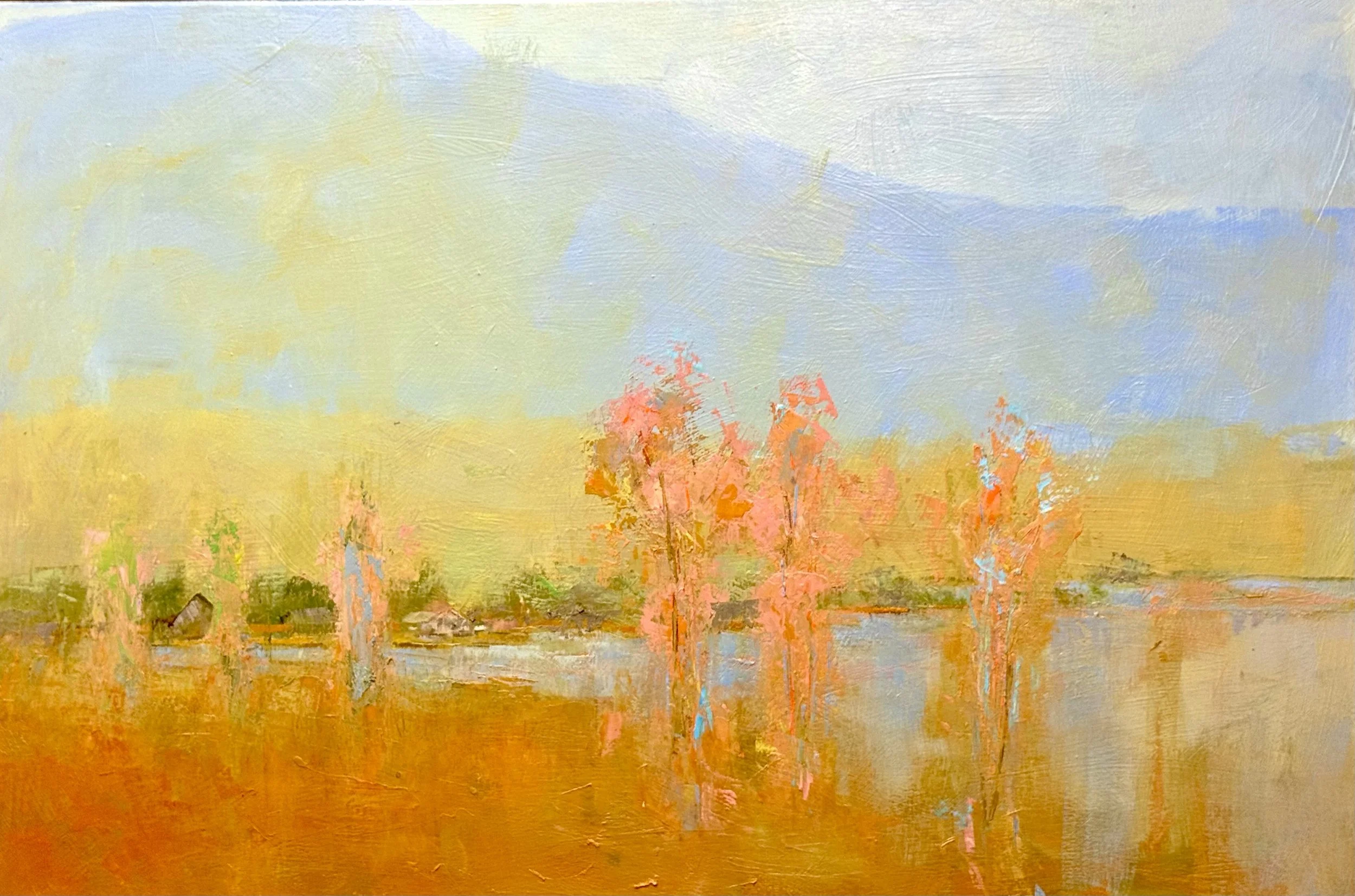
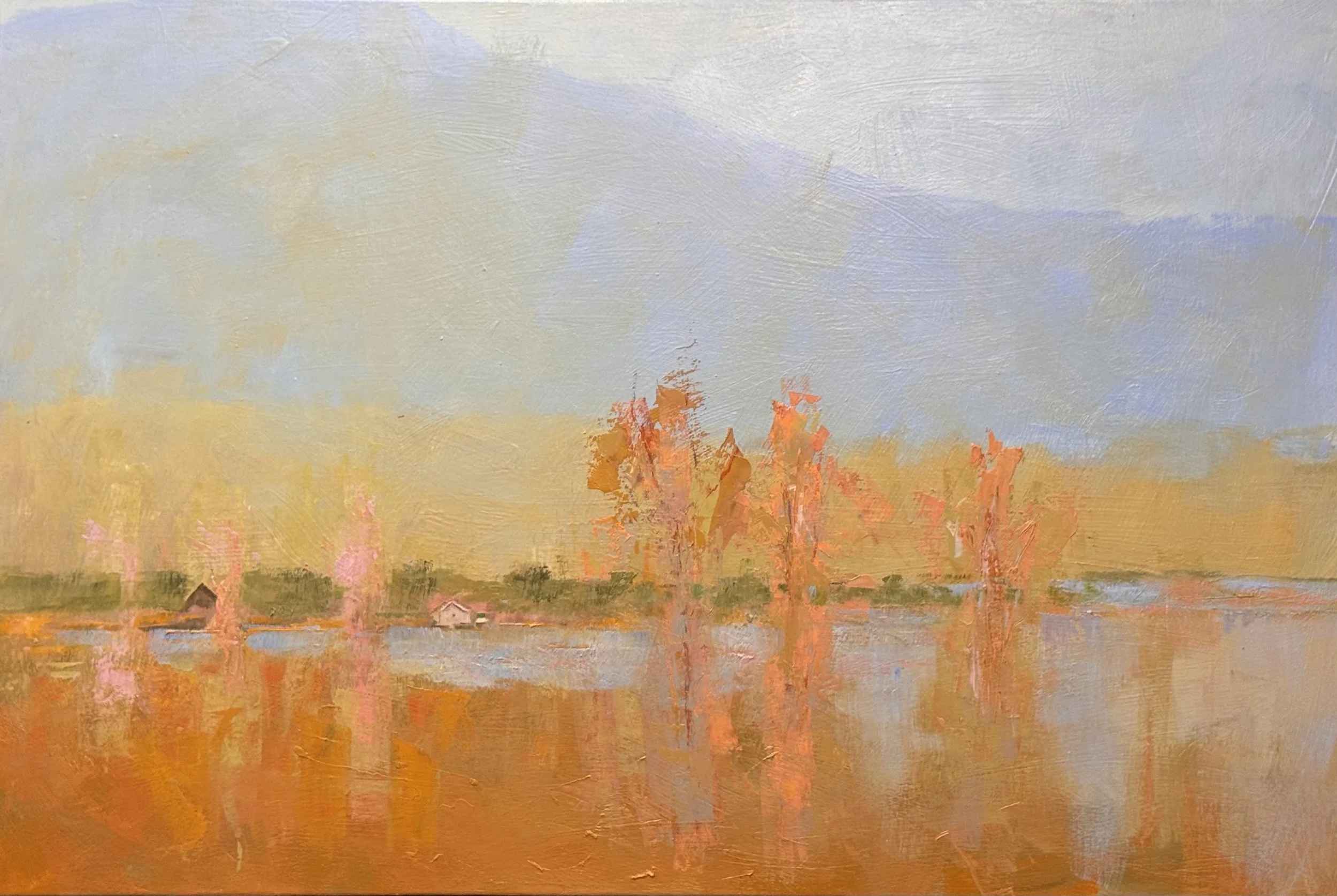
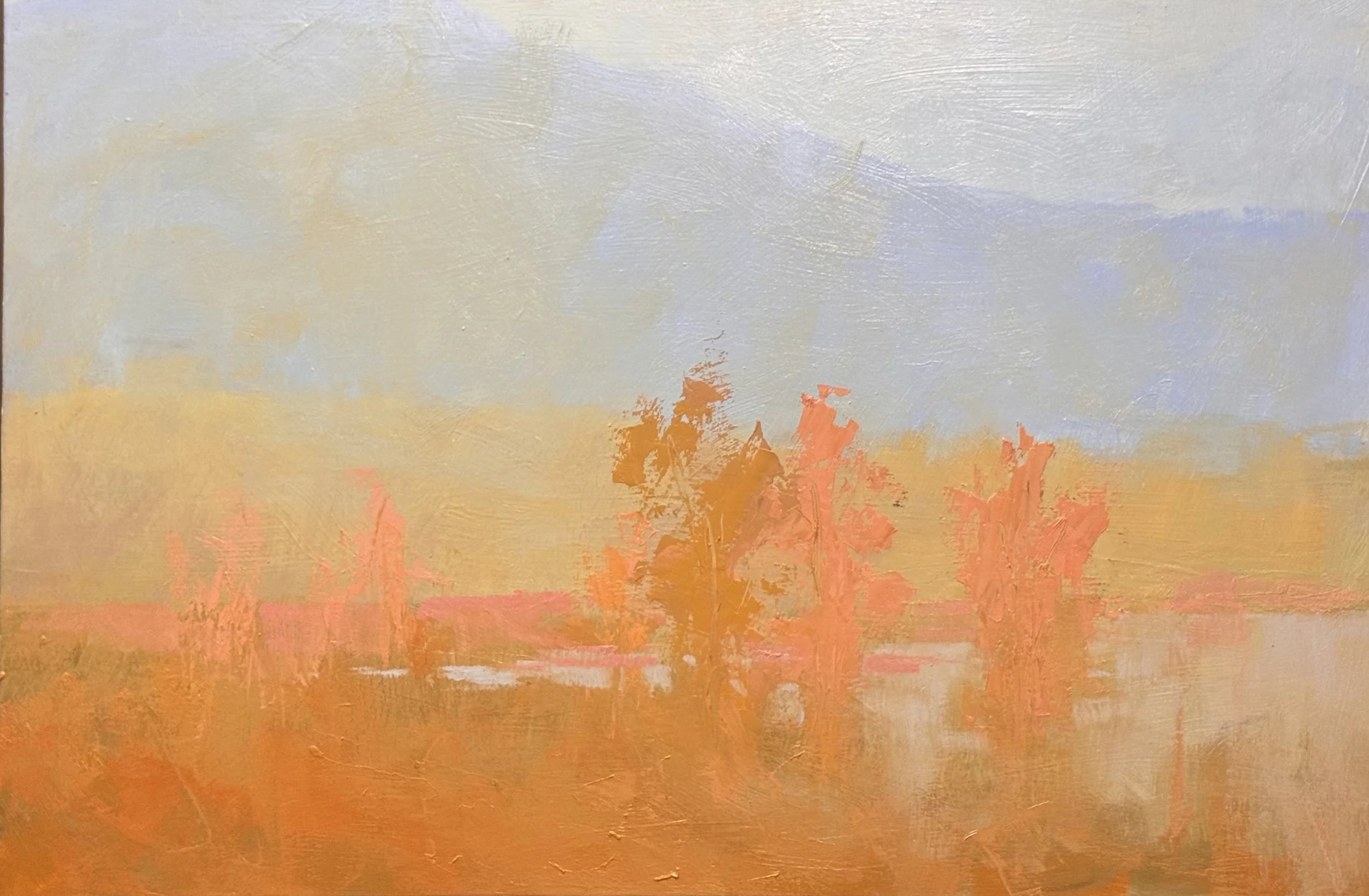
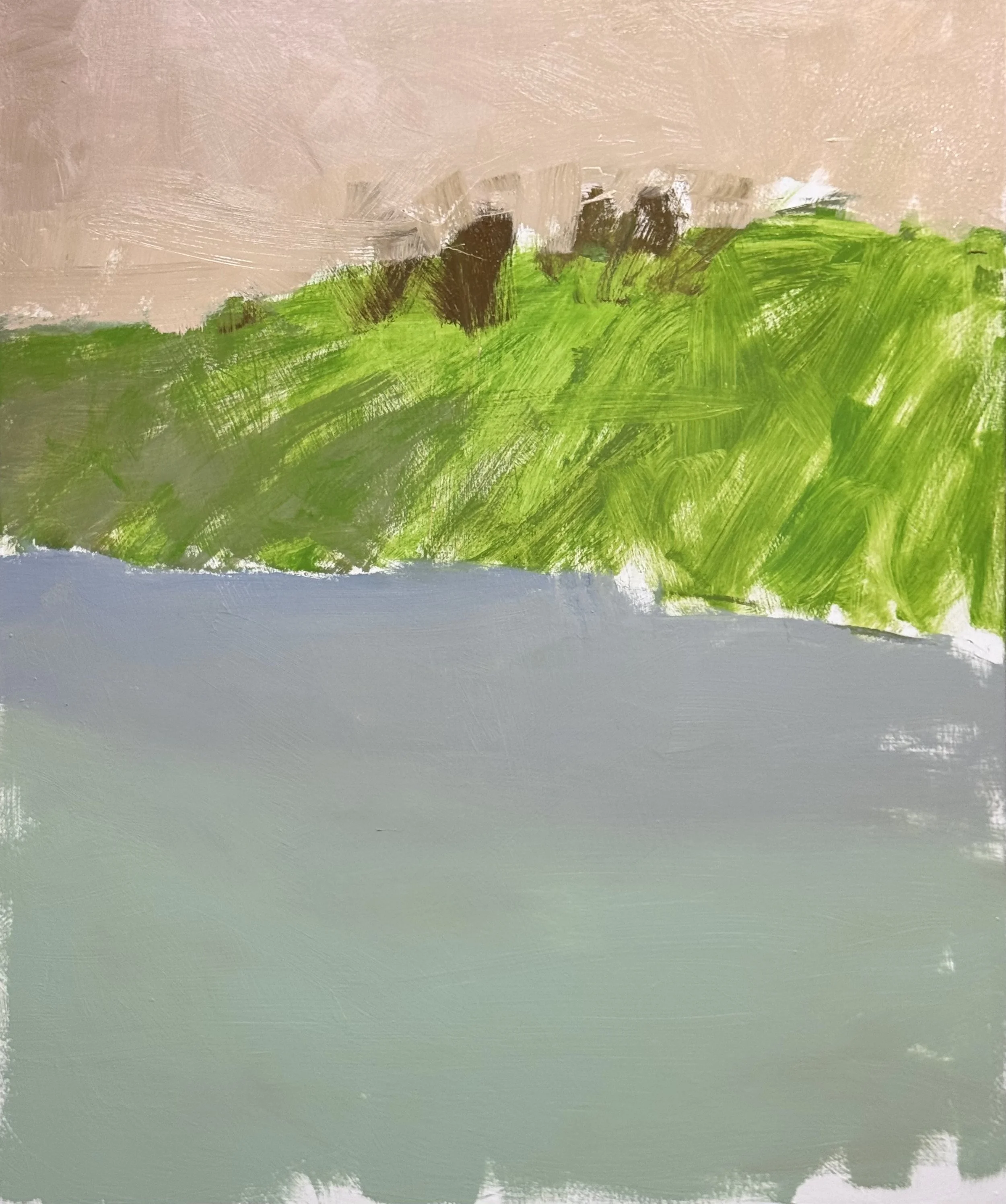
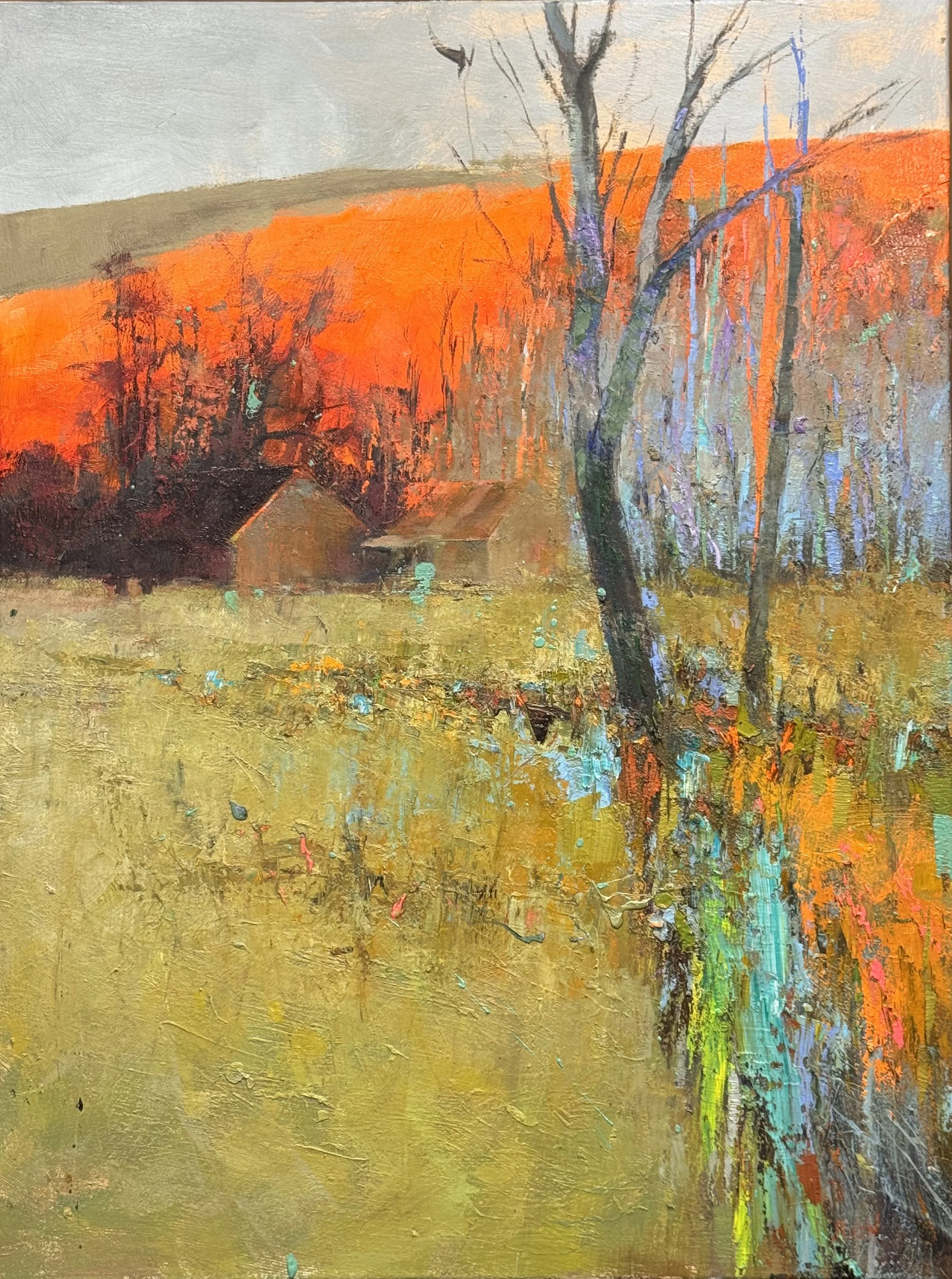
The Fibonacci left shift worked. The structural weight has migrated and the painting breathes differently now — the right side of the canvas has become genuinely atmospheric, almost evaporating into the yellow-gold field. The green band is quieter, more integrated. The pink tree verticals are doing exactly the right amount of work: present without insisting. The two structures on the left horizon feel more earned now, less incidental.

Tuesday 5/12

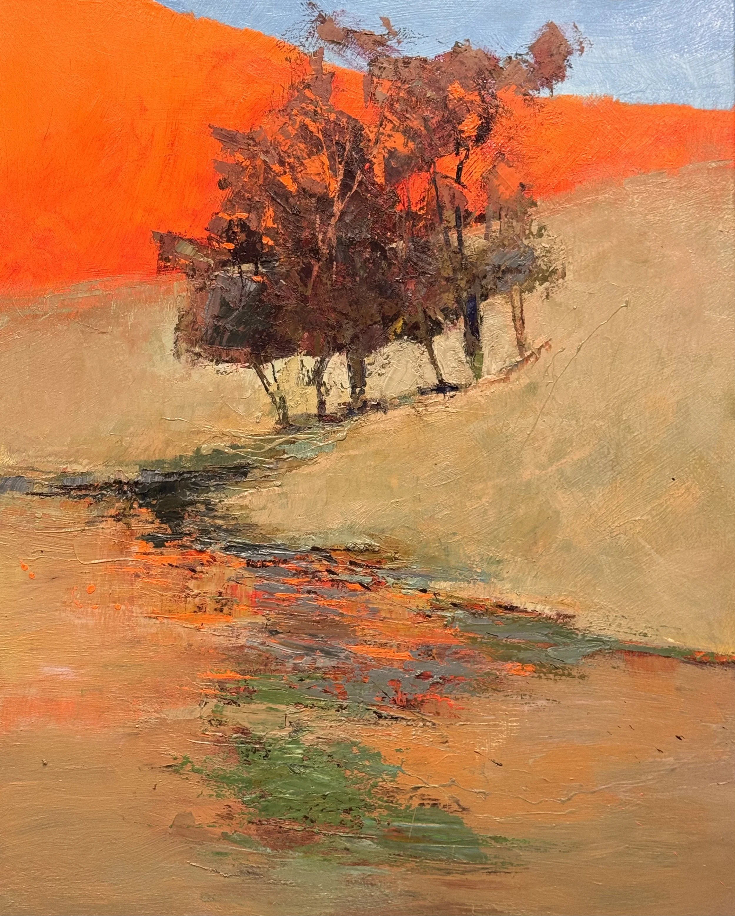
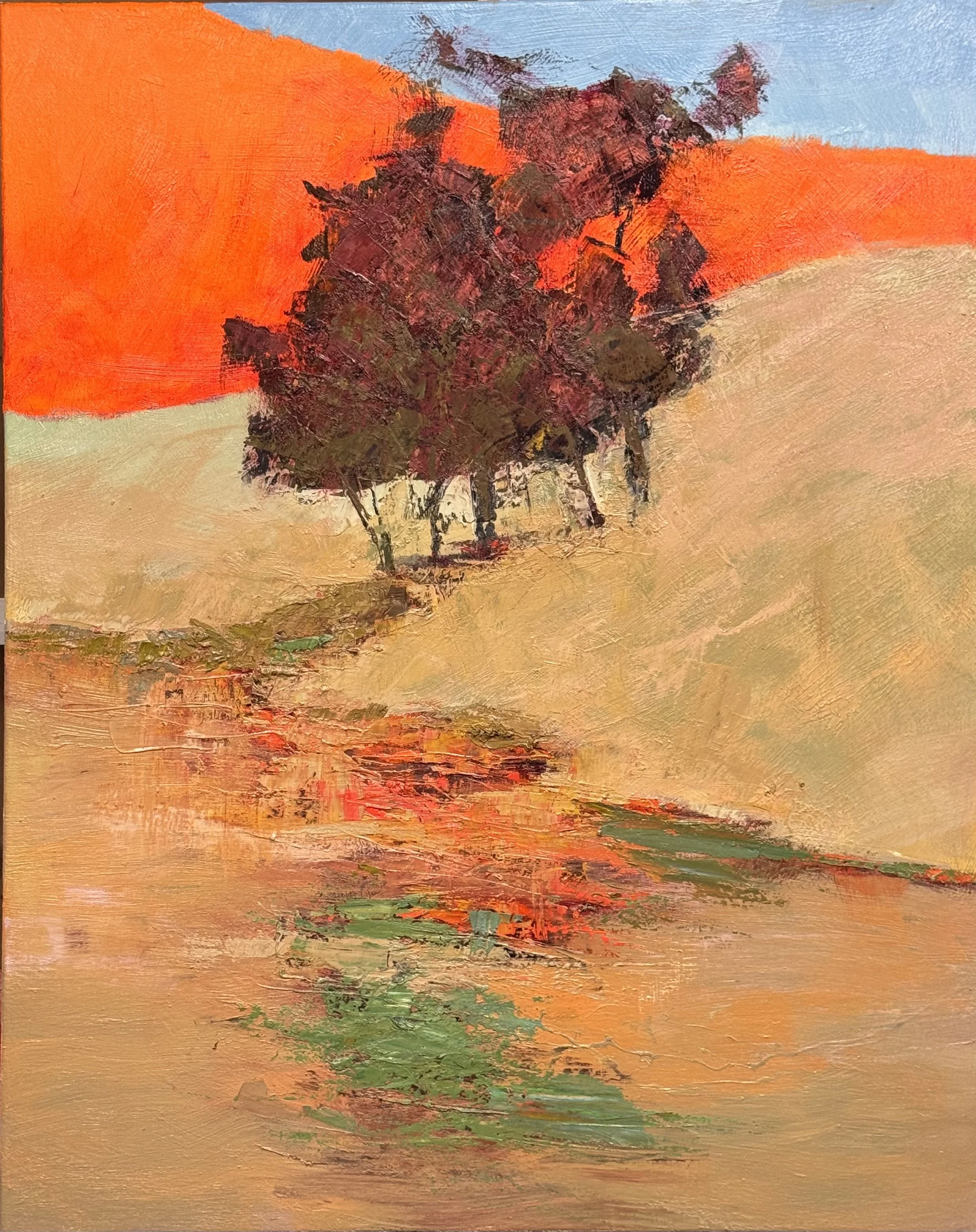
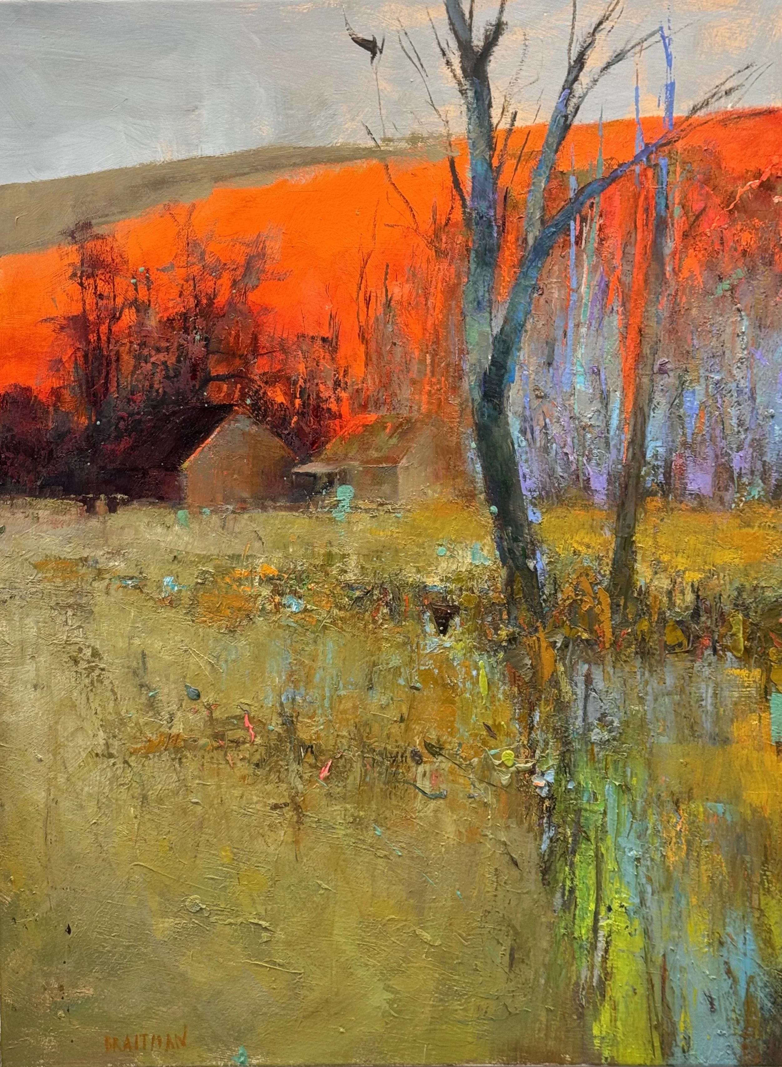
I am all set to do a final alizarin crimson glaze over the oranges in this piece. I am very excited about the dissapearing greens in this piece.

On the disappearing greens This is the quiet genius of the piece. Those greens in the lower water/reflection zone are doing exactly what you love — appearing and dissolving, never demanding. They're holding the teal/green thread without announcing it. The alizarin glaze could inadvertently shift your eye away from them if it pulls the whole canvas warm. Something to watch.

That slate-blue strip of sky upper right —I have not decided if it stays as-is after the glaze? The alizarin won't touch it obviously, but the contrast between a deepened orange field and that cool blue sliver will intensify. Could become more powerful. Could also feel orphaned.

Two New Works in Progress — The Cool Side of Floating

Today the studio holds two canvases, both early, both asking different questions.

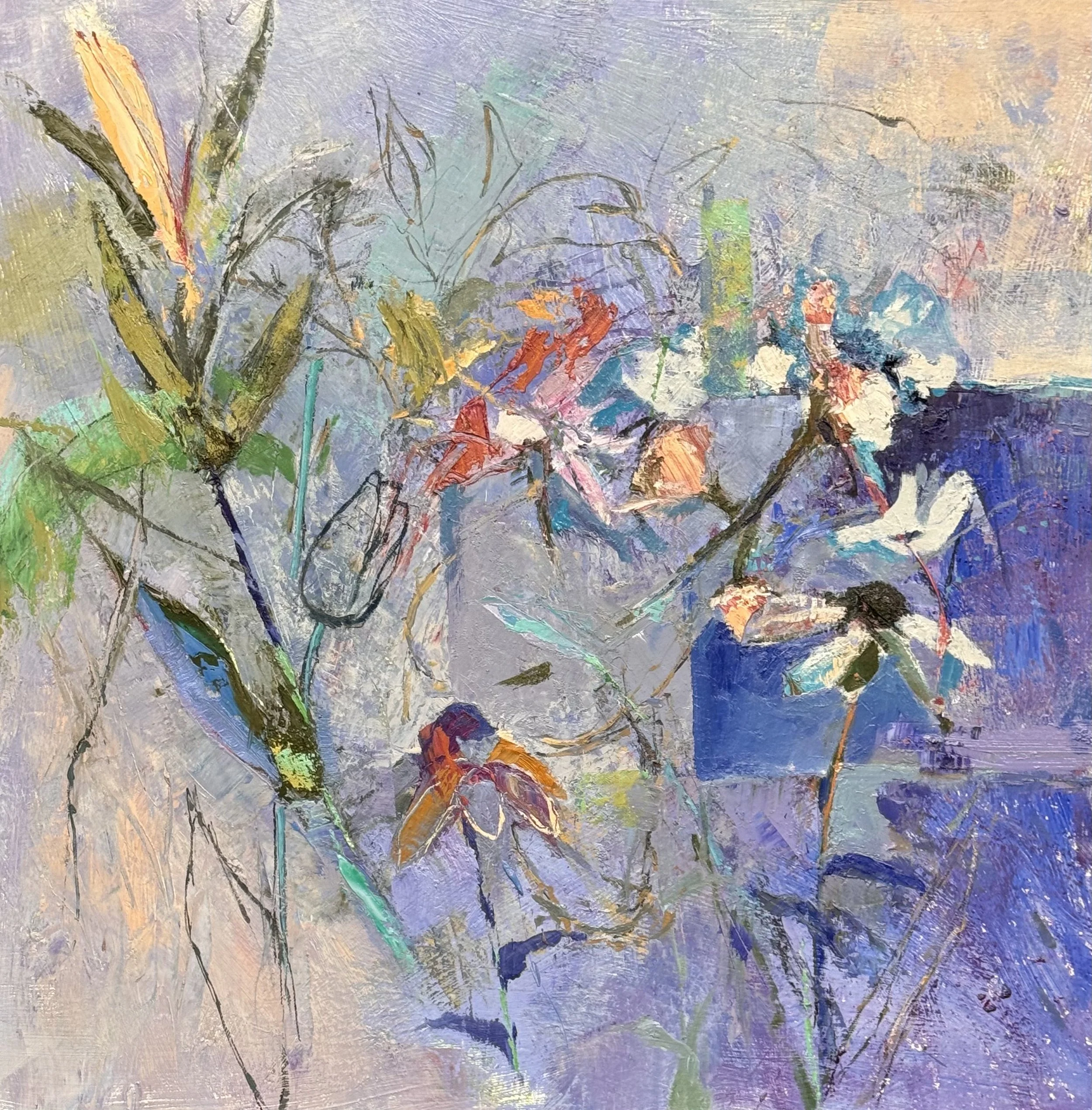
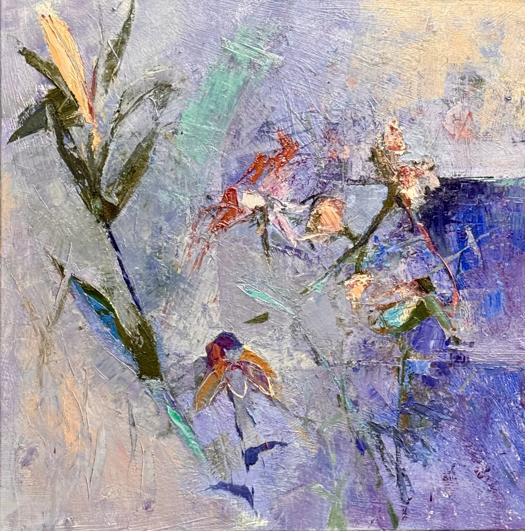
The floral piece is finding its architecture. The plan is to establish a full A-to-Z clockwise rotation — highest contrast anchored in the upper right corner, with a gradual value shift moving counter-clockwise from light to dark, and the return journey clockwise from dark back to light. The lavender and grey ground is already doing quiet work. The scattered reds and oranges feel provisional, which is exactly right at this stage. They'll either earn their place or disappear.

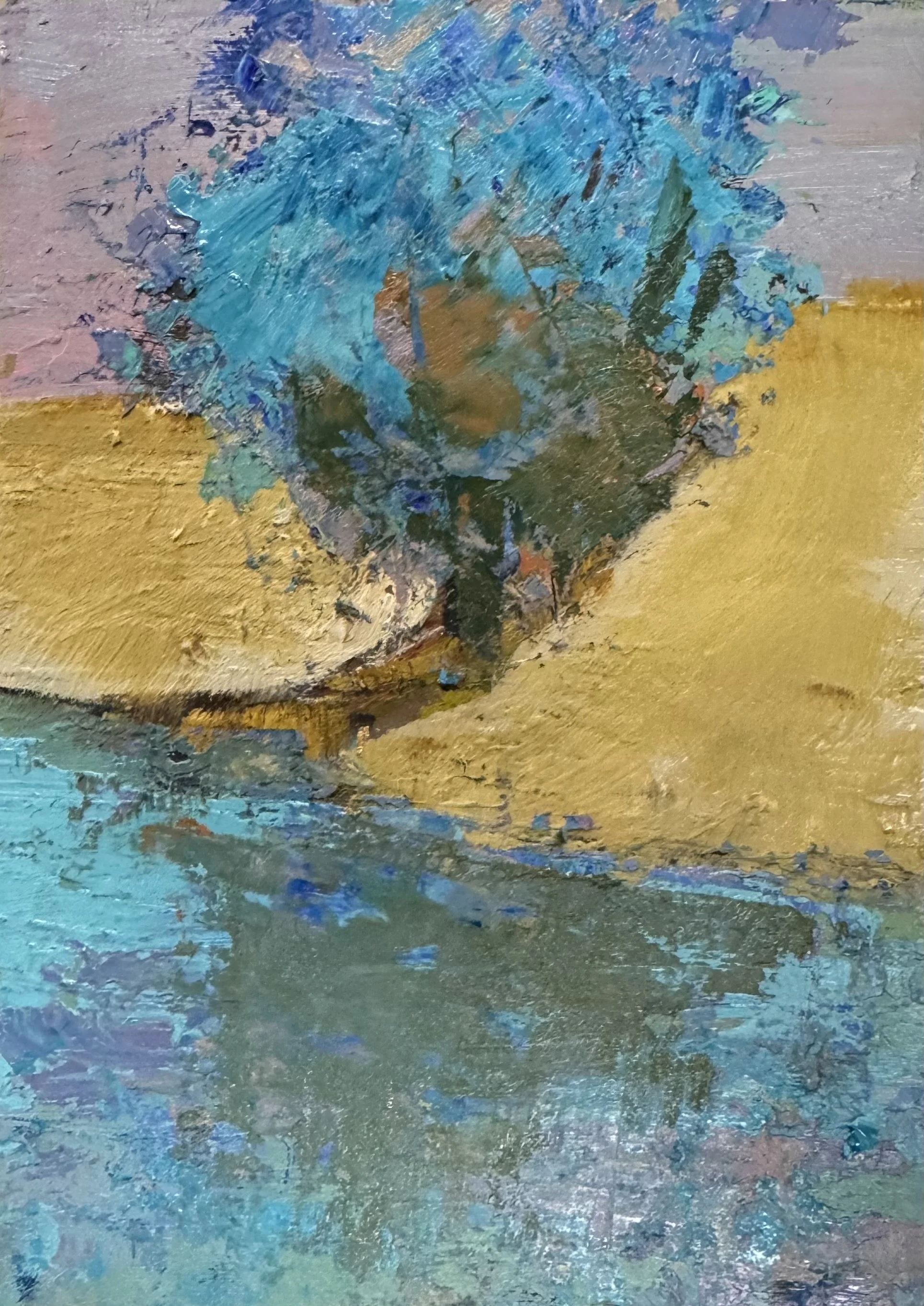
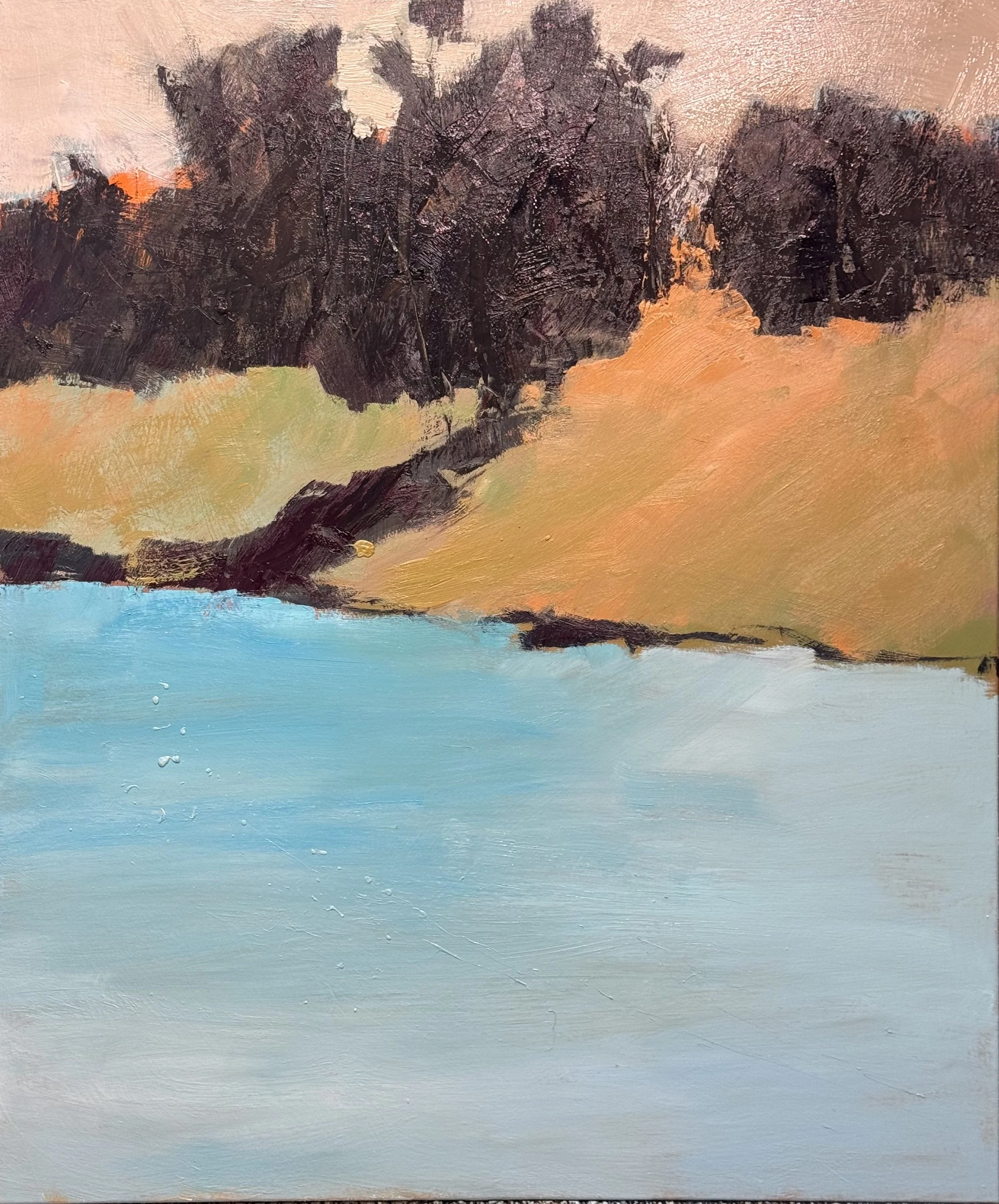
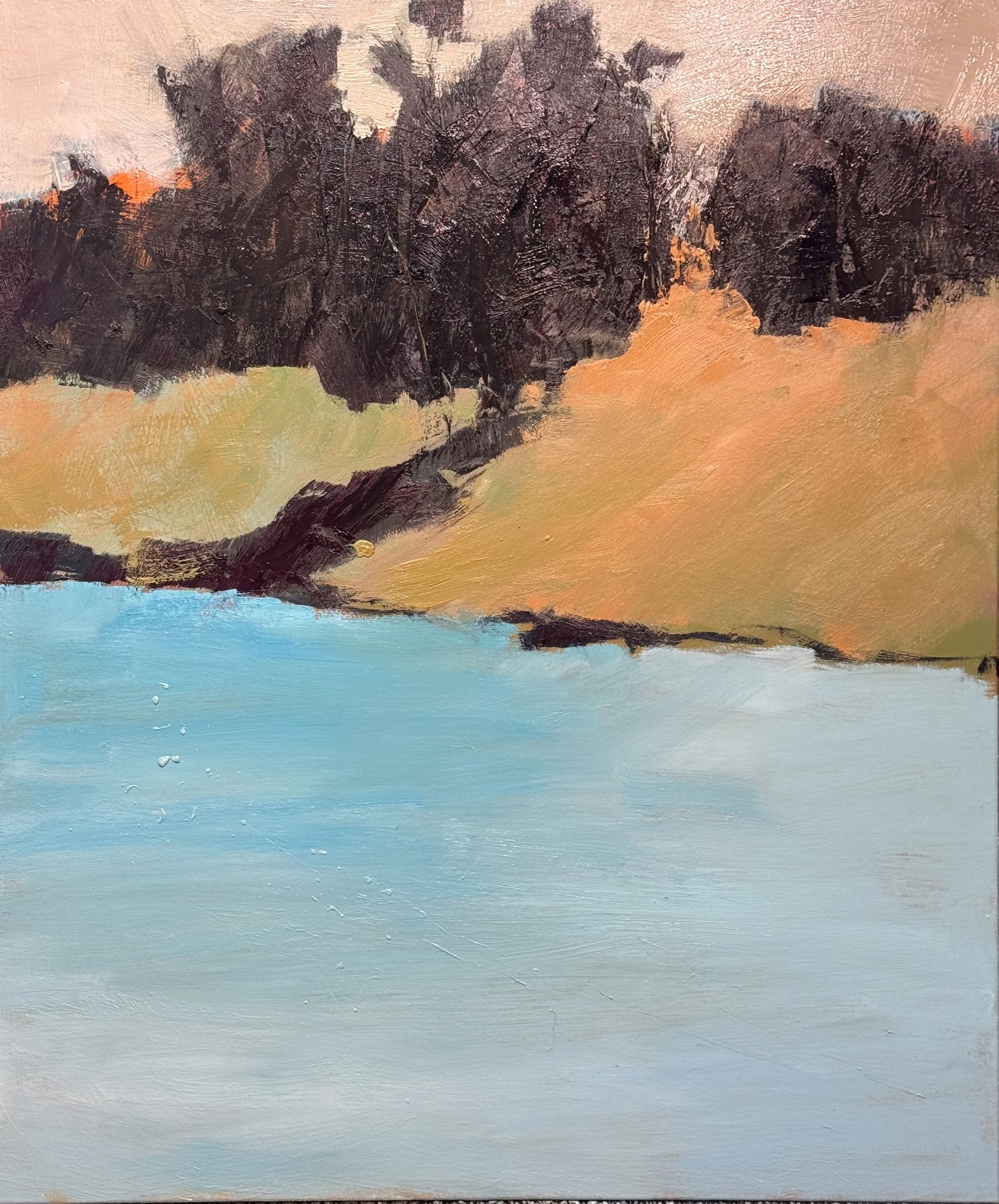
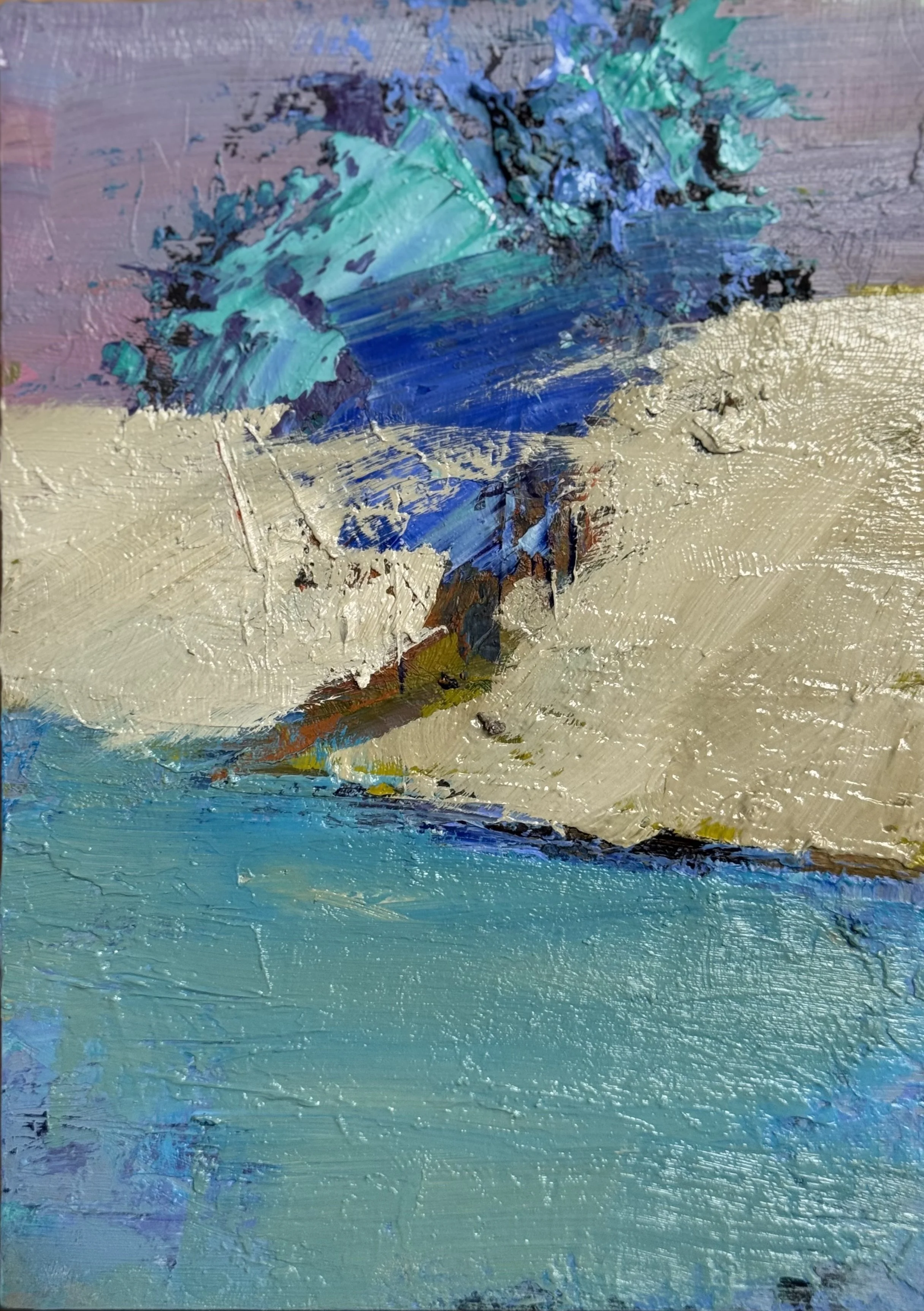
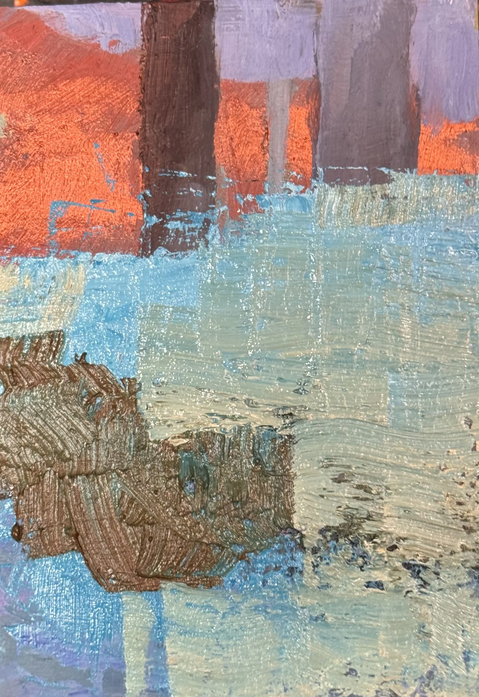
The small landscape study is a return to the floating concept — but this time on the cool side. Cerulean and teal where the orange once lived. The reflection below the tree mass is already behaving well, holding its relationship to the form above without competing. What the warm version resolved through heat and contrast, this one will have to resolve through temperature shift and restraint.

Both pieces are unresolved. That is the point. The interesting decisions haven't been made yet.

More to come.

The atmosphere is already doing almost everything — that luminous yellow-gold dissolving into the blue-grey sky mass is as Turner-adjacent as anything you've made. The horizontal band of green and the two small structures are barely whispered, which is exactly right.

On the Fibonacci left move

Right now the tree cluster sits just right of center, which feels slightly resolved — the eye knows where to land. Shifting the primary structural explanation to the Fibonacci left position will reintroduce productive ambiguity. The water reflection below will have to follow, which could make the whole lower third feel more like pure phenomenon than description.

The "how little is needed" question

This piece is already proving its own thesis. Those pink tree verticals are almost not there — and yet they're holding the whole middle zone. The two structures on the horizon read as almost accidental, which gives them enormous weight. The danger in the next session is the temptation to explain more. The painting is whispering. I really want to maintain that impression.

It's another Monday....I would love to share the two pieces I worked on today.

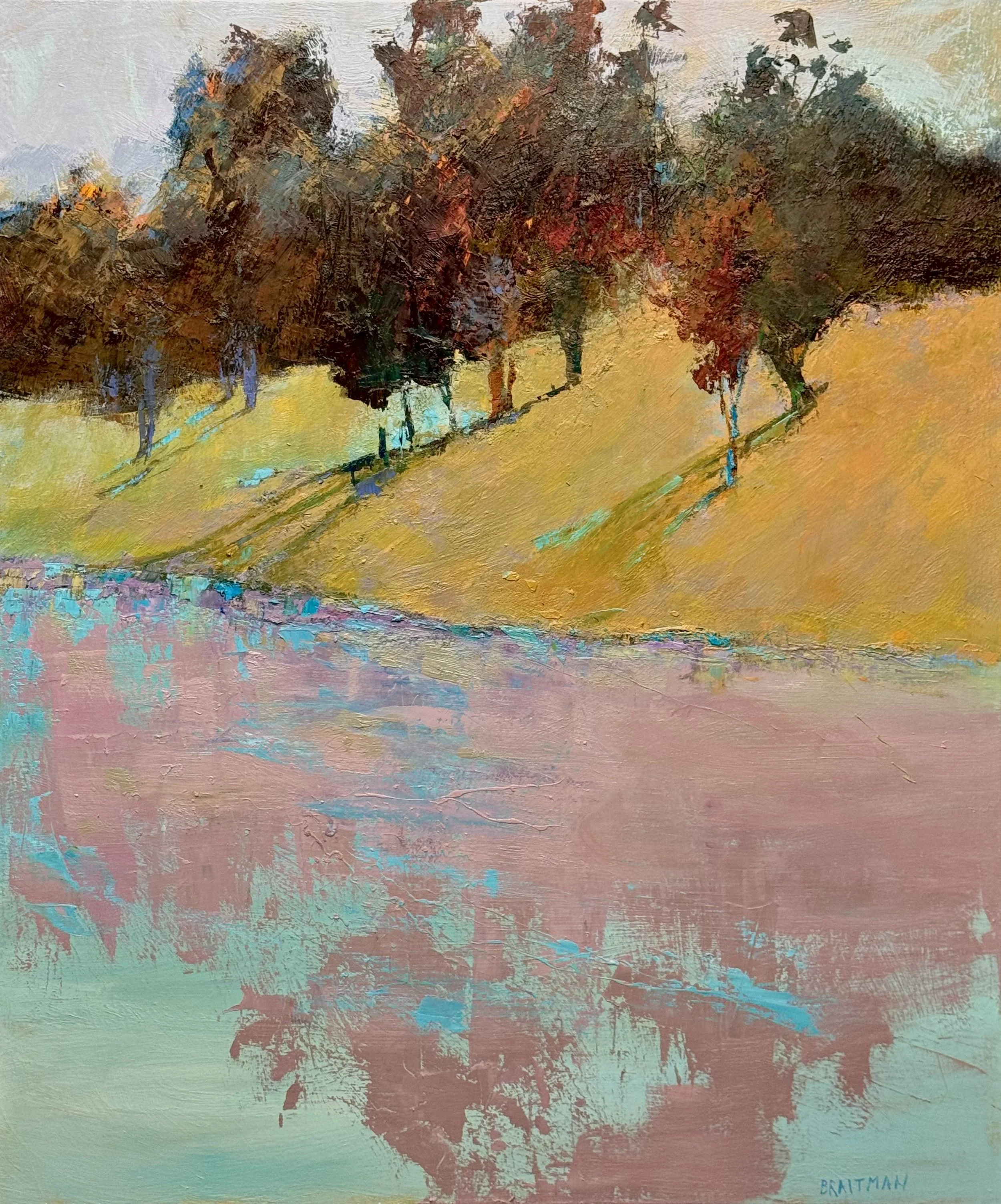
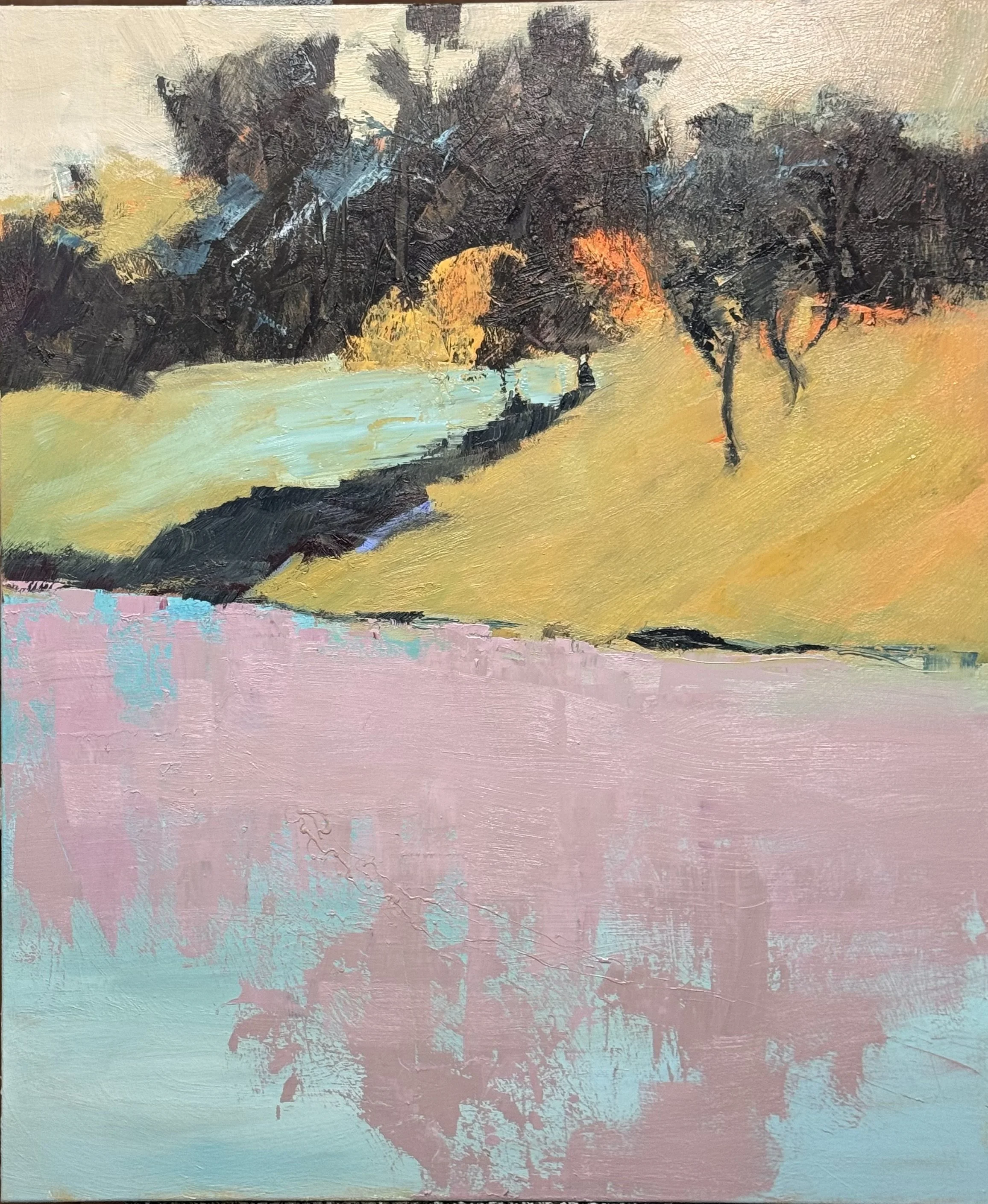
Floating II, 54 x 45

Floating earns its name.

The foreground water plane actually floats — dusty rose with teal interruptions, a surface that hovers rather than sits. Dead center in that field of rose, the blue simply appears — not as accent, not as edge work, but as its own presence, suspended. Visual harmonics. Color singing back to itself across the canvas.

That's beauty as I define it: different colors mixed to the same value. The eye reads harmony without knowing why.

The narrow purple-blue seam where hill meets water handles the transition between warm and cool. The hill glows. The trees hold mass without pulling the composition down. The seafoam in the lower corners keeps the whole thing airborne.

54 x 45. Oil on canvas.

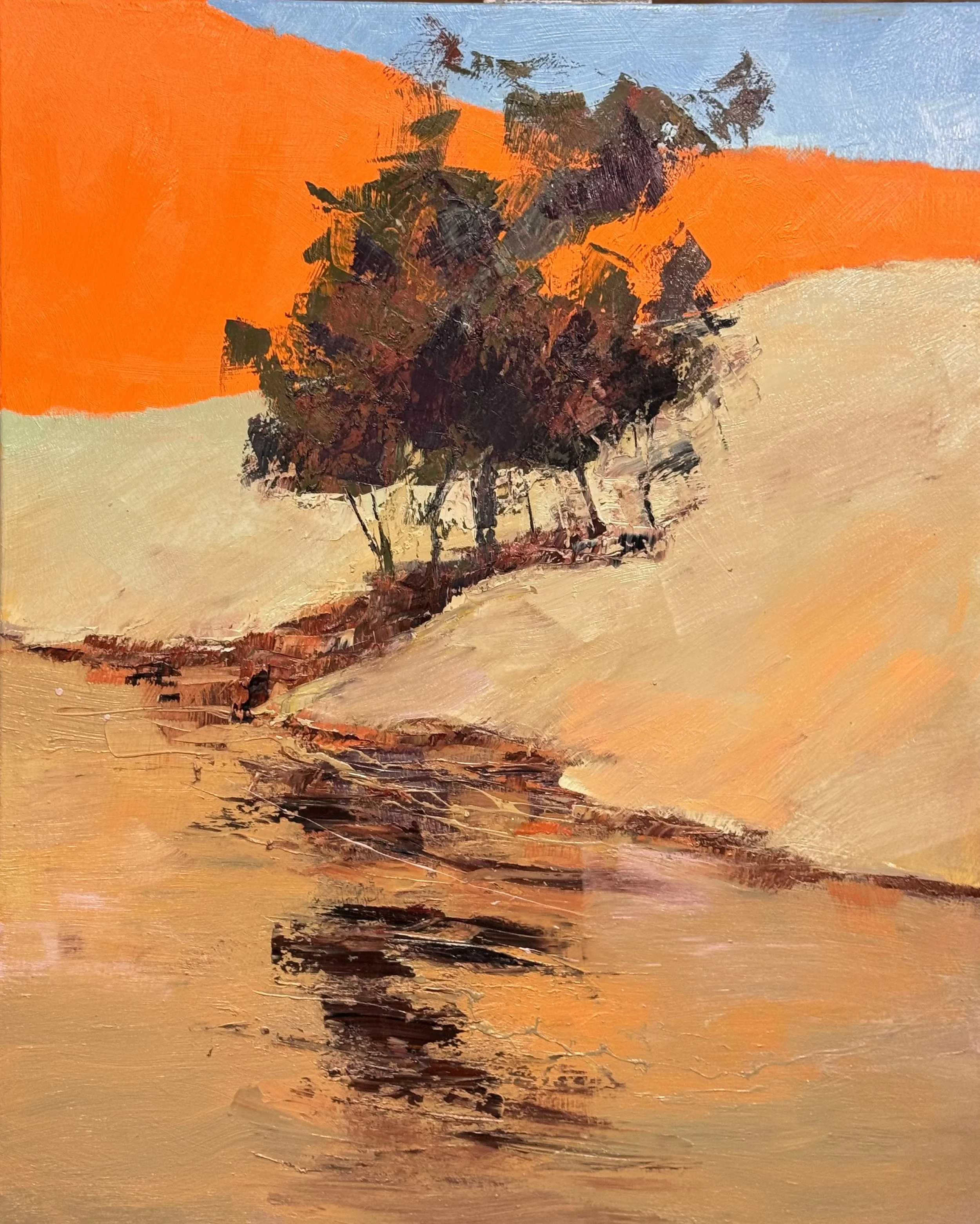
Floating II holds two definitions of beauty in the same frame.

Above the shoreline — the same color mixed to different values. Orange hill, orange tree mass, dark to light. One family, one logic.

Below — different colors mixed to the same value. The reflection fractures into red, green, burnt sienna. Harmony through equivalence.

The shoreline is where the two definitions meet.

Oil on canvas.

Going forward, I will see which definition of beauty wins the painting, or whether they coexist in tension.

Option 1 — Tag the two hillsides together: Same value family, different colors. The orange and the tan become one read — harmony through equivalence. The tree mass then floats between two unified fields, above and below. Beauty as chord.

Option 2 — Make the tree mass an orange variation: Same color, different values. The tree and the hill become a family — dark orange mass against bright orange field. Now the juxtaposition is structural: the hillside unity versus the fracture and complexity of the shoreline/reflection. Beauty as contrast between the two definitions living in the same canvas.

Option 2 feels more conceptually loaded to me. The painting would literally demonstrate both definitions simultaneously — one above the shoreline, one below. The tree becomes the hinge.

In both of these FLOATING pieces, I want to anchor the viewers eye in the strong treemass contrast and use that structure to tickle the viewers eye with the wonderful color harmonics in the reflections. That's a clean directive — the tree mass is the authority, the reflection is the reward.

The tree mass earns the viewer's trust through contrast and structure. Once anchored there, the eye relaxes and follows down — and that's when the color harmonics in the reflection do their work. The viewer doesn't analyze it, they just feel it. Which is exactly your principle: explanation is the enemy of feeling.

Floating I & II

The tree mass is where you enter. Dark against light, structure against field — the eye finds it immediately and holds.

From there the reflection pulls you down.

That's where the painting opens up. Different colors mixed to the same value — the eye reads harmony without knowing why. It doesn't need to. The strong contrast above did its job. It gave the viewer permission to wander.

Two paintings, same logic. Anchor first. Then tickle.

Oil on canvas.

Well TGIF again, I had an interesting painting day today....

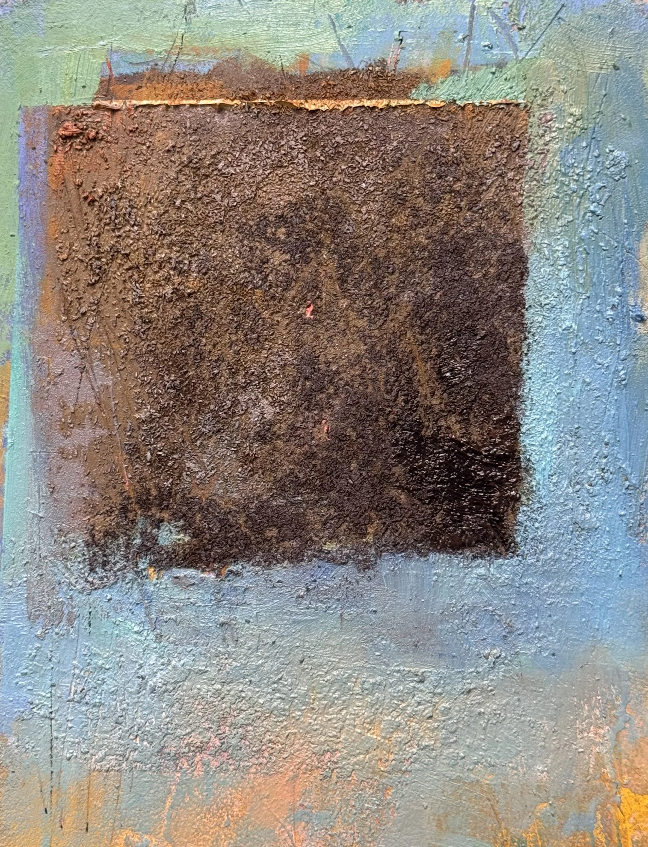
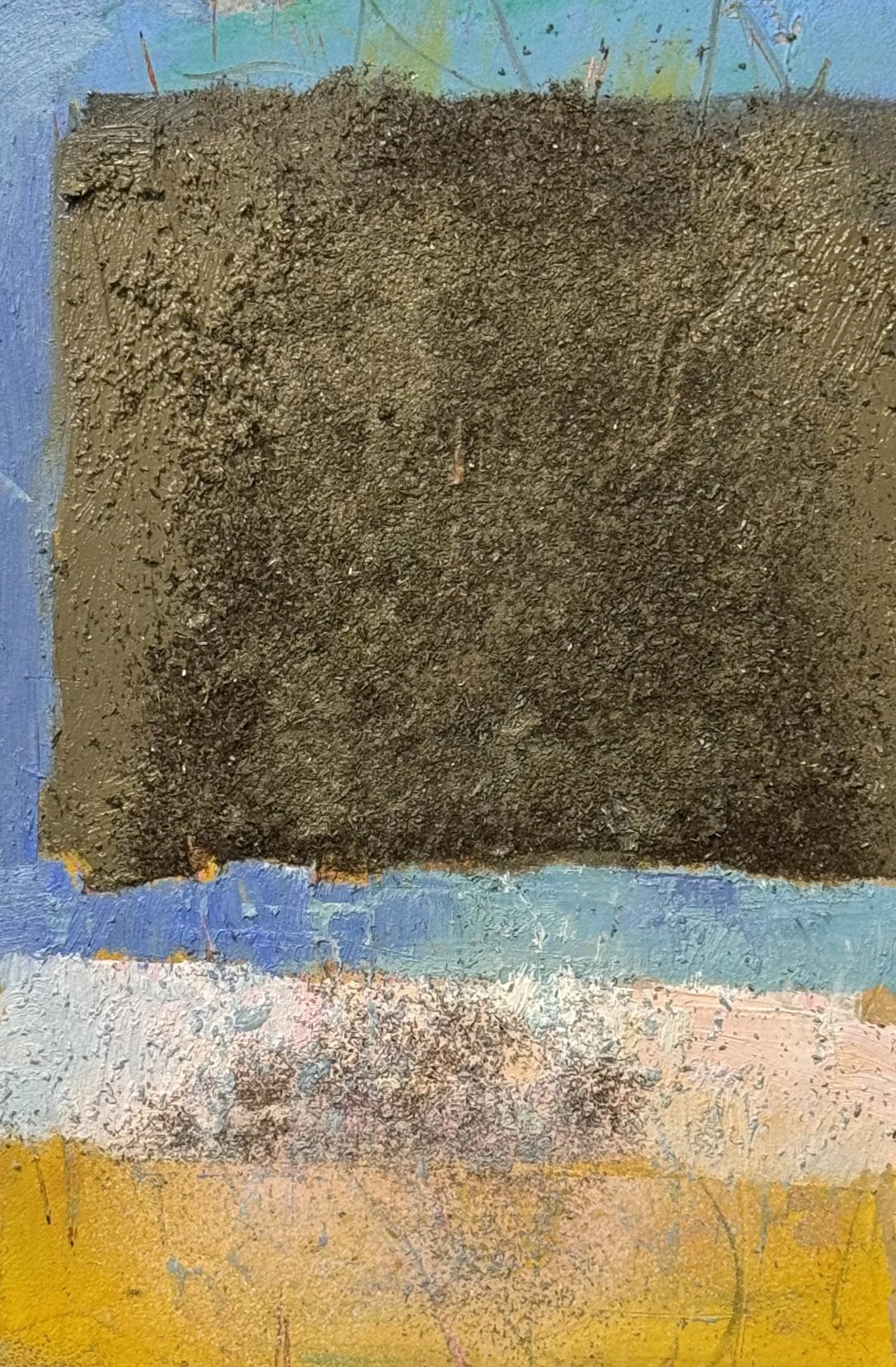
This is an illustration of what I want to play with in July: for me the concept is gravity (in this case—FLOATING.) I will strip it of its protective edging and share this piece next week.

The weight is visual but not gravitational. The dark square reads as enormously heavy — the impasto, the earth pigments, the near-black core — yet it sits mid-canvas without touching ground. That tension is the whole conversation.

Water & Trees — Scaling Up

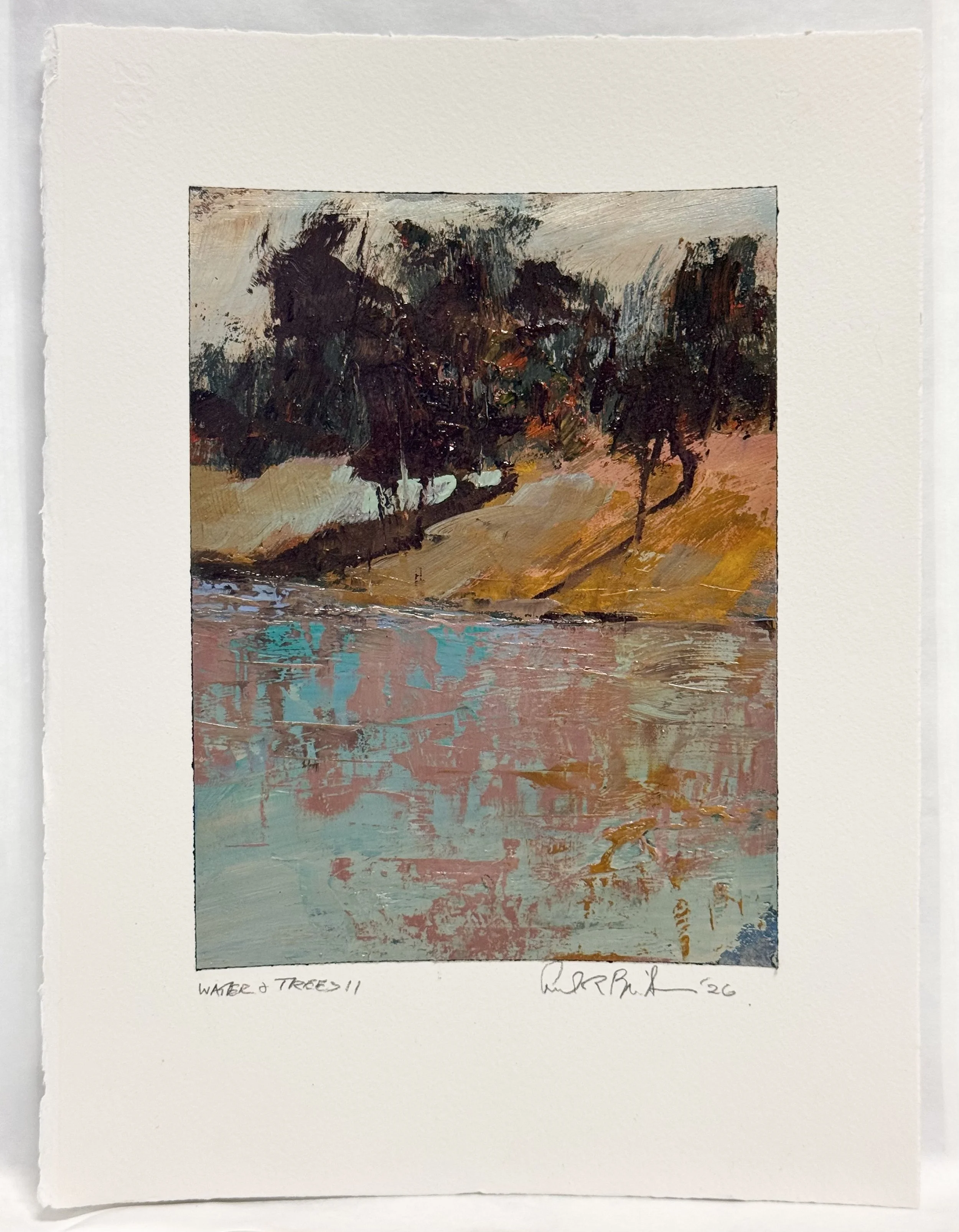
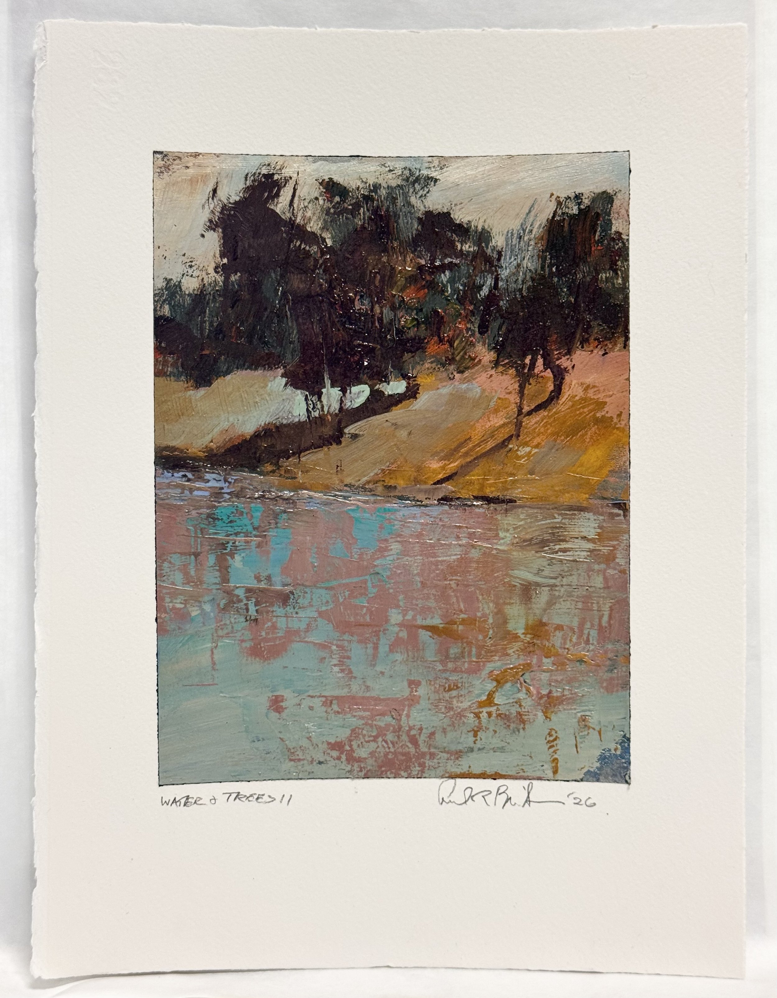
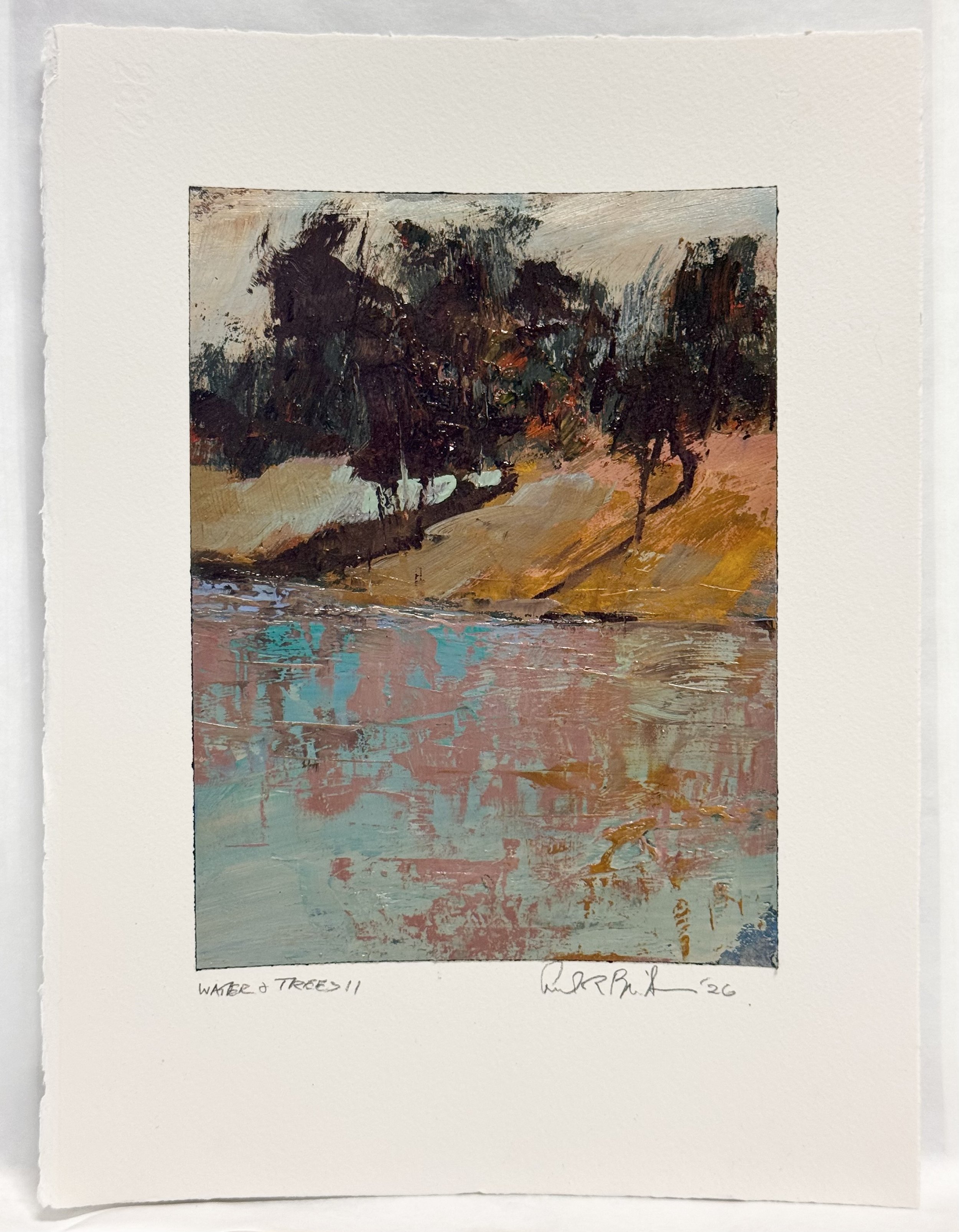
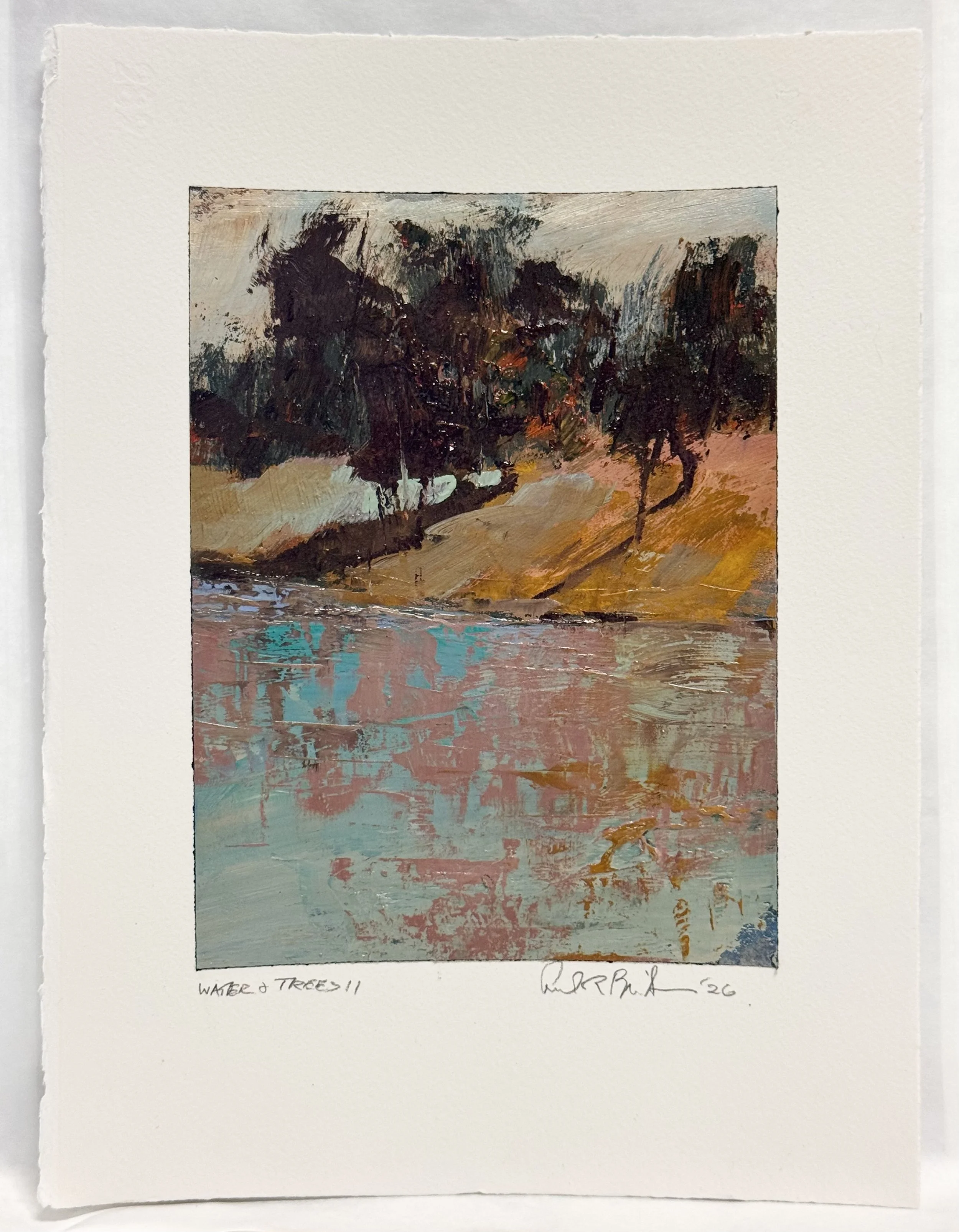
The small study (Water & Trees II) is on the right. The large canvas — 54 x 45 — is where I've been living this week.

What I wanted to accomplish on the big scale: revisit the sky shape, work out how the tree mass meets it, get the hillside reading correctly, and find the water reflection. In a surprising way, I've come to really appreciate what's happened with the hillside — and the reflection is working.

What I've learned: transferring from a small, charged study to a canvas this size is the source of every extra hour I've put into this piece. On the study, the chaos is authentic because the scale allows it to be. Large tools, fast decisions, residue. On a 54 x 45, the big shapes have to explain themselves. They have to read. That means I couldn't let the first layer suffice — I had to work and rework each shape and transition until it both fit and appeared as if it didn't cost anything. That tension is the whole game at this scale.

Still to do when dry: tree trunks, the bottom edge of the tree mass, and some tying together along the water's edge.

One more day.

Workshop Thursday

This is today’s work while teaching a workshop…so it is very limited but I am excited to see the ending already. I want to refresh the sky so that I can place the tree mass to overlap the finished sky. With the proper work, I should be able to imply a great deal of depth in the tree mass as it is silhouetted against the sky.

I also want to make the connection on the hillside where the bright teal hits the school bus yellow.. I need a transitional color (probably and soft or dirty cinnabar (the combination of the teal and the yellow with some dirtying pigment to allow the chromas to bleed into one another easily.

The mix I'd build toward: your teal + yellow in roughly equal parts, then knock it back with a touch of burnt sienna or raw umber — enough to gray it slightly without muddying it into nothing. You're looking for something in the olive/khaki family, warm-neutral, that can be dragged wet-into-wet along that edge so the chromas bleed rather than collide.

Workshop Day / The Patience of Wet Paint

Some paintings tell you immediately what they need. This one did — and then asked me to walk away.

It's a floral, built on a lavender field that functions more as atmosphere than background. The flowers aren't posed. They're discovered — warm russets and peach tones emerging from the cool ground like they've been there all along, waiting for the light to find them. The corn stalk anchors the left edge with a rougher, more declarative energy, which is exactly the counterweight the delicate blossom cluster needs.

The move I'm after is simple and non-negotiable: white blossom hard against ultramarine blue. Highest contrast in the painting. Everything else — the lavender field, the warm flower notes scattered through the middle, the gestural marks underneath — all of it becomes secondary to that one relationship. The eye goes there first. Then it earns the rest of the painting on the way back out.

But the paint is wet. So for now, it dries.

There's a discipline in that. The temptation in a workshop setting is to keep pushing, to resolve while the energy is high. But some decisions need a dry surface to land on. The ultramarine I want is rich and final. Putting it into wet paint would give me mud where I need conviction.

So I'm leaving it. And I already know what it's going to be.
Wednesday May 6th, 2026

This is the change from the last day’s painting. I added the reflection and complicated the color and transitions in each color shape. I did not alter the walls I built previously. I refined the edges of the shapes and complicated the palette inside.
You can also see how I reworked the tree mass, shadows, and layed down some underpainting colors (oranges and reds) to cover and reveal when I next rework the dark tree mass

Tuesday 5/5/2026 -- 5/7/2026 Workshop Week More than likely I will not post this week but should be back at it Friday 5/8/2026 Thank you for your interest.

I did get a chance to work on this piece. I am infatuated with the chroma and colors in the water. I put a new layer of color on the hillside and the chroma is too strong. It must be as light and impure as the blue and violet in the water.

I am pretty certain that as I creativley add a more desired chroma atop this that the hill side will also fibrate with interest.

Then I can work the tree mass and sky.

floating 54 x 45

Happy Monday 5/4/2026

I have 4 images for you today....2 I put on the finishing touches and 2..still building complicated color fields.

No kidding no photo tricks….this is a great red. It is strong enough to be the subject and let me build paint texture in the rest of the painting

I covered some of last weeks’ red in the water so that one could look through the water to see the skies reflection.

54 x 45 floating II

I have 3 separate and distinct areas of work here: the dark tree mass, the angled hillside, and 3, the water. Today I was able to get closer to the pulsating color relationships I am after.

I still need to work the sky, then move the tree mass over the sky, and finish the hill side before I finish the tree mass.

I am very happy about how the water is coming different colors to the same value: layer 1 turquois, today’s lavender layer, then followed later in the week with another turquoise atop the lavender.

48 x 36 floating I

This is the 4th and last painting of the day. I am leaving the orange hillside and sky alone. When everything is dry, I will try to repeat attaining that pulsing red. (Again, that is a glaze of alizarin crimson atop a completely dry cad orange pure.

So today I added an complicating layer of color on the hillside (different colors at the same value)

worked and shaped the tree mass

complicated the water and reflection as I did the hillside with color value games

One more to solve any big concerns and then an alizarin crimson glaze over the hillside, tree mass, and reflection

TGIF 5/01/2026

BEYOND THE LANDSCAPE

NEW CLASS COMING — 25 YEARS OF NON-REPRESENTATIONAL

PAINTING AND 6 YRS OF COLLEGE IN JUST 12 HOURS

Structure vs. chaos. Weight vs. openness. Control vs. surrender.

This July, I'm offering a new class built around the seven elements of 2-D art — not as rules, but as forces. You'll learn to feel them, use them, and let them collide.

No reference. No representation. Just paint, decisions, and the tension that makes a painting alive.

If you've ever wanted to push past what you see into what you feel, this is the class.

Limited to 5 spots. July 2026.

This has not yet been posted on Braitmanstudio.com website.

quietly electric, 36 x 54 inches

paper maquette 10 x 6 inches

10 x 6 inch maquette

These are both ready for me to start to finish them. Next, I continue to complicate each color block and then work the edges of each shape. After that I can apply an alizarin crimson glaze that will unify each canvas and in the orange hillside—that will make that color absolutely glow.

40 x 30 3rd layer

54 x 45 3rd layer on this too

Thursday April 29, 2026Wow, a very interesting day—-I made the decision about classes in the summer and fall. I will post that i

I softened the tree and signed this

this is the 2nd layer on this weighted abstract tree and water

today was a working day, I was not thinking very hard. I simply added another layer to most of these piece. In these cases the structure was there and I building complication and interest in each color shape.

2nd coat on this prelude to abstracted trees and glazing color

I was excited to start this first study for floating series as a prelude to the summer’s Beyond the Landscape class

six pieces today—just a build up of color surface for the next layers.


Third layer on the small beauty

Wednesday 4/29/2026

It was a good day, Yesterday was a disaster—my bank acct was hacked and I had been working with that all morning in stead of painting. That was a terrible trade off. I used it as a springboard and finished 4 pieces today.

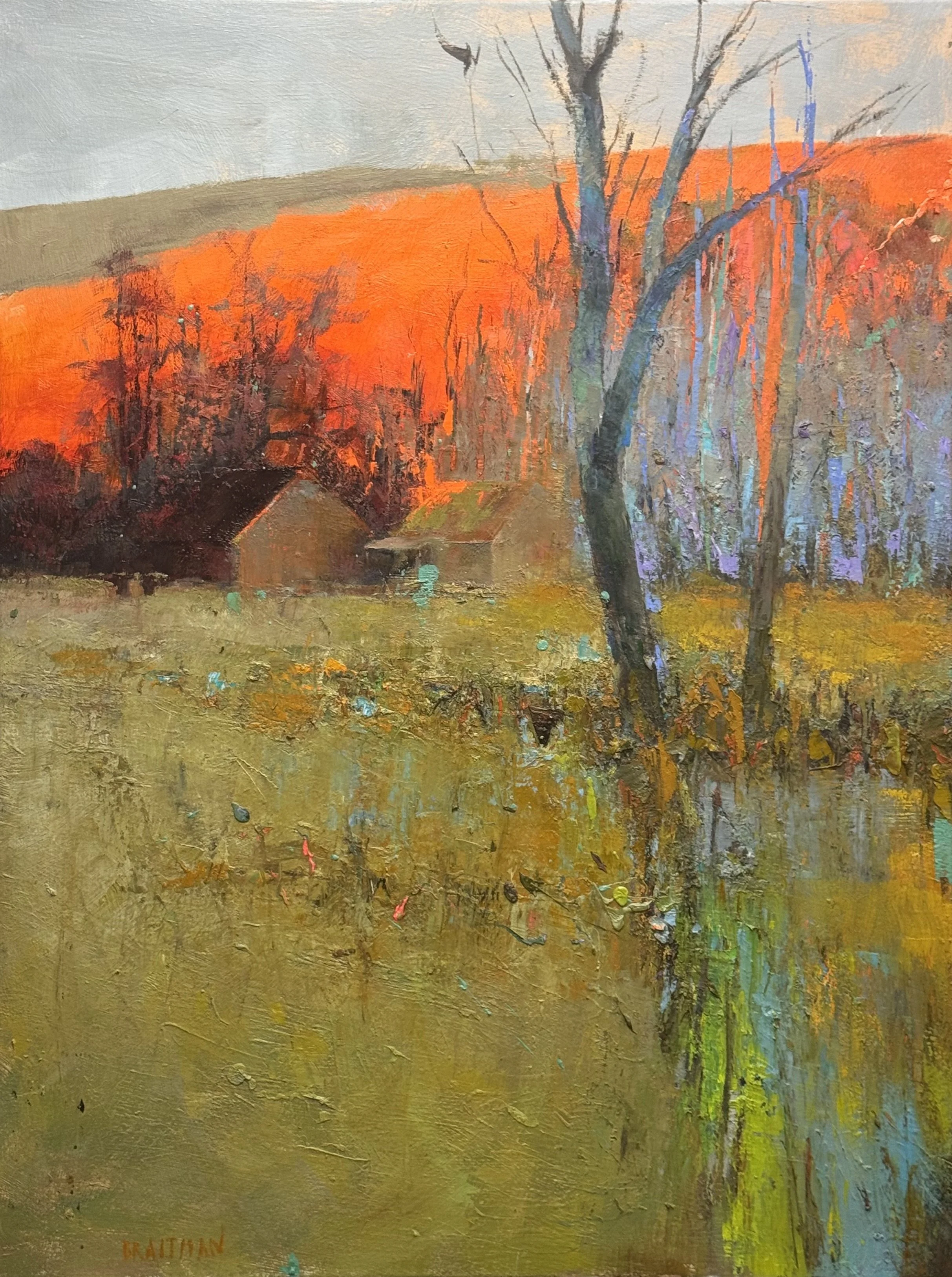
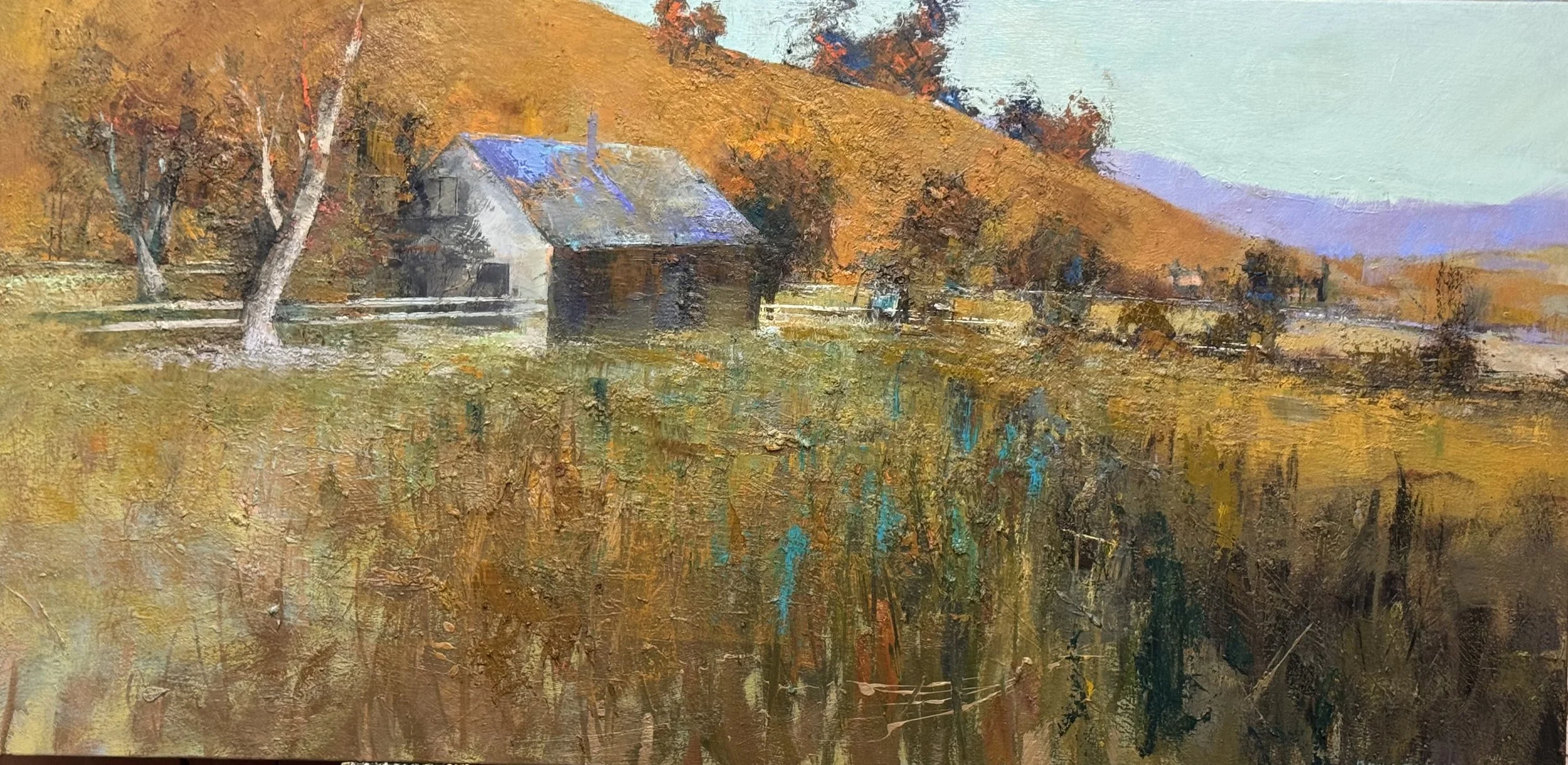
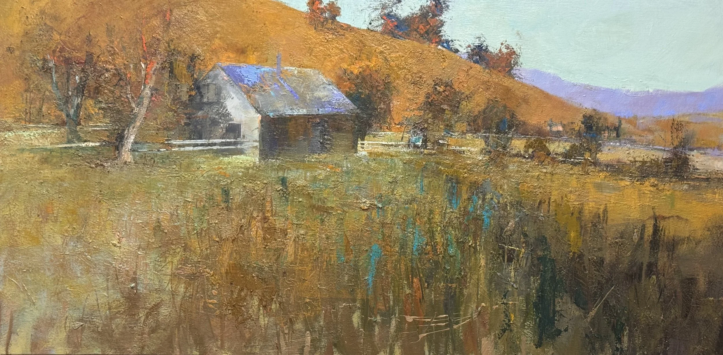
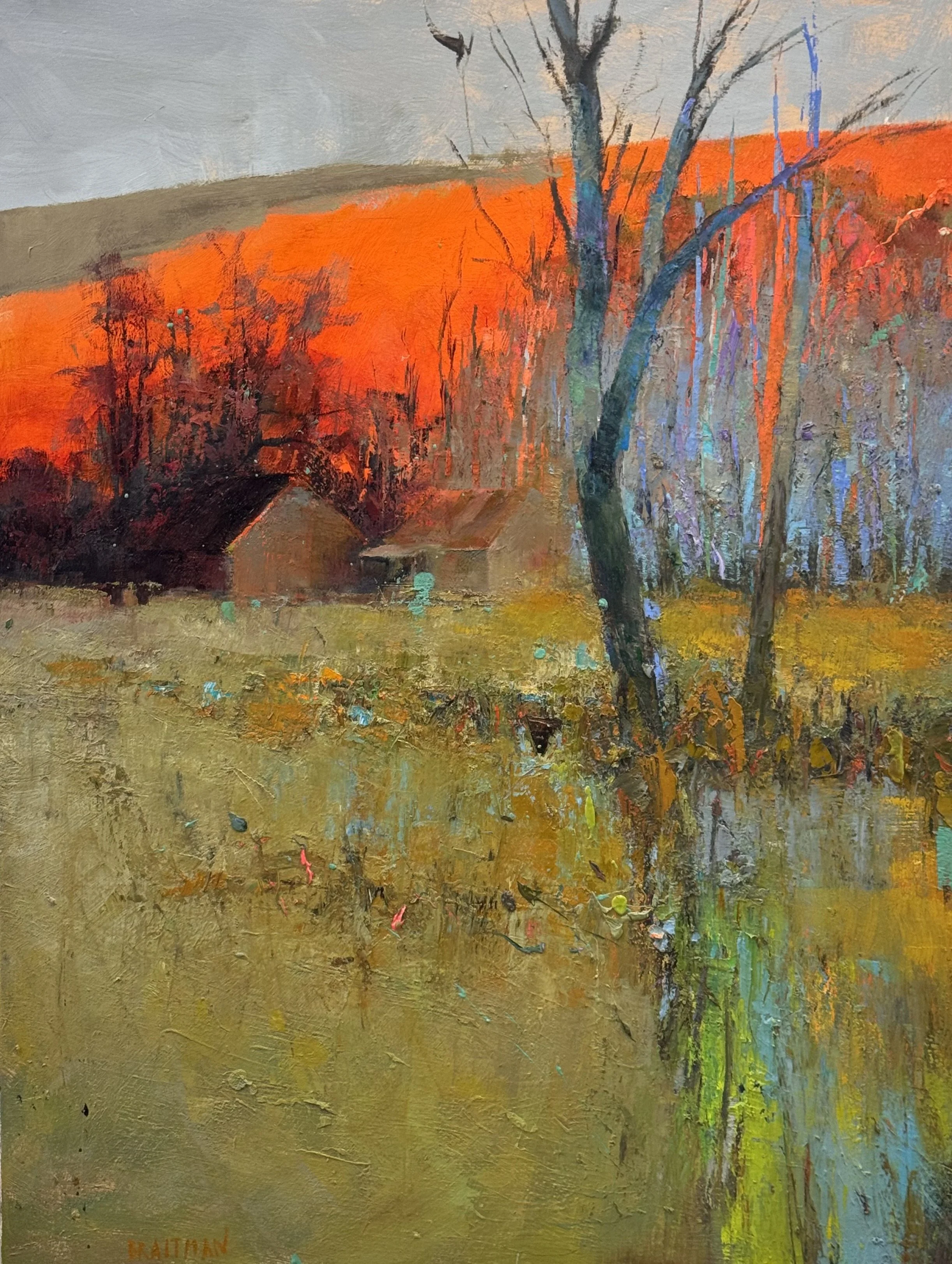
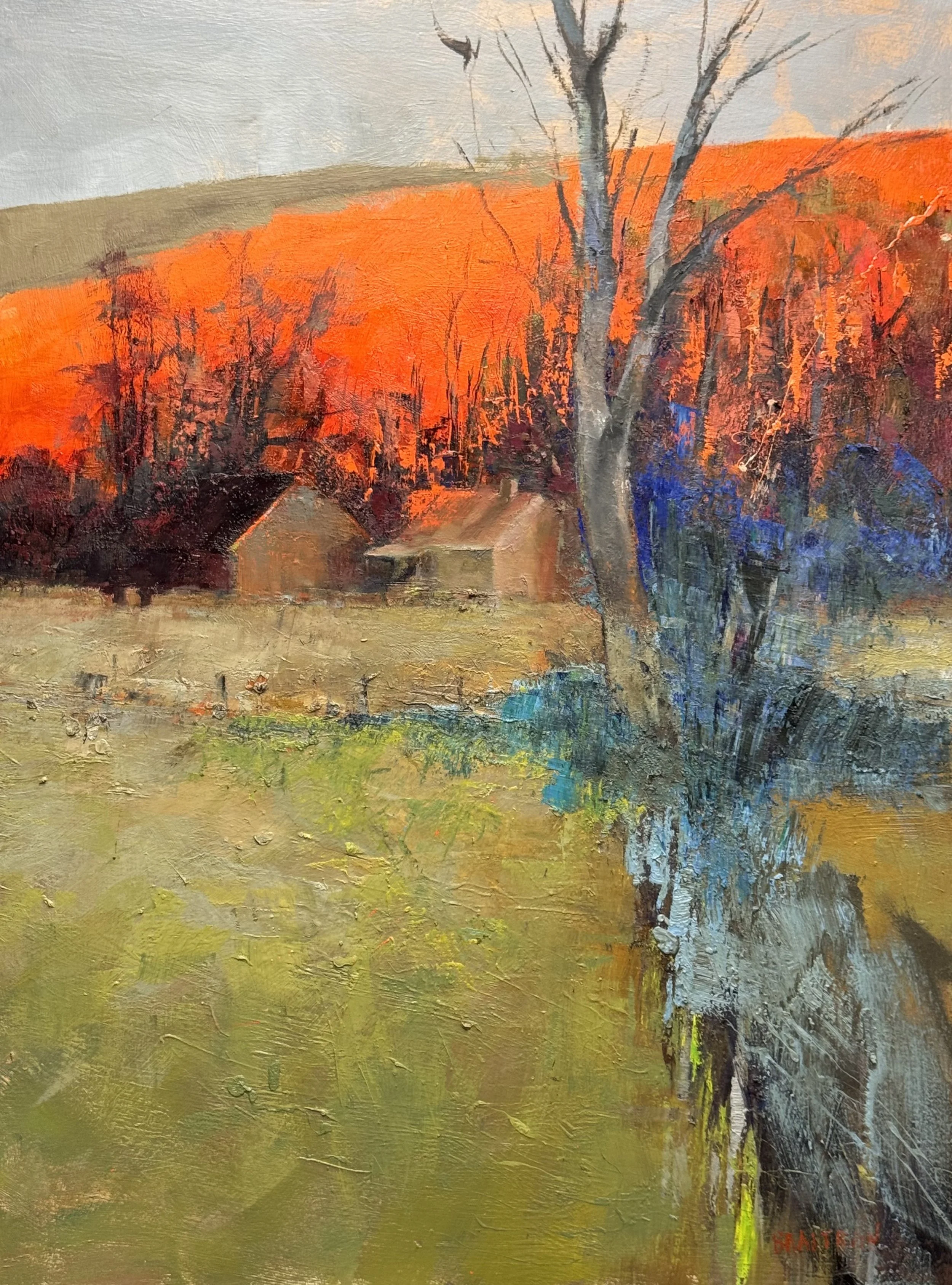
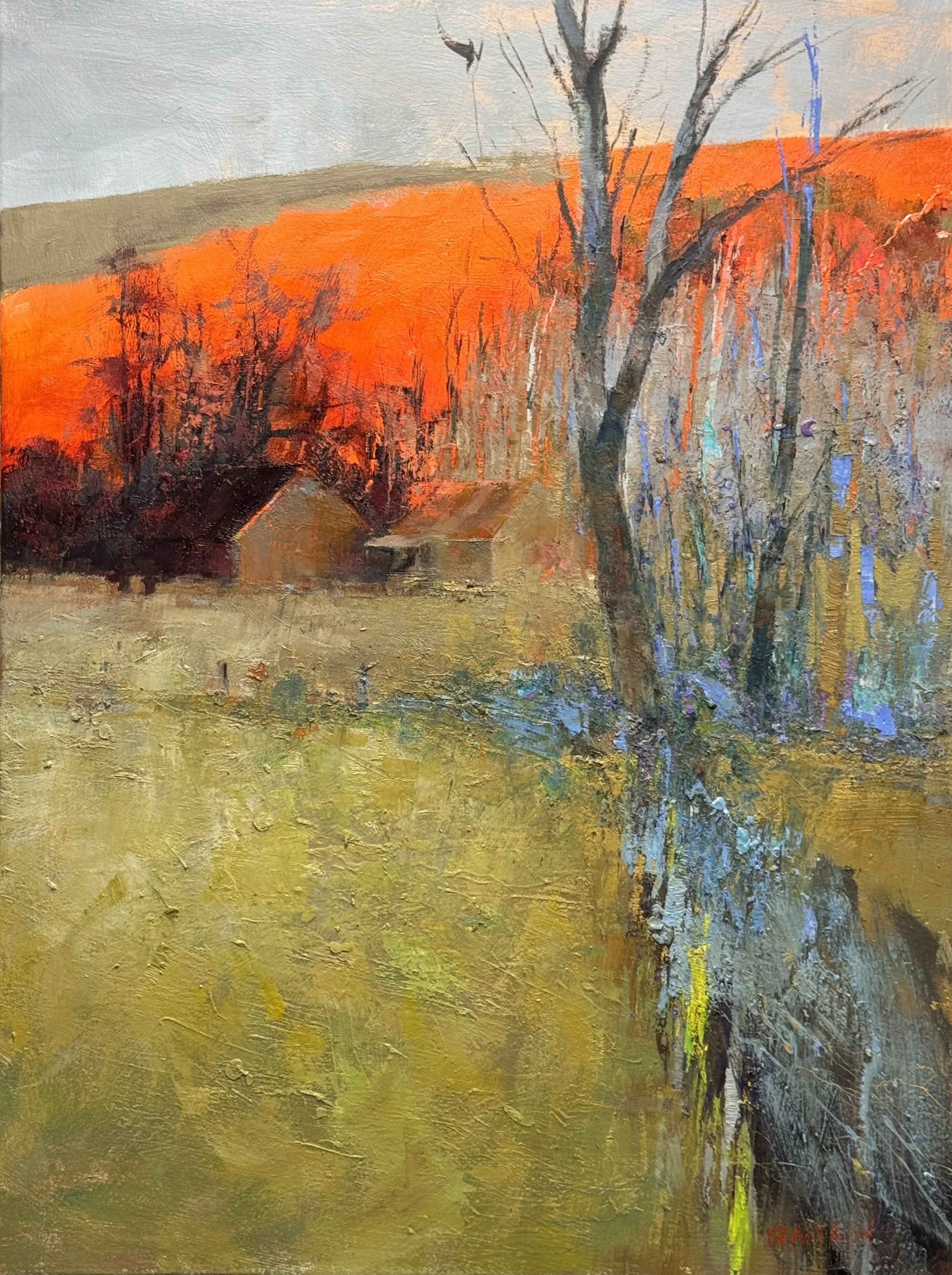
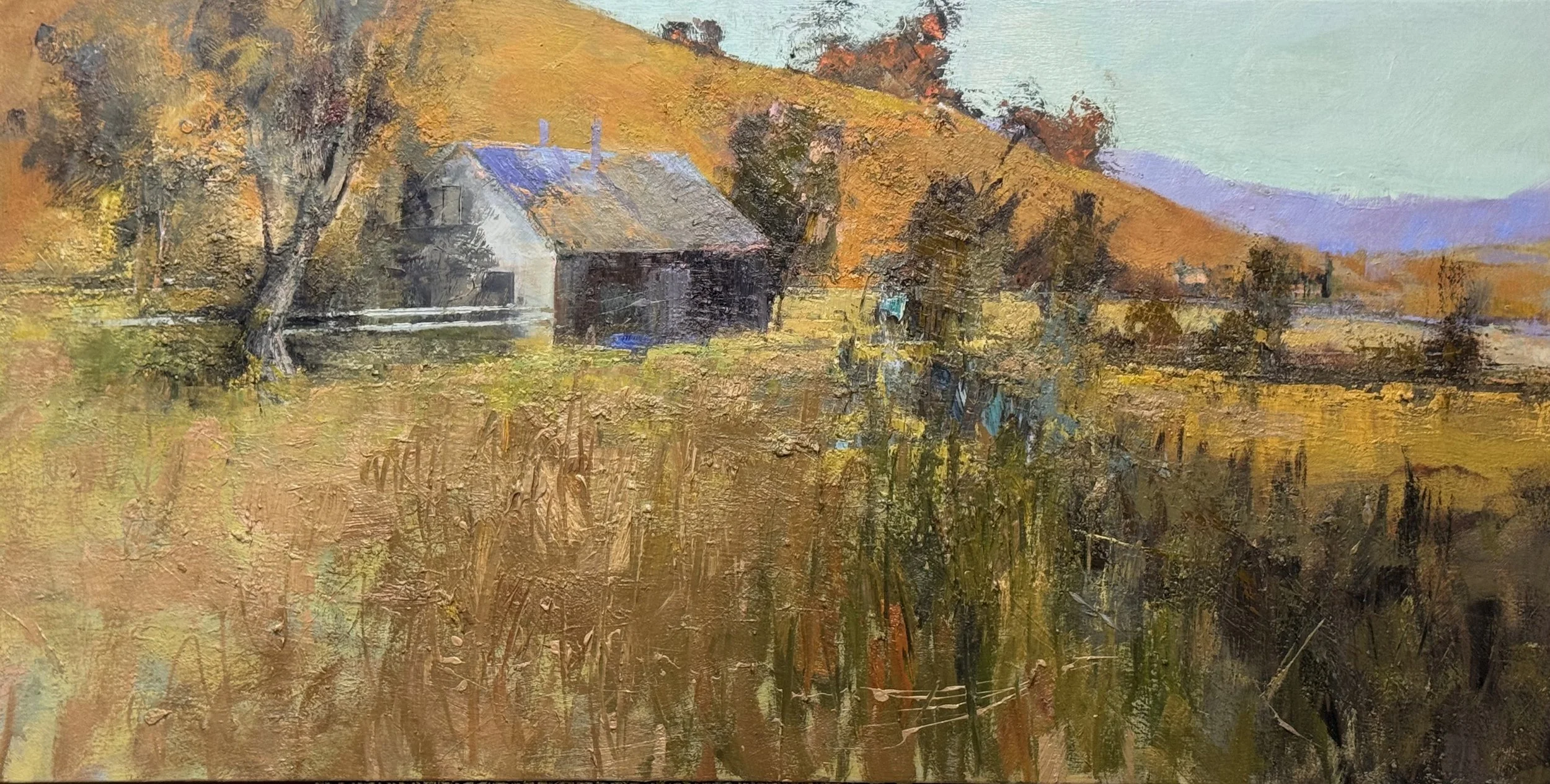
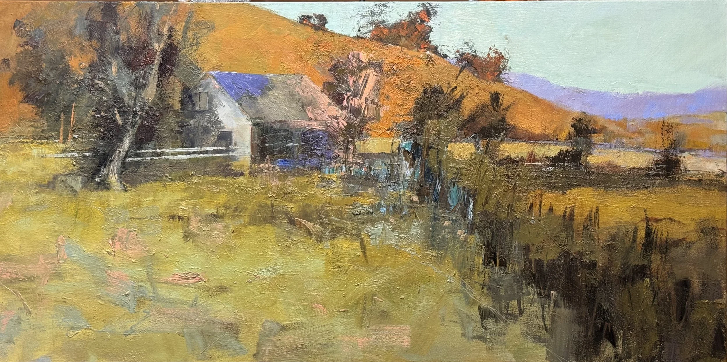
Every composition has a load-bearing element — the thing everything else leans on. Here it's the bare tree at right: a single dark vertical that anchors the foreground, splits the field from the tree line, and gives the eye somewhere to land before the orange hill takes over completely.

And that hill. Even before the final alizarin glaze, it's already close to combustion — a wall of heat pressing down on the muted field below. The contrast between that intensity and the cool grays above it is what keeps the painting from tipping into pure sensation. The sky earns its quiet.

The foreground is deliberately unresolved — flecks of teal, raw marks, paint thinking out loud. It's not description. It's rhythm. The barn sits back in the middle distance almost apologetically, which is exactly right. This painting isn't about the barn.

One more glaze to go. The orange will glow. Then we'll see if it's done.

SunDown Farm II

48 x 36 Inches

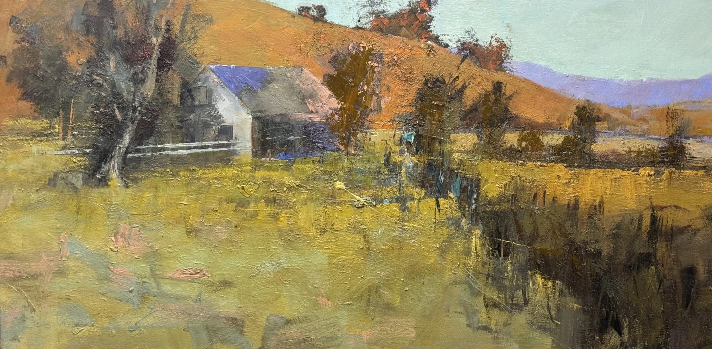
One True Corner

33 x 66 Inches

Feeling vs. Explanation: A Hard-Won Balance

Some paintings give themselves to you. This one didn't.

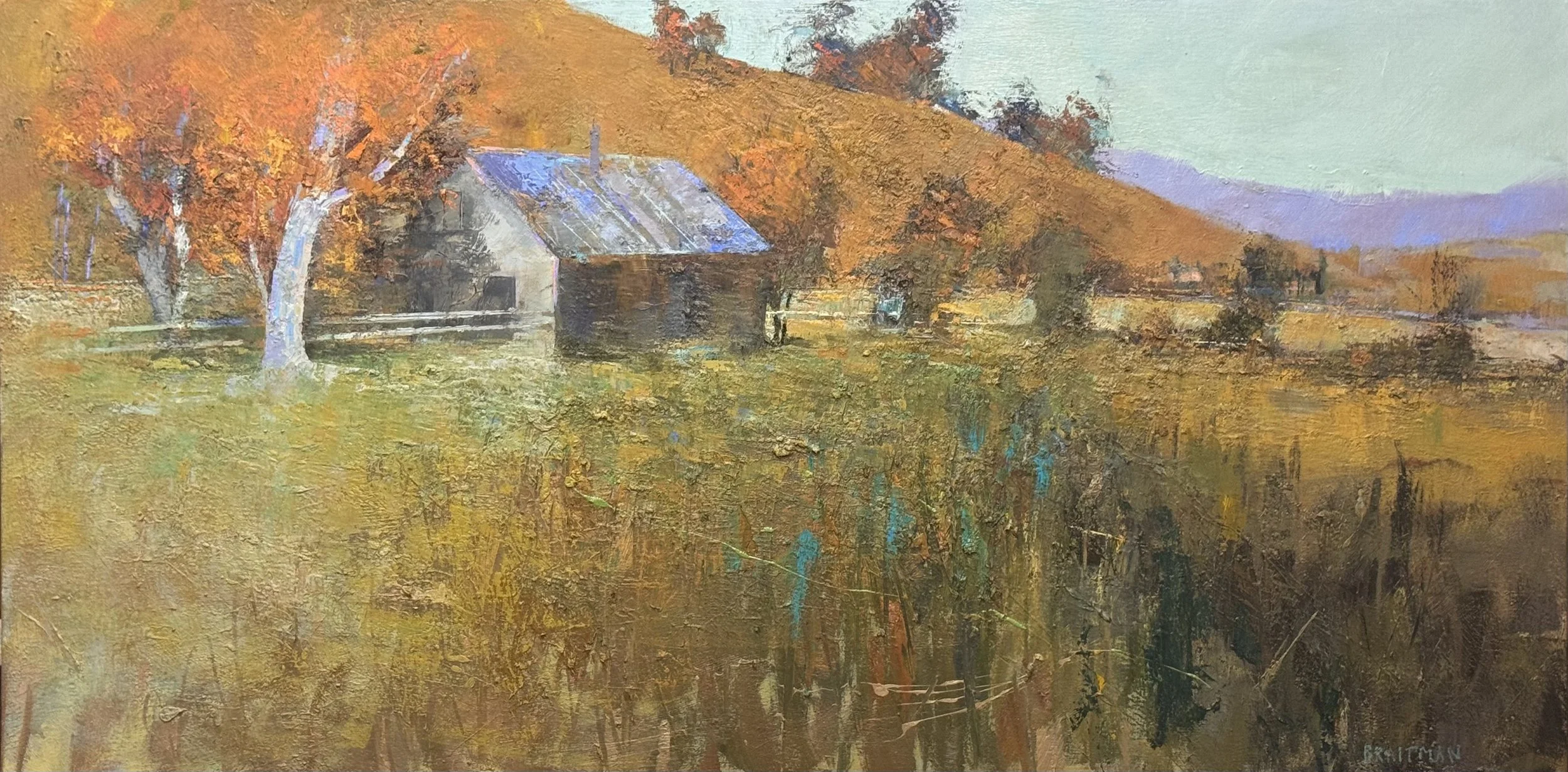
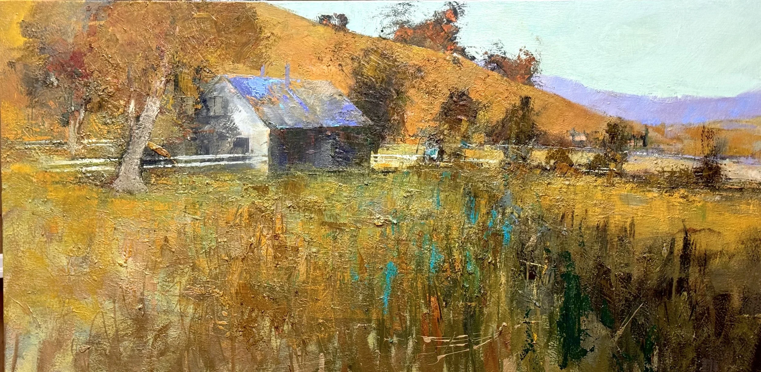
The struggle was always the same: how much do I explain, and how much do I trust the feeling? Hard edges at the barn pull the eye into clarity. The foreground — grasses, shrubs, fence lines, field passages — pushes back with abstraction and aggression. Getting those two registers to coexist without one apologizing for the other took more sessions than I care to count.

The extreme width of the canvas was the central challenge. The large tree at left acts as the bow of the boat, splitting the eye right or left before the barn corner pulls it into a counter-clockwise rotation — hill, distant mountain, warm field, layered foreground, back to the tree. Around and around, but never stuck.

The blue-violet roof against the burnt orange hill is where the palette declares itself. Two quiet notes that keep this from being a picture of a farm — and make it a place instead.

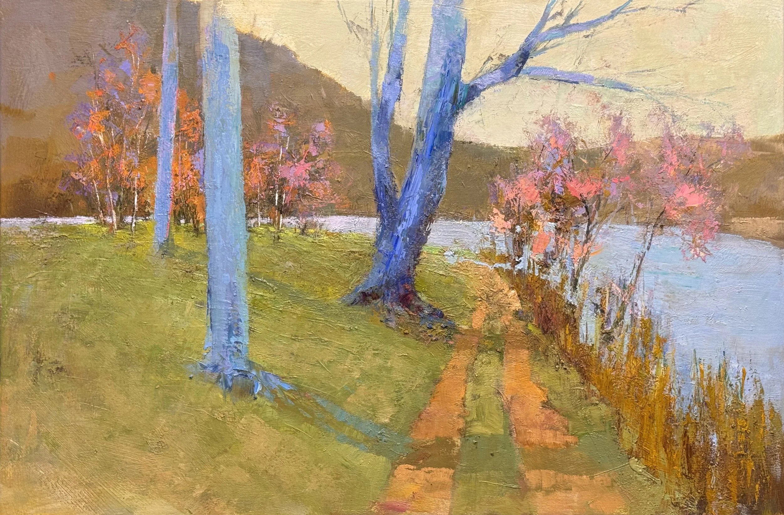
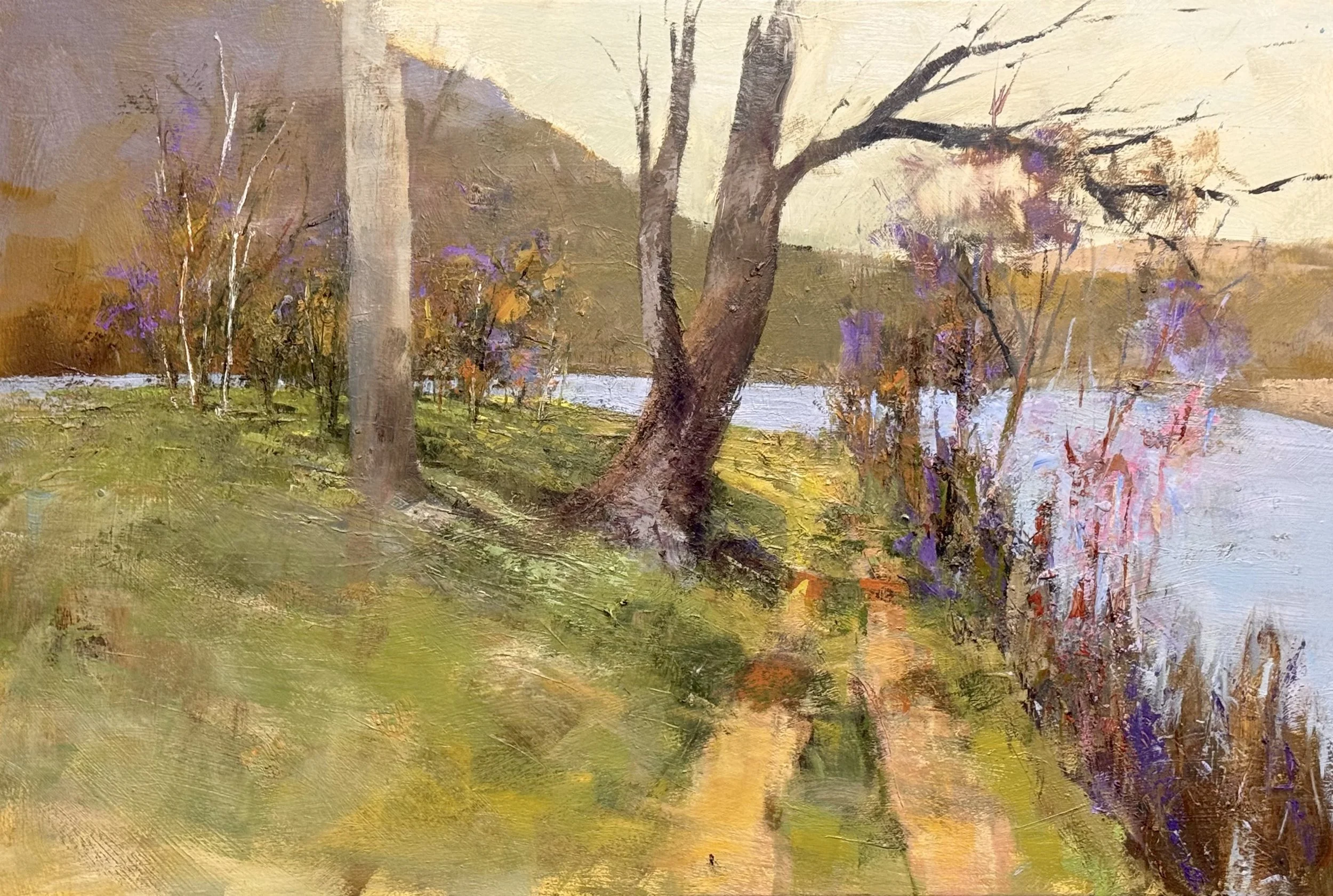
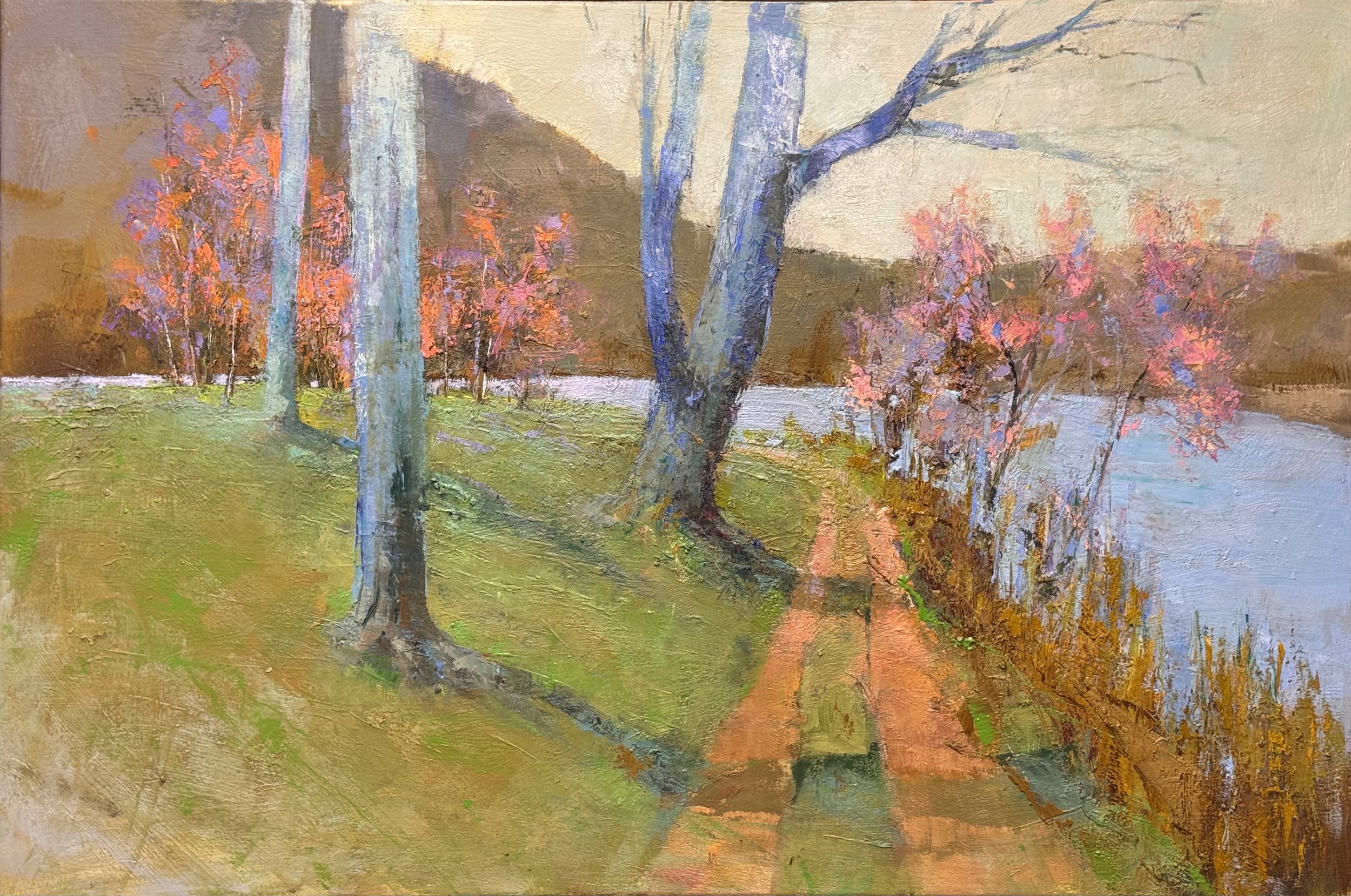
This one is about depth that keeps changing its mind. NEAR AND FAR, 36 X 54 iNCHES

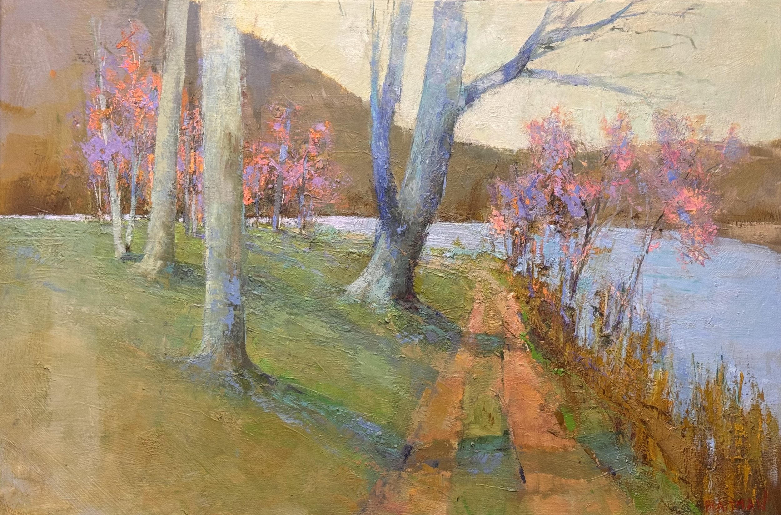
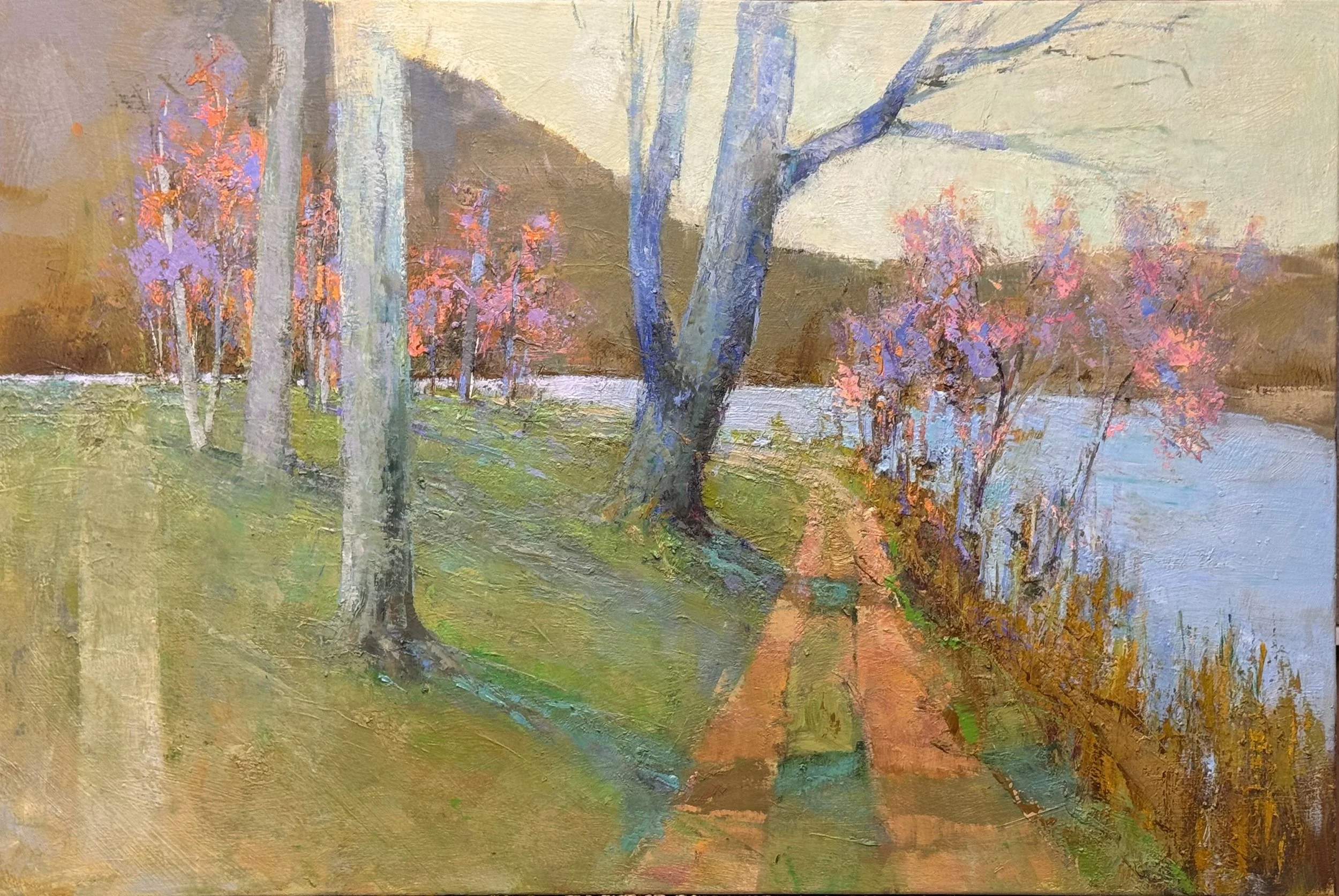
The eye moves in, then pulls back. The foreground trees push toward you — those blue-violet trunks are practically in your lap — while the pink-lit trees behind them step back, then back again toward the hill. The dirt road curves right and slides toward the river, which opens the whole right side into light and distance. Then the near bank pulls you back to earth.

In and out. Near and far. The painting earns its width by never letting you settle.

The tree placement is doing all the structural work — each trunk a different distance, a different color temperature, a different weight. The river isn't the subject so much as the release valve: every inward push eventually exhales into that cool horizontal band of water.

What held this together in the end was resisting the urge to resolve it. The push and pull is the painting.

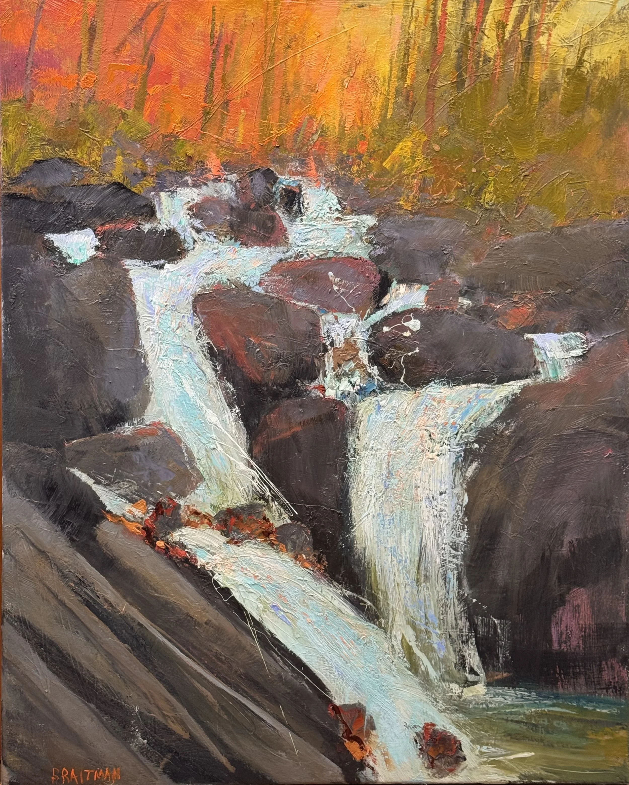
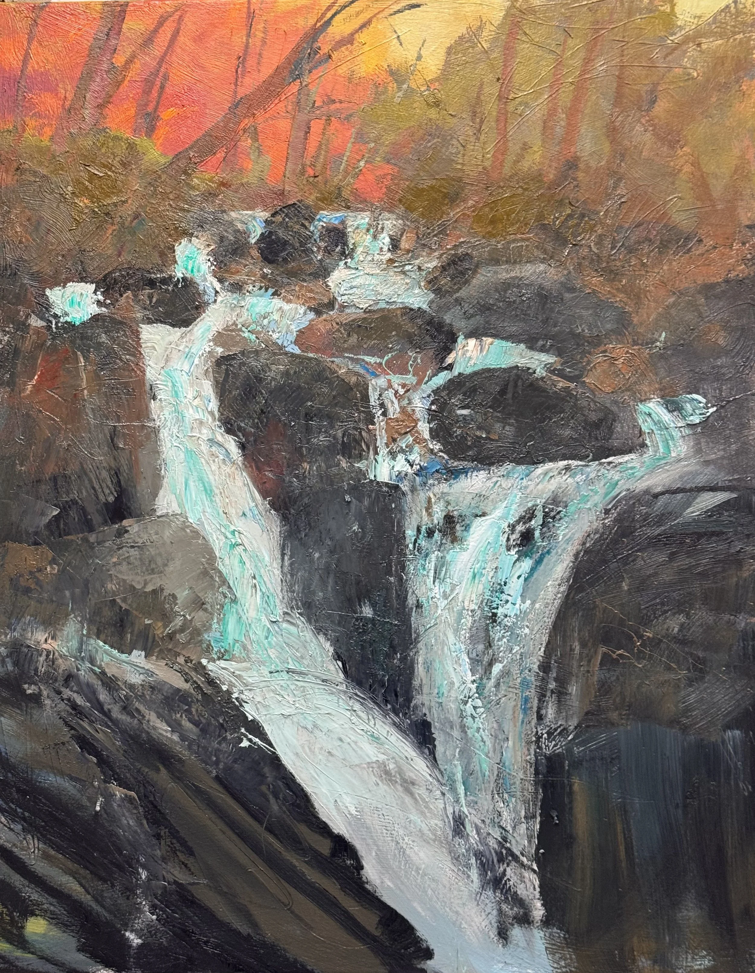
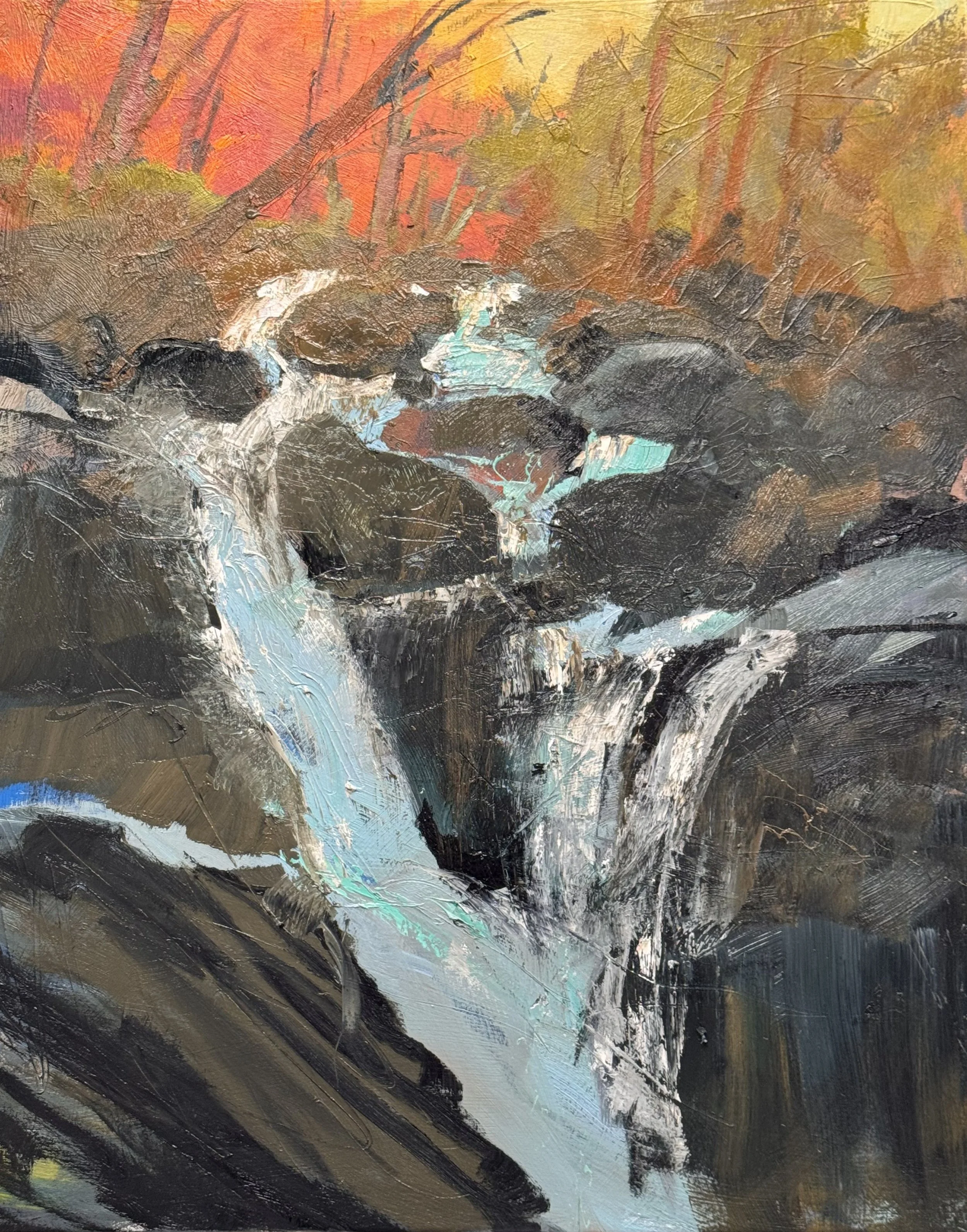
Water doesn't hold still, and neither does this painting.

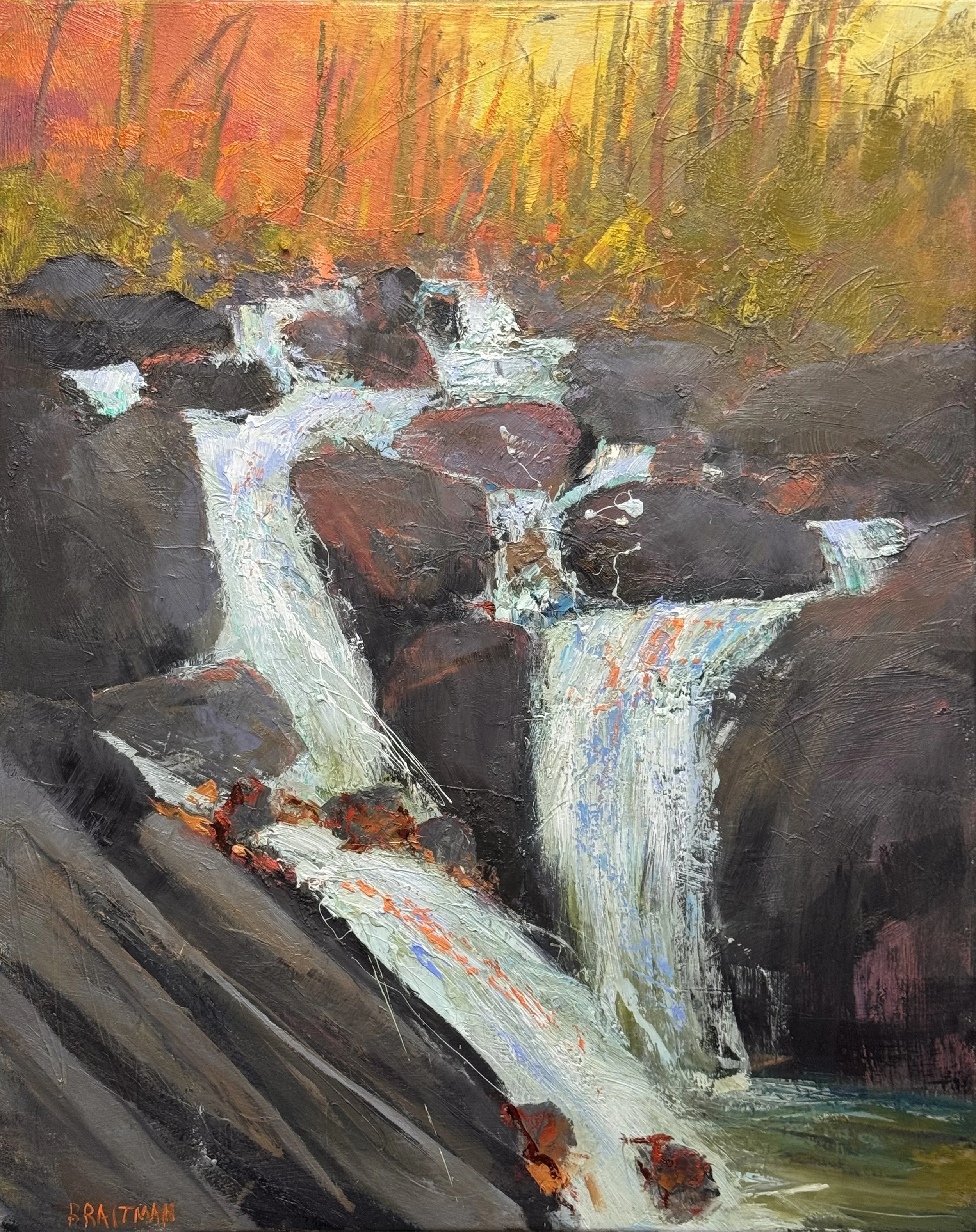
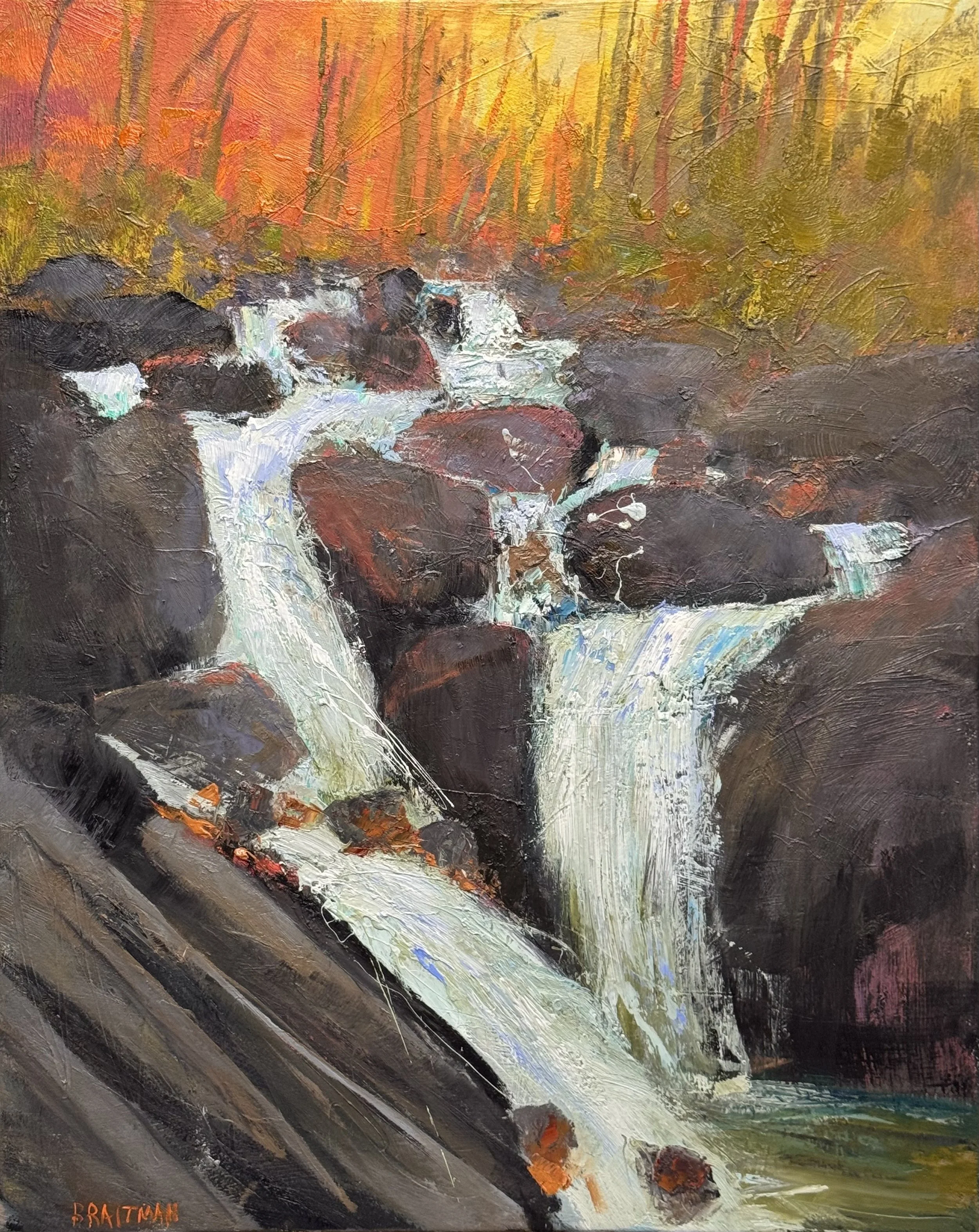
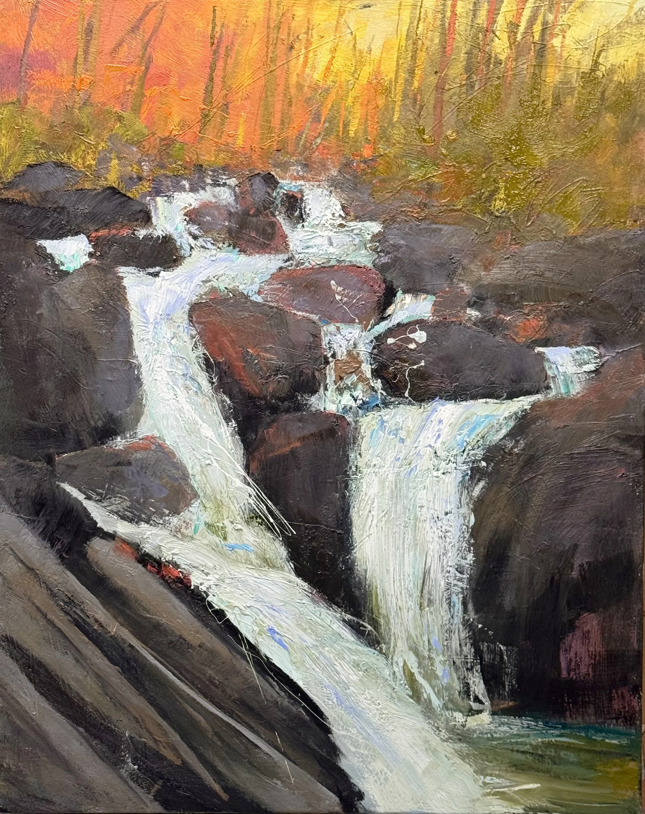
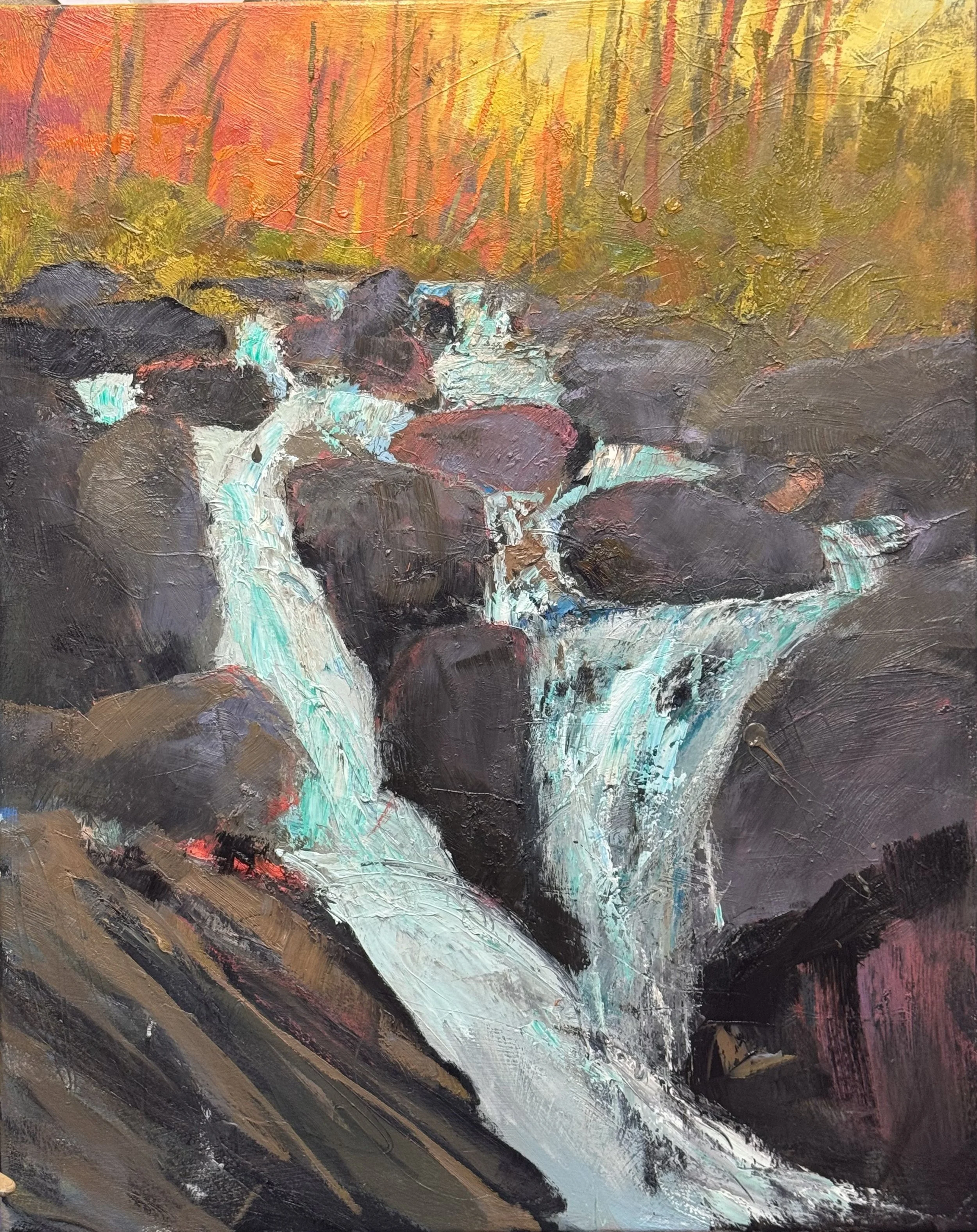
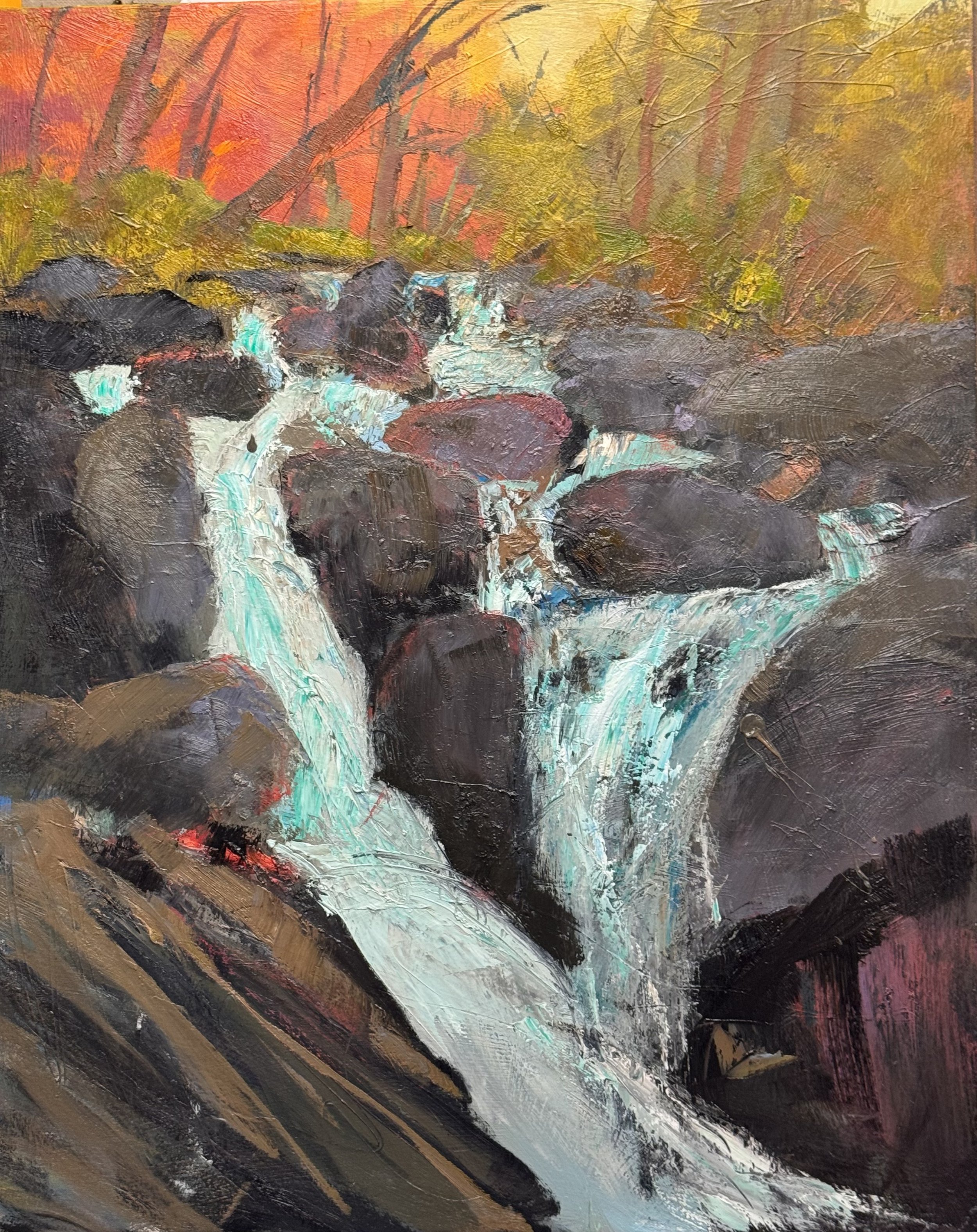
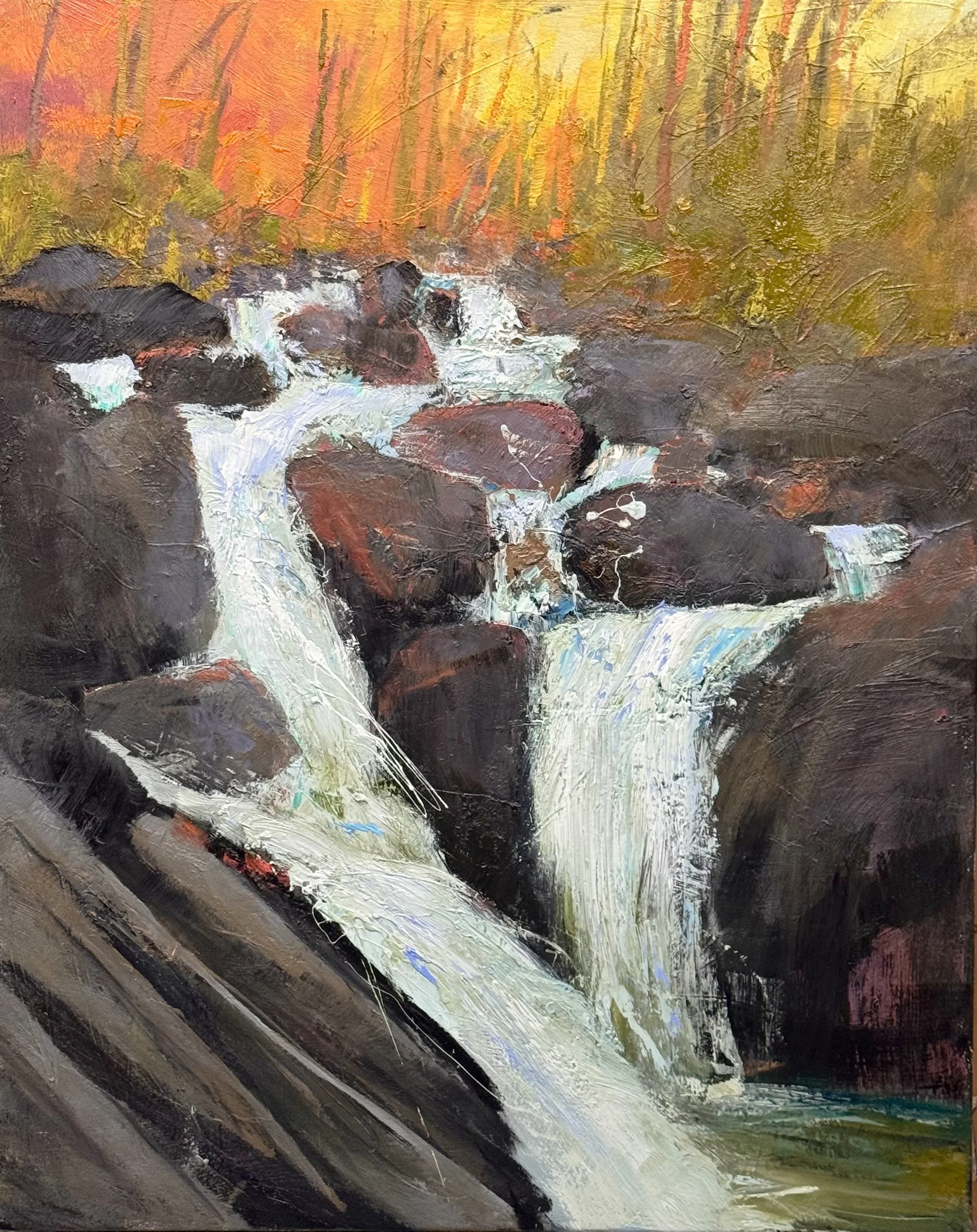
The cascade moves on a hard diagonal — upper left to lower right — and the dark rock masses on either side are what give it velocity. Without that weight, the white water would just be white paint. With it, it falls.

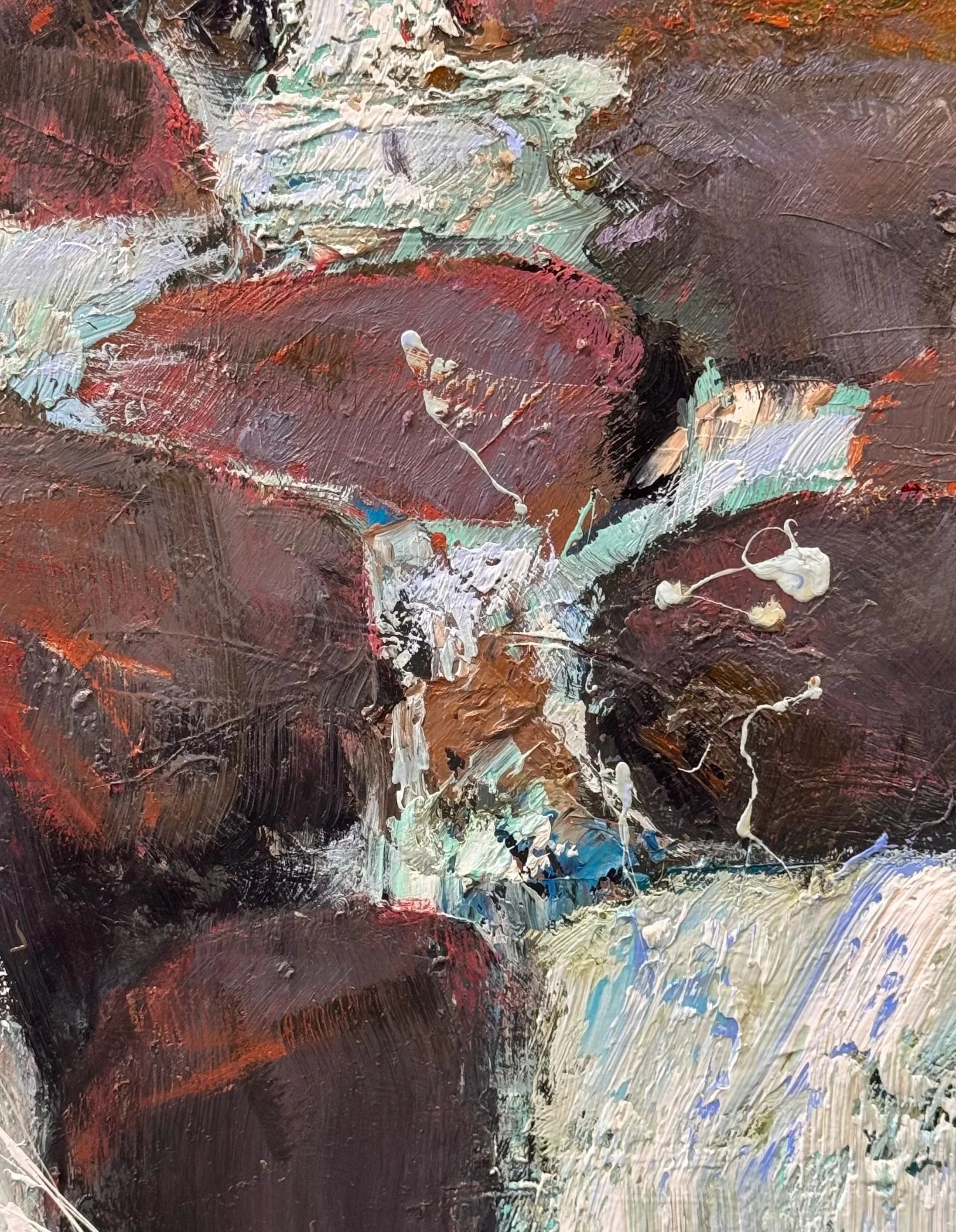
The final session added two things: a bit more chaos along the cascade edge — dark drawing marks and bronzy red-orange worked into the small stones — and reflected orange and red pulled onto the water's surface. That second decision is the one that matters most. It connects the fall to the burning forest above it, making the whole painting one thermal event rather than a landscape with a waterfall in it.

The palette throughout is fire and shadow. The water is the only thing moving through both.

BURNT CREEK, 48 x 36 inches

Monday 4/27

The white tree and its cast shadow are the subject. Everything else exists to support that read. The trunk needs more luminosity, cooler lights playing against warmer darks, and the shadow needs to become a full compositional event rather than just a mark on the ground. That shadow travels across the foreground and I want it to do real work.

The pair of trees on the left is meant to function as a pivot point — a place where the eye arrives and then has a choice: break left and move deep, or swing right along the shadow toward the barn and beyond. For that to work, the two trees need to read both as individuals and as a group. Right now they're a cluster. The goal is a hinge.

The barn roof gets a few strokes of sky-reflected cool light. Nothing dramatic — just enough to pull the eye all the way back into the depth of field, which is considerable in this scene.

The fence line needs to earn its place by moving the eye laterally and then deep. Once it's doing that job, I can quiet it down so it reads as rhythm rather than inventory.

And the whole painting needs to come up in key. The foreground field is absorbing too much light. As the other elements brighten, that should begin to resolve — but some warmer, higher-key strokes through the middle-distance grass will help lift the painting and give the white tree's shadow the contrast it needs to matter. The middle field behind the barn need to brighten as it spills over onto the foreground on the left side

I had an appointment in the morning so I only got to work on two pieces. I wanted to finish both but that will have to wait until Wednesday.

The Ghost Tree

The painting is nearly finished. One thing left to resolve — a ghost tree on the far left, a remnant of the original drawing that I want to keep but quiet down. Not remove. Just let it breathe as part of the rhythm rather than announce itself as a shape.

The fix isn't to erase it uniformly — that just looks like a mistake. Instead: break the silhouette in a few places by dragging surrounding color across it, let the upper branches dissolve into the sky while the lower trunk keeps the faintest presence, and shift the temperature slightly so it stops reading as an object and starts reading as a vertical pulse.

When it's right, no one will stop to name it. They'll just feel it. If I can’t establish this feeling I will erase it all together

Today in the studio: I worked on 3 canvases and with Meredith’s assistance we prepared 3 more canvases for the upcoming abstract floral workshop. May 5 -7.

River's Turn is genuinely beautiful — and I've named the problem exactly right. Pretty has a gravity all its own. When the color relationships are this harmonious — warm salmon ground, cool blue water echoing the trunks, pink trees distributed like punctuation across the middle distance — the painting becomes self-protective. It won't let you break it. Every mark that might introduce tension feels like vandalism against something already working aesthetically.

The result is a painting that explains its season, its light, its mood — completely and pleasantly. The viewer receives it rather than experiences it. The pendulum landed hard on explanation.

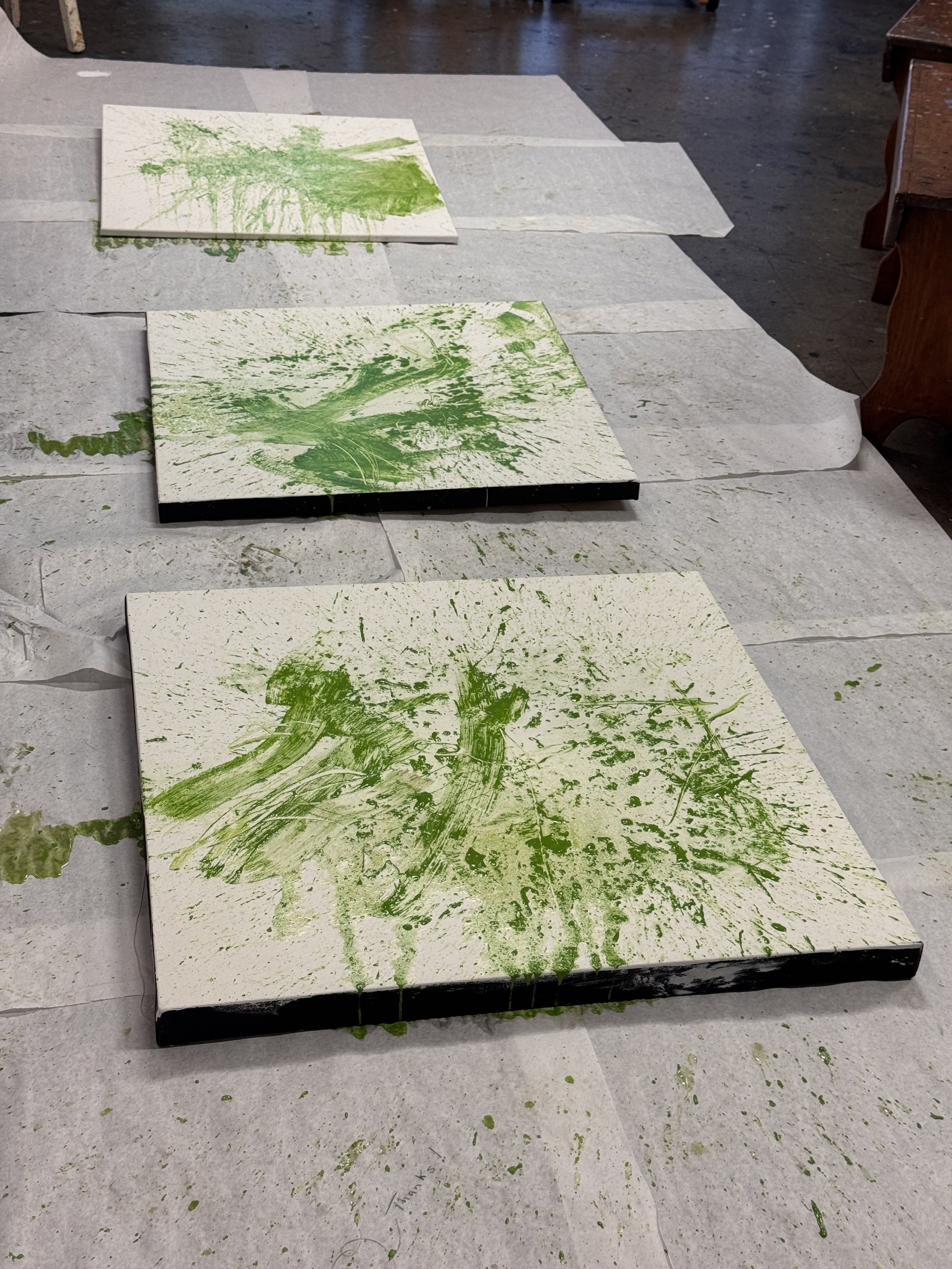
These 30 x 30 canvases are examples of what we will do on the first day of the workshop. We will throw an emulsion and rubber tipped tool into a nice sub-text for our pieces.

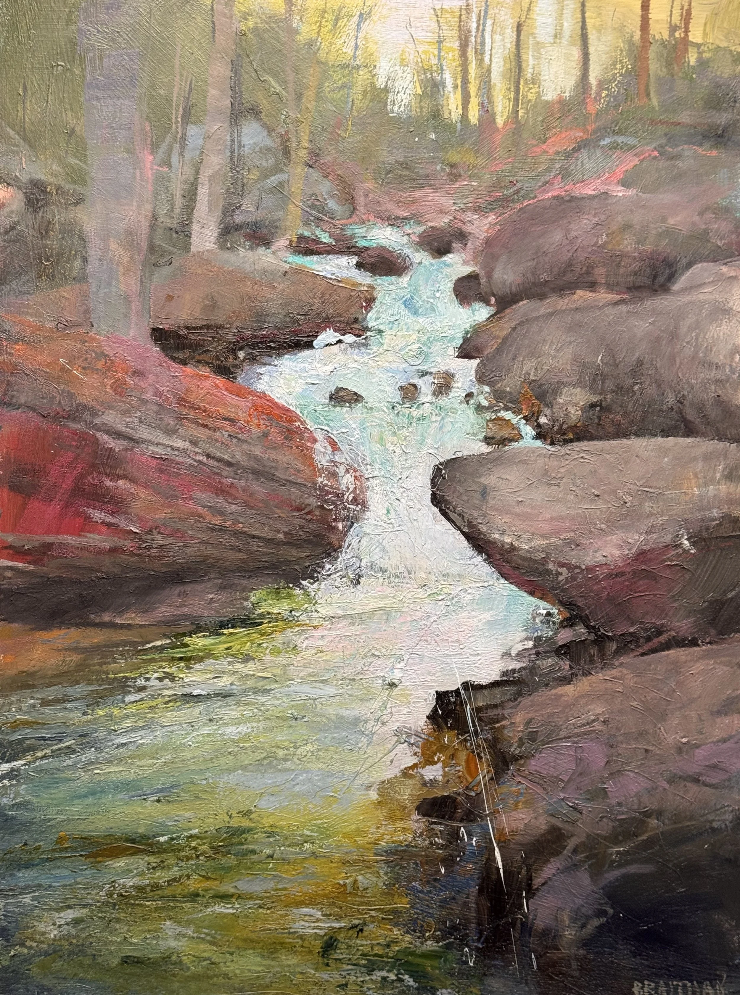
This is where I started today. My eye goes directly to the center of the cascade and completley bipasses the foreground. With the addition of the smaller stones, see how we work our way to the middle of the cascade instead.

In the first image the water is a highway — the eye gets on and drives straight to the middle, no stops. The foreground ledge plane is just a ramp delivering you there.

In the second, the added stone shapes break the flow into intervals. The cascade now has rhythm rather than speed — pauses, redirections, a sense that the water is negotiating its way down rather than simply falling. The eye has reasons to linger.

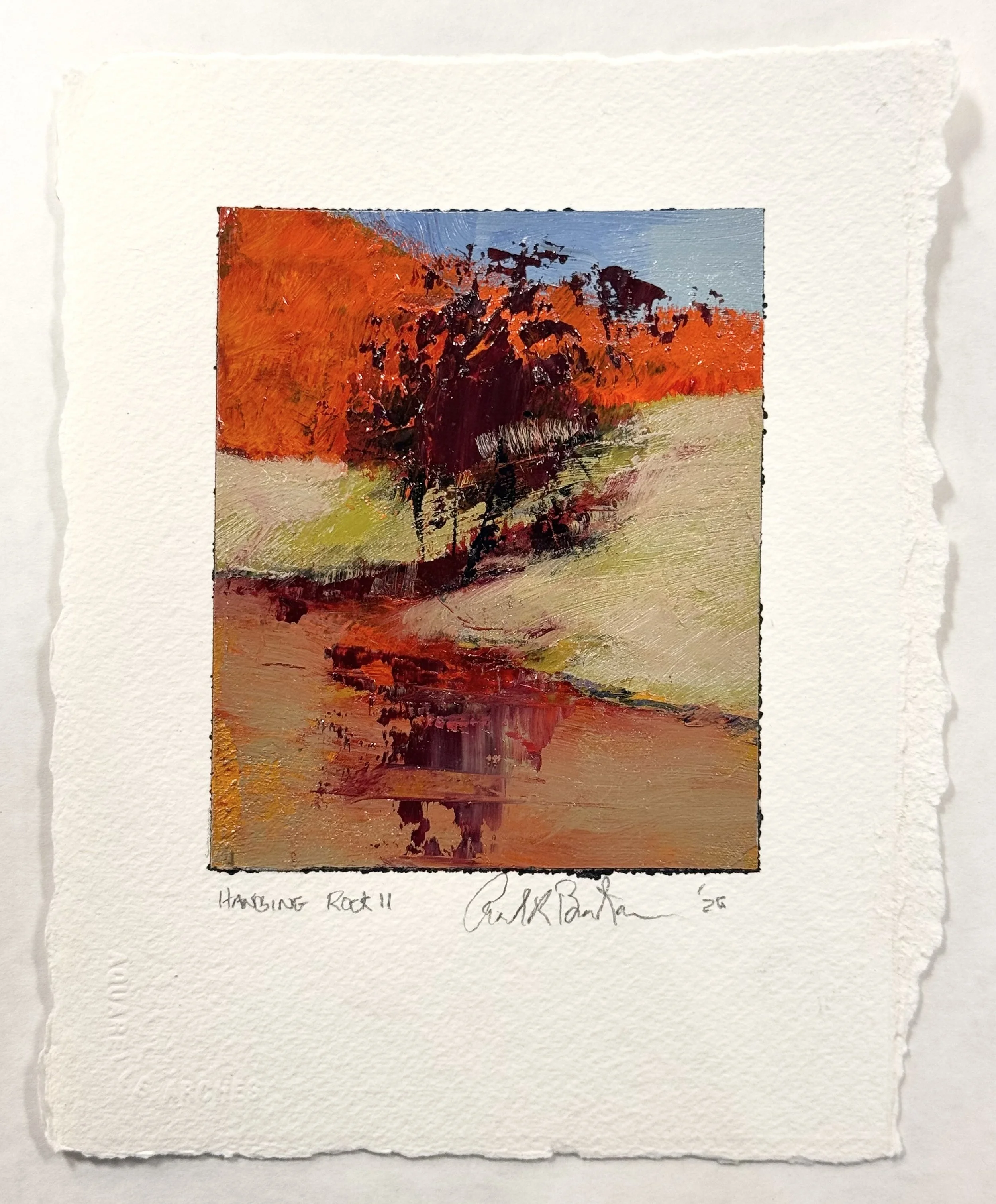
This is the end of the first coat of the future planned Hanging Rock painting. Three big shapes dividing the canvas into exciting top heavy structure. This will allow me to add huge amounts of chaos into the foreground.

I have to make a second layer of color closer to this study. The shore line bulges out a bit too and in my fist pass in recedes.

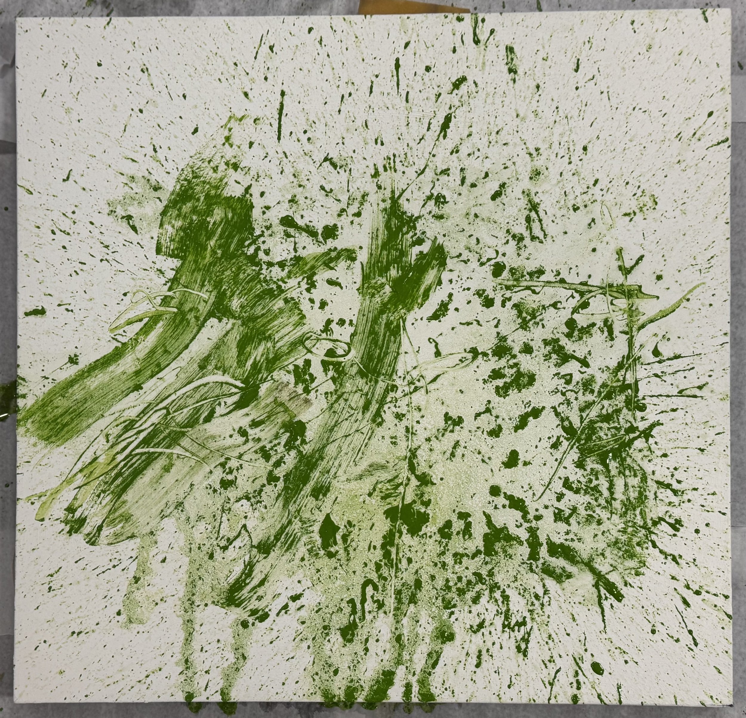
Below is reflects the first day of the abstract floral workshop. It is always nice to start on a messed-up surface. A pristine page stifles the creativity of feeling

This green is a mixture of sap green, cad yellow med, and ultramarine blue, along with a pinch of cad lemon, No white.

This is only one of the two canvases we will work on in this workshop. The other will start more traditionally with structure and drawing. But to quote Michael Tyson “everyone has a plan until they get hit in the face”

This is one of the pieces as an example. It serves many purposes for us:

1—subtext or underwear

2—plant leaf color

3—just enought mark making with R-T Tool to start to establish a rhythm of stems, leaves, pods, and blossoms, sort of a floral chaos

Thursday 4/23/2026

Finishing Day Whoo Hoo, I signed two pieces today.

In terms of the Explanation vs. Emotion debate. The unfinished left side was difficult for me to leave and let the corner do its job.. But it is done so I did. The cast shadow from the implied canopy on the barn is the bomb for me. That is why I titled the piece Cast Leaves to call attention to my intention.

One Corner, 33 x 66 inches

I am going to use this study for the 54 x 45 piece I just started on the right. I really like the balance of Explanation and Emotion and want to see what happens on a bigger surface

I am so delighted to have captured the chaos and noise of this cascade as opposed to the next most recent “Head of the Pool” I think I will try this again and this next time throw a bit of the orange/red into the cascading water.

Detail of Burnt Creek


Wednesday 4/22/2026

33 x 66 One True Corner

I am very happy finally with this image, if you go to me current work section and click on this, you can see what a fight it has been for me to balance expanation and feeling. I am just going to “explain” the main big tree on the left and call it done.

The same with this. It took all of the front right chaos to balance the explanation of the structures on the left. I want the real theme of this to be the red hill. It is a pure cad orange with a glaze of alizarin crimson ovet the dry orange. I have one more glaze on the left side of the hill to sign this one too.

I felt the sky needed to be a greater influence to provide a distance to the piece. I added another layer there and plan to add to the feel of the water tomorrow

This is a new start. 45 x 36. My plan was to try to get away with even less explanation on this one. I entend to start with a version of this study (below)

Tuesday 4/21/2026

I am 30 minutes away from finishing Burnt Creek

1) new alizarin crimson glaze over cad orange on the left side top

2) darkening the forward leaning wishbone branch

3) I am trying to reclaim some of the visual harmonics from earlier versions

Burnt Creek, 48 x 36 inches

detail of one corner

A bit farther away for where the harmonics could be shown

The entirety of One True Corner, 33 x 66 inches

I still have another day of explaining and some added feeling. I think first I must explode onto the bottom 1/3 of the piece to soften the left side and build the right side up with large strokes and richer value. Also, the school bus yellow field on the right and a few other places need the continued suggestion of a horse fience.

Monday 4/20/2026 Burnt Creek and Blue Trees were today's efforts and ideas about the next session. Tuesday I will be working on One Corner and the larger Sun Down Farm.

Cool the lower left slab into gray-violet and reinforce the sedimentary striations

Add some air to the upper right (let it participate in the discussion more)

Work the chaos and energy of the lower cascade more and perhaps let the water rest a bit at the bottom

48 x 36 inches —Burnt Creek is getting close

anchor the trees with both value and color at the base of each

let the road and water recede optically but lightening the road in value and cooing it off

still uncertain about the flowering shrubs on the right side

And finally, I want to had a prismatic progression to the sky Limeade to Lemonade then address flowering shrubs

Blue Trees, 36 x 54 inches One more day (I think)

Week's End: my workshop completed and clean up and painting dayI

48 x 36 Head of the Hole

I finally finished “The Top of the Hole” I wanted to add some depth to the water at the top of the hole.

48 x 36 The Gloaming

I want to still add some yellower orange to the foreground and think about adding a reference to fence post tops on the right side of the blue fence line

One True Corner, 36 x 54 I feel the foreground entrance to the painting is working a just needs the structure of fence post tops poking up on the right side of the entrance grasses. The subject tree on the left of the barn is very close, finishing touches at I am done with this. I feel the white fence should be continued on the right of the barn and a bit more suggestion in the back ground.

workshop Tuesday: Trees

The Structual support for many landscape paintings.

this was a warm up for todays workshop. A new layer clarifing rocks and cascade.

I wanted to reflect a bit of the sky red/orange into the rocks.

Also a new layer on the shrub line, the tree behind the barn, and I started to raise the field to the correct level

I also started to integrate the hedge line, raise the field to the correct height, and a new layer on the tree to the right of the barn.

Monday the 13th

Today I was oscillating between chaos and explanation. I laid the subtext for the tree and fence on the left side, started integrating the major shrub line with the foreground, and placed the tree and shadow shapes to the right of the barn. The dark verticals there create a bracket that keeps the eye from sliding out of the frame.

The blue roof creates just enough surprise against all that warm ochre, and the orange hillside has real weight and authority. The push-pull between the loose foreground and the more structured middle ground is alive — not a problem yet.

I still have to raise the right side mustard field to the base of the barn — it's floating slightly off its platform right now. Maybe Wednesday. The foreground marks will eventually need a unifying temperature decision, but that can wait. The painting has real atmosphere. That hillside is going to be something.

Today was complex with this piece.  I could only start this in the morning.  By lunch my thinking was already too anylitical to give myself a battle plan.  Some chaos  and some explanation or structure.  I still need some srtuctural organization

Today was structural. I wanted to give the stream a believable fall — a dominant flow with secondary sections branching off it — and add another layer of built color to the top of the waterfall.

The white water is finding its logic now, cascading in a convincing sequence from upper left down through the rocks. The dark masses are doing their job, giving the falls something to push against. Those flashes of teal tucked between the boulders are quiet but effective — they keep the water feeling transparent and alive rather than just painted white.

The fiery canopy above is already the emotional engine of the piece. As the water structure tightens below, that tension between the warm riot up top and the cool, deliberate fall of water is going to be what makes this painting sing.