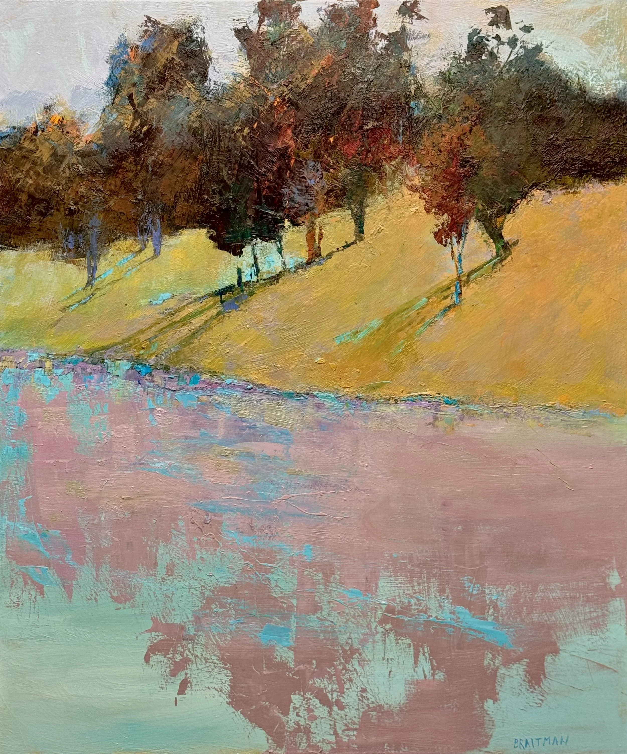
Floating II, 54 x 45
Floating earns its name.
The foreground water plane actually floats — dusty rose with teal interruptions, a surface that hovers rather than sits. Dead center in that field of rose, the blue simply appears — not as accent, not as edge work, but as its own presence, suspended. Visual harmonics. Color singing back to itself across the canvas.
That's beauty as I define it: different colors mixed to the same value. The eye reads harmony without knowing why.
The narrow purple-blue seam where hill meets water handles the transition between warm and cool. The hill glows. The trees hold mass without pulling the composition down. The seafoam in the lower corners keeps the whole thing airborne.
54 x 45. Oil on canvas.
Floating II holds two definitions of beauty in the same frame.
Above the shoreline — the same color mixed to different values. Orange hill, orange tree mass, dark to light. One family, one logic.
Below — different colors mixed to the same value. The reflection fractures into red, green, burnt sienna. Harmony through equivalence.
The shoreline is where the two definitions meet.
Oil on canvas.
Going forward, I will see which definition of beauty wins the painting, or whether they coexist in tension.
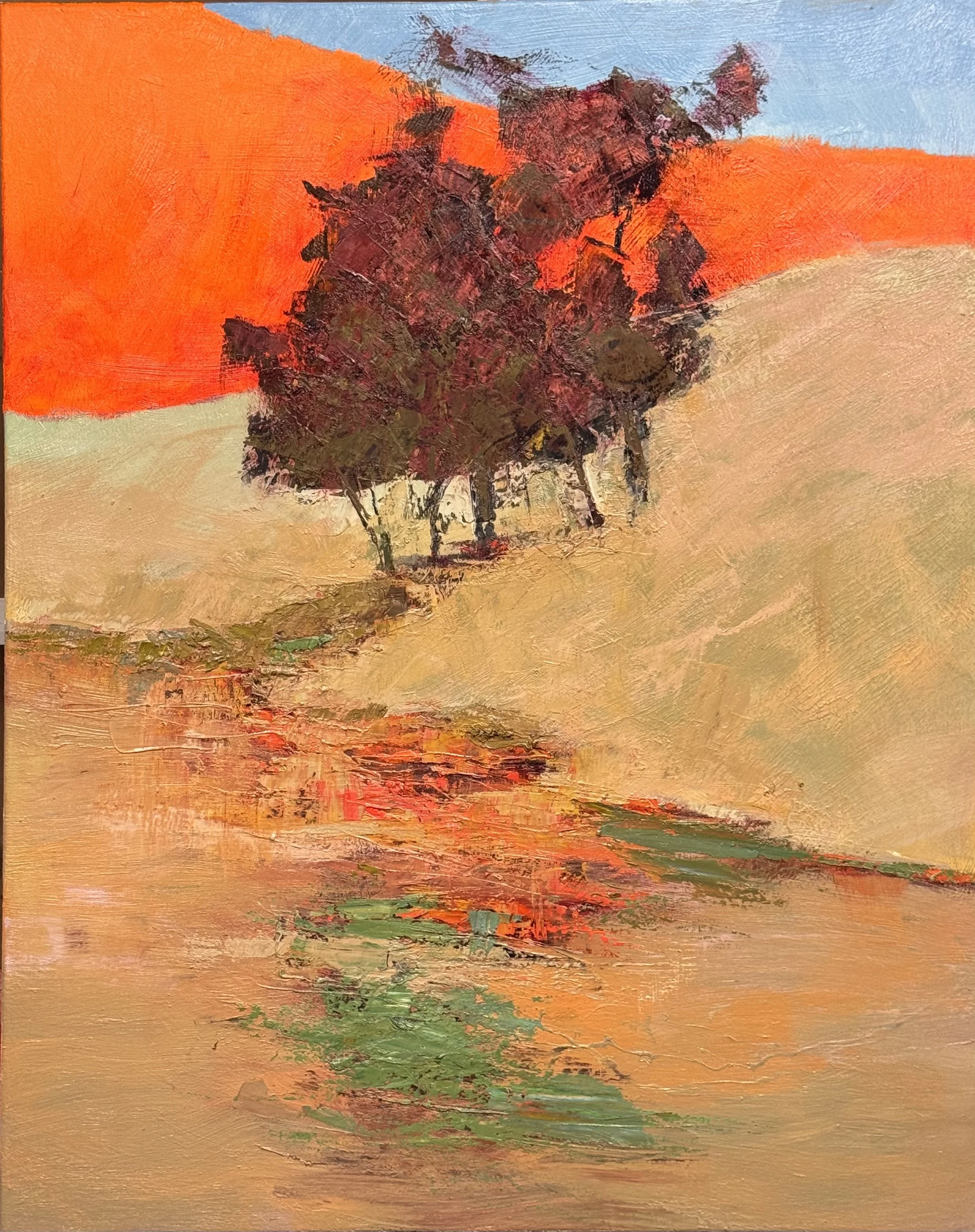
Option 1 — Tag the two hillsides together: Same value family, different colors. The orange and the tan become one read — harmony through equivalence. The tree mass then floats between two unified fields, above and below. Beauty as chord.
Option 2 — Make the tree mass an orange variation: Same color, different values. The tree and the hill become a family — dark orange mass against bright orange field. Now the juxtaposition is structural: the hillside unity versus the fracture and complexity of the shoreline/reflection. Beauty as contrast between the two definitions living in the same canvas.
Option 2 feels more conceptually loaded to me. The painting would literally demonstrate both definitions simultaneously — one above the shoreline, one below. The tree becomes the hinge.
In both of these FLOATING pieces, I want to anchor the viewers eye in the strong treemass contrast and use that structure to tickle the viewers eye with the wonderful color harmonics in the reflections. That's a clean directive — the tree mass is the authority, the reflection is the reward.
The tree mass earns the viewer's trust through contrast and structure. Once anchored there, the eye relaxes and follows down — and that's when the color harmonics in the reflection do their work. The viewer doesn't analyze it, they just feel it. Which is exactly your principle: explanation is the enemy of feeling.
Floating I & II
The tree mass is where you enter. Dark against light, structure against field — the eye finds it immediately and holds.
From there the reflection pulls you down.
That's where the painting opens up. Different colors mixed to the same value — the eye reads harmony without knowing why. It doesn't need to. The strong contrast above did its job. It gave the viewer permission to wander.
Two paintings, same logic. Anchor first. Then tickle.
Oil on canvas.