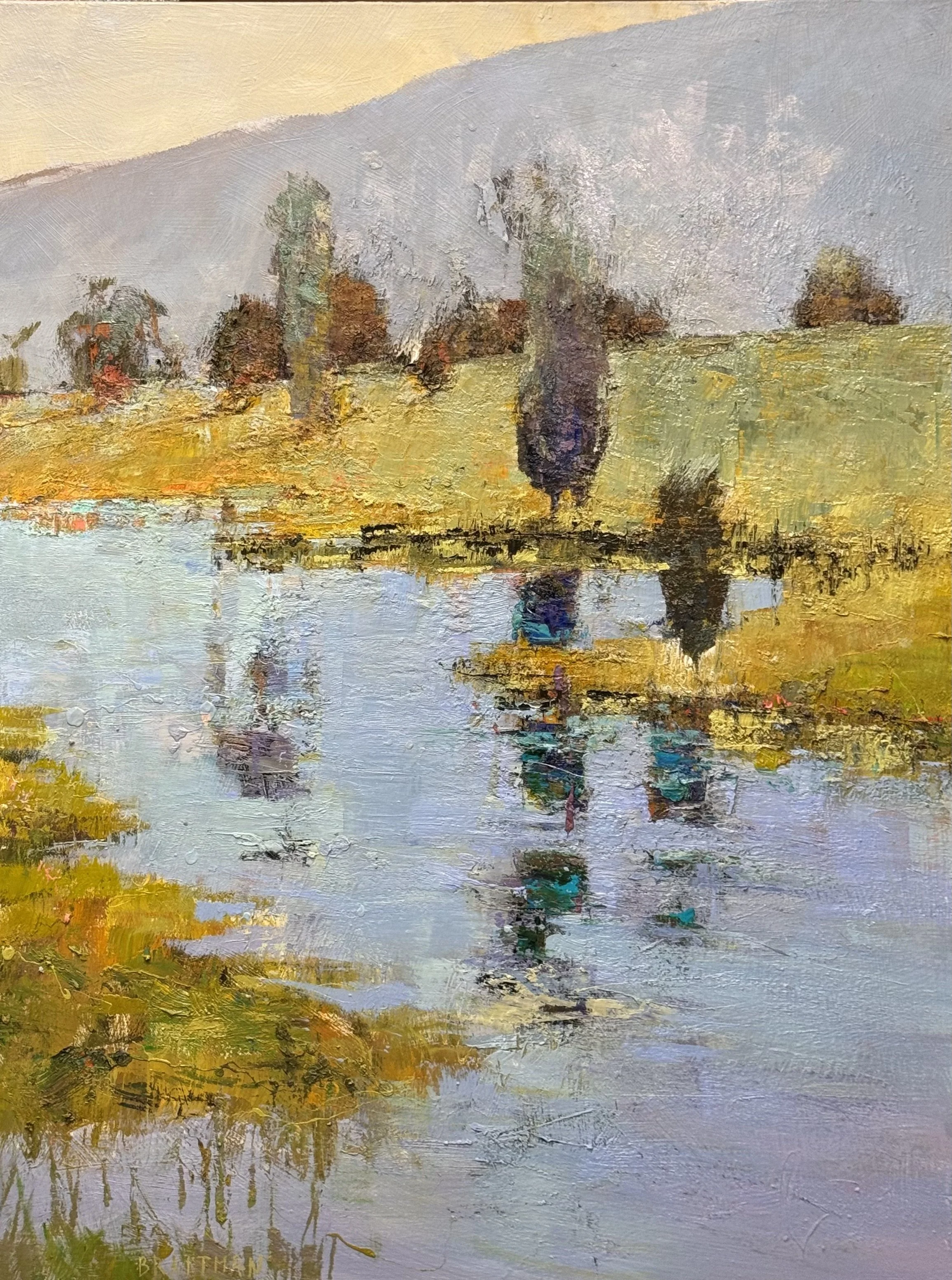
I had a very confusing day today but still managed to get a bunch accomplished (mostly with Meredith’s help). I worked on 3 pieces and got the booklet into the printer for next weeks’ workshop
monday is a new day
I managed to work on 4 pc’s today…. and had a wonderful day painting.
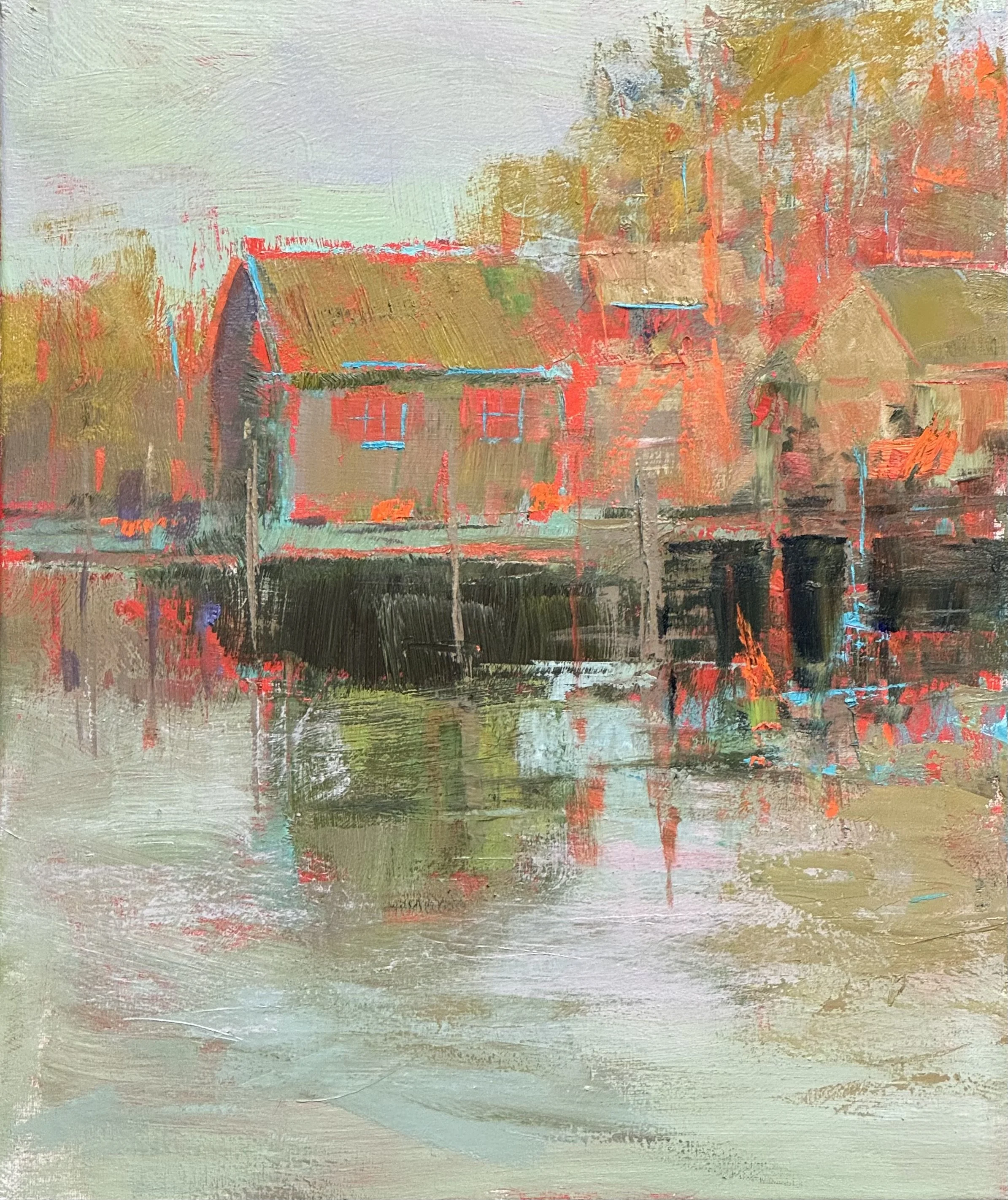
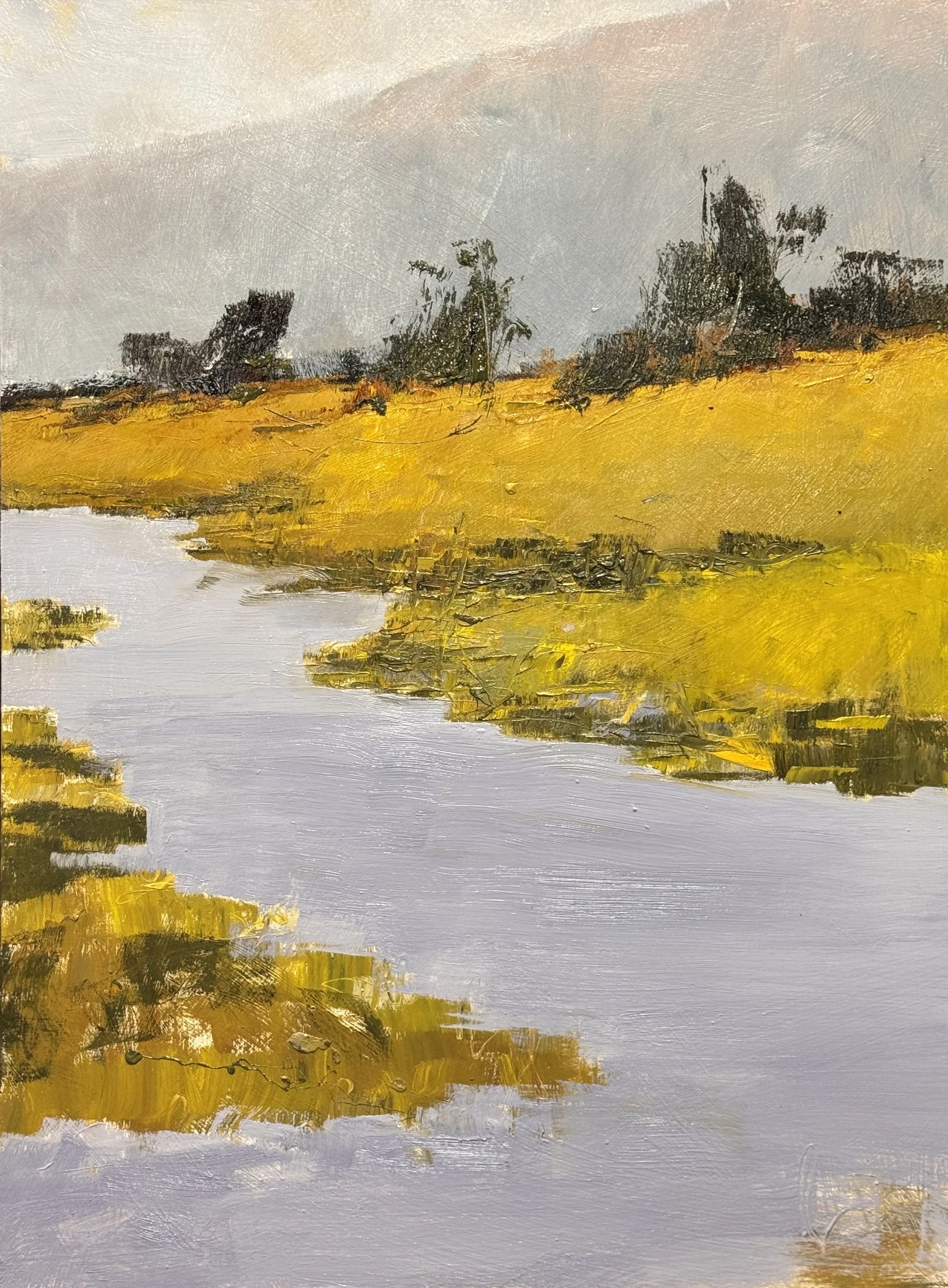
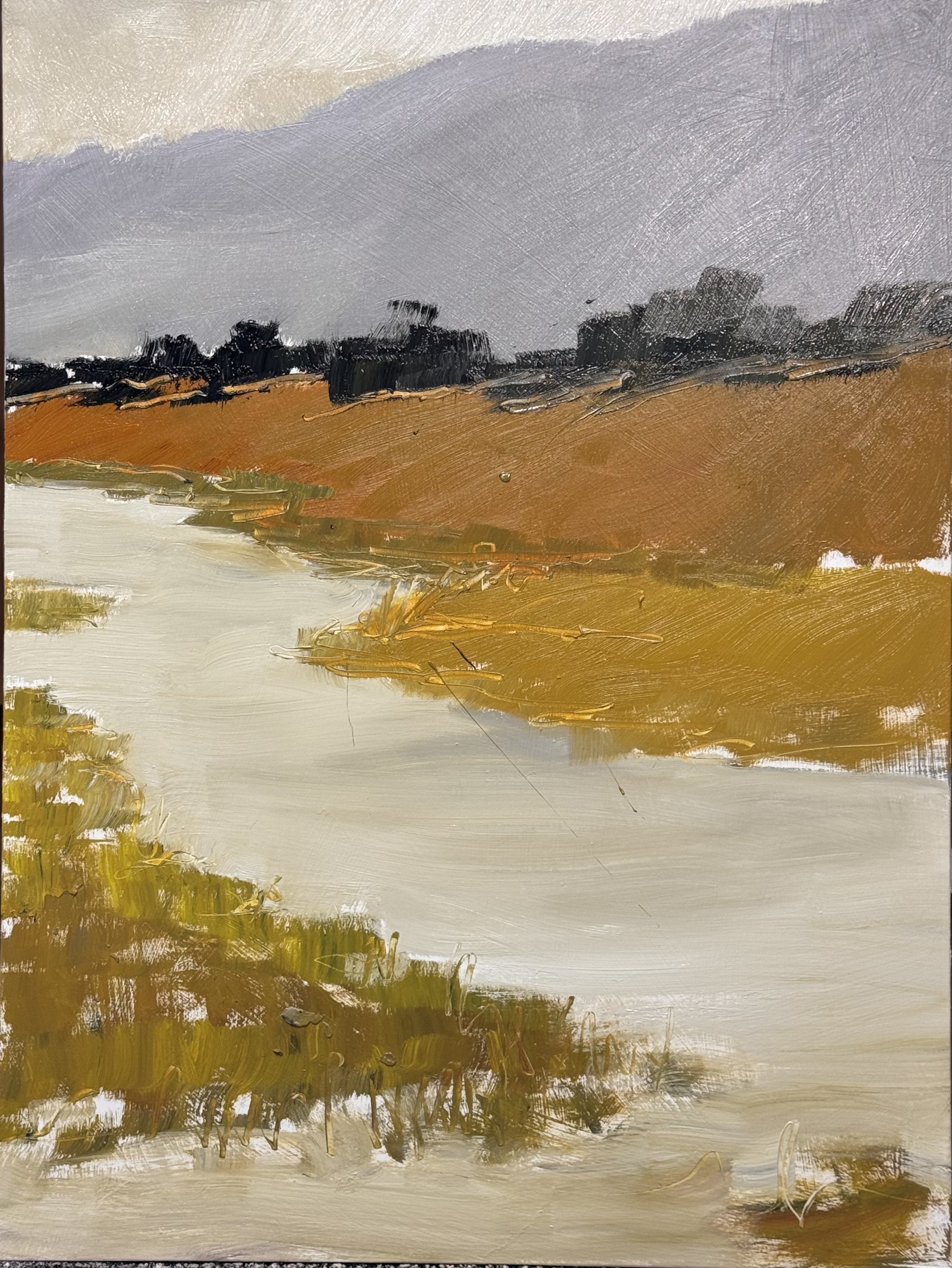
This little 24 x 20 demo from the last workshop got finished. This was based on an underpainting of scarlet and a bright teal (complement) with a quina gold as the remainder of the triad.
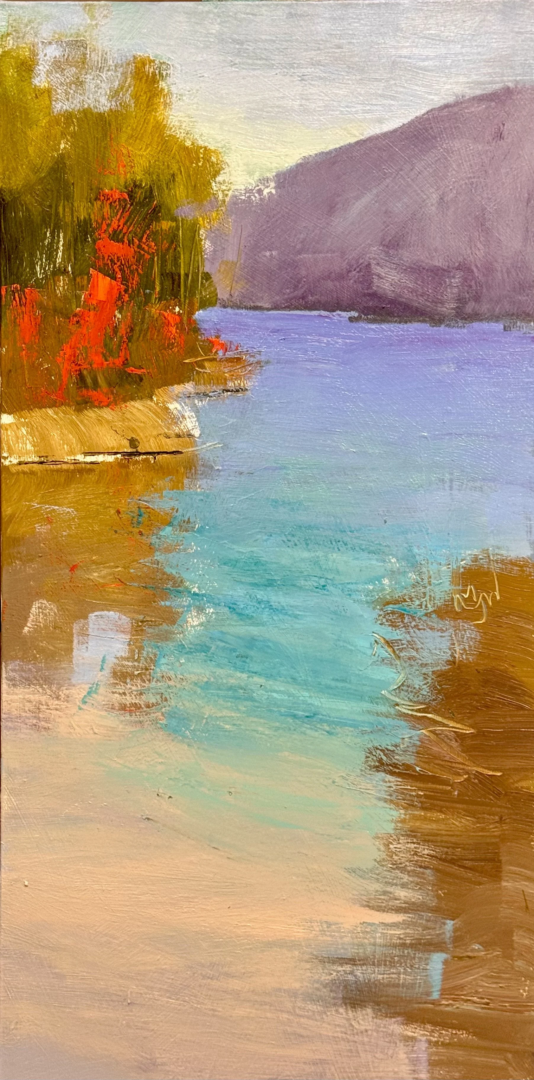
I was really happy with the next layer on this 48 x 24 commission. Just complicating color and refining the edges.
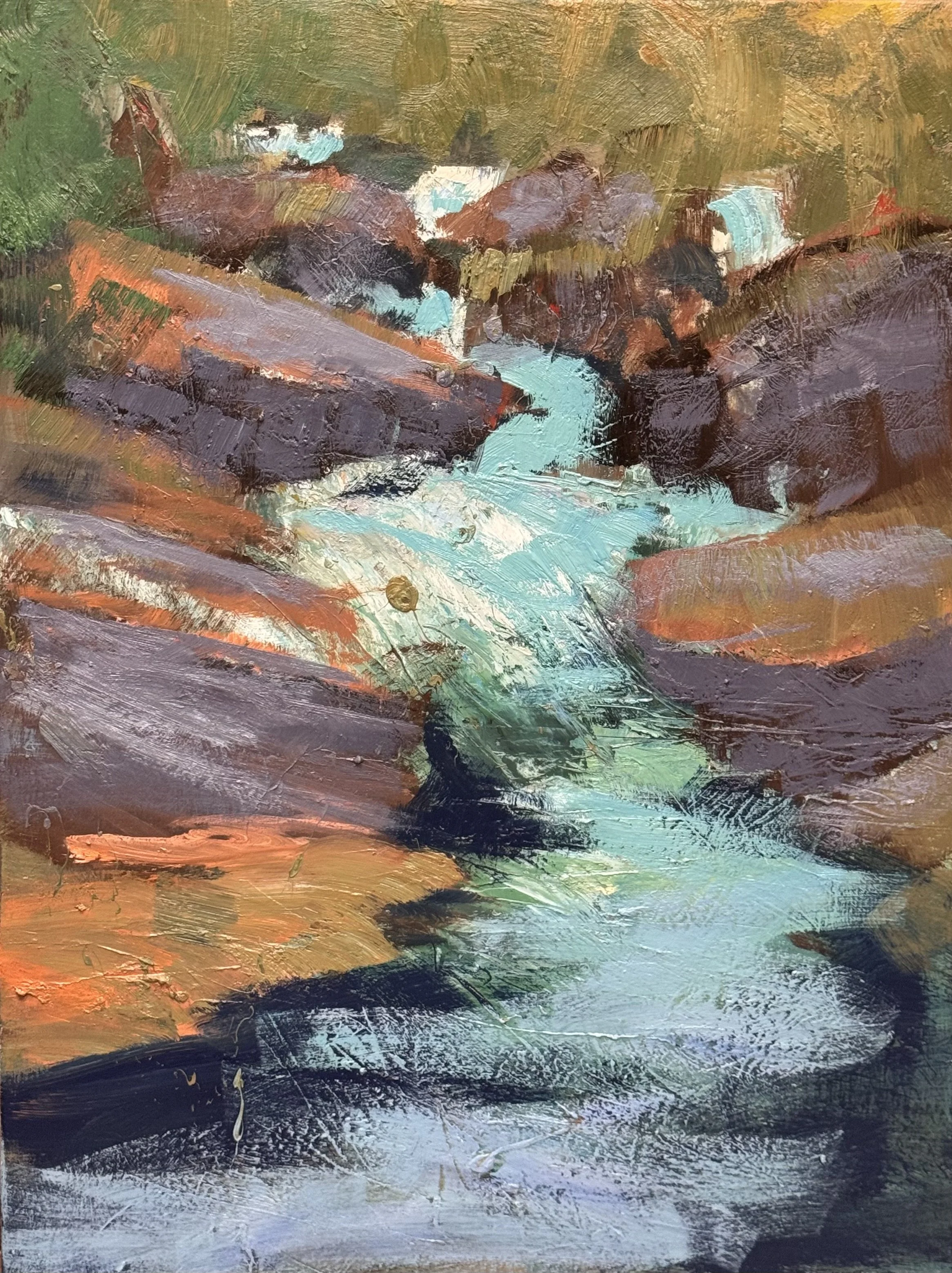
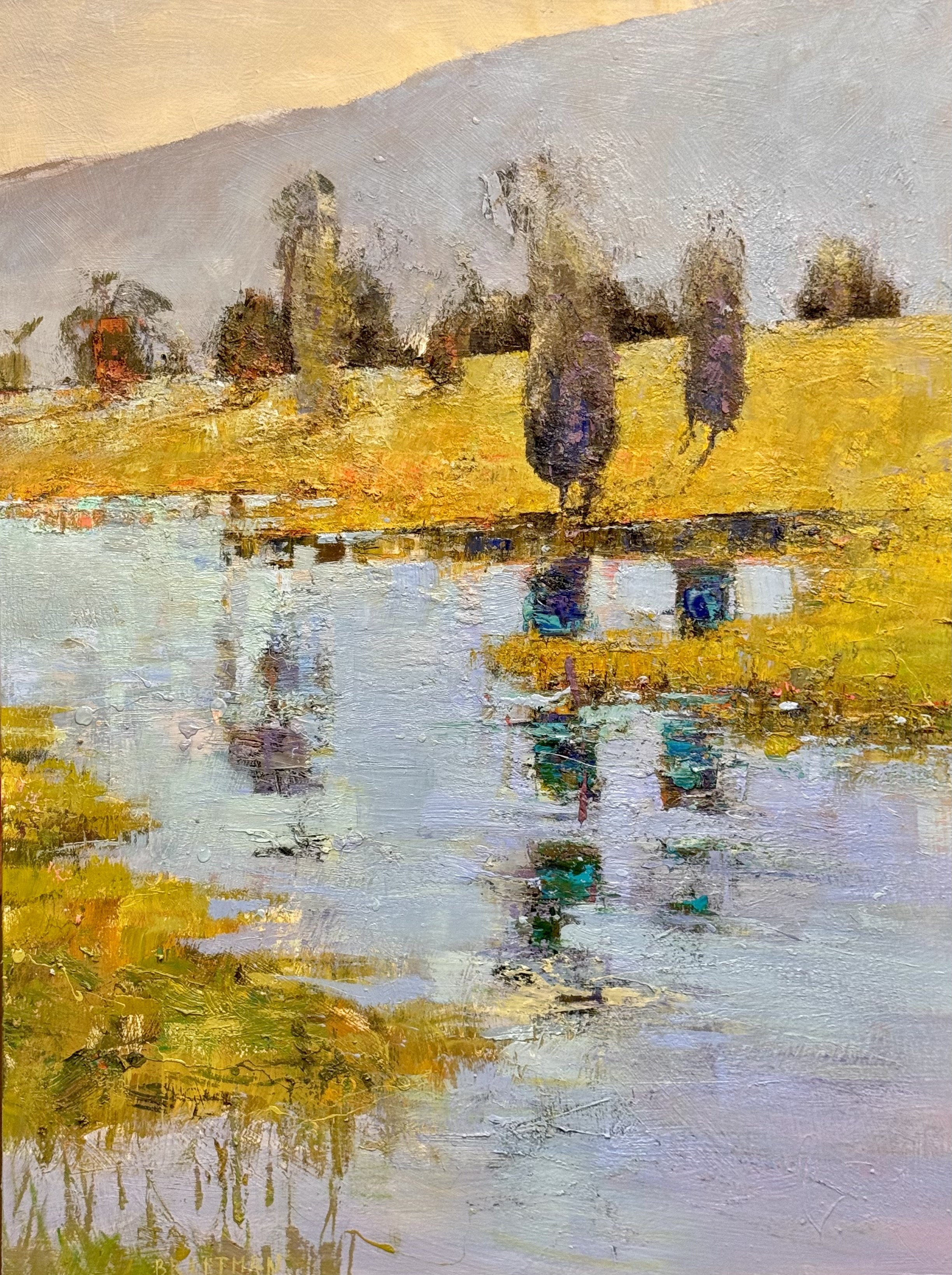
Finished the final layer of this piece. Now I just have a few touches of electric color to add. I was thinking a bit of cad red light and cad orange and paynes grey at the water’s edge to anchor the grasses in the foreground and bring the eye to the background over or on the edge of the yellow hill.
Friday 9/25
Today was a great day of painting. I used only one #4 Richeson wash brush all day. Easy clean up.
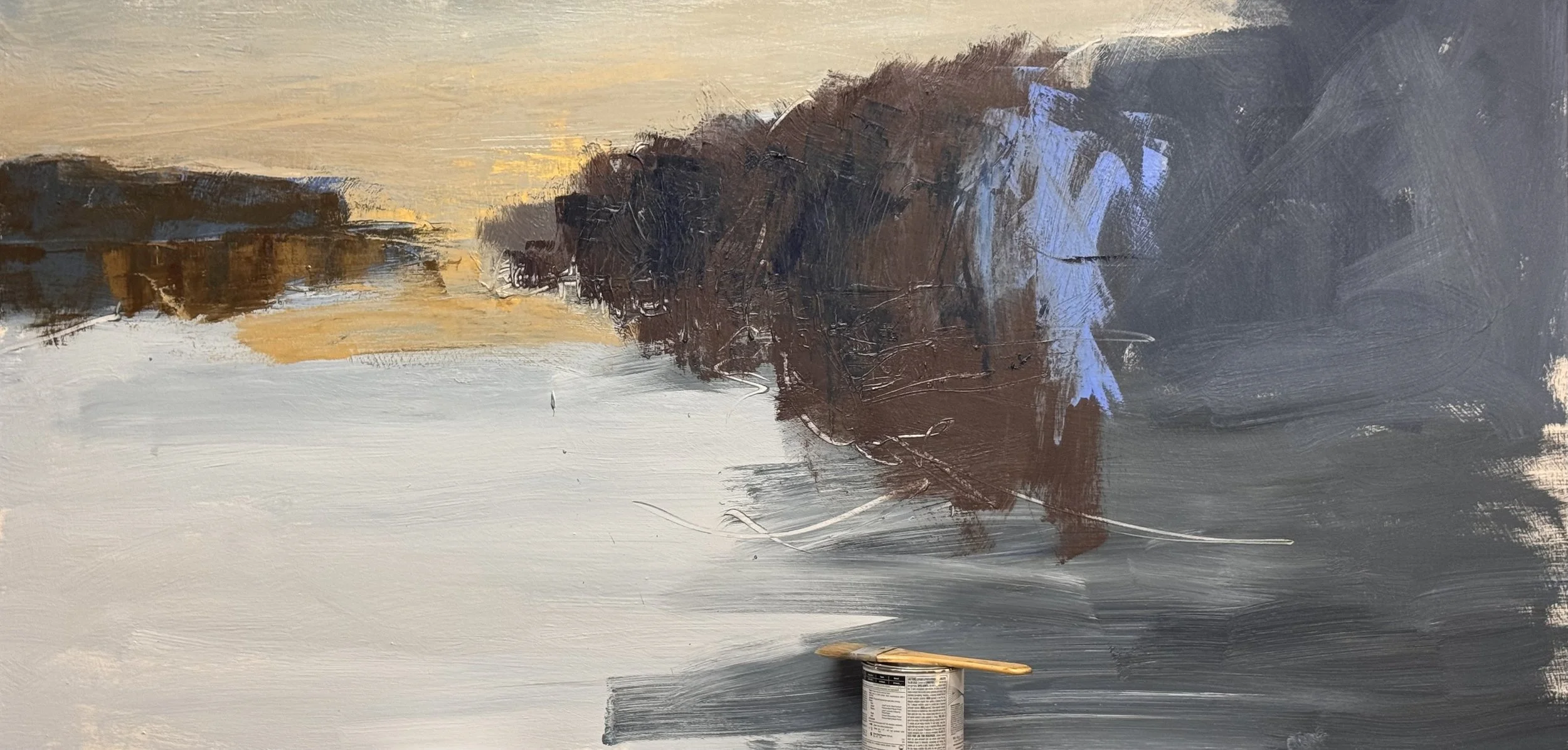
33 x 66
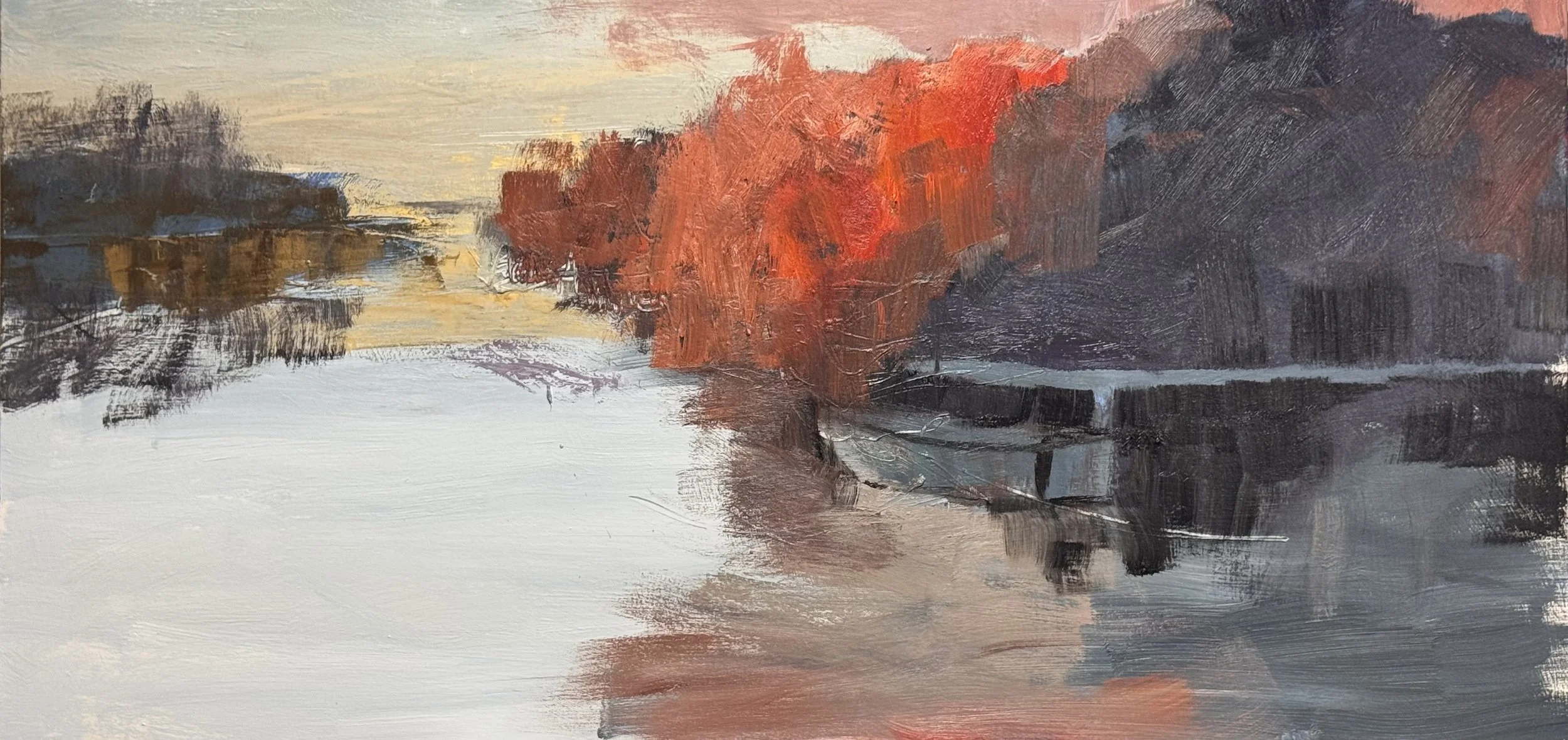
3rd layer—beginning to build: refine the shapes and complicate the color
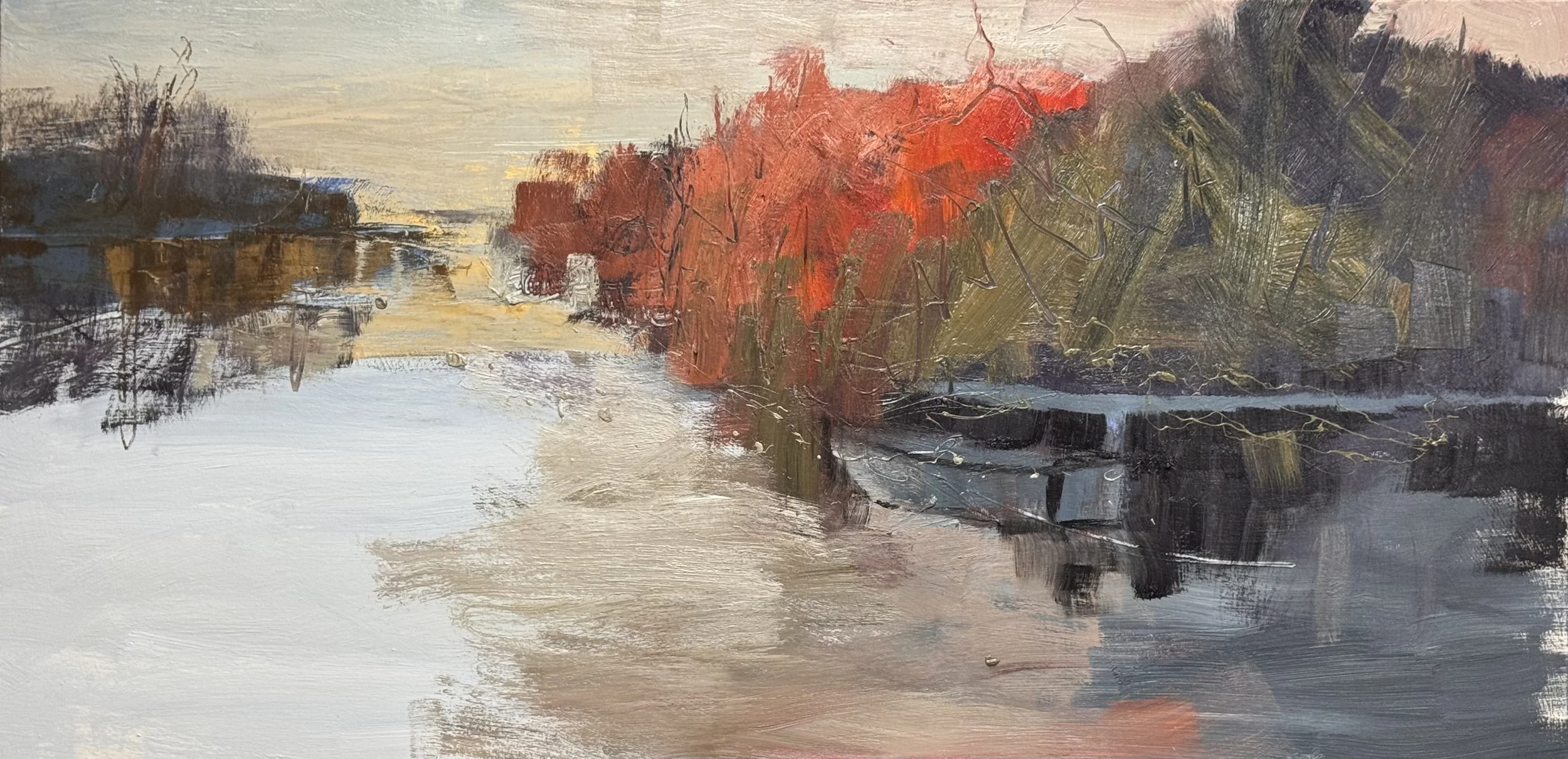
the end of the 3rd layer
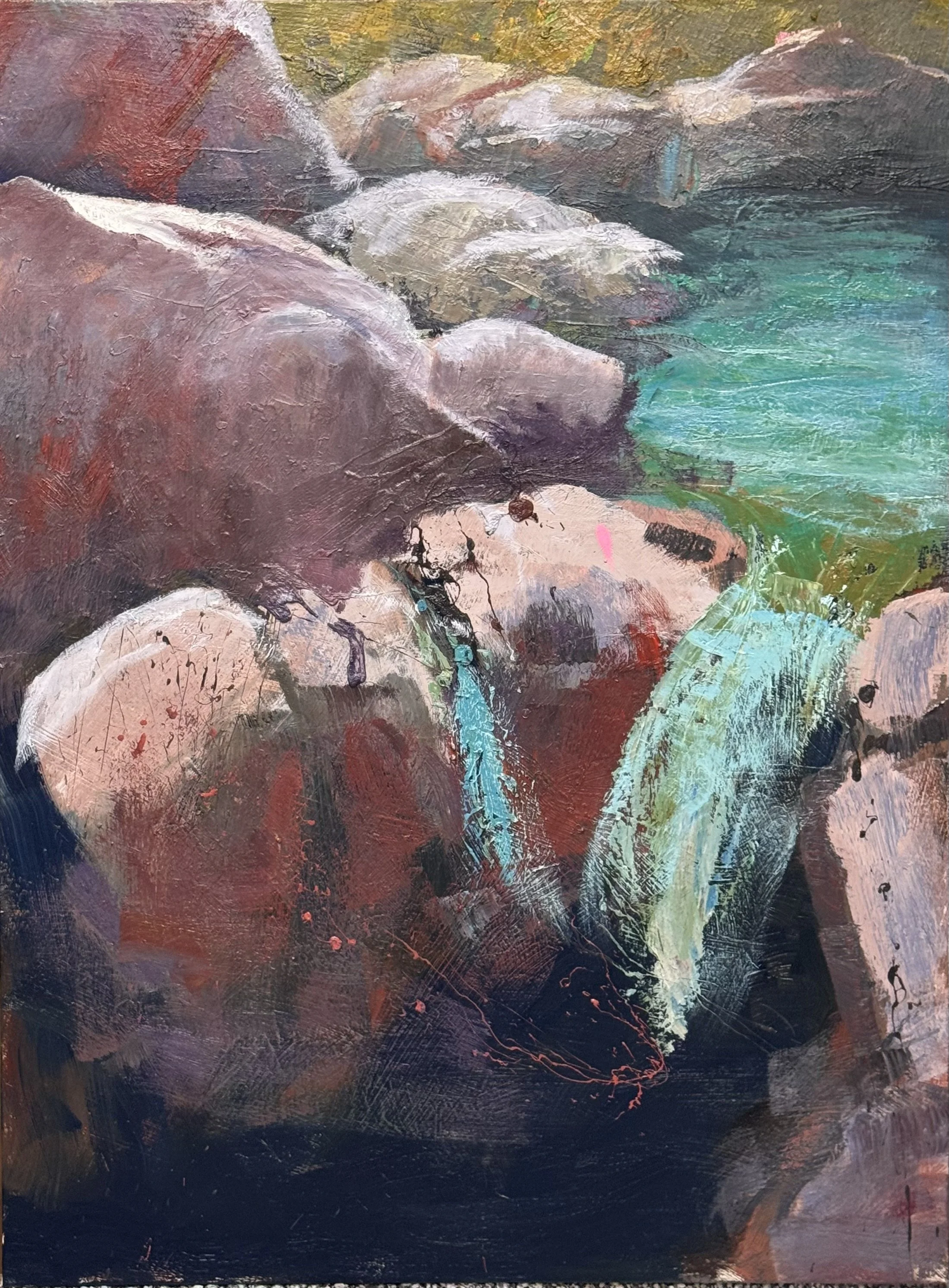
48 x 36 inches, This is the 3 layer of this
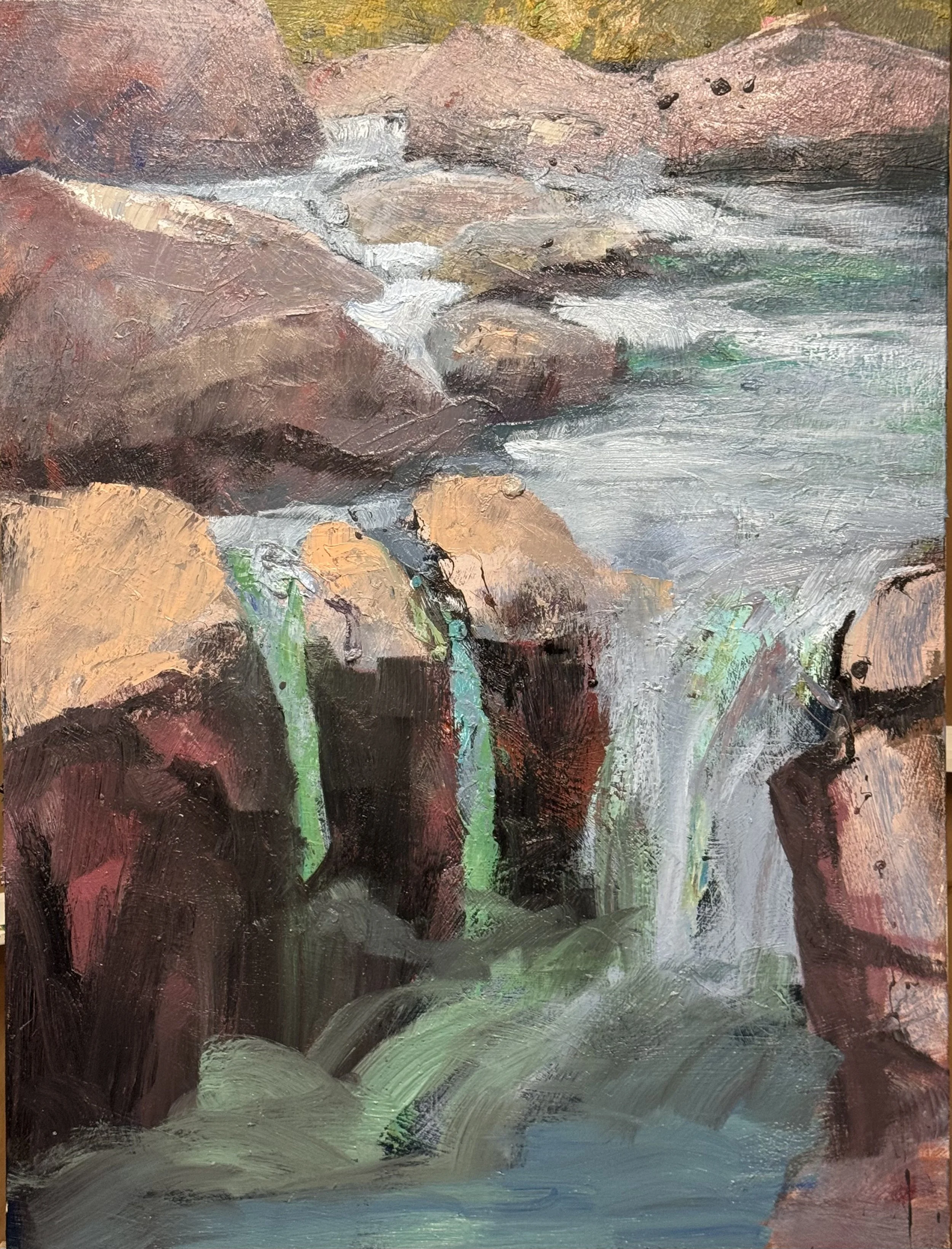
And here is the 4th layer of building, complicating, and refining.
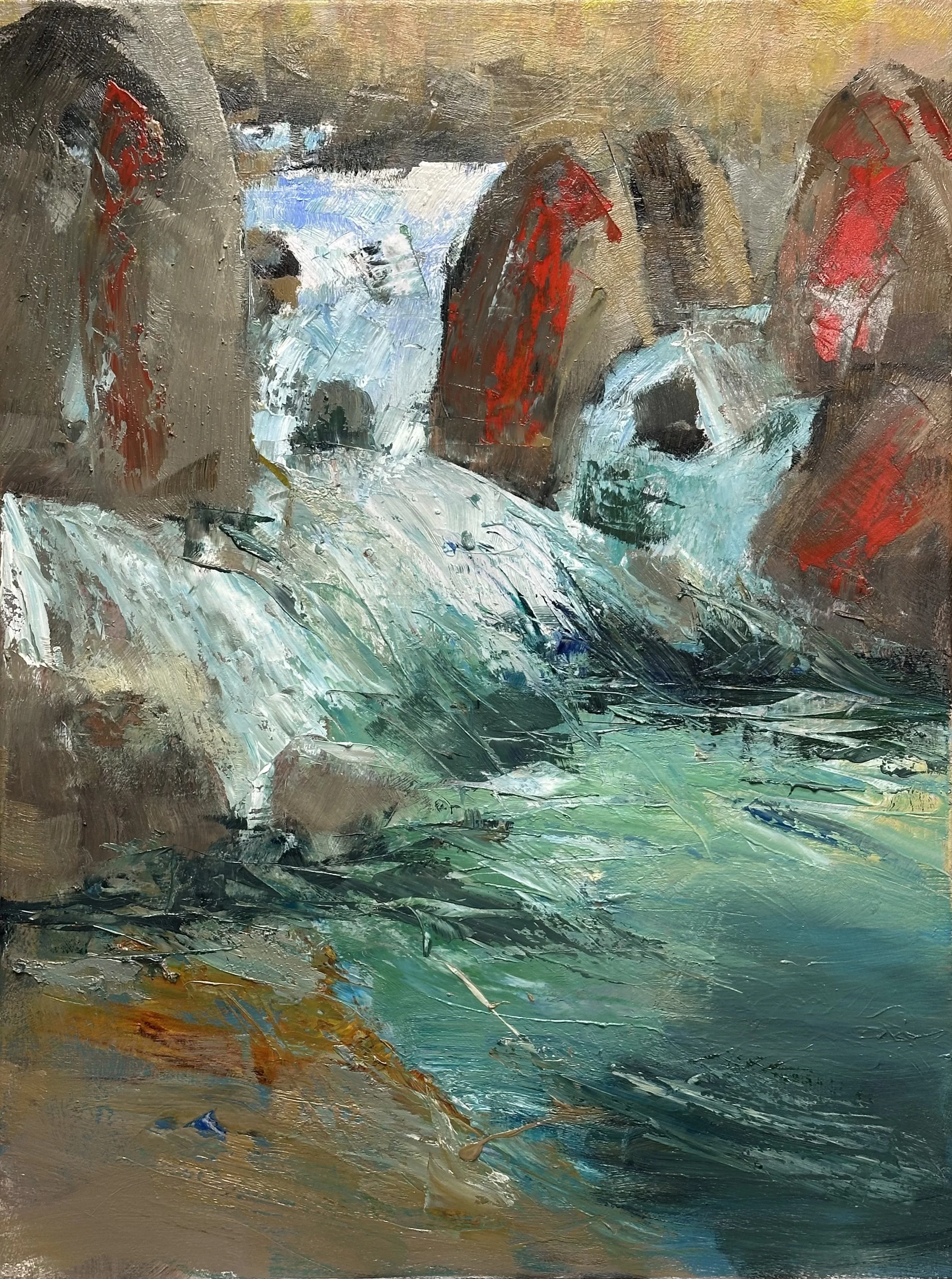
where I left the previous layer
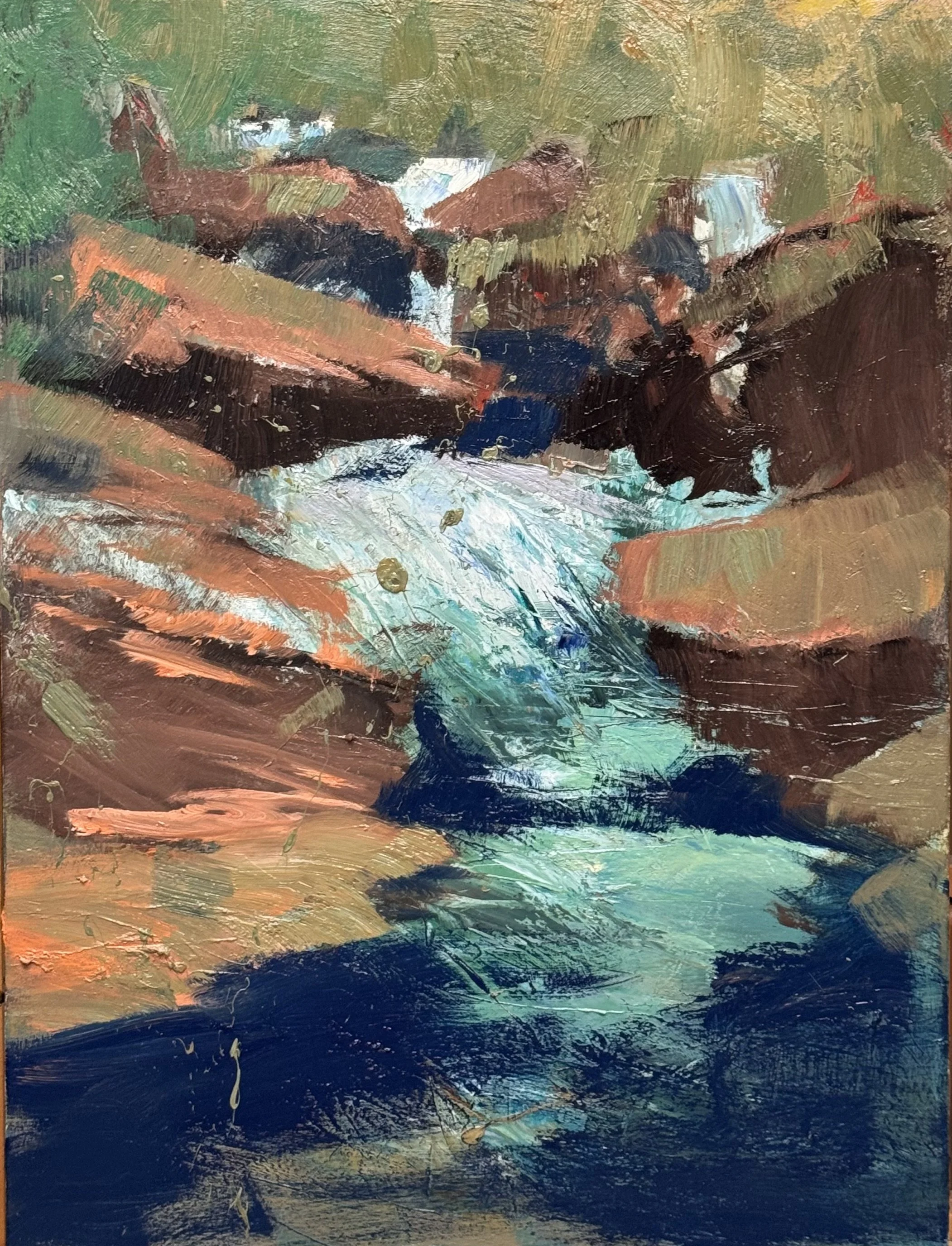
just a 40 x 30 piece, but a forest stream is imerging
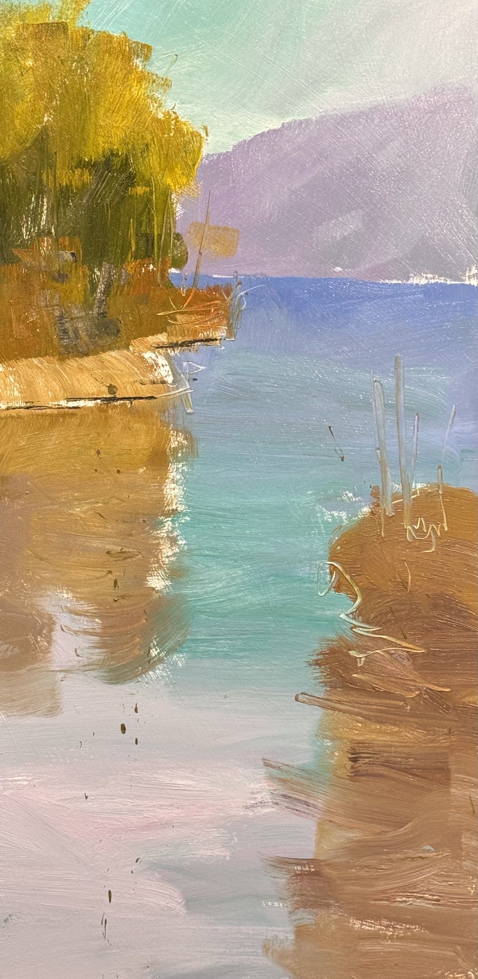
This is the 1st layer on a 48 x 24 image that belongs on a horizontal format. I am excited to see that it can be manipulated to fit this strong vertical.
One brush all day: a #4 Richeson wash. Easy cleanup, and no chance to hide behind tool changes.
Above is the only new start. Three jobs only: refine shapes, build and complicate color, subdue or enhance energy.
The river panel: broke the violet mass with sage. Red now sits against its complement. The right side is louder. Not sure it earned it.
Line work over the red. Watching that it doesn't become handwriting for its own sake.
Vertical channel: turquoise, ochre, lavender. Resolved. Maybe too resolved.
Copper cascade: the diagonals carry it. The navy pool stays quiet on purpose.
Mauve falls: the green streaks work. The three lit rock tops are the same size, which is a problem I made and haven't solved.
Complicating color is easy. Knowing when you've only made it busier is the work.
Thursday--4 pieces in the works today
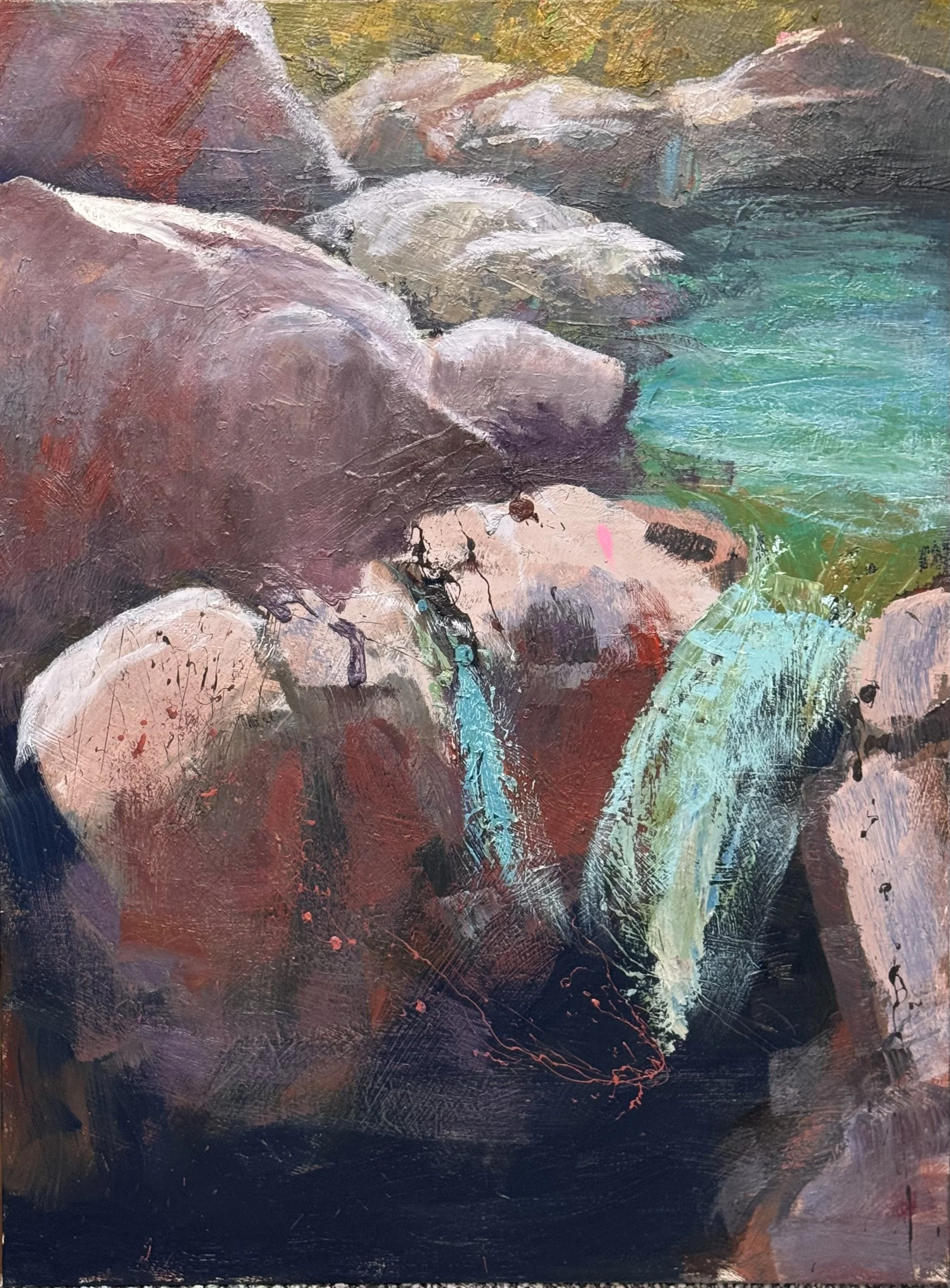
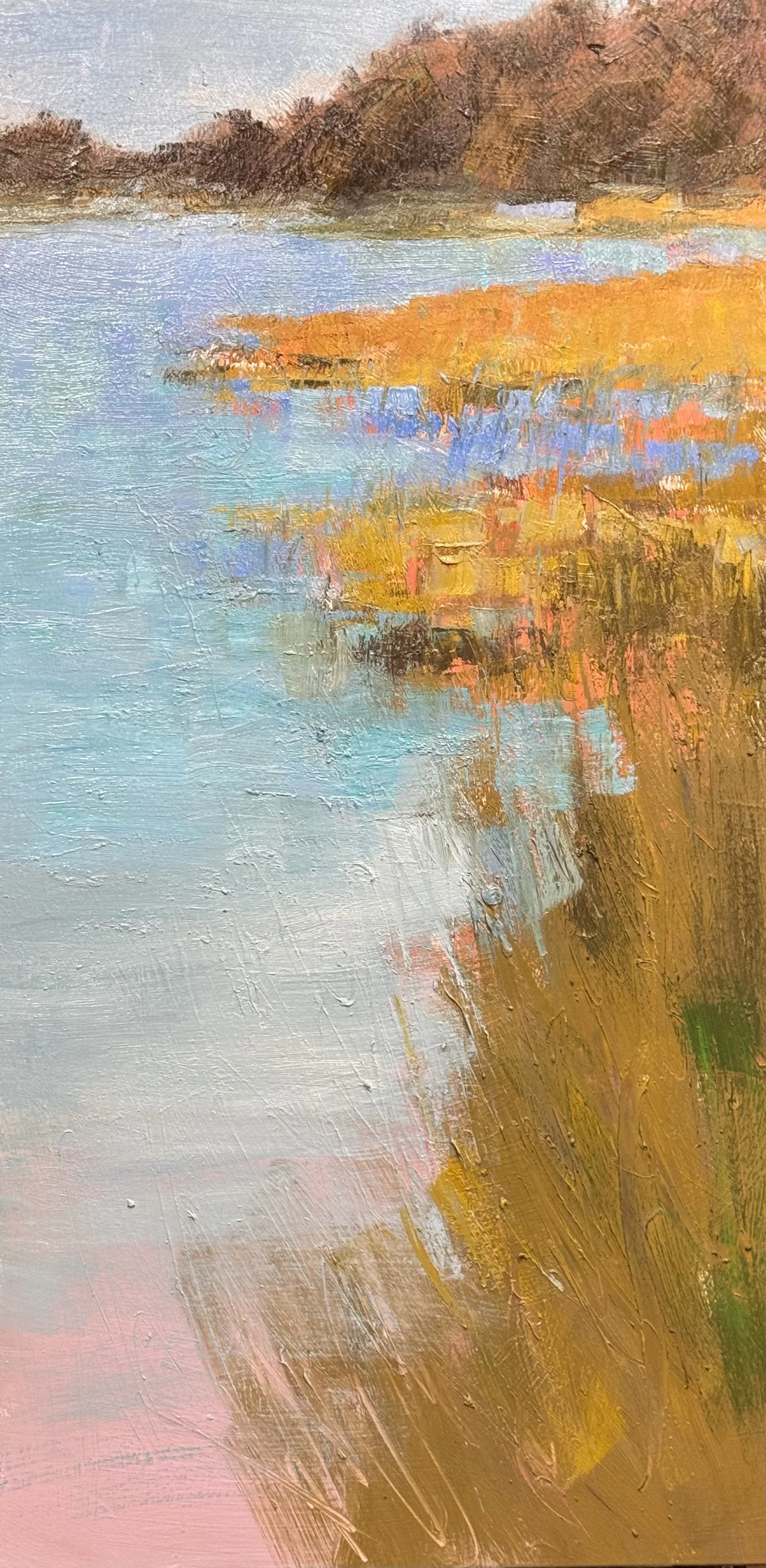
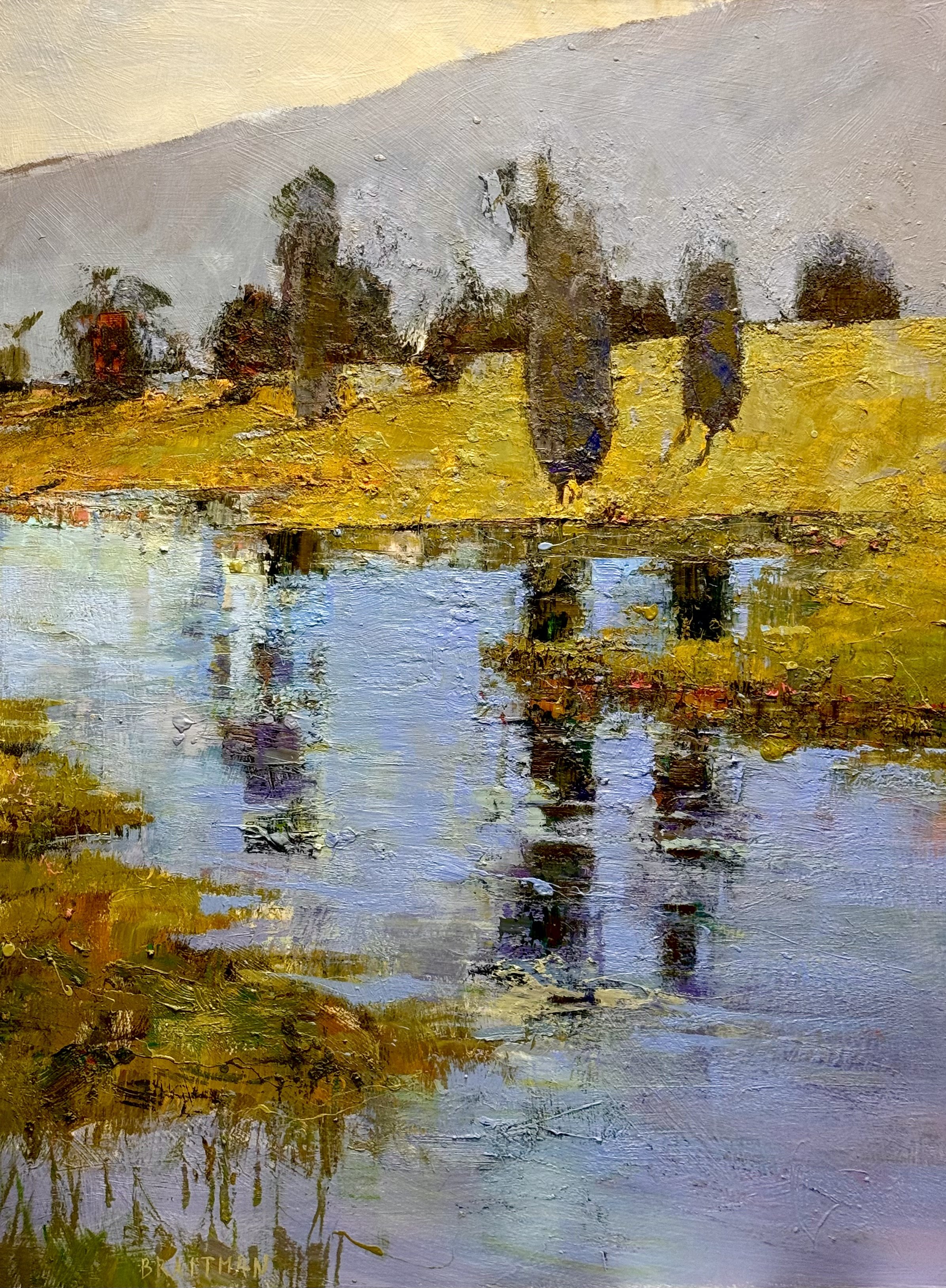
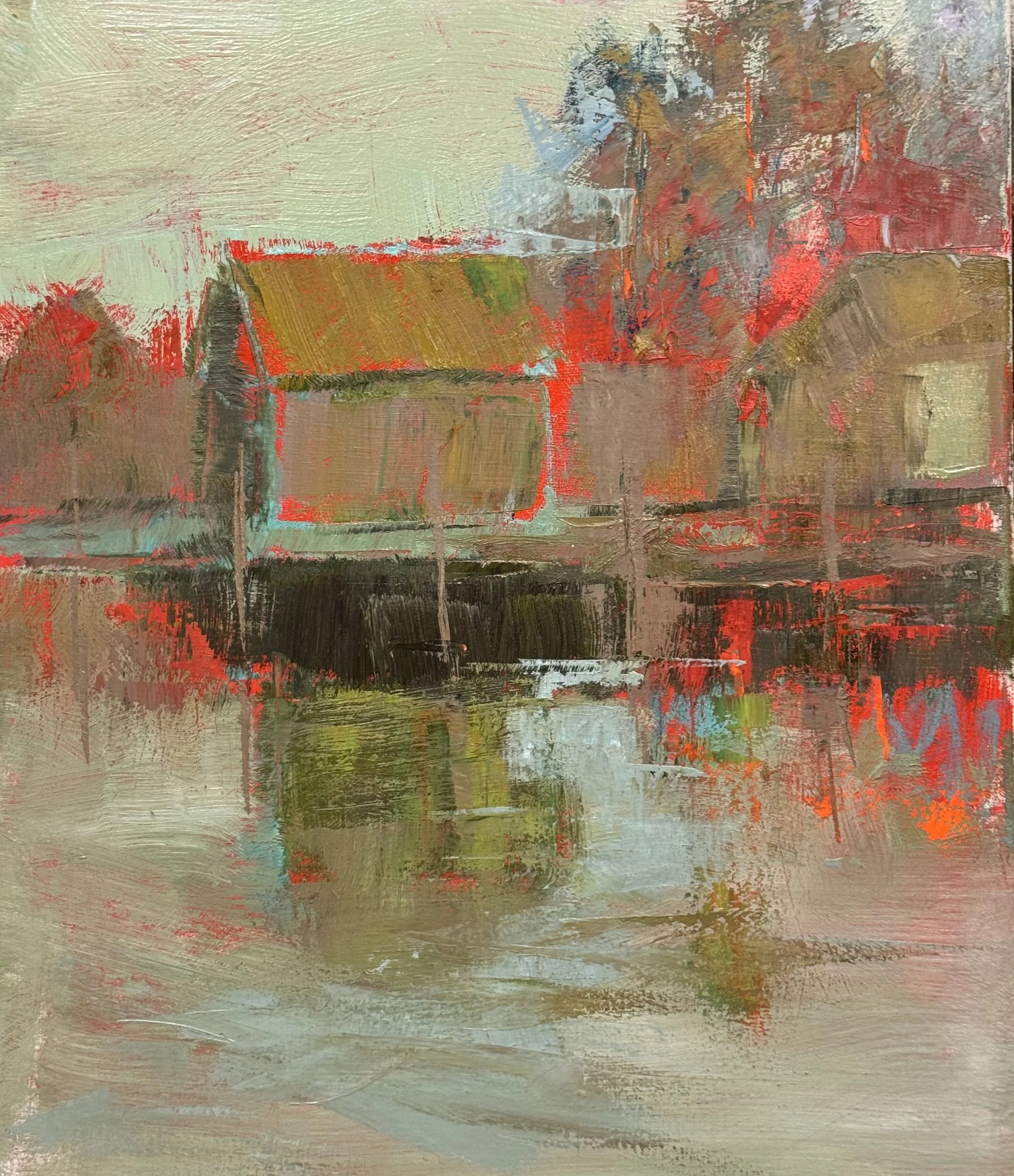
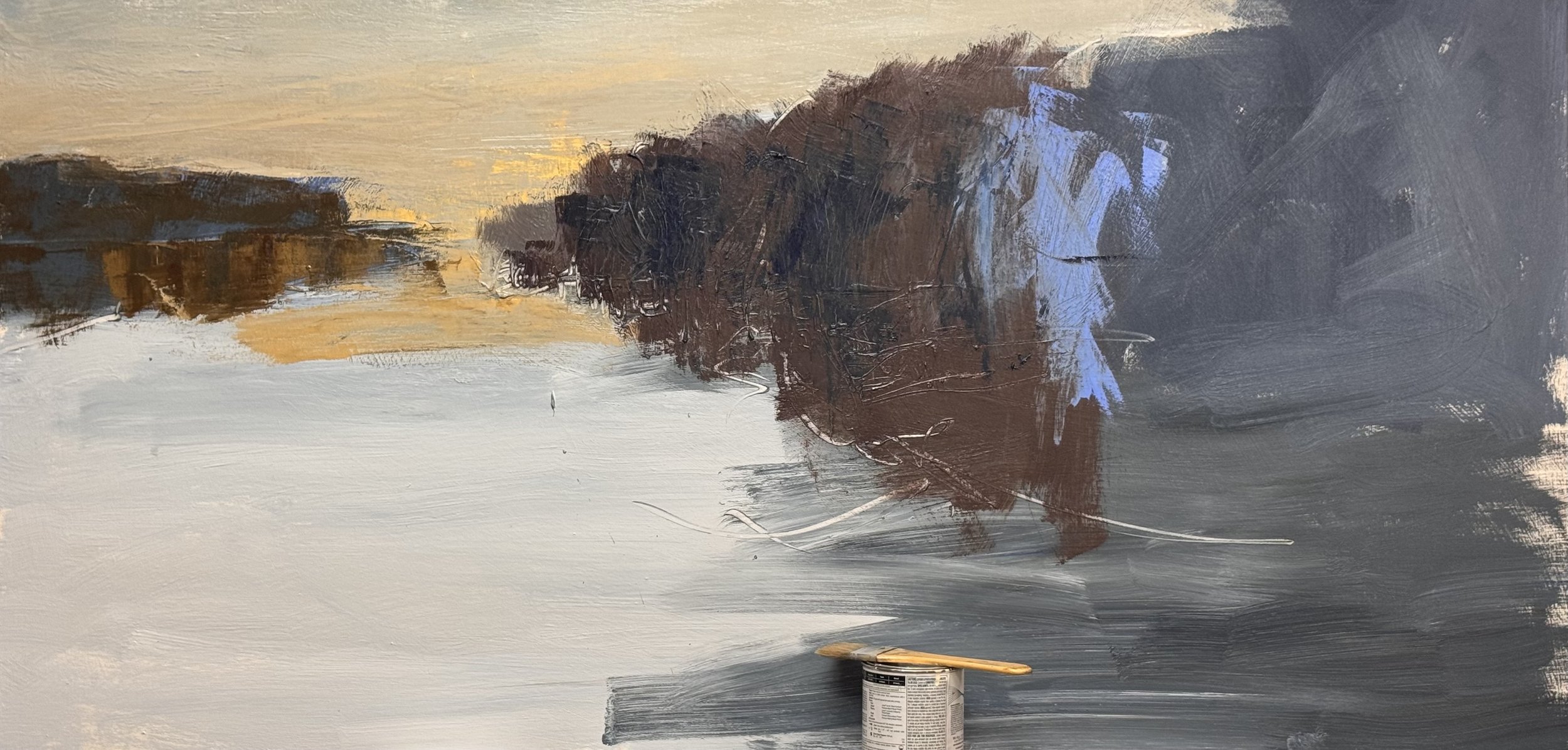
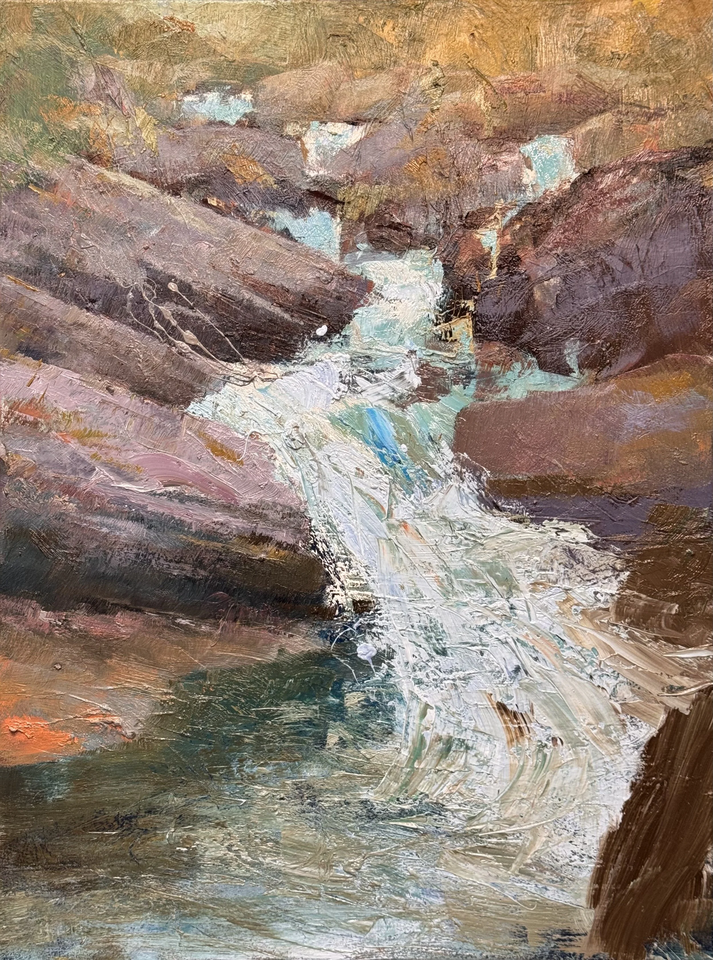
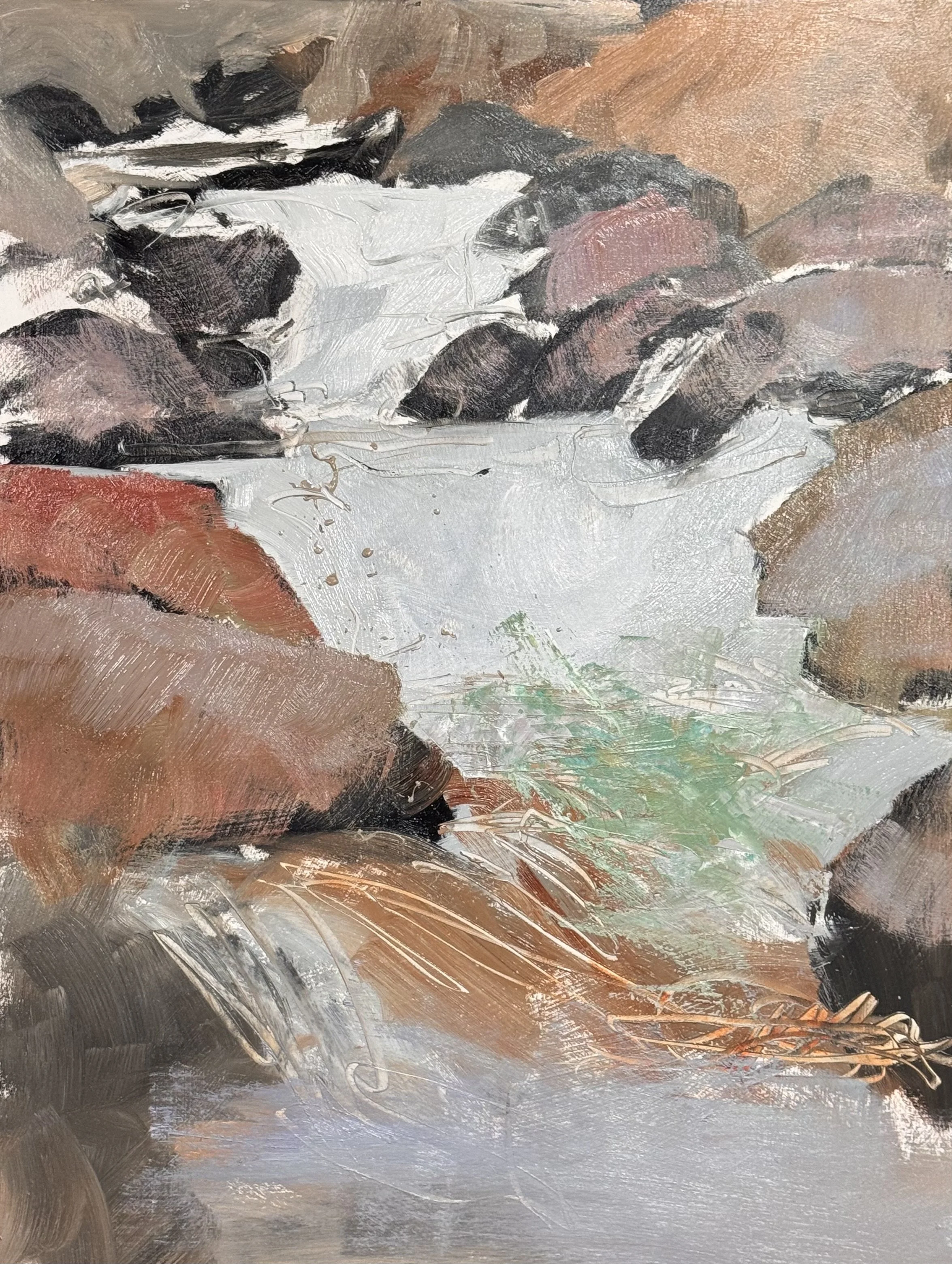
I had the good fortune to be able to work on 4 pieces today and sign an additional painting. On the first image I began to define the rocks that will support the falling water.
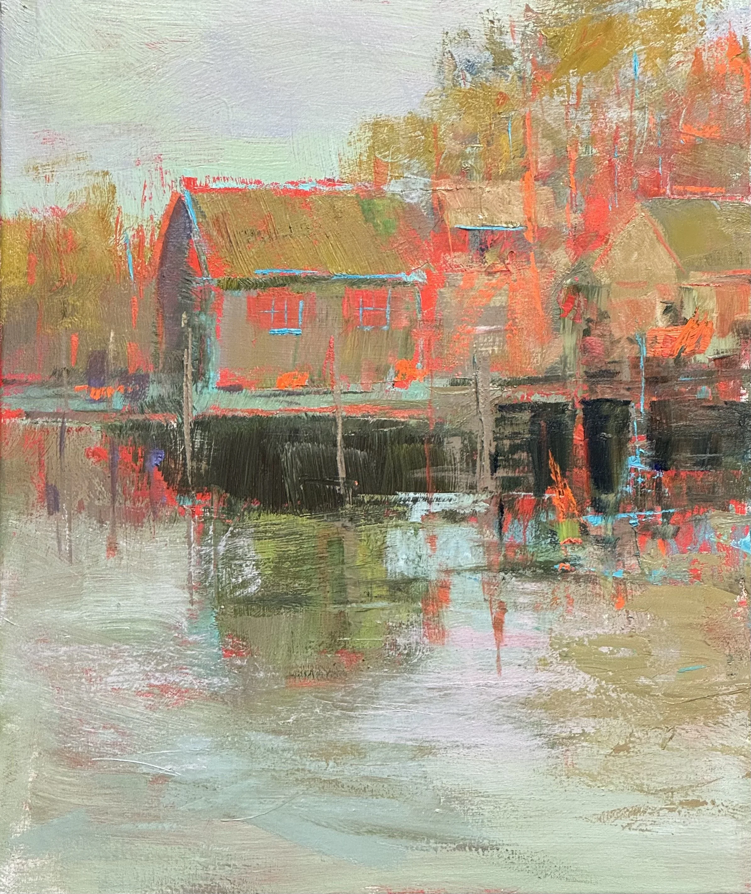
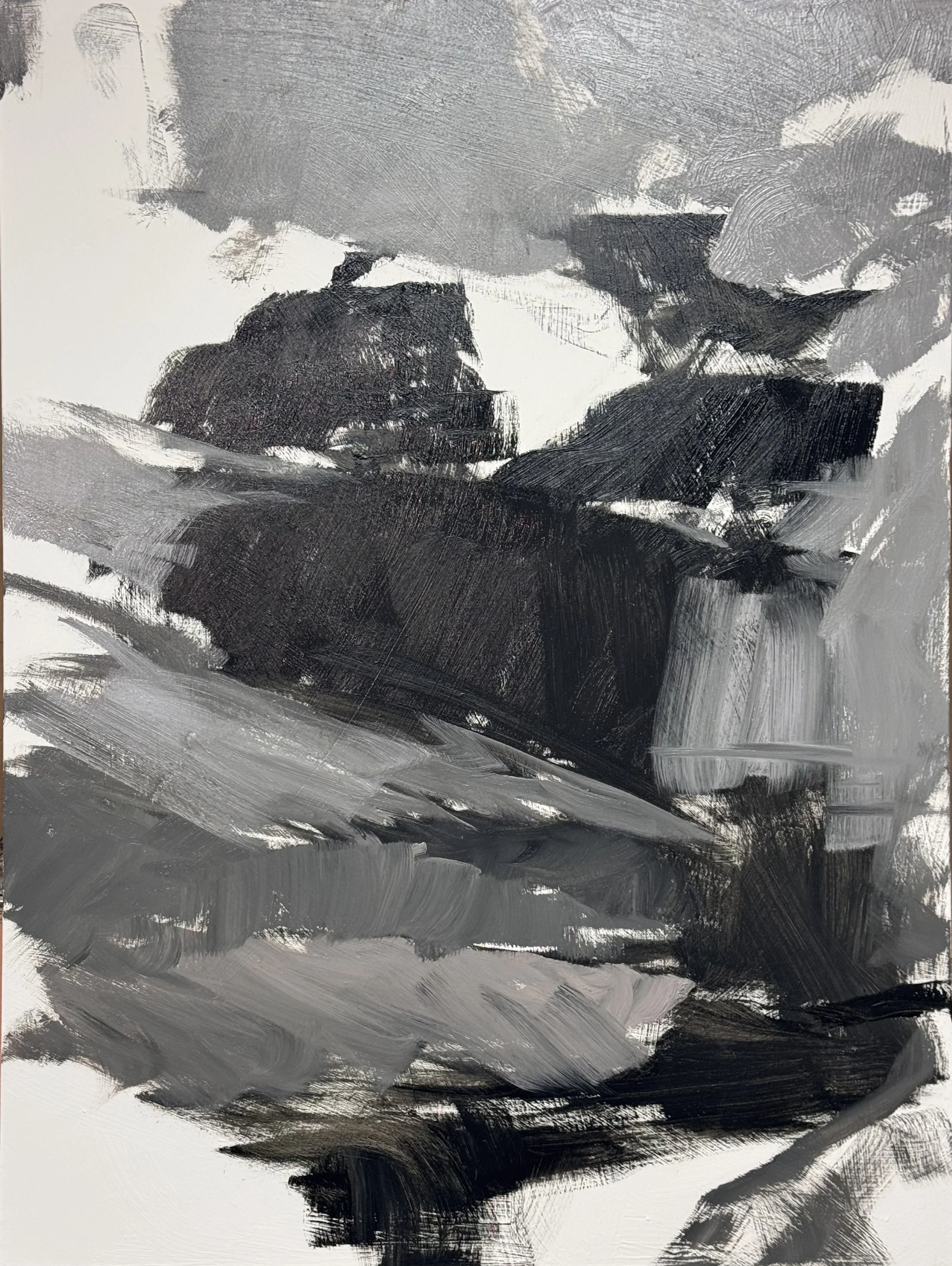
The second painting is still a build up of a commission so it is not a discovered painting but an executed piece.
While the 3rd image is the finish of
Monday, Yom Kipper
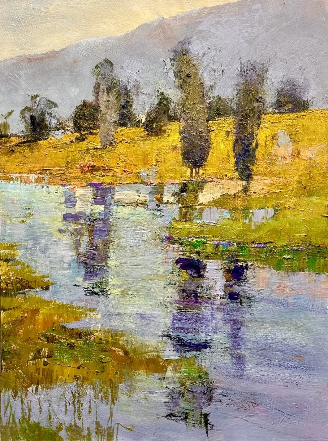
Not quite finished, But I happy with it’s direction. It is a bit too worked (noisey) for my taste. I need one more layer to quite the surface of the yellow hill and orange up the top of the background mountain shape.
I also need to address the tree on the far right. Bigger or not at all… I may compromise and set in the middle of the yellow hill vetically.
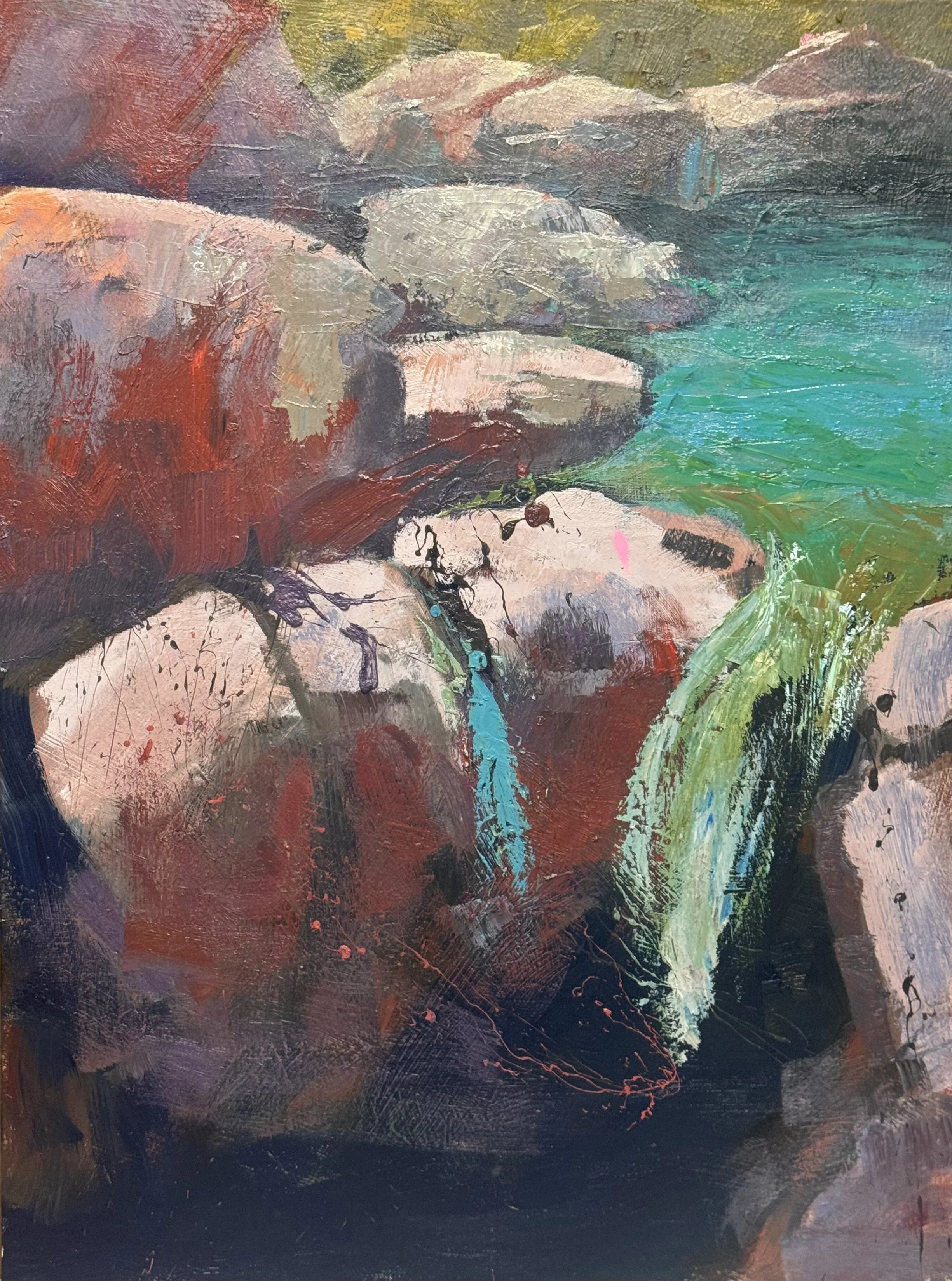
Still developing this piece… I am excited for the direction and the activiy but still have to balance the detail. I feel that a bit more omage to the reality detail of the rock will balance a greater amount of activity and excitement in the moving water
Two paintings, both unfinished.
The first is too busy. The hill argues with its own reflection. One more layer to quiet it, and a decision about the tree on the right. It is either larger or it goes.
The second has the opposite problem. The activity is the point, but it needs something to stand against. A little more rock, in one place, and the rest can be as loud as it wants.
Same lesson twice. Detail is a budget, and it works best spent in one place.
finished two
I am very excited about these two—-they are finished in time to include in Shain Gallery’s show for me at the end of the month.
Image 1 — Savage Trees — White
Flat red-and-white bands as a color-field backdrop for the trunk screen
Near-black foreground trunk anchors the piece
Cool mint/blue reflection breaks up the warm palette
Image 2 — Wabi—Sabi Watershed
Warm, late-day glow through birch trunks
Turquoise pooling in the stream echoes the cool-note device from Image 1
Loose, varied brushwork in the central trunks and understory
Image 3 — Stream Waterfall
Stacked block forms read like river rock or ice catching low light
Loose black and coral drip work is the most alive passage
Small yellow sliver at top pulls the eye up out of the rock cluster
Early-to-mid stage: structure's there, edges and one more color event still to resolve
Image 4 — Yellow marsh with tree reflections
Strong value anchor: near-black tree clusters against gold field
Hard-edged reflection broken by a soft coral-pink passage
Purple accent in the upper cluster keeps the palette from reading too literal
Quiet, open foreground water as a deliberate rest area
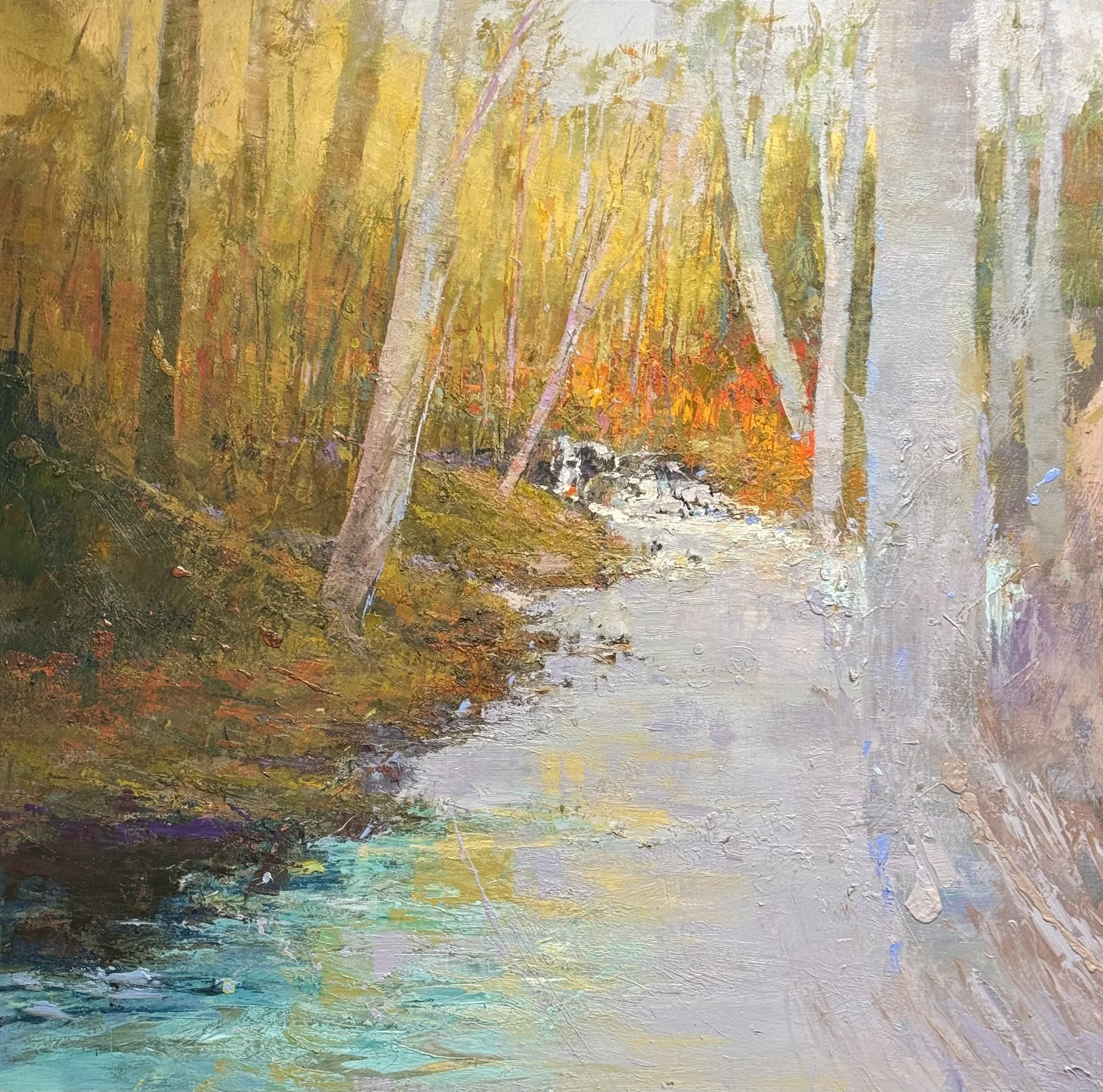
54 x 54 inches. Wabi Sabi Watershed
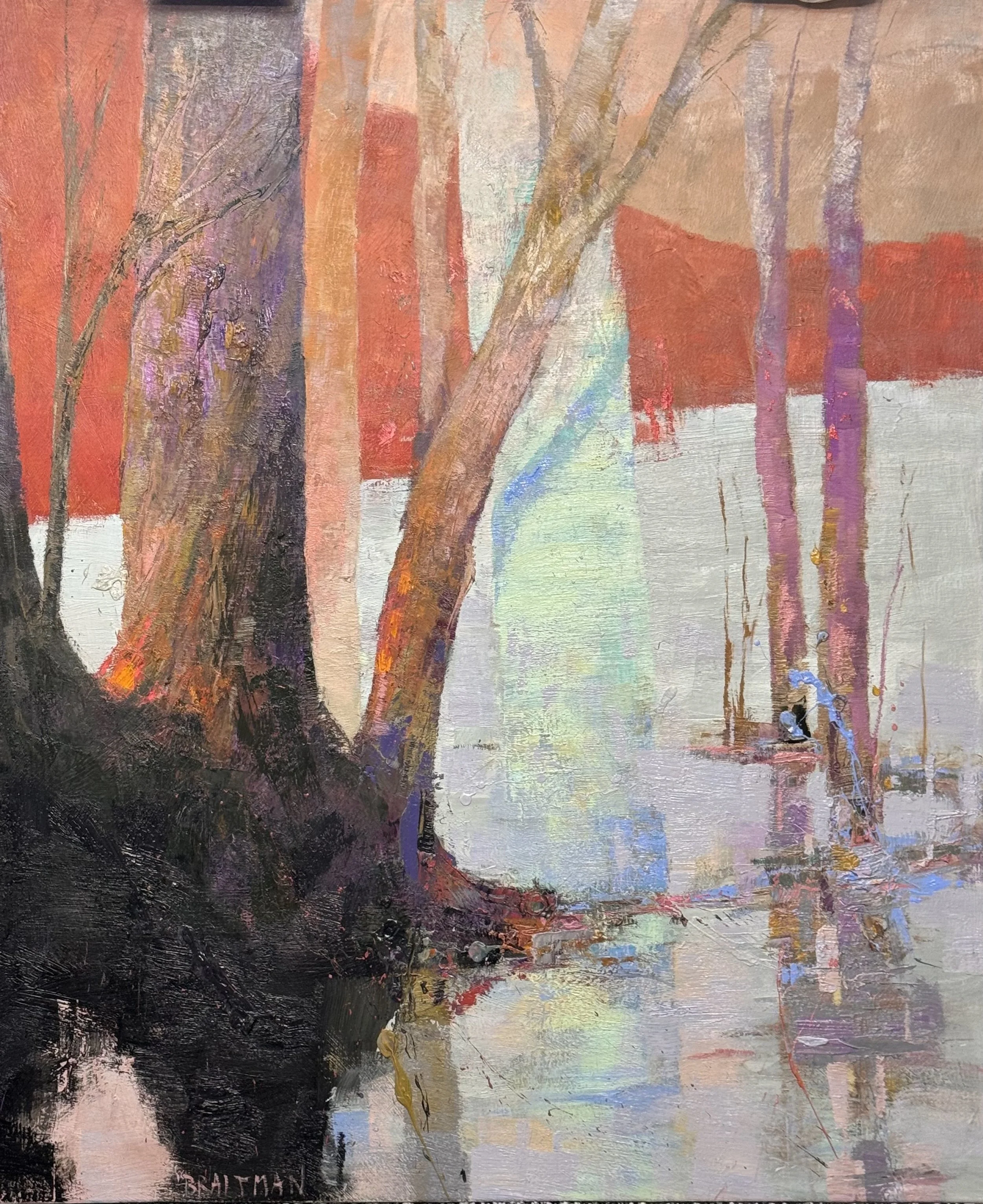
54 x45 inches. Savage White Tree
I mananged another coat on these two pieces too.
Wednesday 9/9/2026
I have had a busy day today—getting ready for next workshop, ordering 50 canvases and gessoing 1st coat, picking up folder for workshop from fedex, working on my big 54 square redux of Catch and Release below.
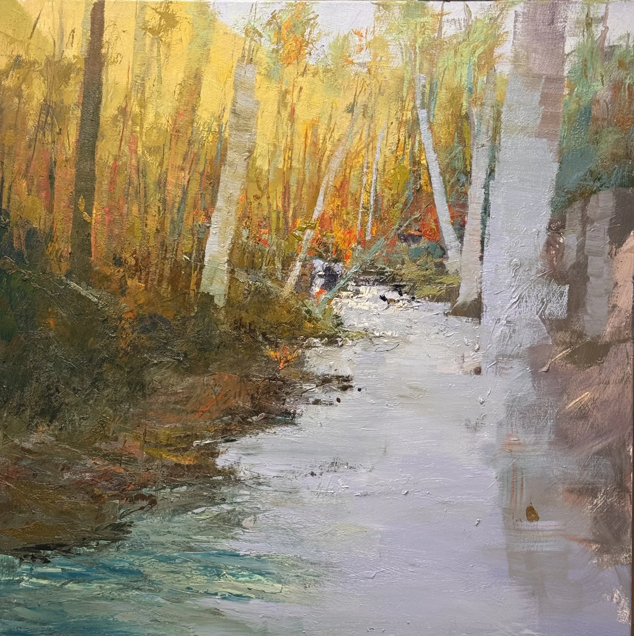
54 × 54 inches, Wabi-Sabi Catch and Release
Final day punch list
Sky → right trunks: Bleed a cool sky sliver down along the closest birch/rock edge — stitches top to bottom, stops that column reading as separate backdrop
Gold sky → water: Bounce warm yellow-gold into the upper stream, tapering as it comes forward — makes the water feel lit, not just pale/cool
Extend the sky-colored trunk: Keep it slightly warmer or higher-key than the water so it stays a distinct vertical anchor and doesn't merge with the lightest water passages
Sharpen center black/white: Place the contrast on the existing diagonal (upper-left dark trunks → dark marks in water → lower-right), not dead-center — should be a stop along the eye's path, not a stall
Wednesday 9/2/26
Another wonderful workshop day…. I also managed another layer on 3 pieces.
TUESDAY 9/1/26
Today was the first day of a build a landscape workshop. Everyone did such a good job today. I was also able to start 2 new pcs and finished a third.
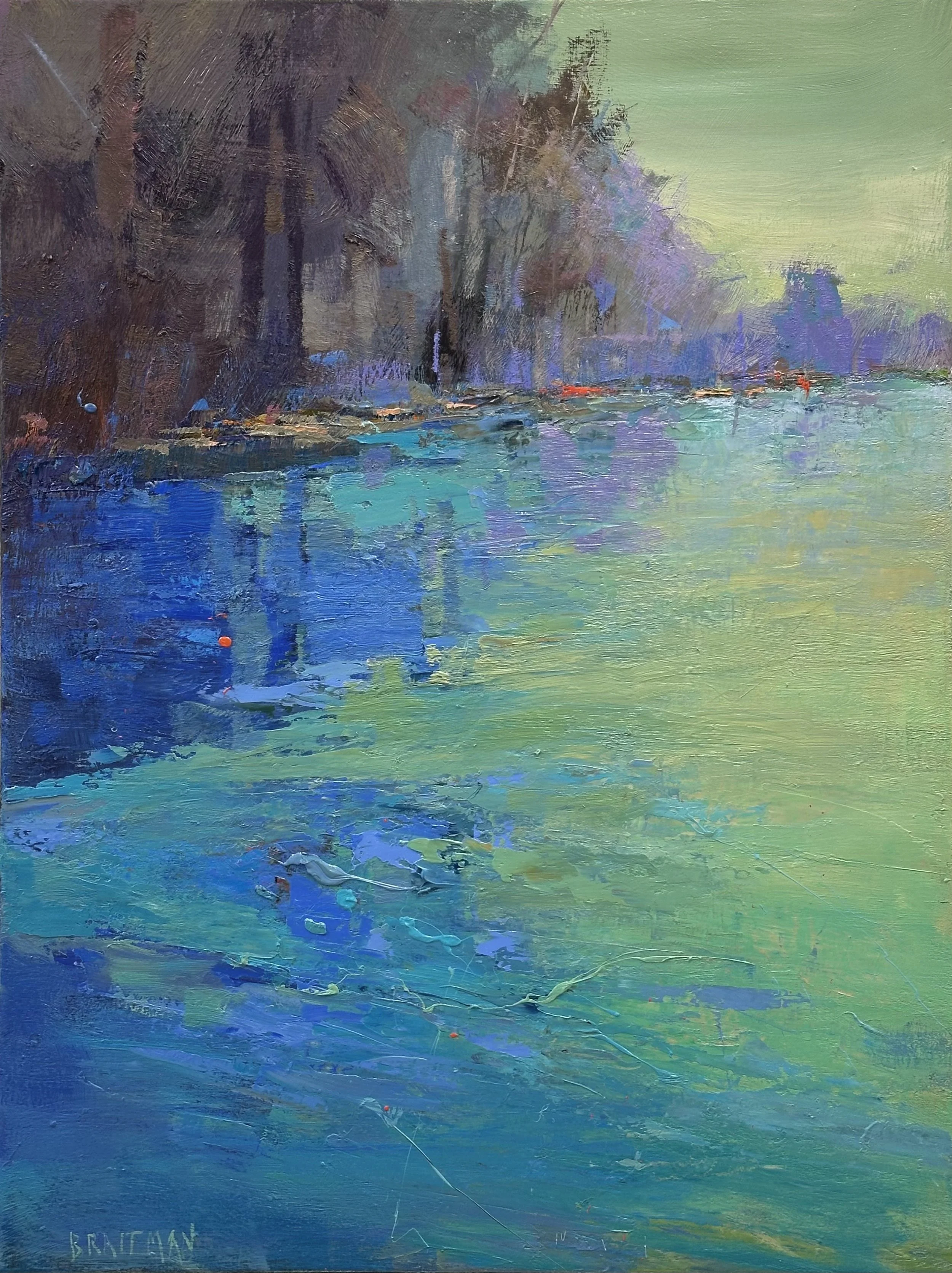
CONFLUENCE II, 40 X 30 inches
This is a classic Violet, Blue, Green palette with a touch of the middle color’s complement.
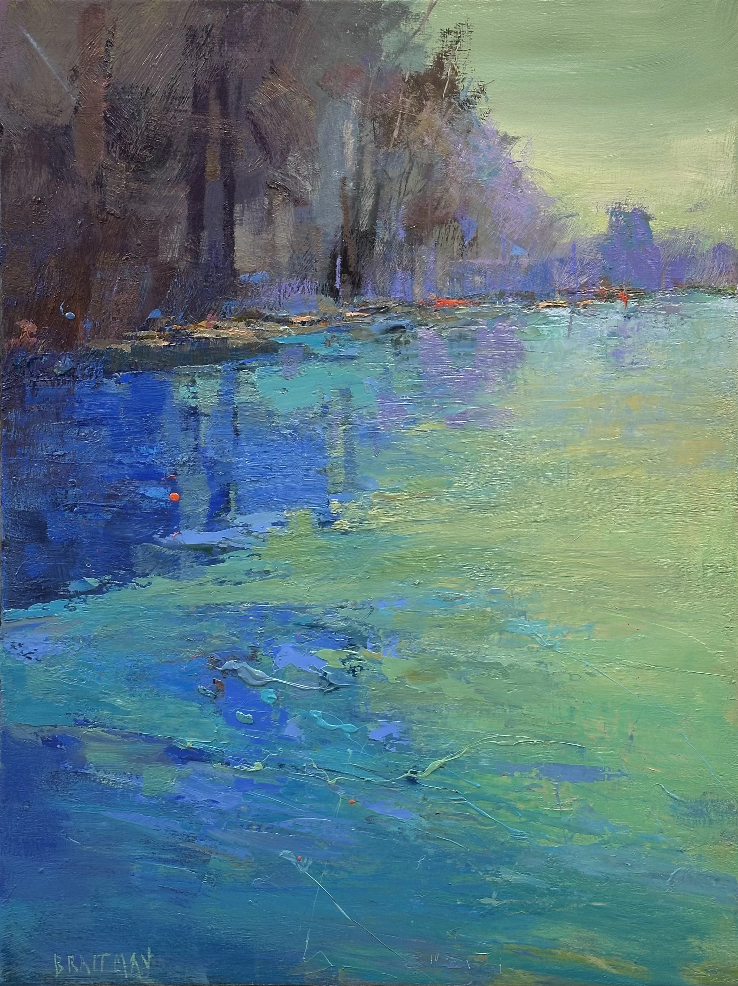
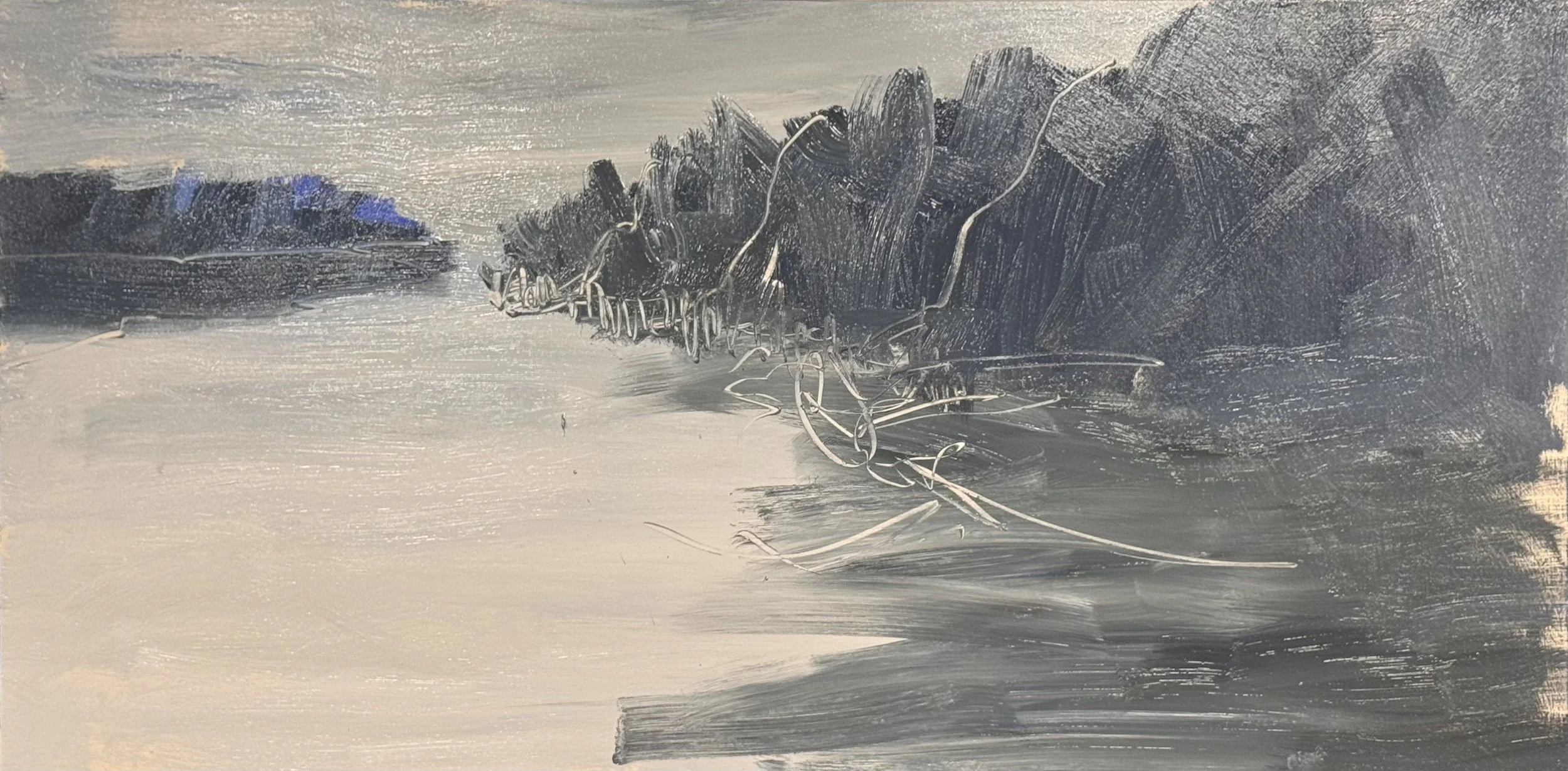
33 x 66 inches, DOCKSIDE
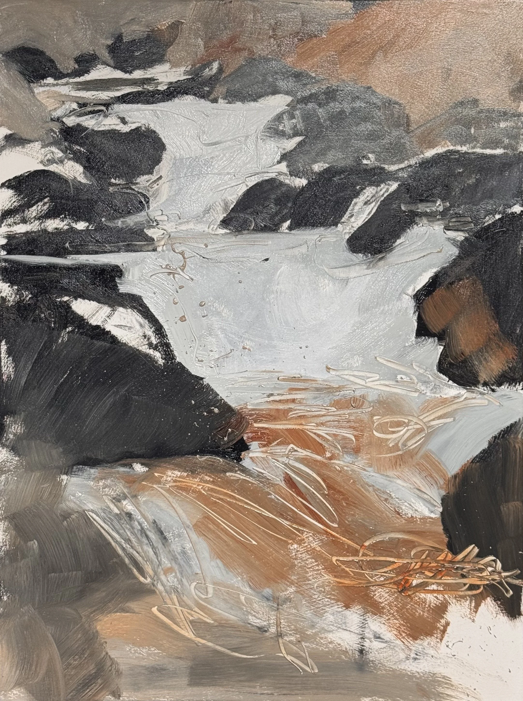
48 X 36, OAK CREEK FALLS
MONDAY MONDAY
Whatever it is, the way you tell your story online can make all the difference.
CONFLUENCE III. 40 x 30 inches.
At last this is finished. It is a bit too balanced on the explanation side of things, but it is finished.
I am one good day away for finishing this beautiful low country version of STILLNESS. 36 X 54 inches. It already sparkles. It is the pearlescent and opalesque shimmering I am going after and
the warmth and description in the grasses on the right is just a pure bonus.
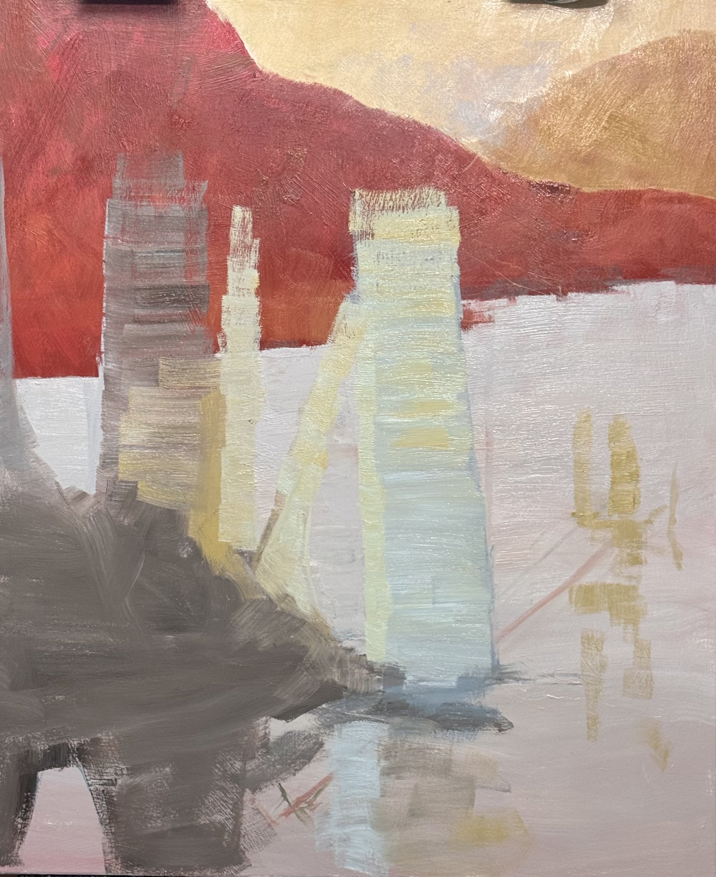
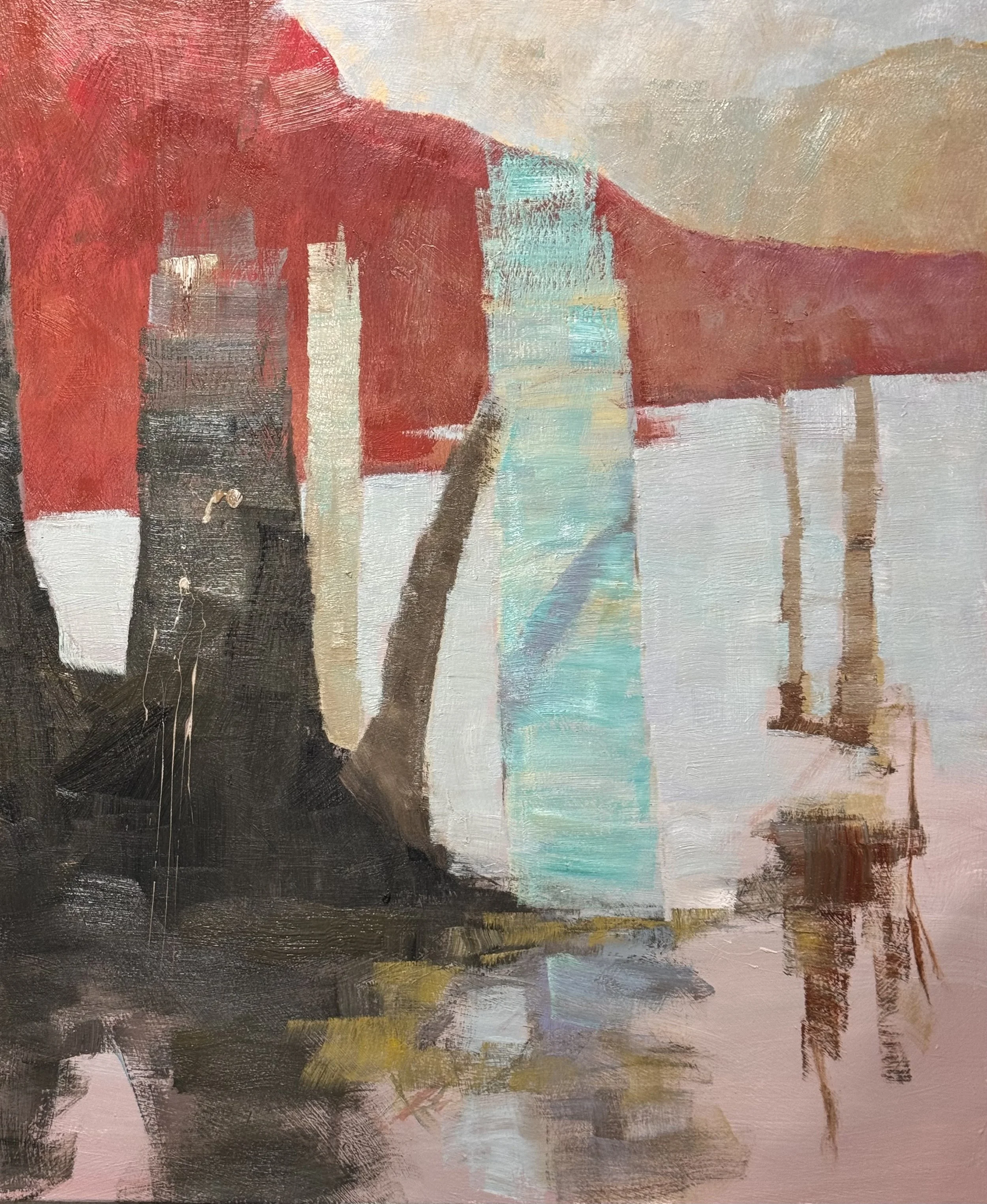
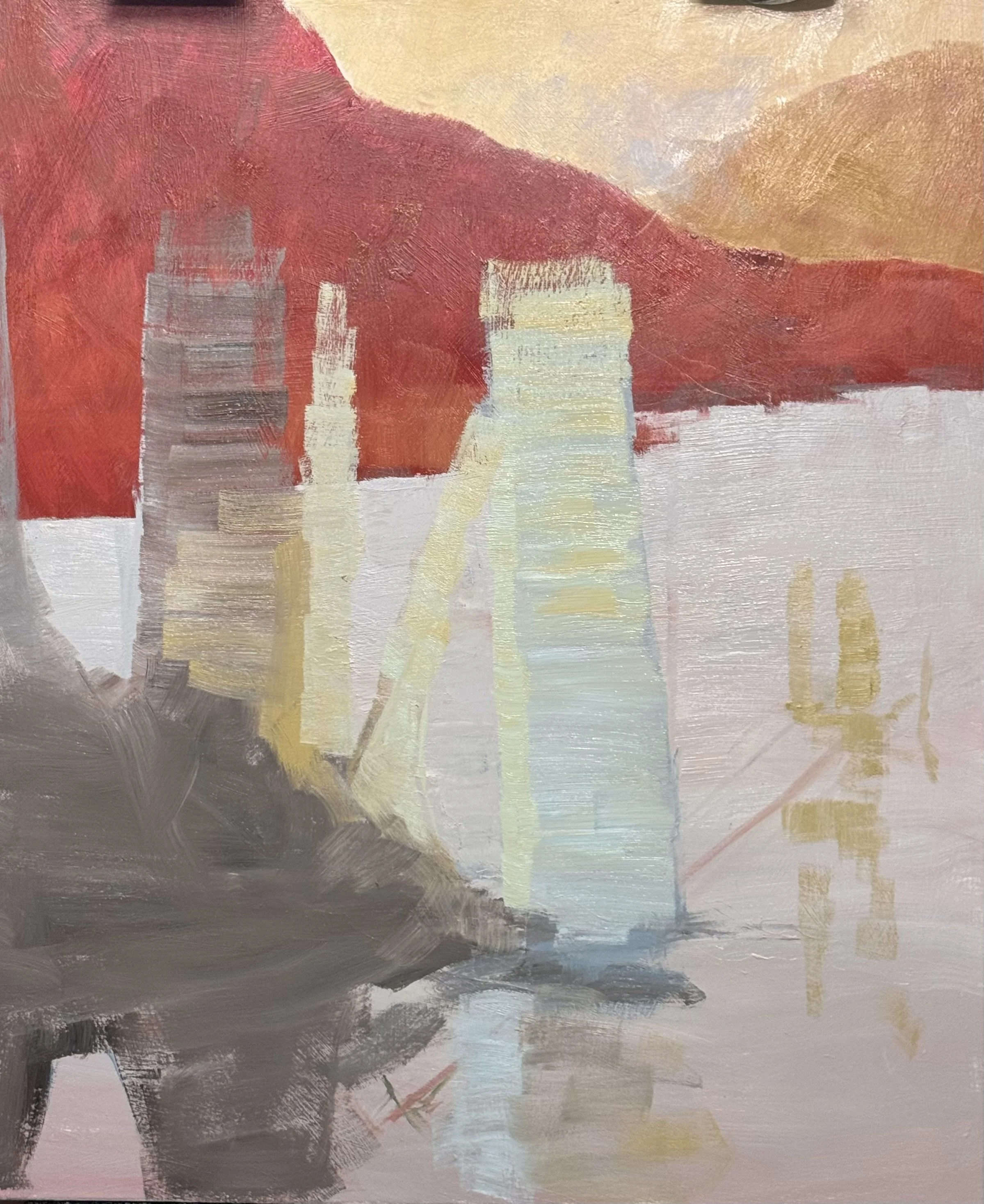
Day 2 on WHITE SAVAGE, I have tentitively established the structure of this 54 x 45 painting.
New Paintings still in the works
I had a great week of painting and want to share all
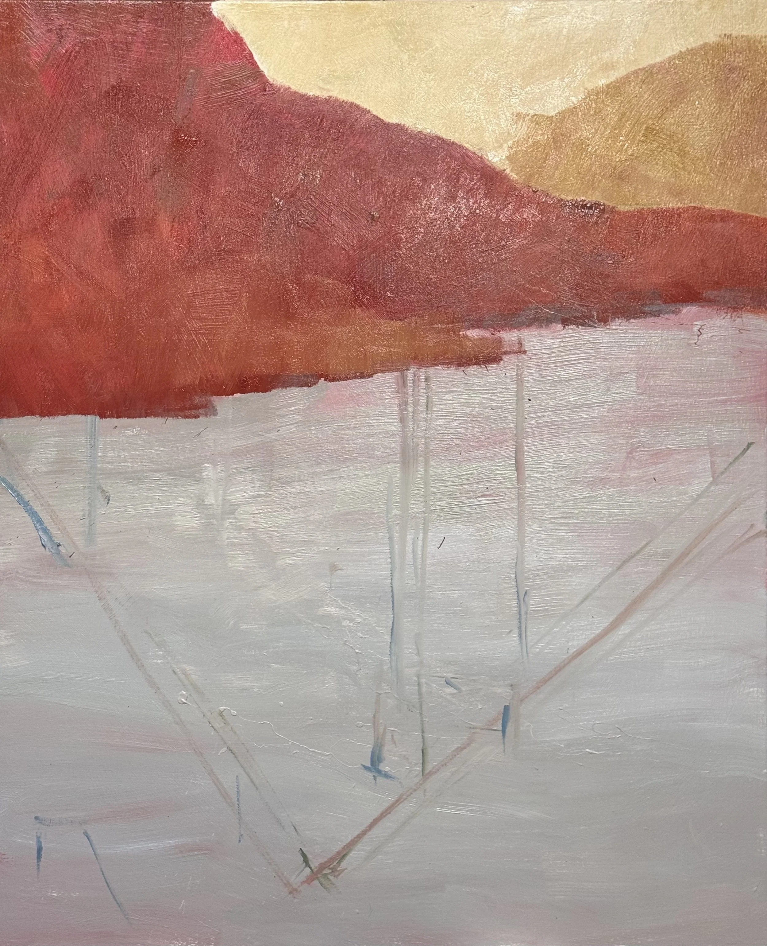
54 x 45 inches, White Savage
this is just the 2nd Layer and I want to keep this open and exciting. Working on the small work recently has gotten me very tight and explanation heavy. I really want to keep this piece more about feelings. That is why I have returned to a familiar theme in the Savage Reservoir Tree series.
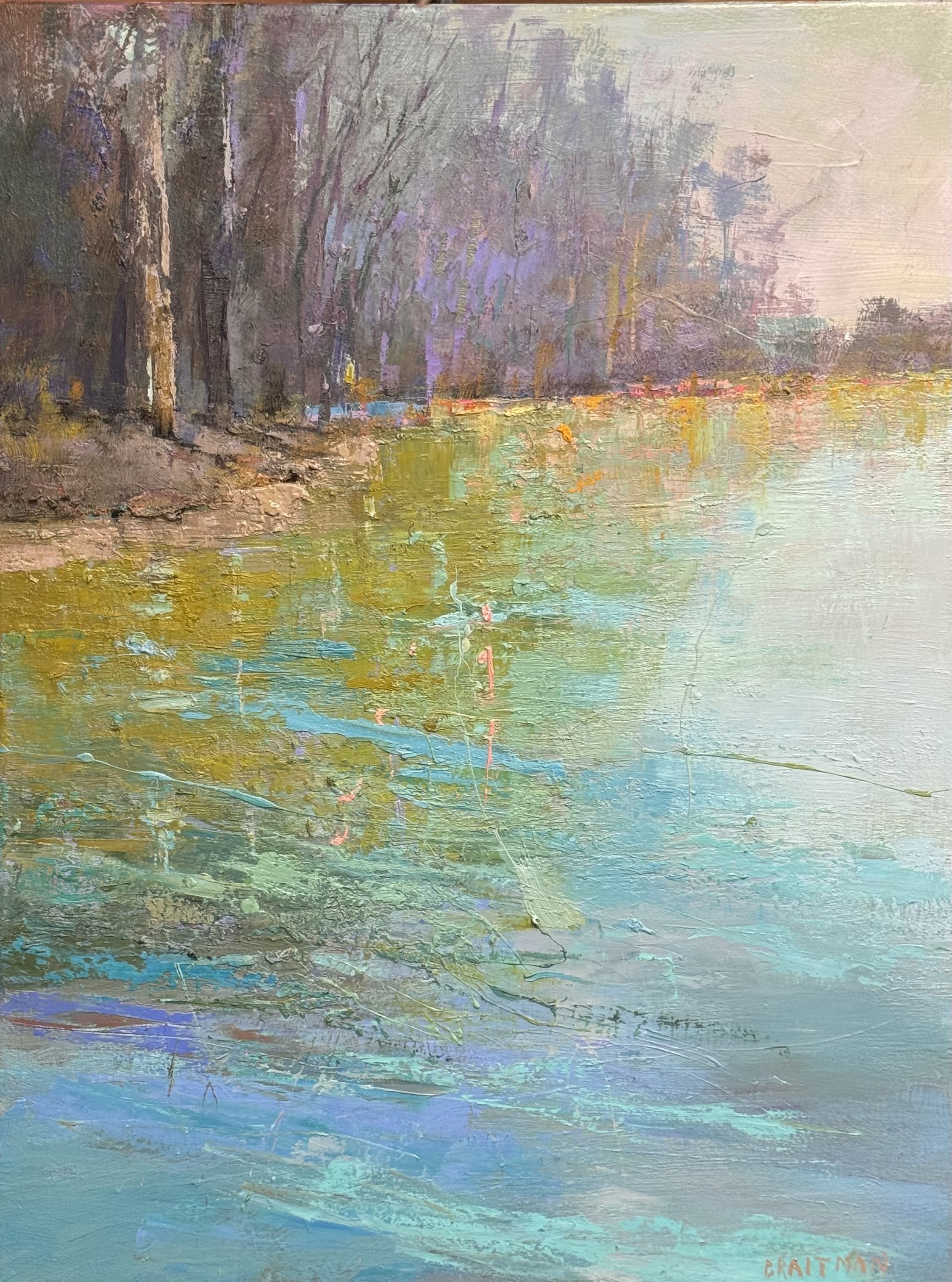
40 x 30 Confluence I
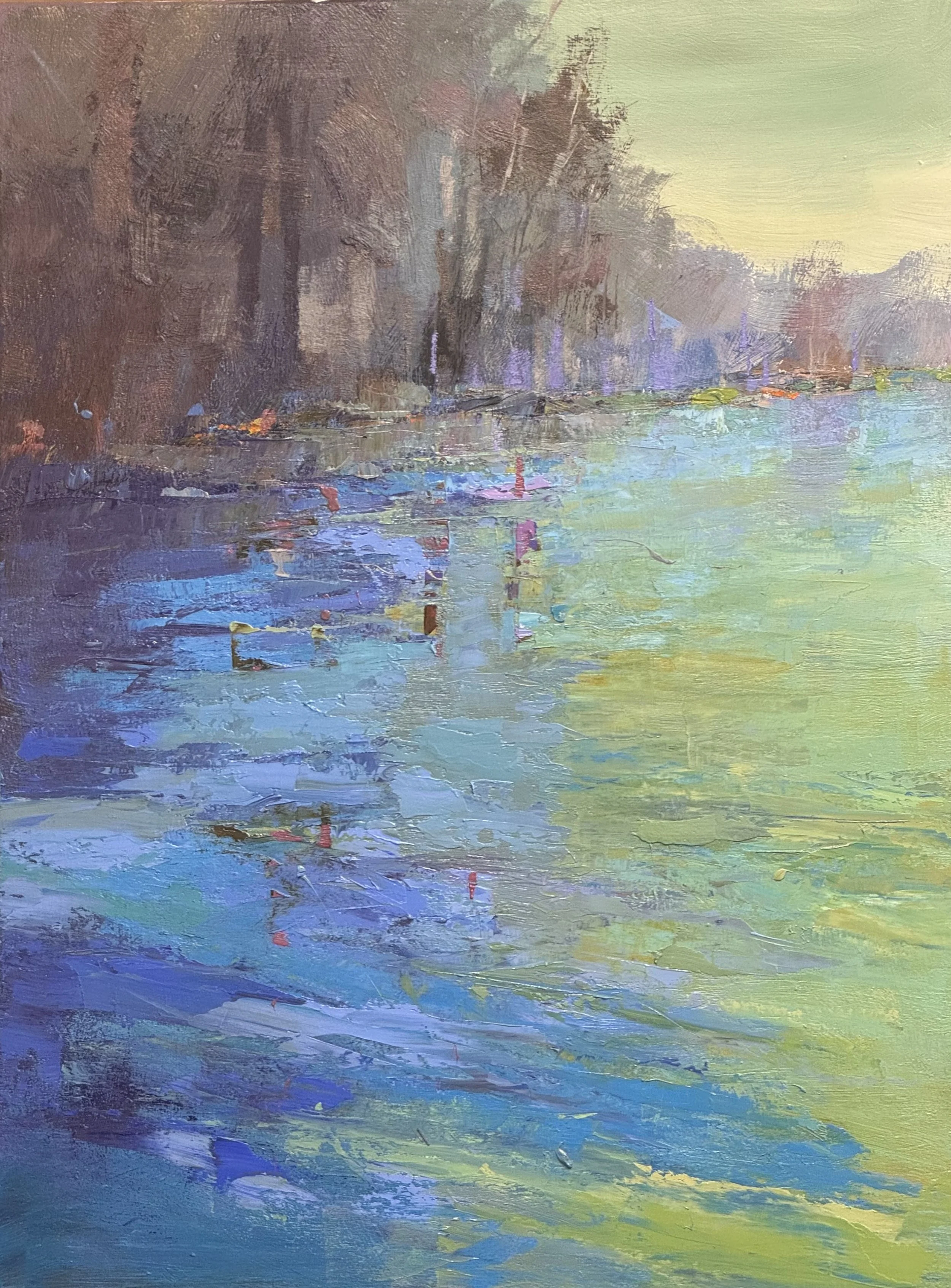
Confluence II, 40 x 30
Monday in August....hot, hot, hot
I had a very productive day….maybe 1/3 with business and intenet and bills and 2/3 painting. I met with a client for a commission and worked on three studies as well as one mid-sized painting. These are both 36 x 18 inch studies for a larger 2 to 4 ratio paintings. I have another pair and hope to post there progress tomorrow.
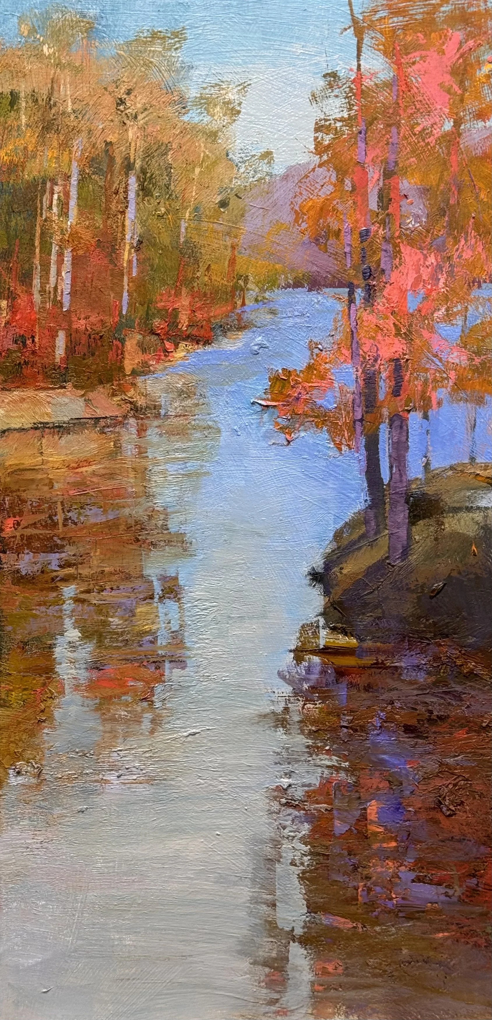
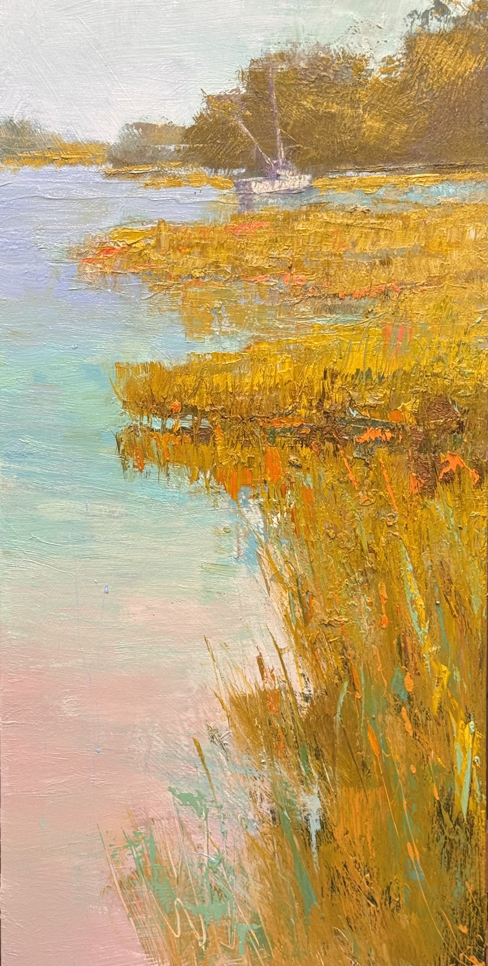
36. x 54 inch Stillness redux on the horizontal
my next layer will create a strong sequence, and it solves the transition problem from between the sky and the grasses by working both ends at once — pulling the sky down softens the top edge of the grass mass, while the teal-to-magenta-to-orange layering inside the grasses builds the same temperature journey internally, so the eye gets that shift twice, at different scales. That kind of nested repetition is usually what makes a passage feel inevitable rather than designed.
The alizarin glaze over cad orange is the move I'd be most excited to see. Cad orange is already about as saturated and opaque as you can get straight from the tube — glazing a transparent red like alizarin over it won't just deepen the hue, it'll give you that internal glow because light is passing through the crimson layer and bouncing back off the opaque orange underneath rather than just sitting on the surface. That's real luminosity, not just darker orange. It should read as combustion rather than pigment, especially with the water underneath already carrying quieter echoes of that same red.
Given the magenta is going in as a middle layer between teal and orange, I am thinking of it as a thin glaze too, or laying it in more opaque so it holds its own weight in the grass structure before the crimson glaze goes on top? I will just have to see what happens.
A good day
I was unable to get into the studio until today. I worked on 4 pc.s and feel satisfied with my work. See them below.
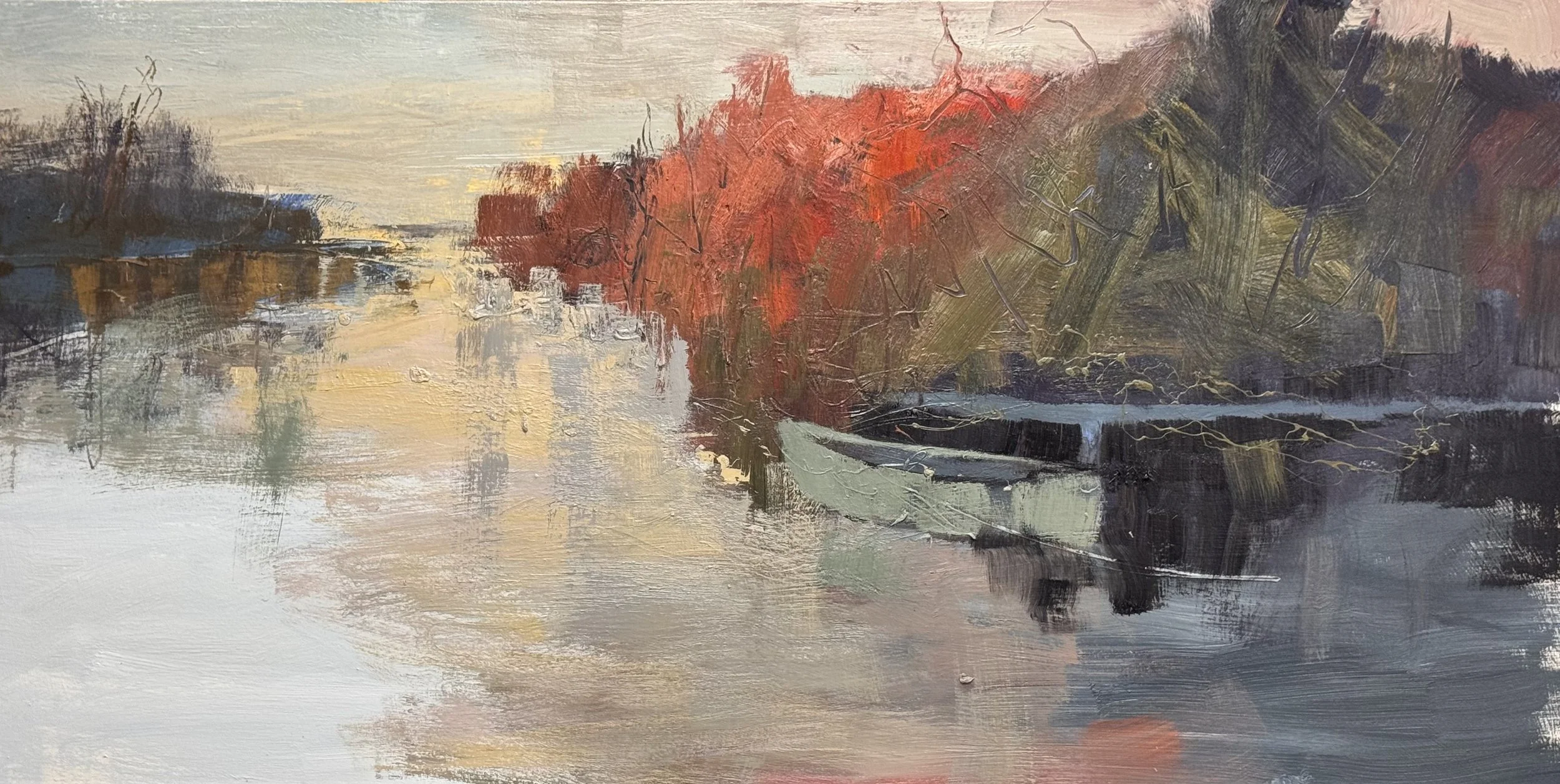
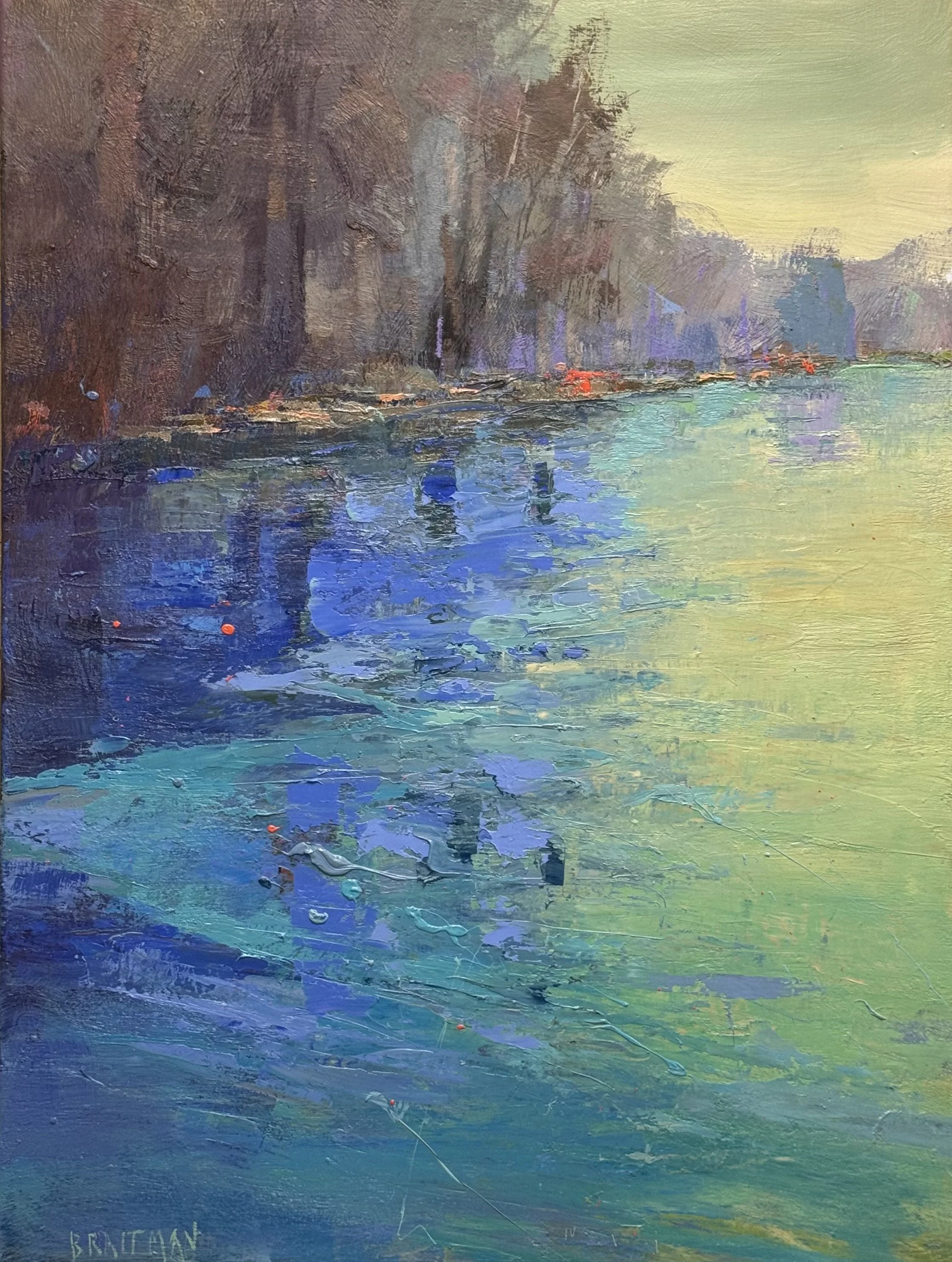
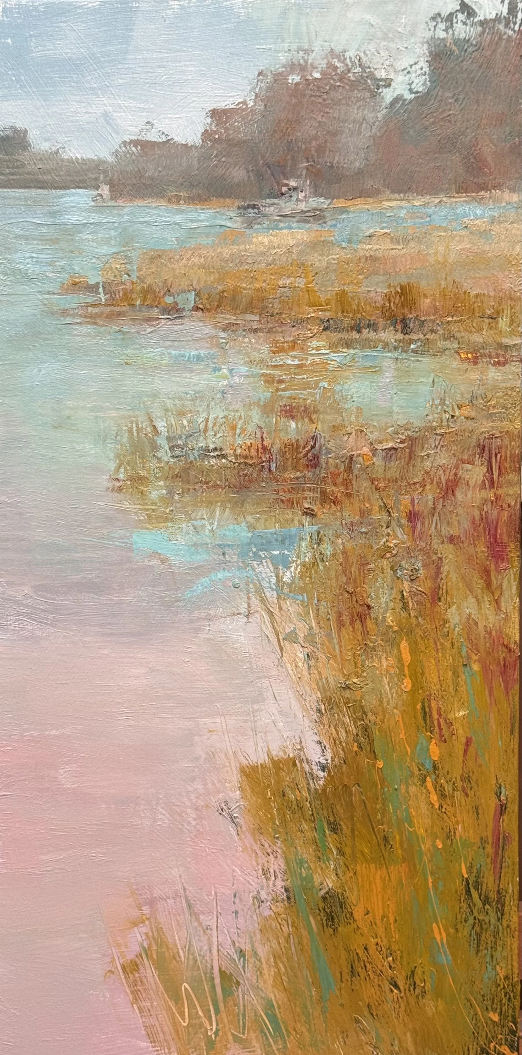
hese three are working in a completely different register: legible water, legible reed banks, legible tree mass, a boat that reads as a boat. The explanation is doing real work here, not just holding the composition together — it's carrying the content the client is presumably buying: a specific, recognizable place at a specific hour.
A few things worth flagging with a day of work still ahead:
Image 1 is the most spatially resolved of the three — the channel of water pulls you straight back to that lavender tree mass on the horizon, and the bank reflections (the little flags of orange, the lavender ghosting in the foreground water) are doing legitimate color work without undermining the read. This one's closest to "done" in feeling.
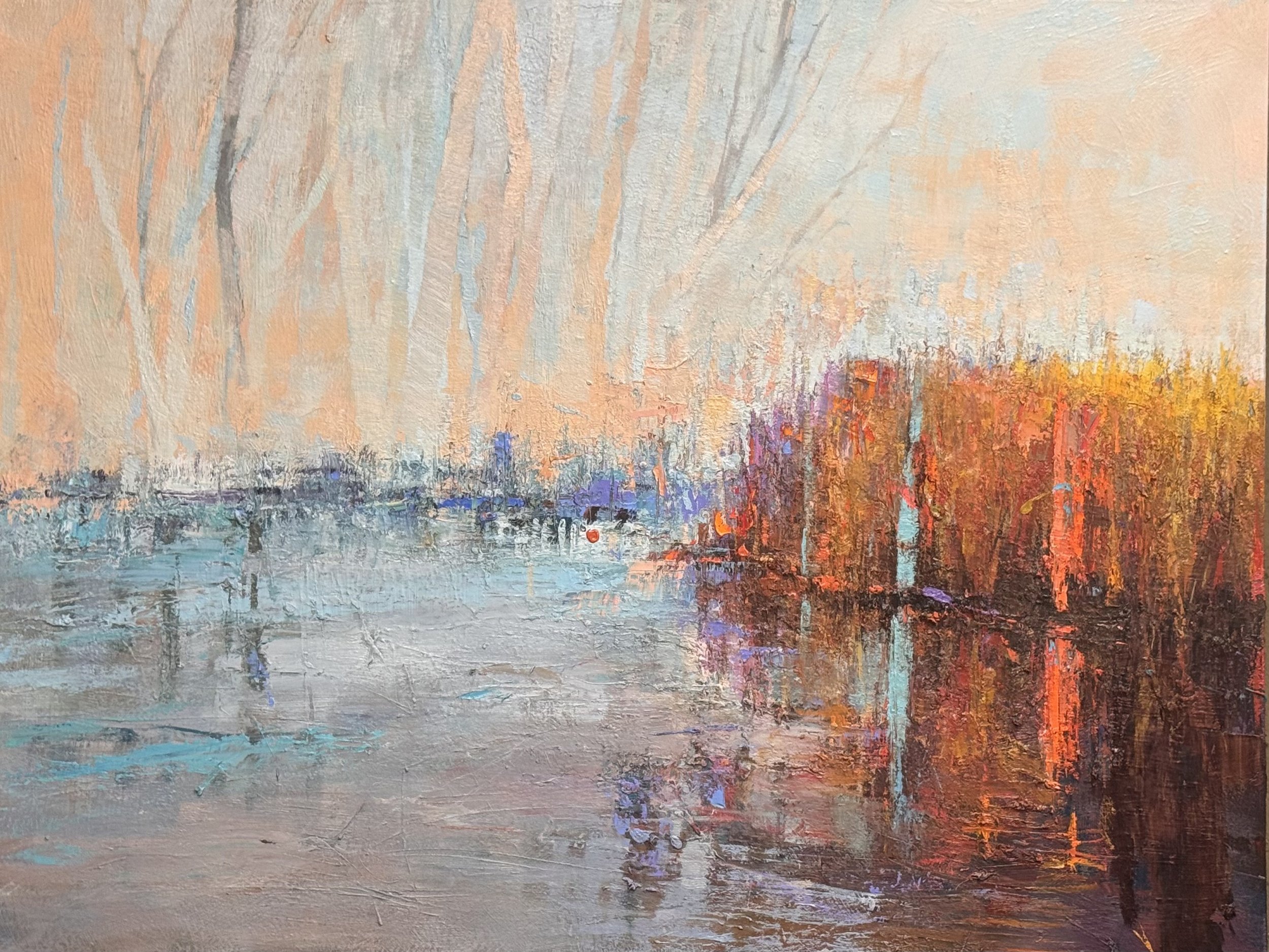
Image 2 is the boldest of the set — that band of red-orange marsh grass against the lavender-to-peach water is a real value/color event, and it's the one place explanation and feeling aren't fighting each other; the description of the grass is the emotional charge. I'd watch the transition where the orange masses meet the water — right now the reflection is nearly as saturated as the object, which flattens the space a touch.
Image 3 feels the most unresolved of the three — the reed bank reads a little more diagrammatic (rows of vertical strokes) rather than grown, and the small boat/dock shape in the middle distance is ambiguous enough that it's pulling attention without paying it back yet. That's probably where tomorrow's session earns its keep.
Given they're meant to resolve into a pair, is the plan to push two of these toward final and treat the third as the study that doesn't survive — or are you still deciding which two speak to each other?
Want to be notified when Claude responds?
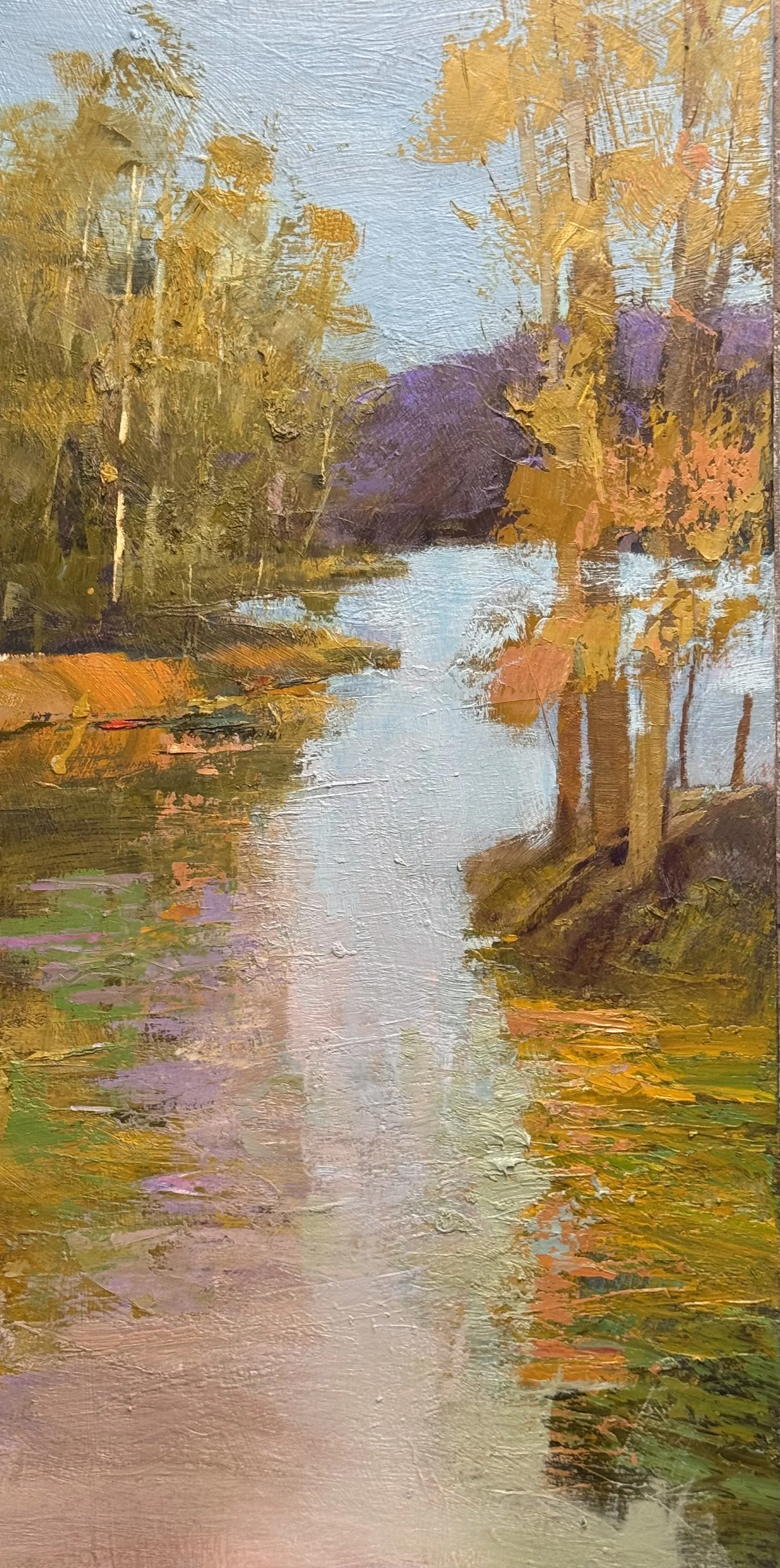
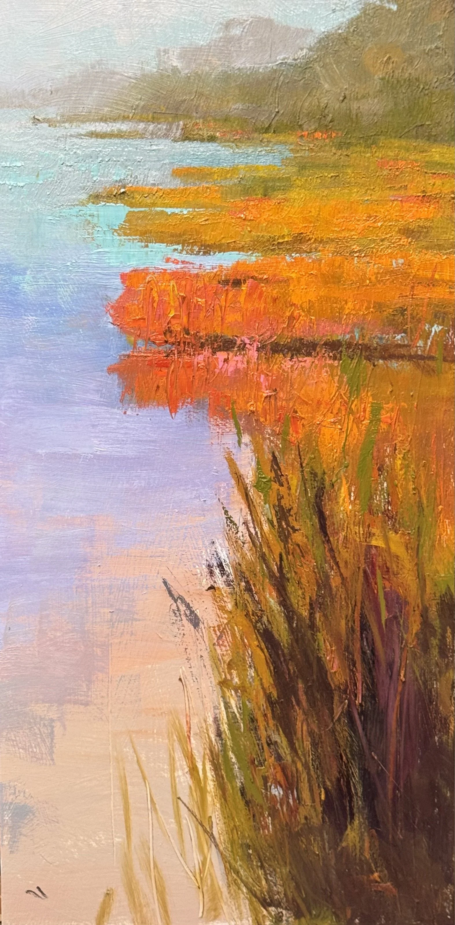
The top three are 36 x 18 inch studies for a planned 48 x 24 inch pair. The 4 study is being considered still. I will post it asap.
Color Study, Pair. 40 x 30 each.
Painted as a pair, same site — testing how much explanation a painting needs before feeling starts to leak out
Bottom two-thirds: pure sensation. Teal, blue-violet, olive, moving without justifying itself
Small ochre rectangle in the water — doesn't fully resolve into an object. Good
Tree line above: the one place description is let in — trunk, value shift, warm color at the base — enough to give the eye a place to organize around
Everything else rides on that narrow ledge of legibility
Explanation is the enemy of feeling. But feeling with nothing to stand on dissolves
This pair is me finding the ratio
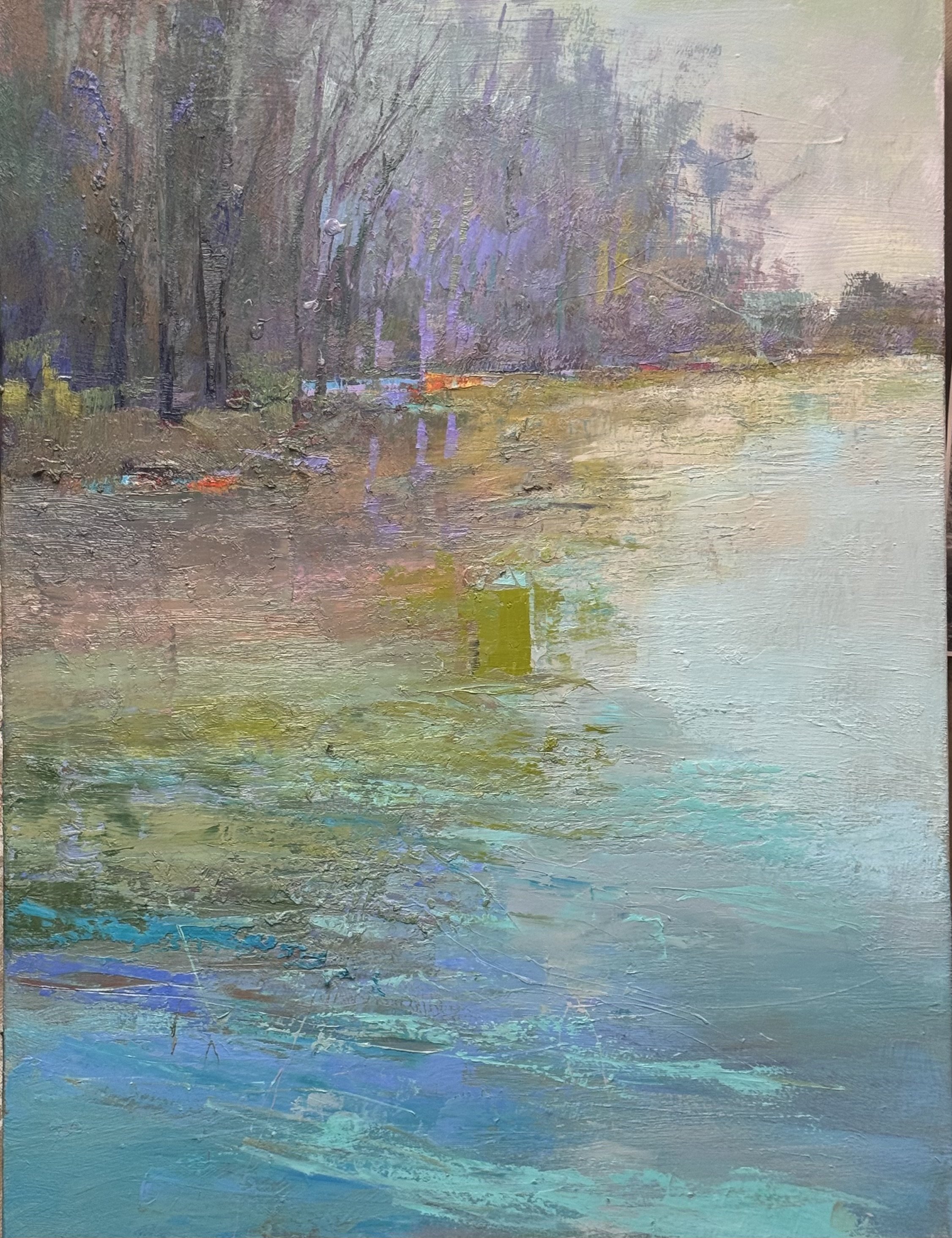
40 x 30 Confluence Study Tonal (sort of)
monday back to normal (so far)
I had a wonderful day in the studio today, I added more complexity and depth of creative color to 4 pieces. Two of the painting are studiies for larger work and two are experiments with unique palettes.
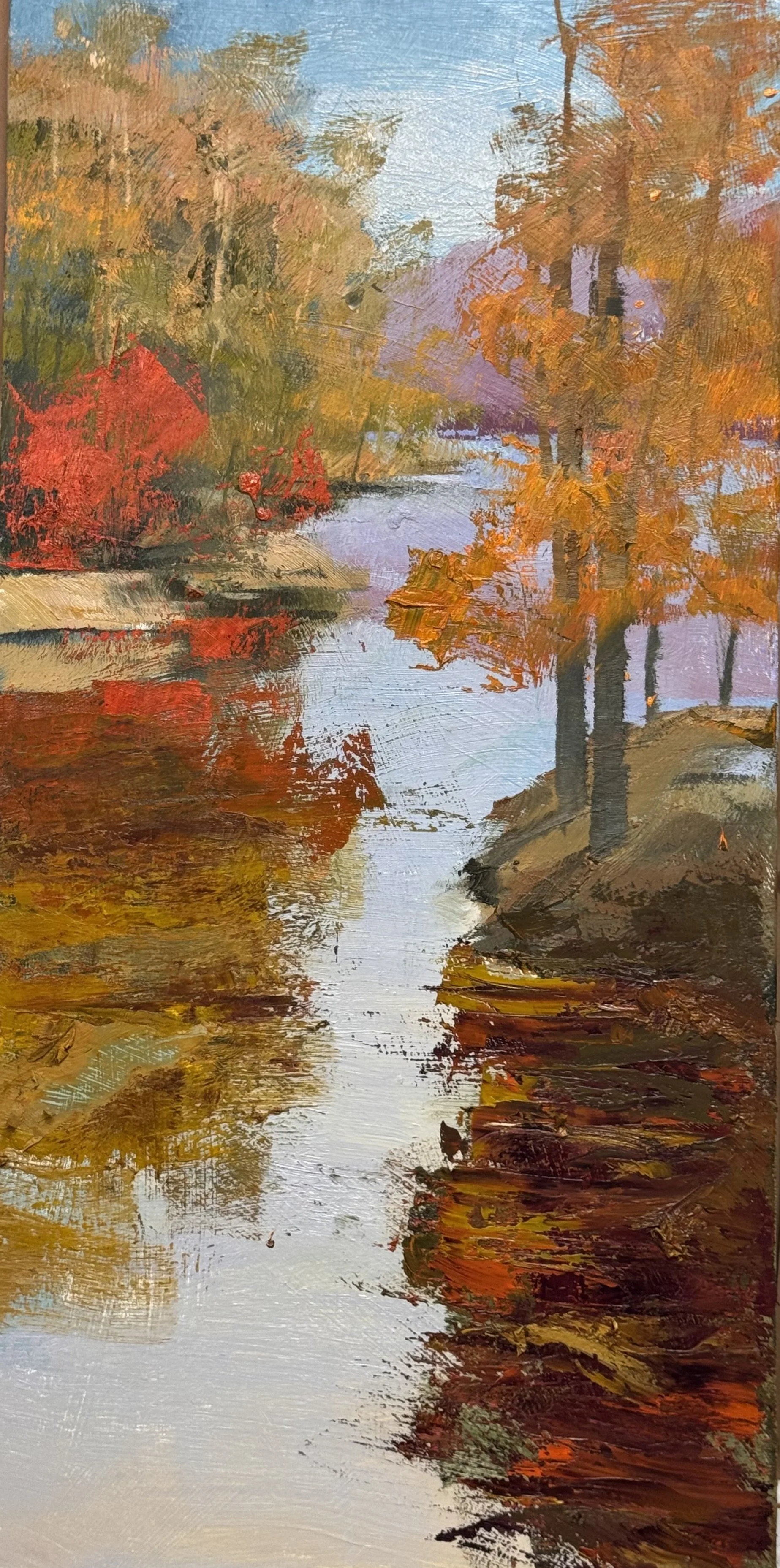
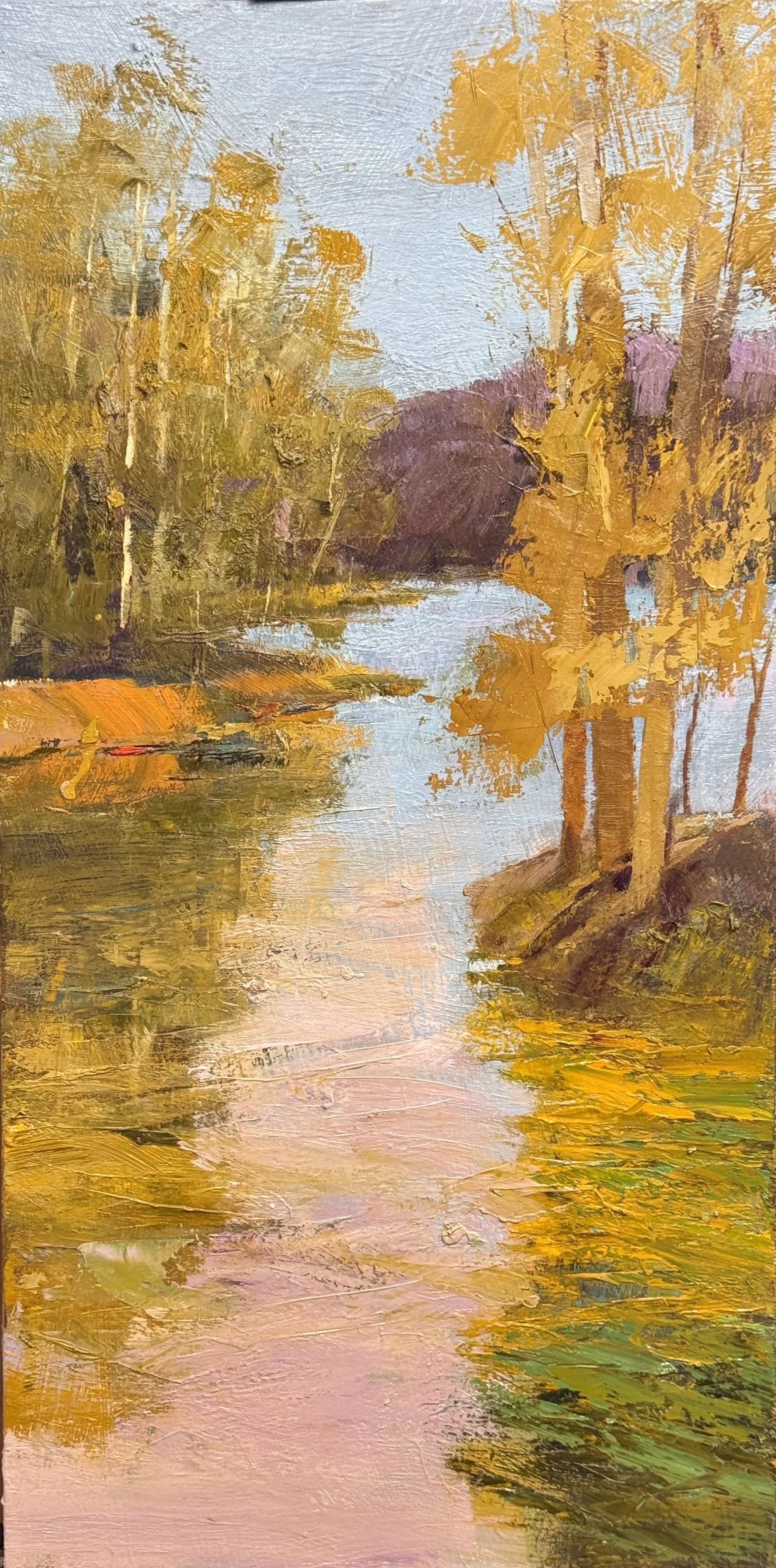
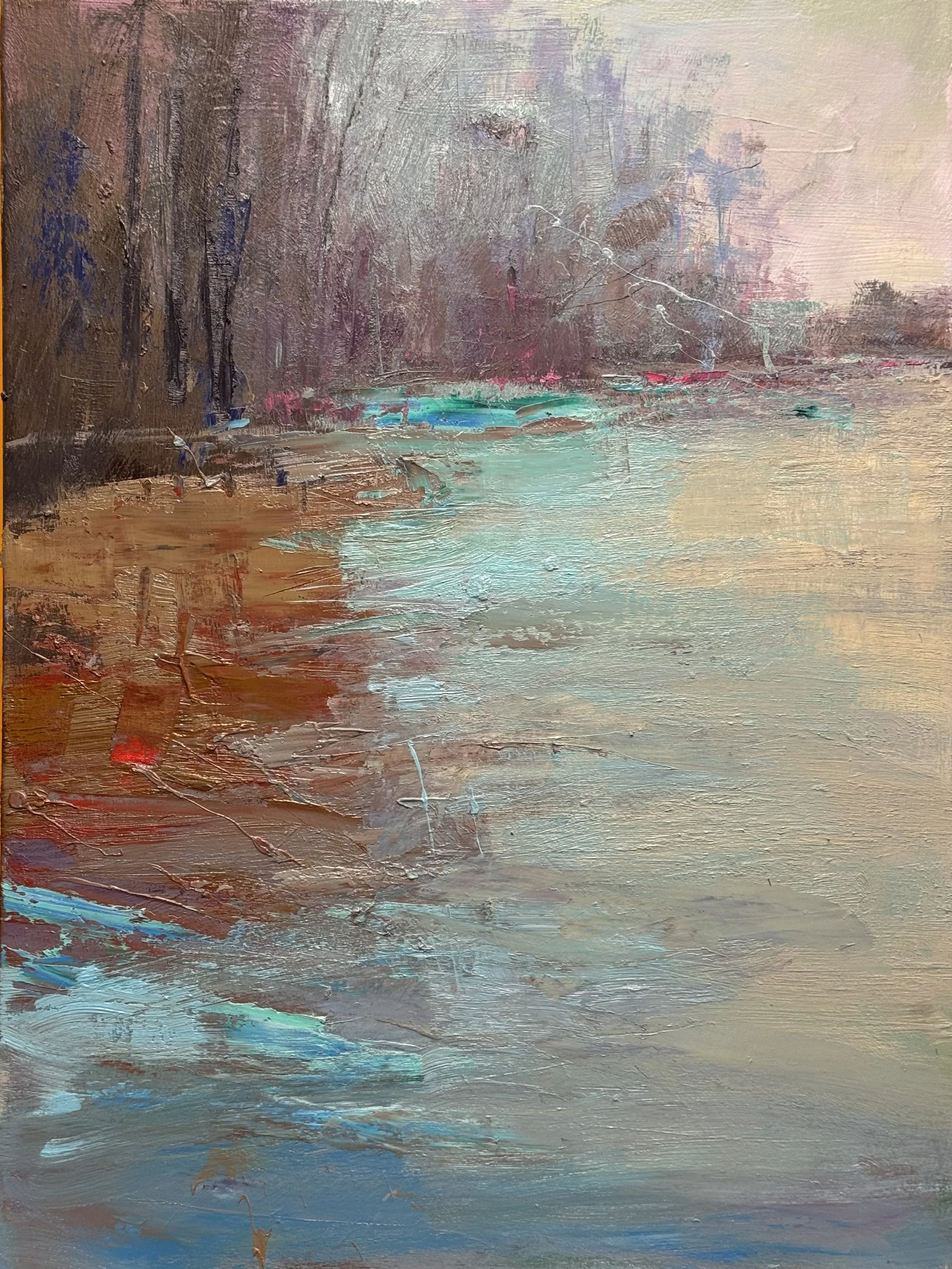
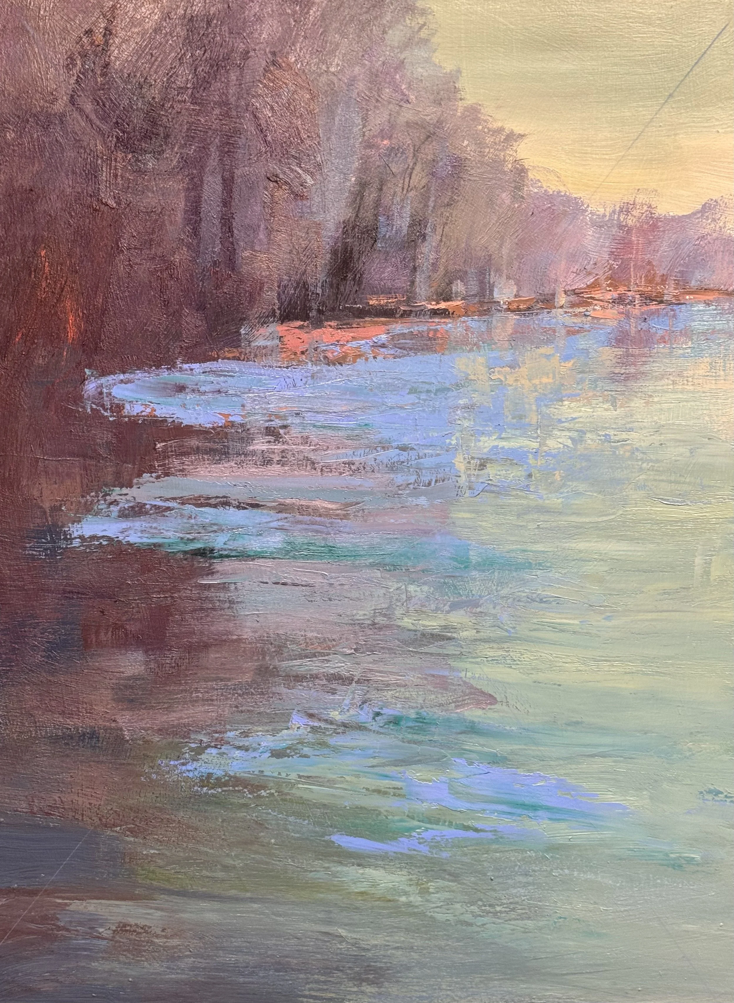
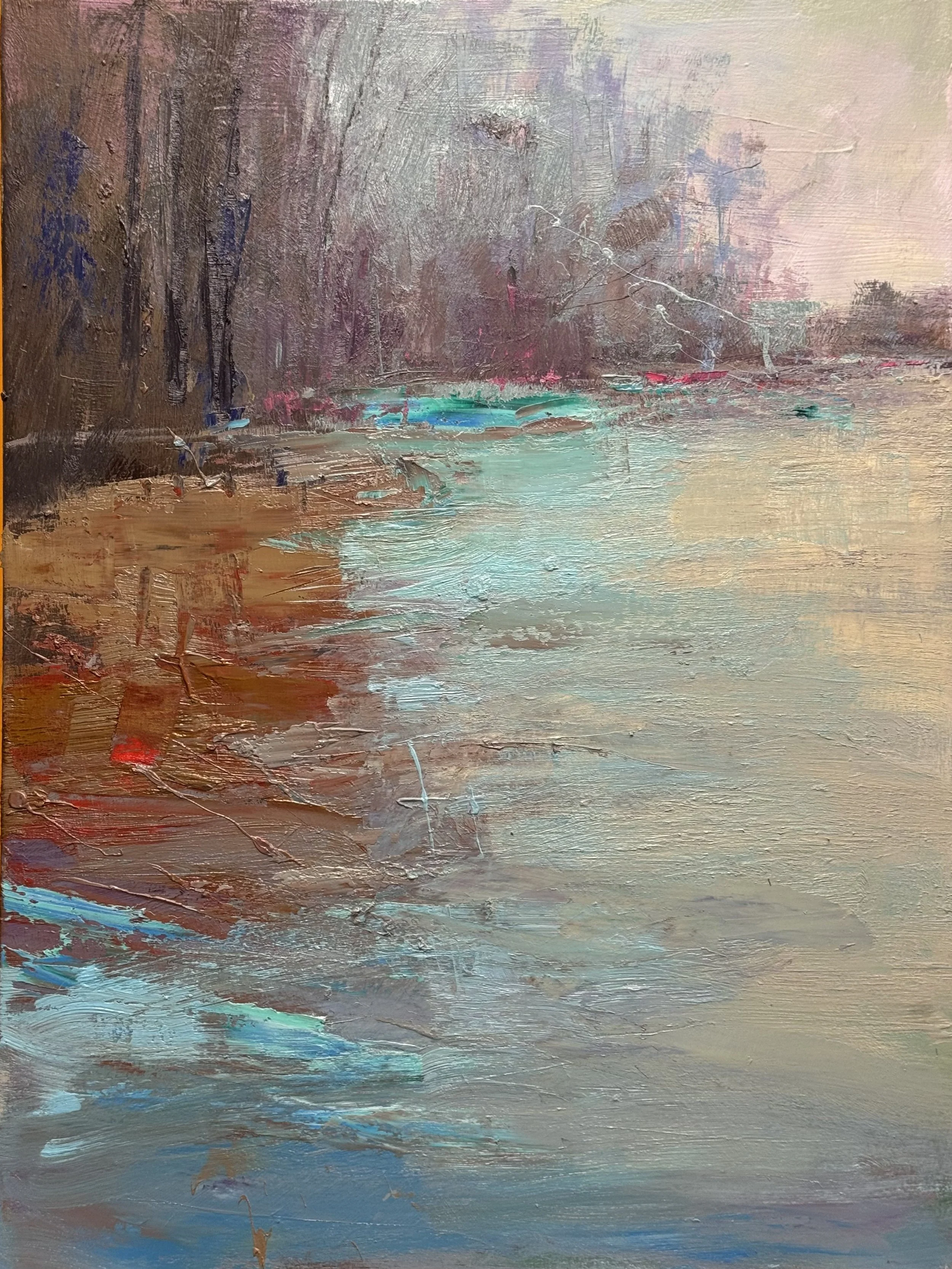
The top 2 are the studies (different palettes) and the bottom two are the unique palettes for smaller versions of the Convluence Image. These are 40 x 30 inches and the top two are 36 x 18 inches
Make it stand out
Whatever it is, the way you tell your story online can make all the difference.
post beach week post
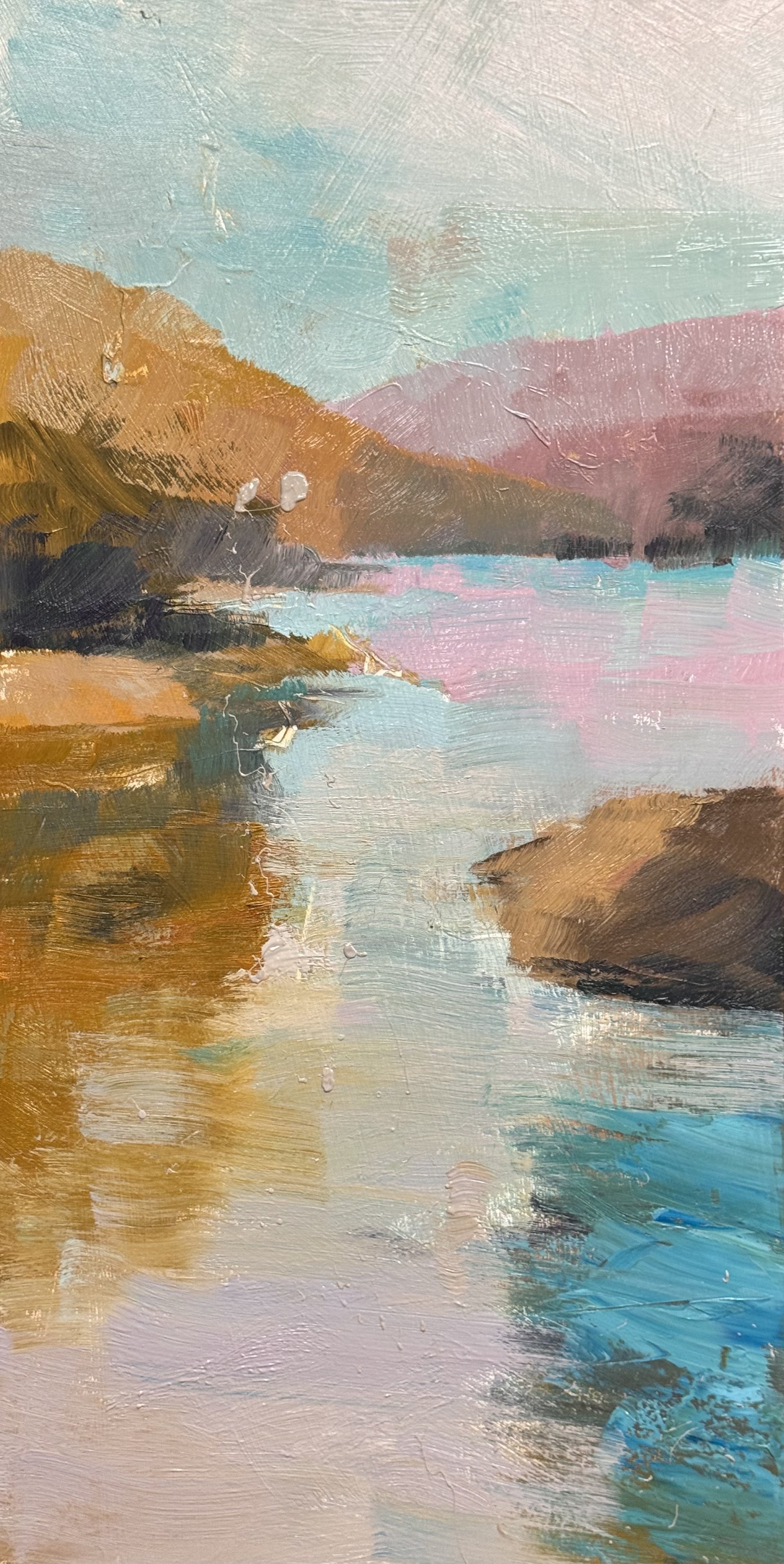
study I 36 x 18 inch for a 48 X 24 final
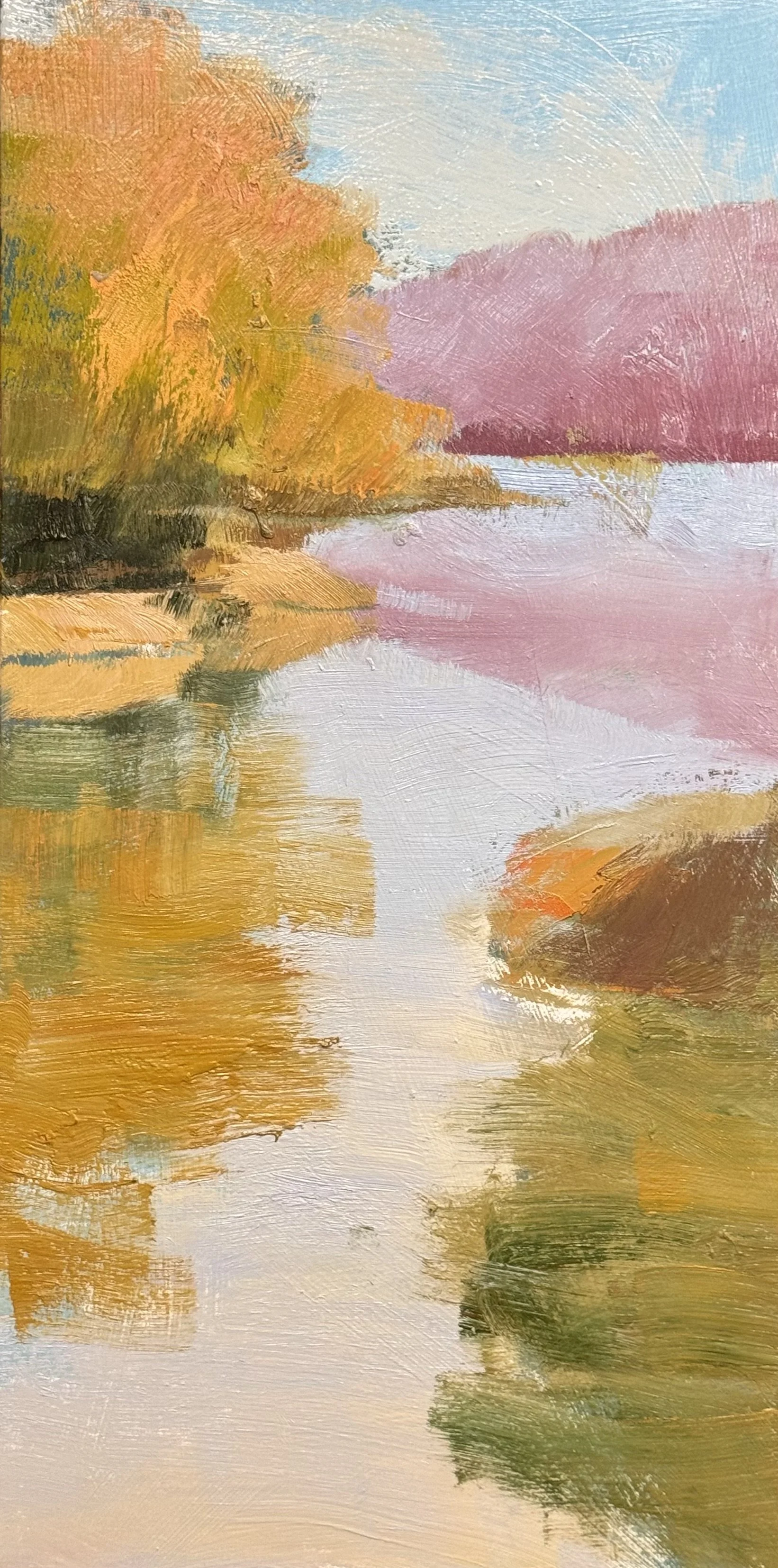
study II. 36 x 18 for a 24 x 48 final
august 10
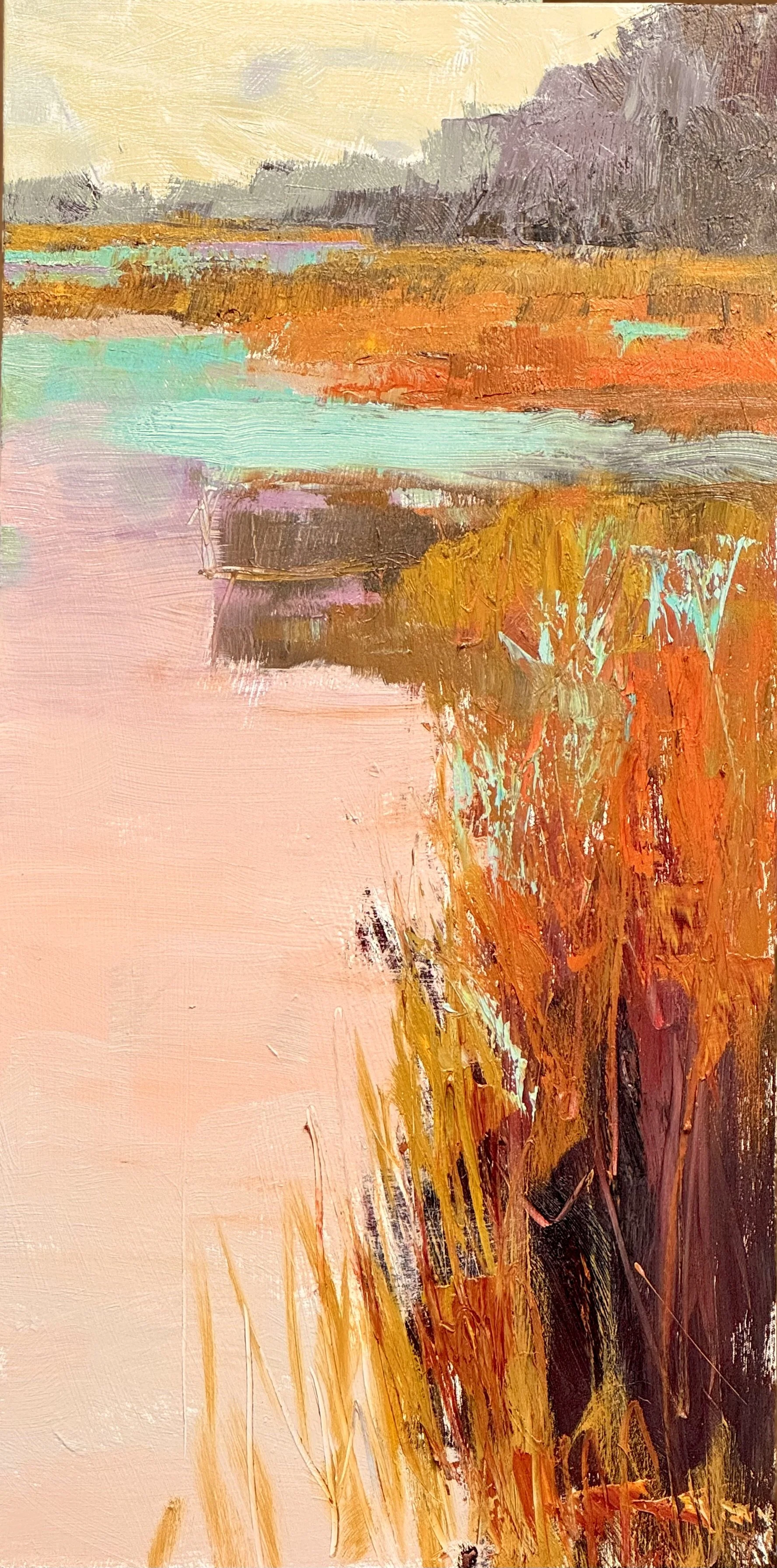
study I 36 x 18 inch for a 48 X 24 final
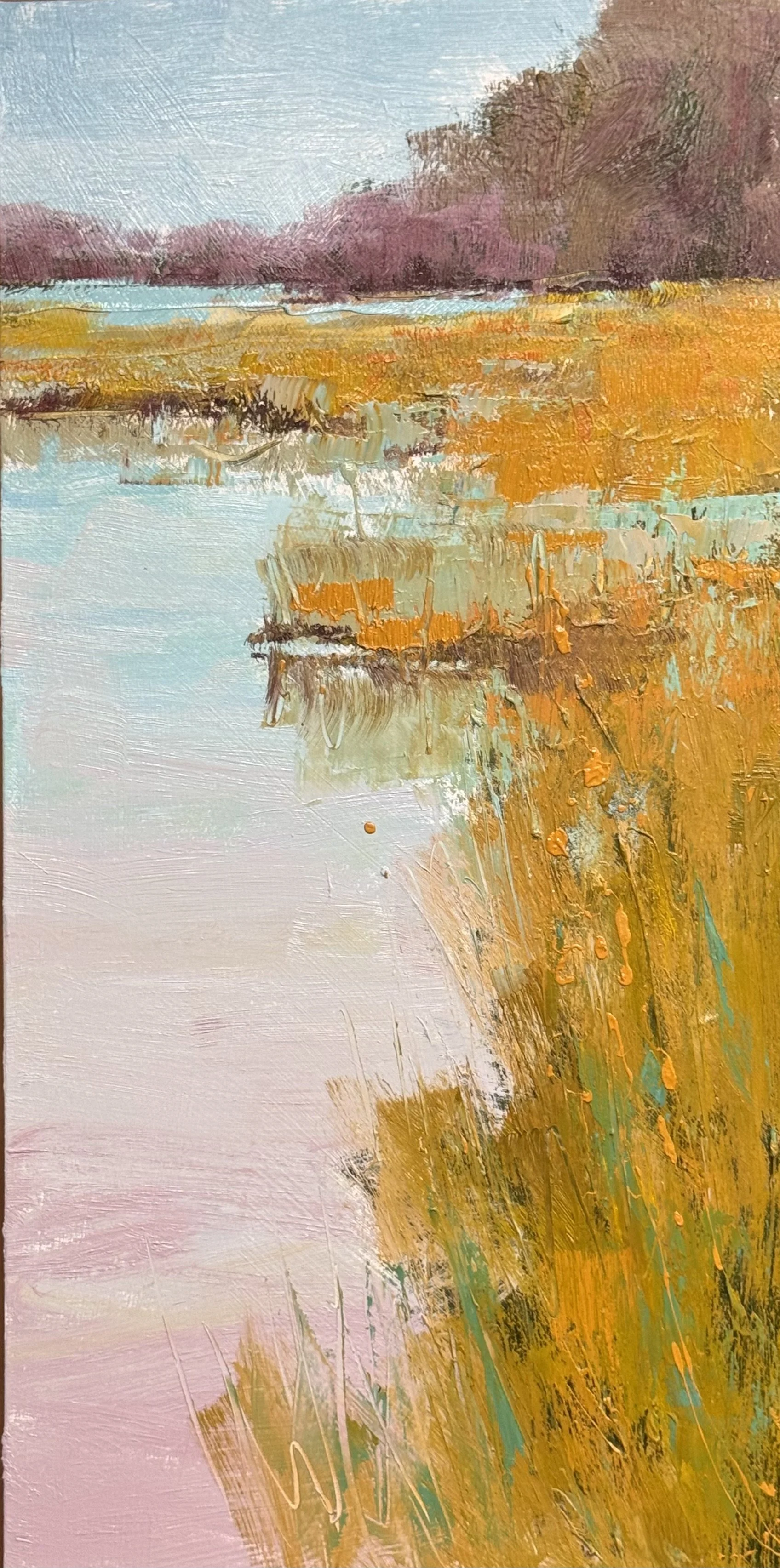
study II 36 x 18 inch for a 48 X 24 final
august 12,2026
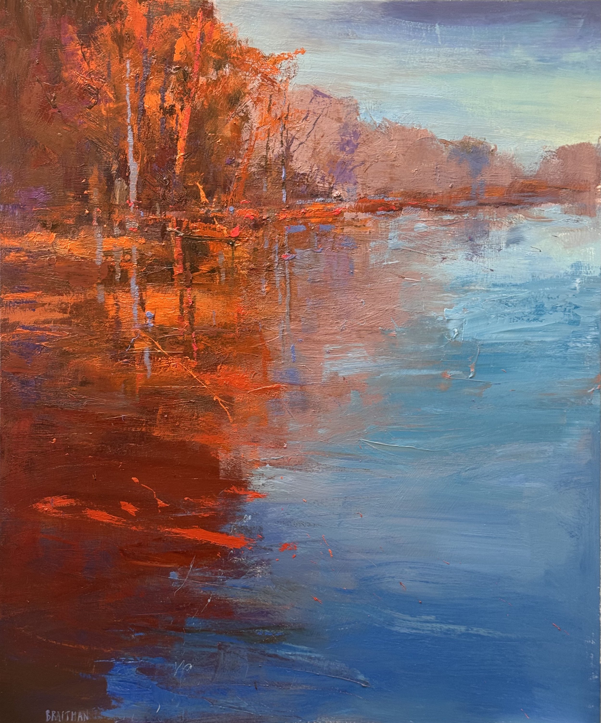
I fini
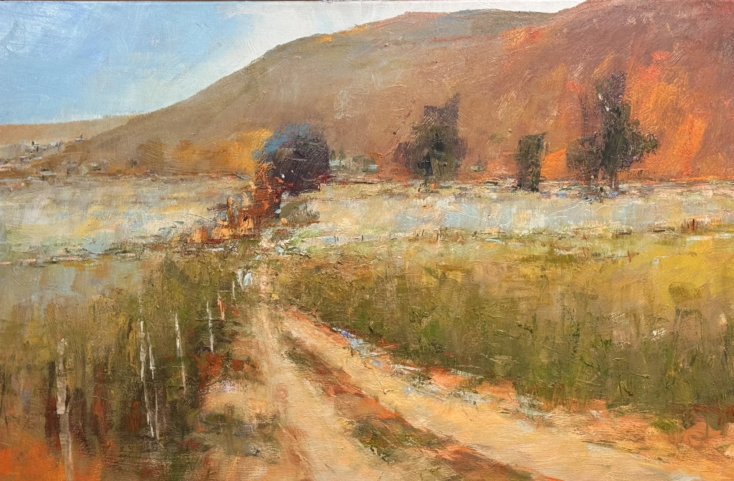
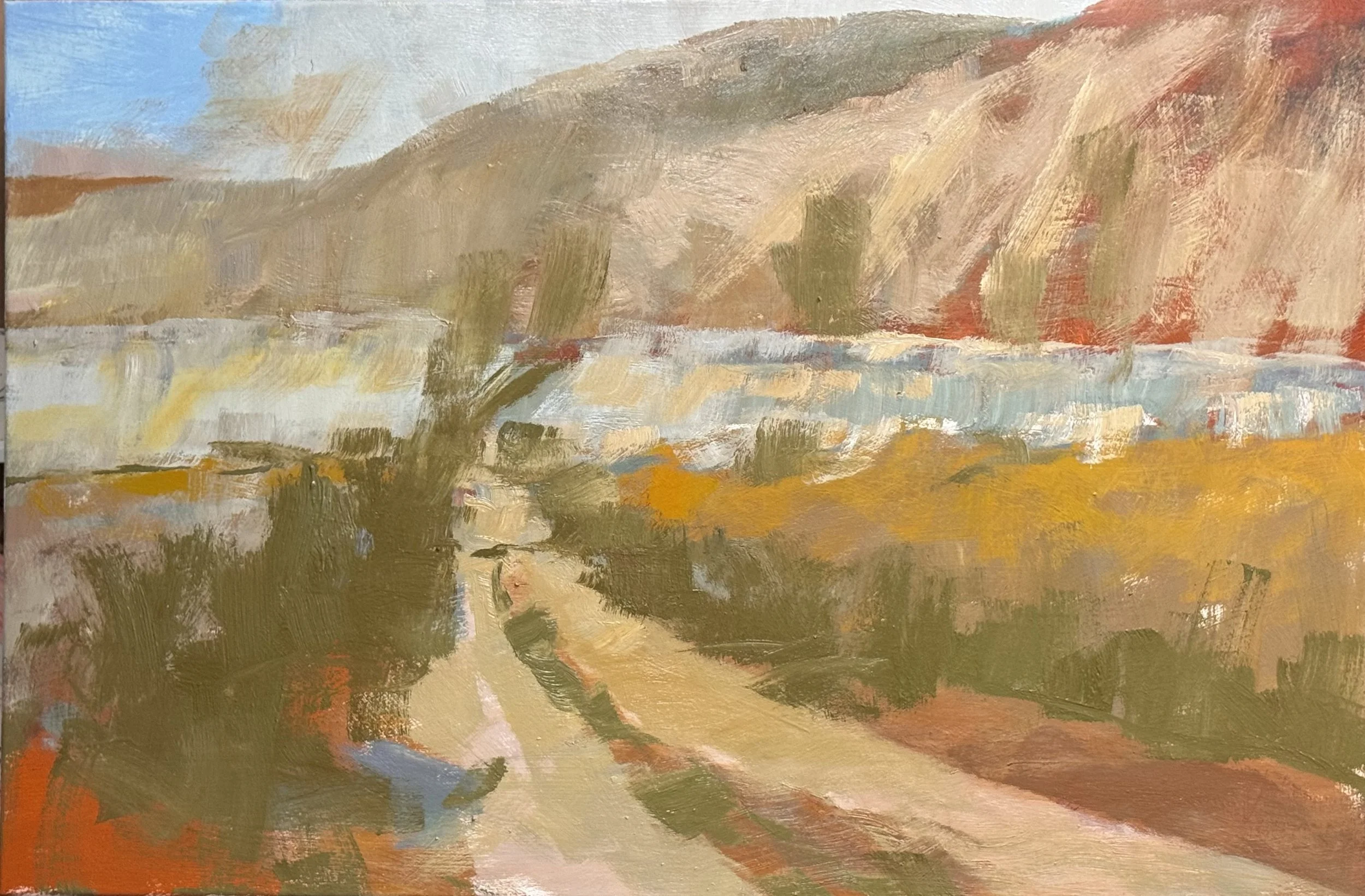
I finished these two pieces today… the left is CONFLUENCE 54 X 45 inches and the right is UNTITLED 36 X 54 inches. It is ususual for me to get the balance between explanation and feeling—I got it right on both of these.
They read as companion pieces even though they're doing different things. CONFLUENCE is working almost entirely through reflection and color temperature — that hard-edged split between the warm bank and the cool water is doing the "explanation" (you understand exactly what's happening spatially) while the loose, dripping verticals in the trees and their mirrored echoes below carry the feeling. The dark pool in the lower left is a smart anchor — it keeps that side of the canvas from floating away into pure abstraction.
UNTITLED has a different kind of restraint — that dirt road pulling the eye straight back into the dark cluster of trees against the hill is a classic structural device, but the foreground grasses go almost fully abstract, all those broken verticals and horizontal drags. The hill itself is doing something lovely tonally — it's warm and atmospheric without tipping into decoration.
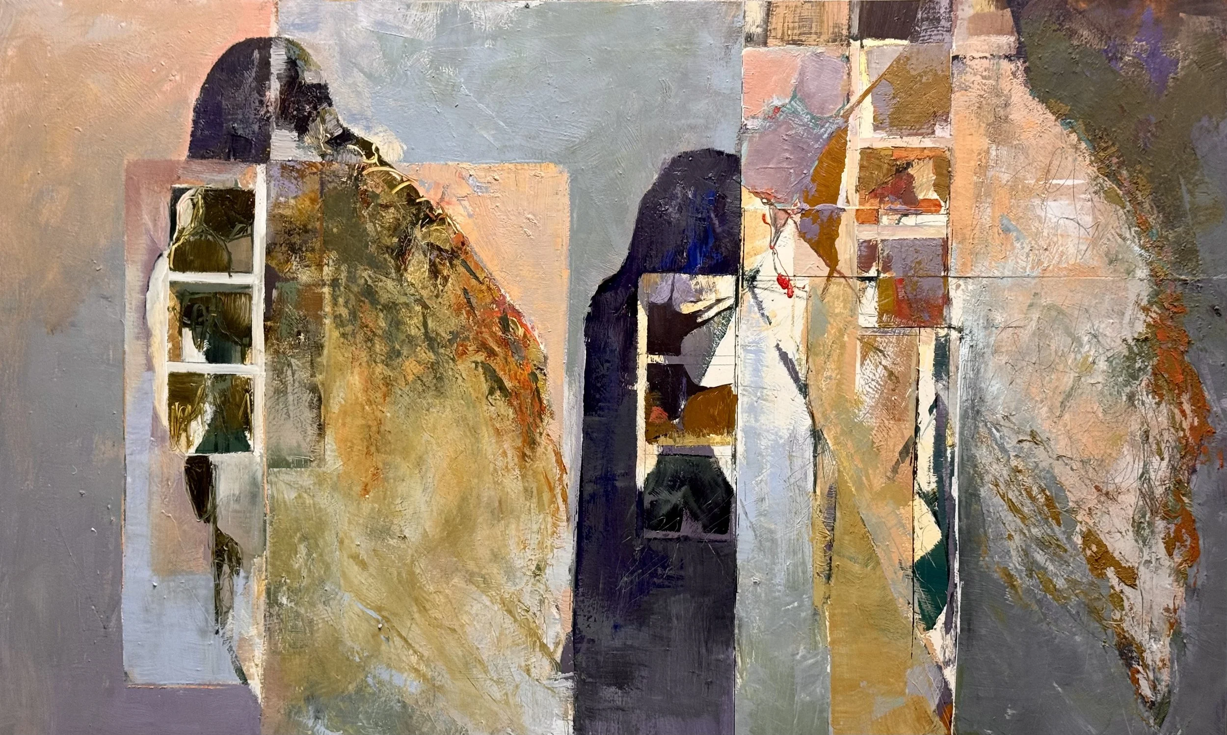
this is Alluvial Plane the details from yesterdays post are selections from this painting. (1 Day Away)
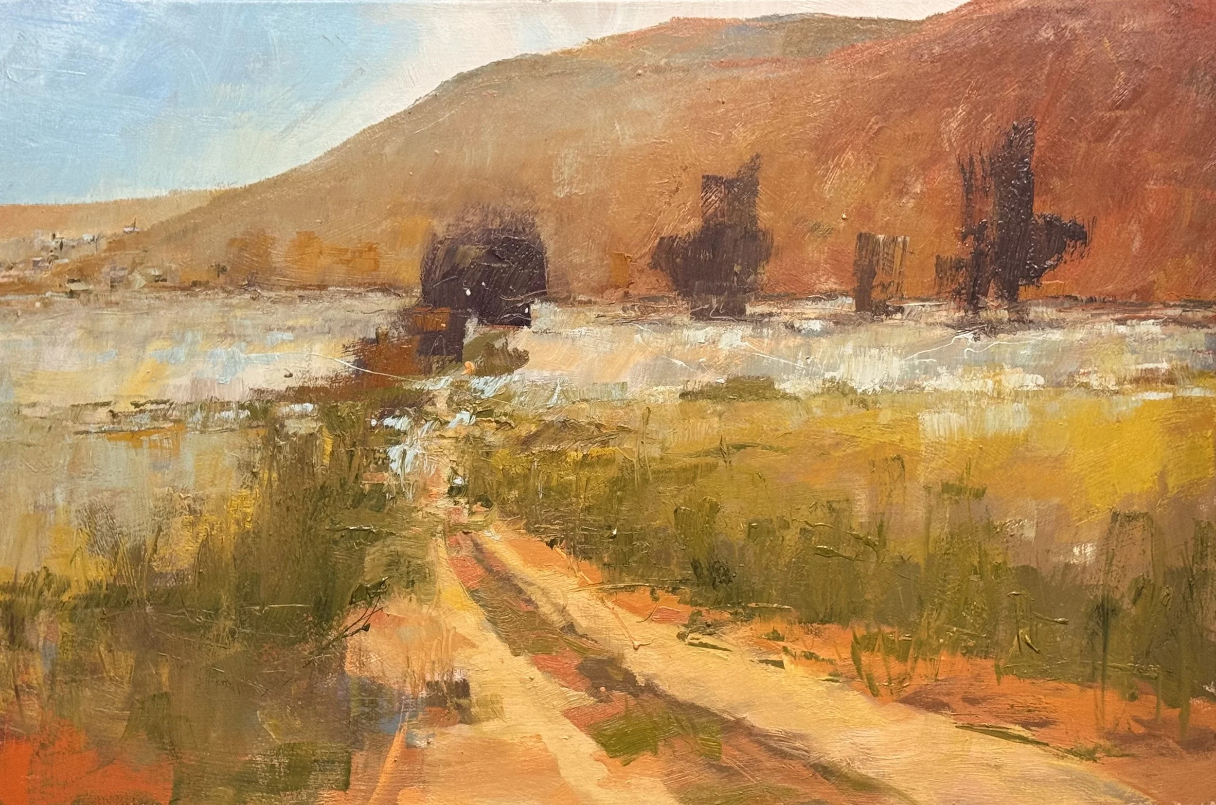
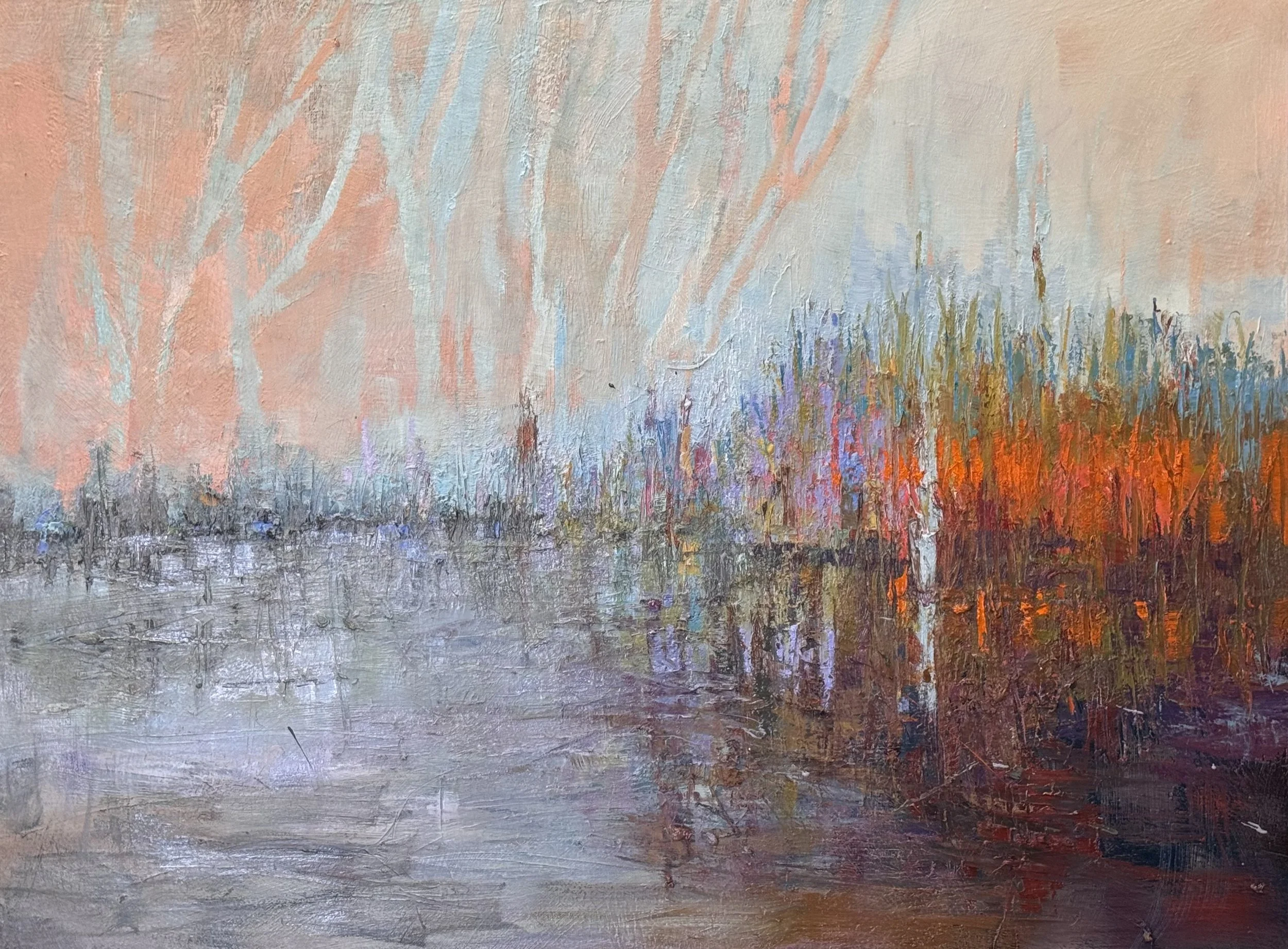
Above is 36 x 54 revisit of favorite atmosphereic painting from earlier this year—I wanted to attain the same quality of non-resolution. I am still a day or two away from my goal here.
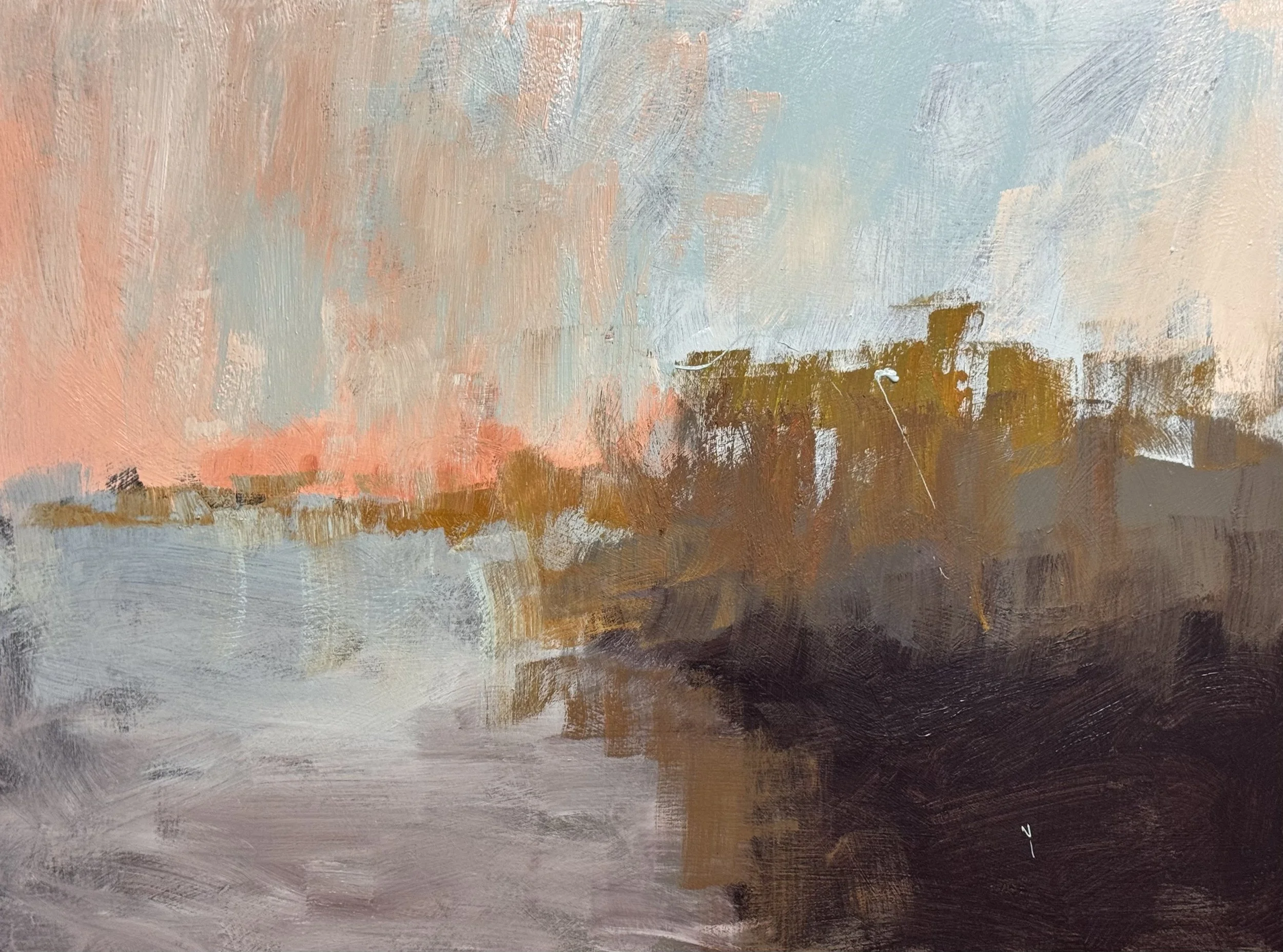
this is a second layer on the ghost tree marsh image—I am so excited for this start.
While this was the final day of a very successful workshop, I was still able to get a bit done of these pieces.
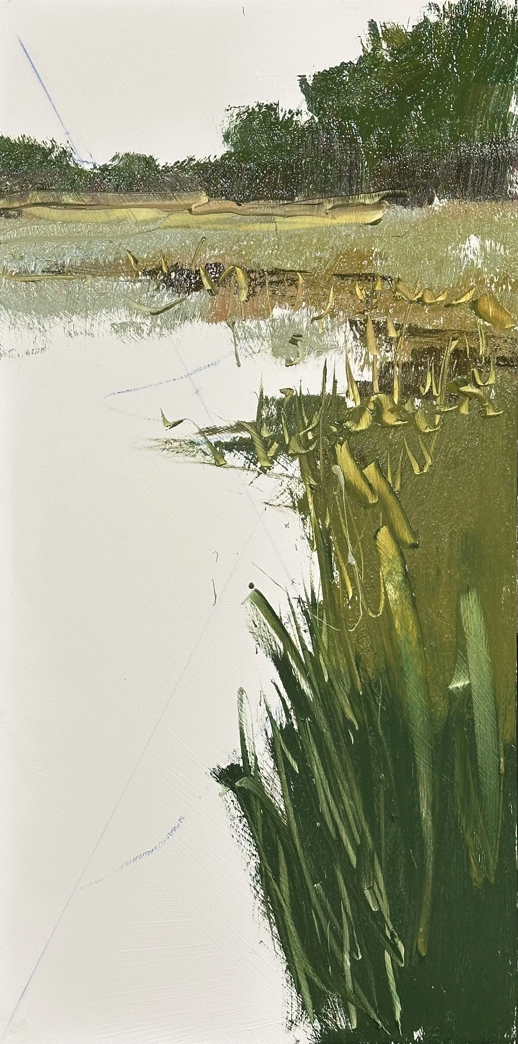
As the below pair, these are also studies to see how they can work in an exaggerated vertical format.
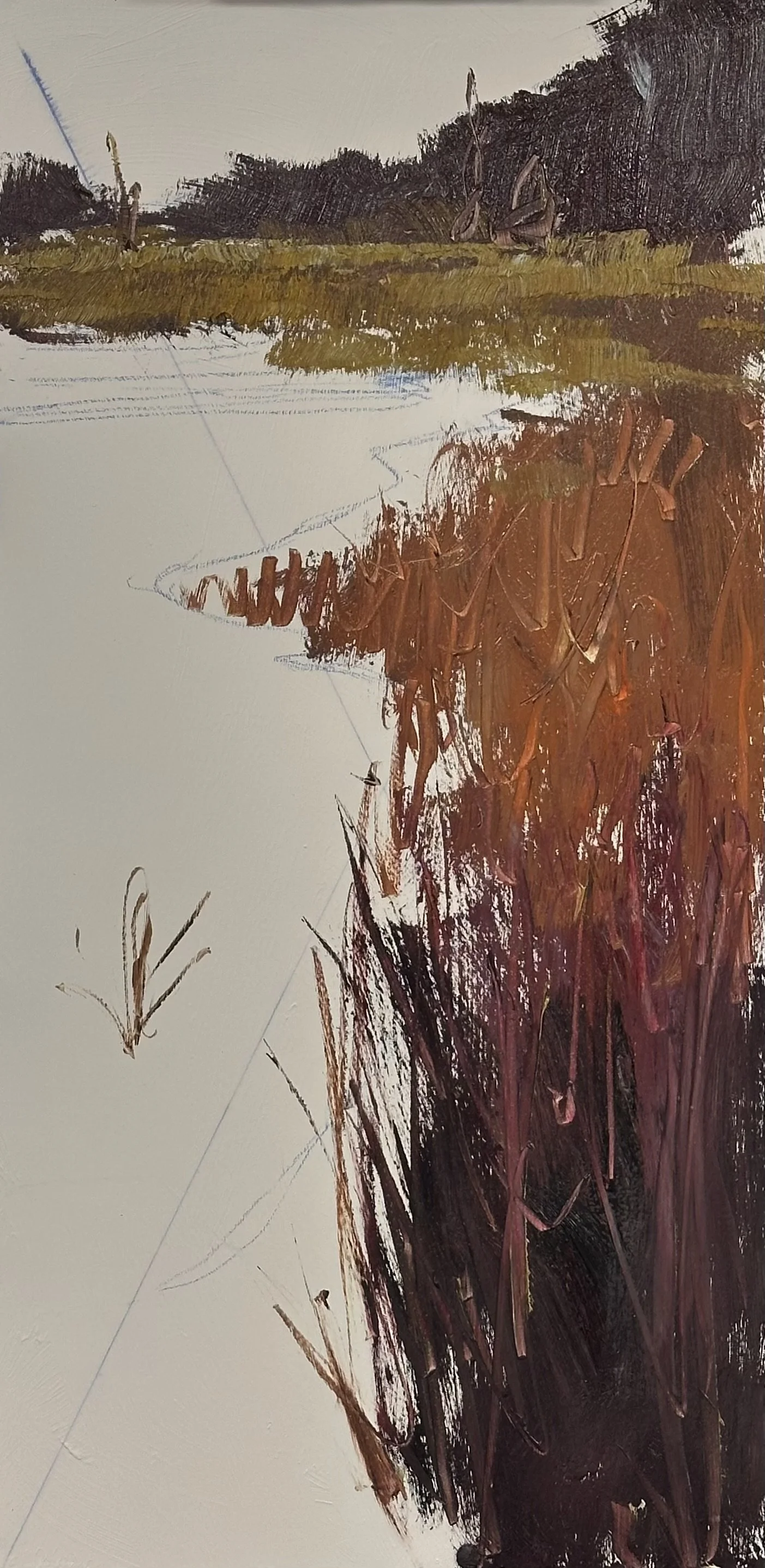
As the below pair, these are also studies to see how they can work in an exaggerated vertical format.
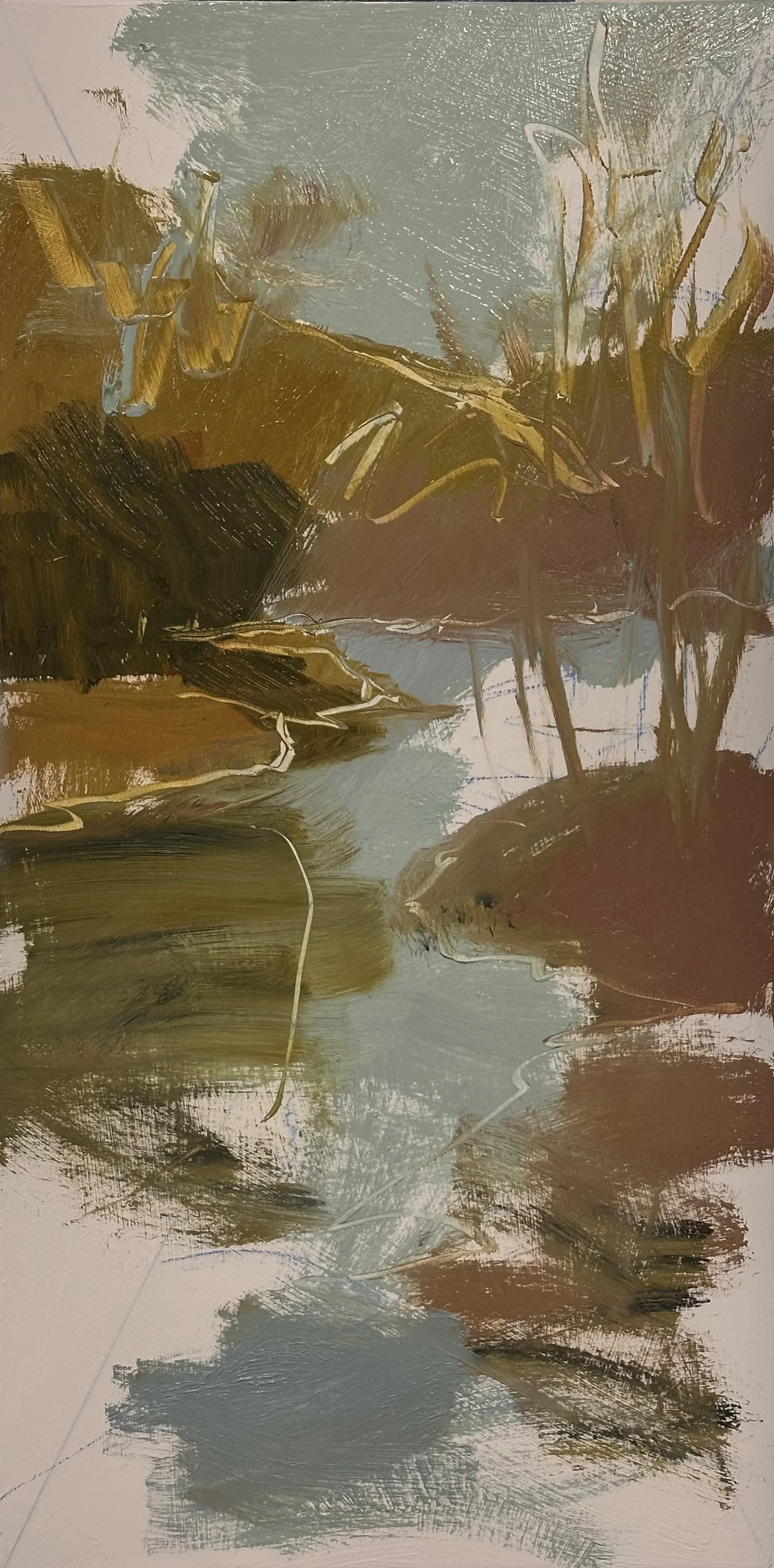
So I am seeing if it will work in this exaggerated format
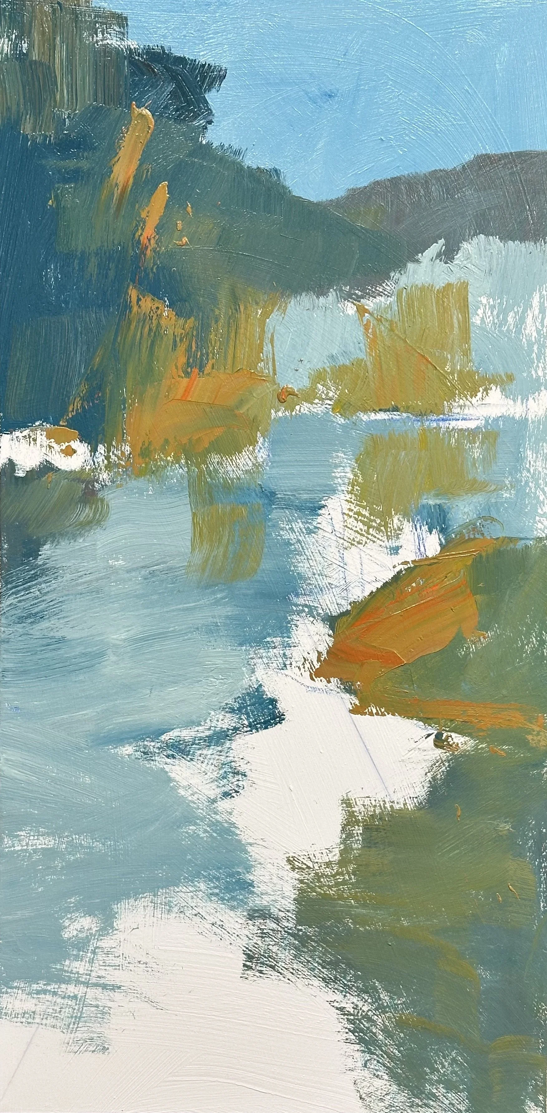
.first run through on a study for a 48 x 24 landscape. It is derived from another piece of mine but it was substanrially wider visa vi the height than this 2 to 1 ratio painting.
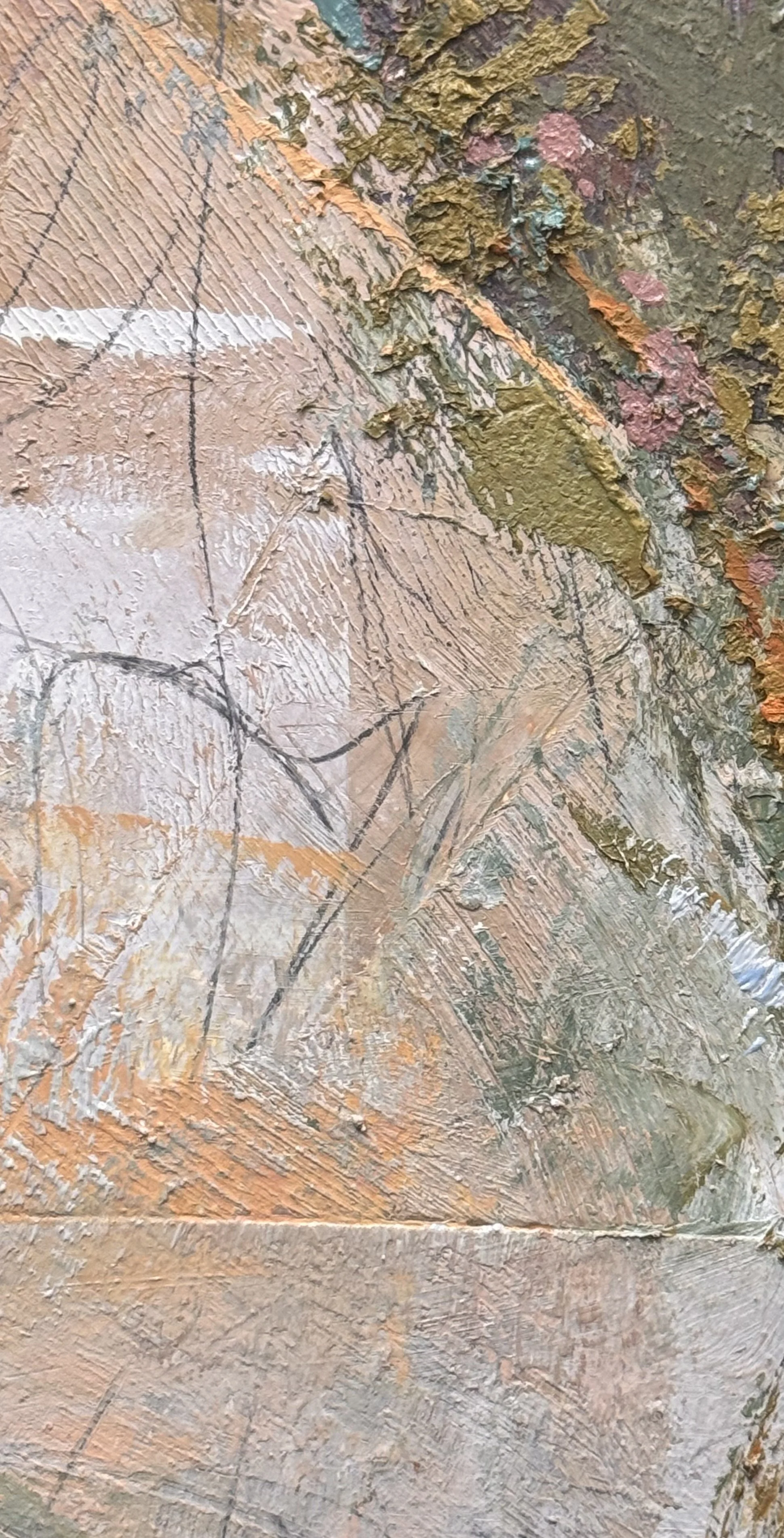
This is also very close to complete,with any luck, I will finish this Alluvial beauty tomorrow. I will share the finished piece along with some selected detail pics.
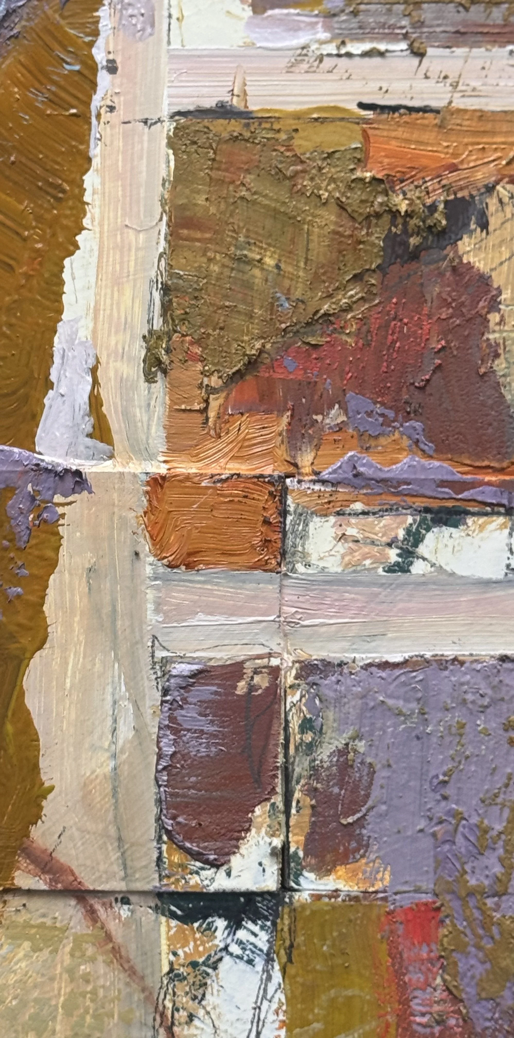
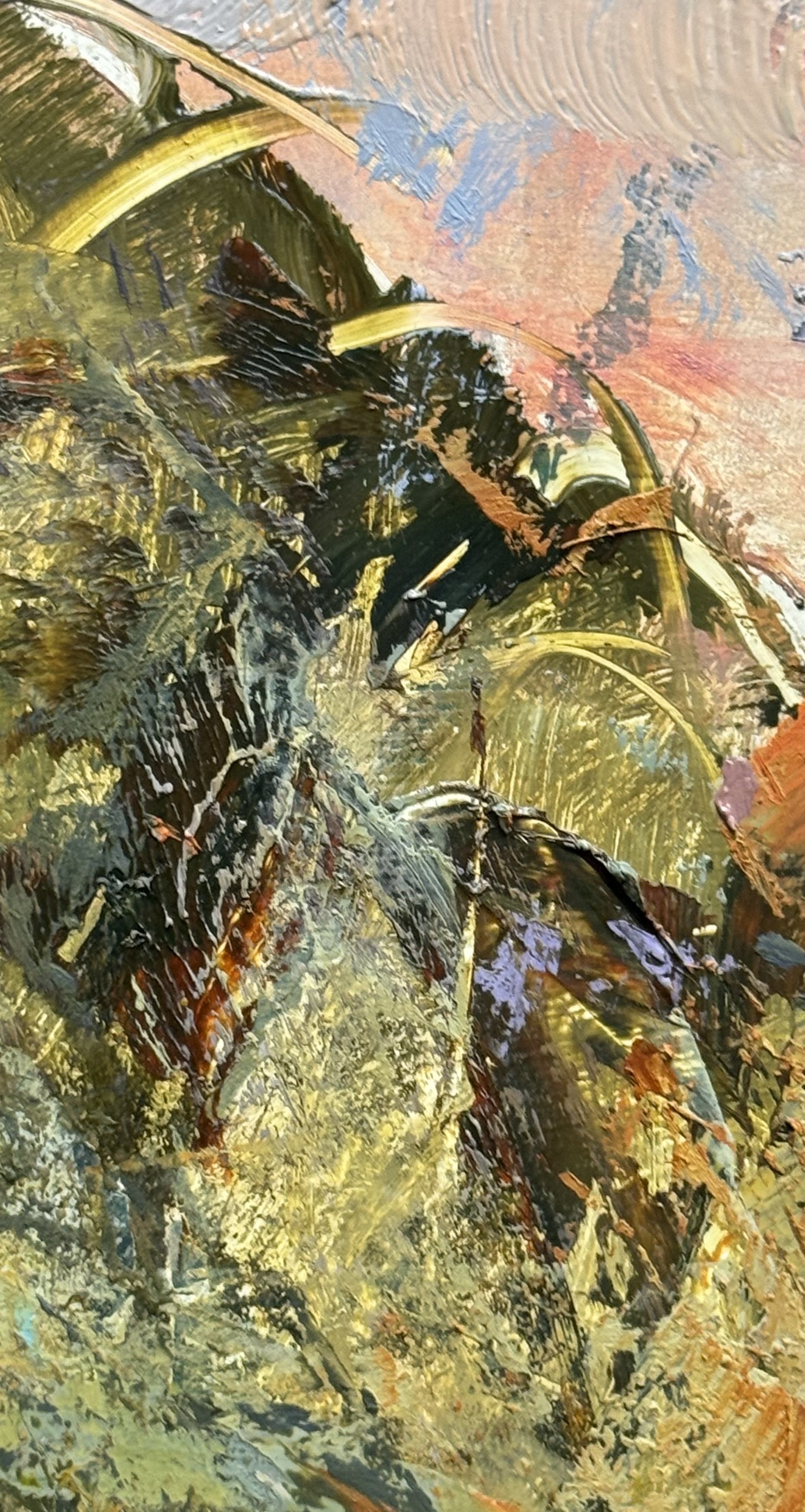
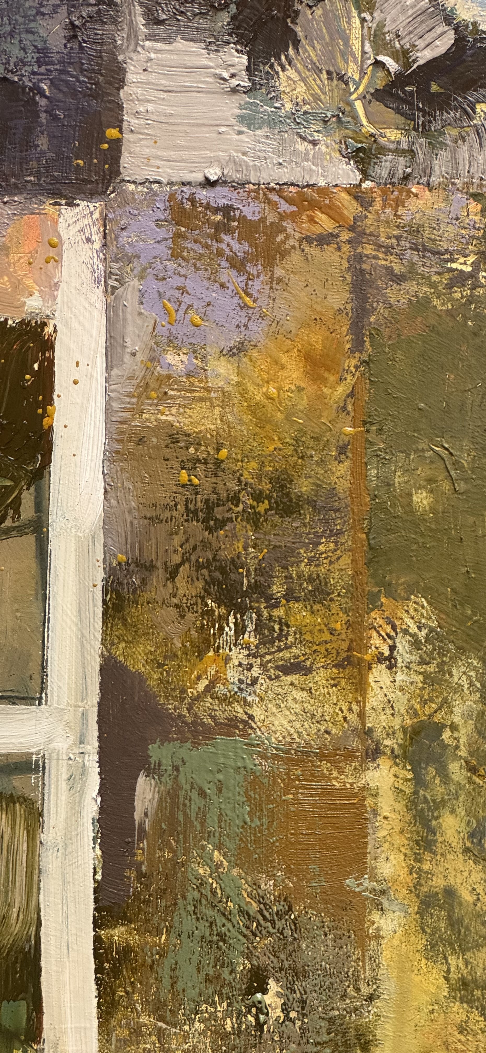
Saturday Catch-up
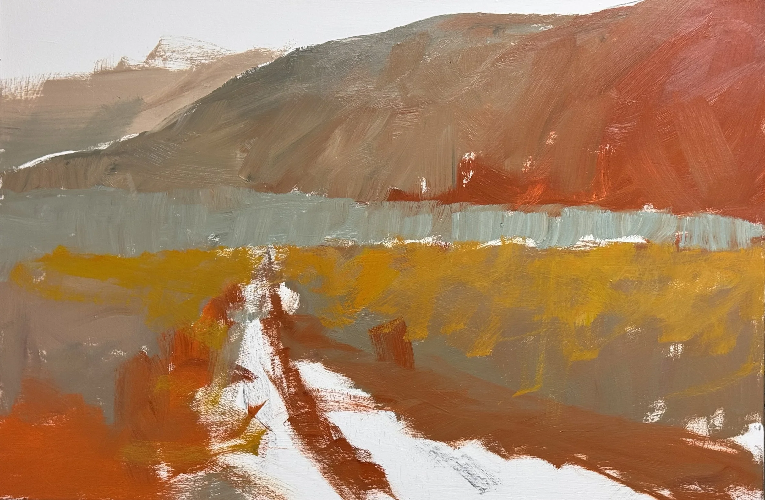
36 x 54 inches
Another layer on this atmospheric landscape that I am revisiting.
doctors appt,, acct appointment, and clean up and ready for the last day of the Beyond the Landscape Workshop. These gals were all so good, I just may not repeat this workshop. But I will post my fall schedule before the weekend is over. In the meantime I was still able to get a bit of painting accoplished.
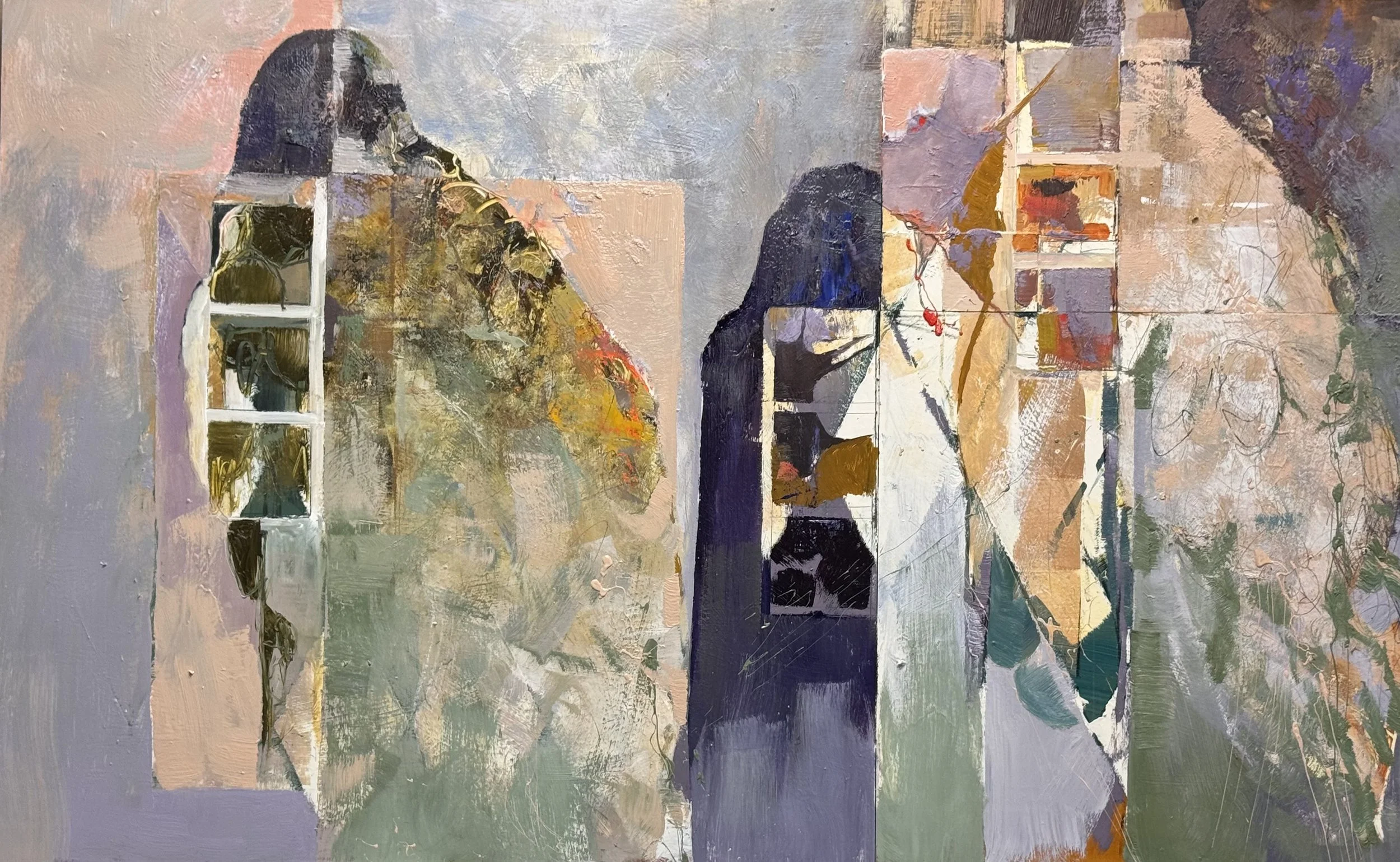
Another layer of development on this Alluvial Island revisit atop the fibonacci panals
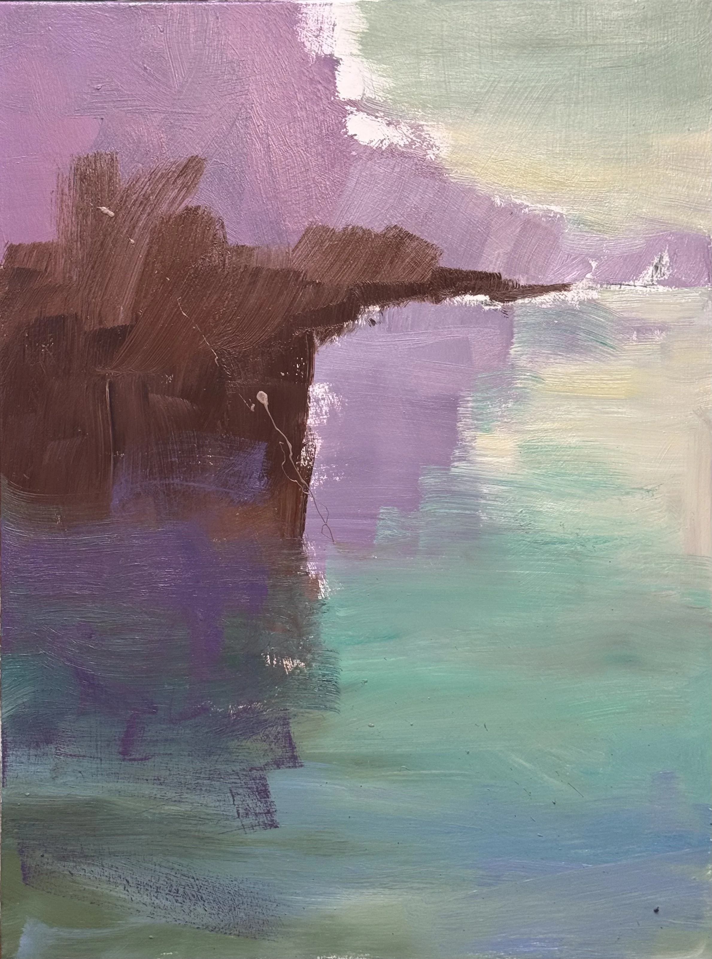
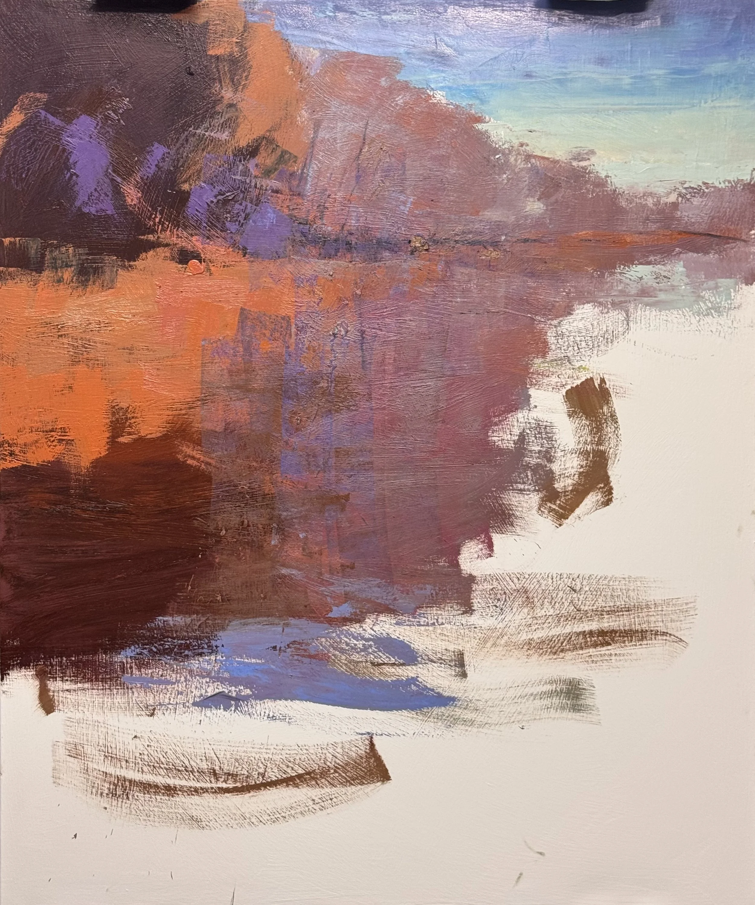
40 x 30 Confluence Study
Tonal shift on this one — testing whether it deepens feeling without losing illusion.
Dark, close-valued left mass reads as mystery. Real weight.
Sky and water sit too close in value — atmospherically honest, spatially flat.
One violet passage is doing all the structural work. Too much on one note.
Foreground band grounds the piece but sits a hair disconnected from the water above it.
Feeling: earned. Illusion: still owed.
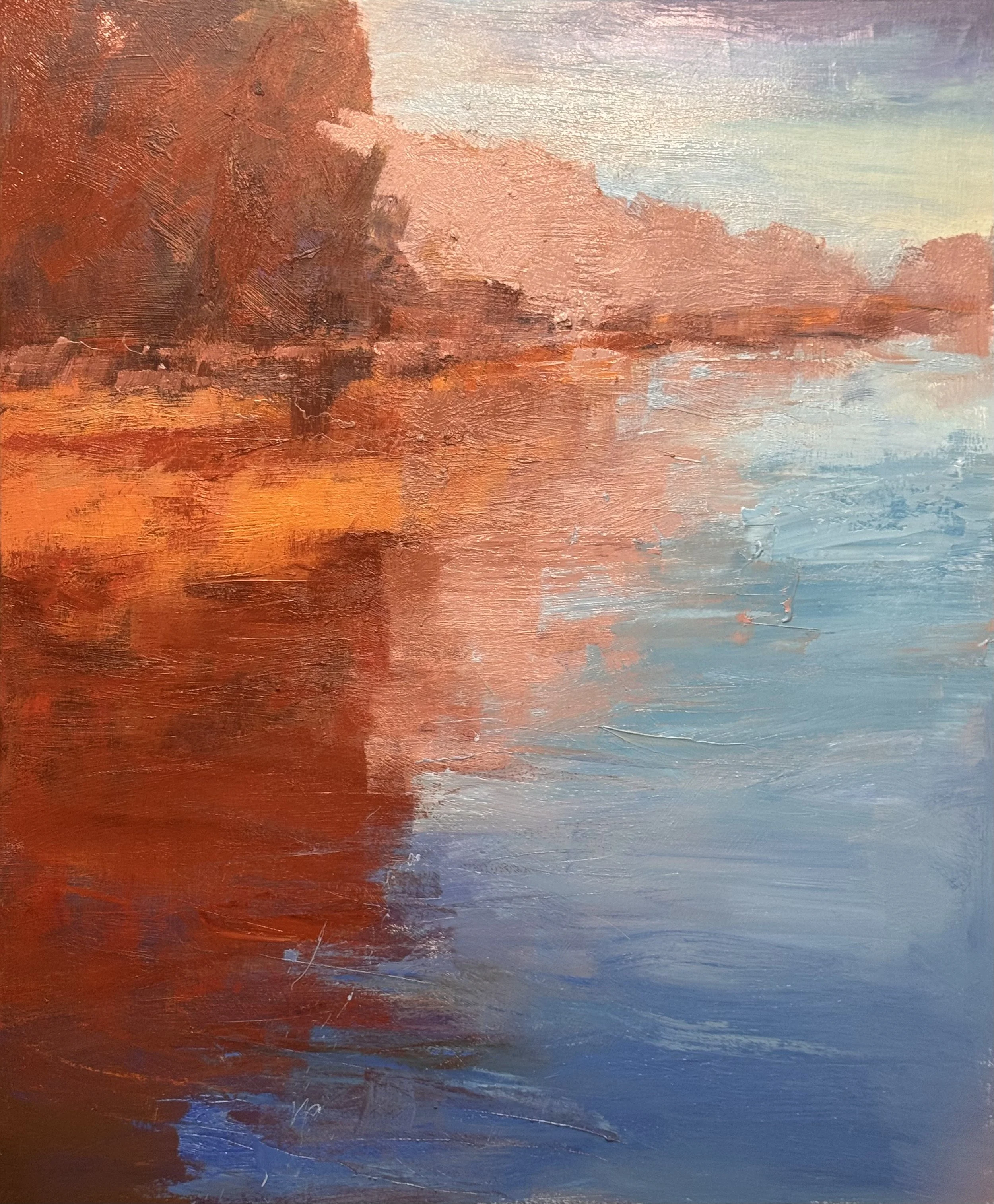
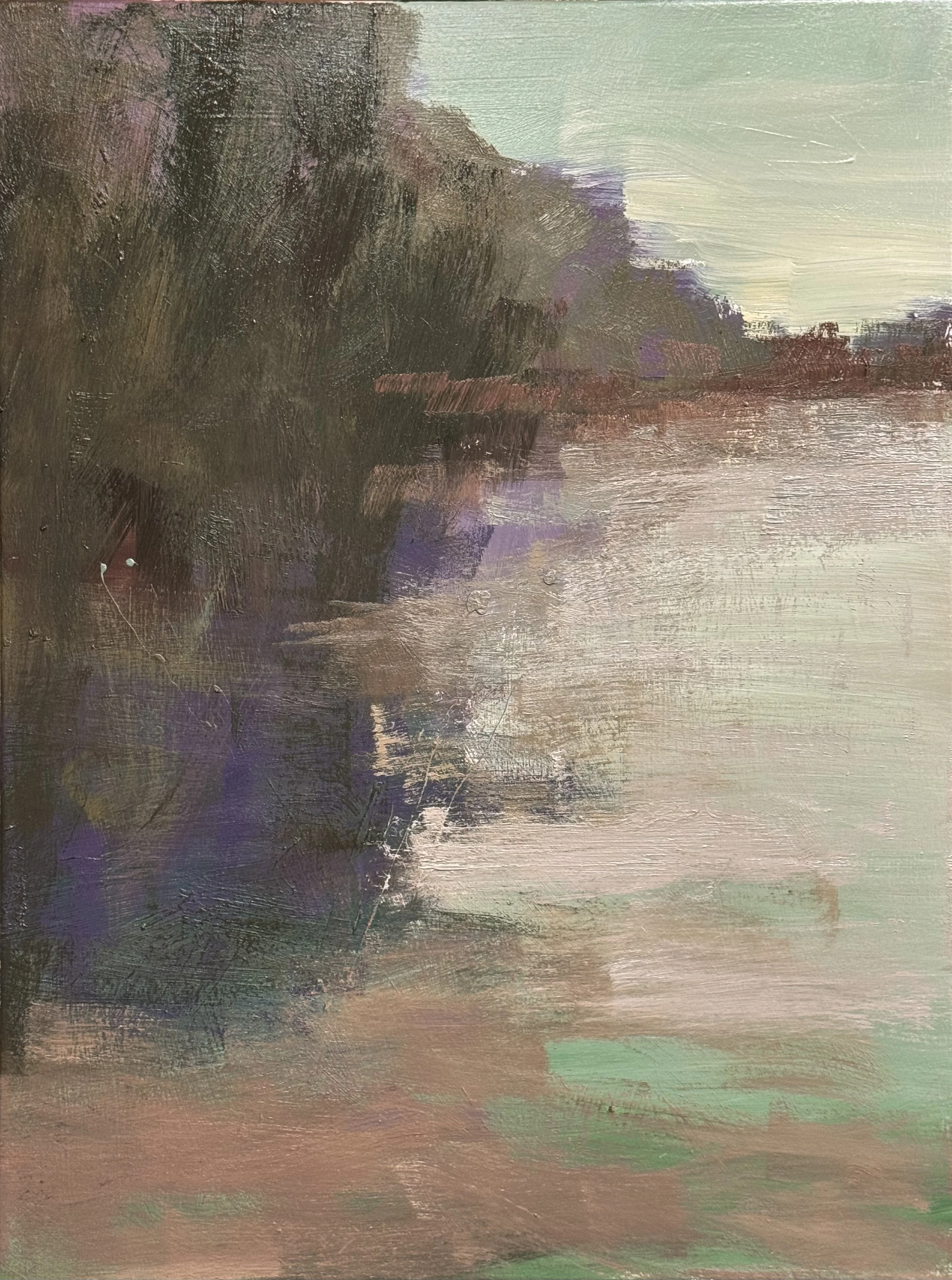
This speaks for itself. Warm bank against cool water, one seam holding the whole thing together.
The rust field on the left is strong but too settled — one temperature doing all the talking. It needs a second and third voice inside it, not new shapes, just heat variance breaking the mass from within.
The reflection where warm bleeds into blue-violet is the real hinge. That's where the complexity should live. Everything else — especially the pale horizon on the right — stays quiet. Silence there is what lets the density on the left mean something.
Complicate the field. Trust the seam. Protect the silence.
Tuesday 7/21/2026
I will try my best to get back on schedule with my posts…. This is a workshop week, so I don’t get to much painting accomplished but here is what I have for today.
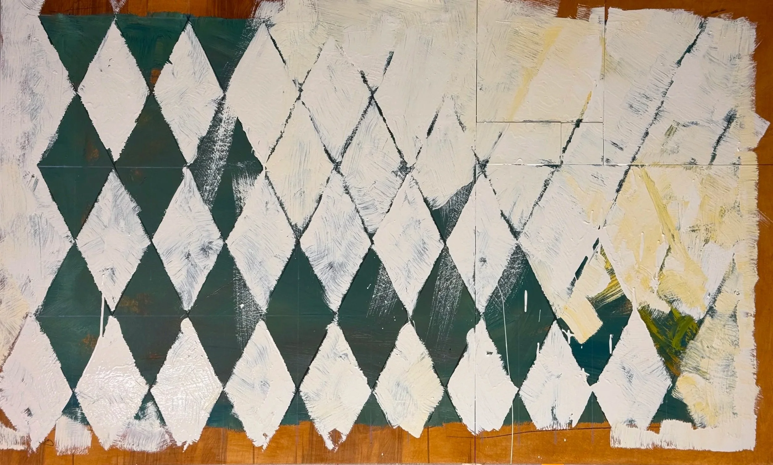
this is the first layer atop the beautiful wood panels Ian built for me.
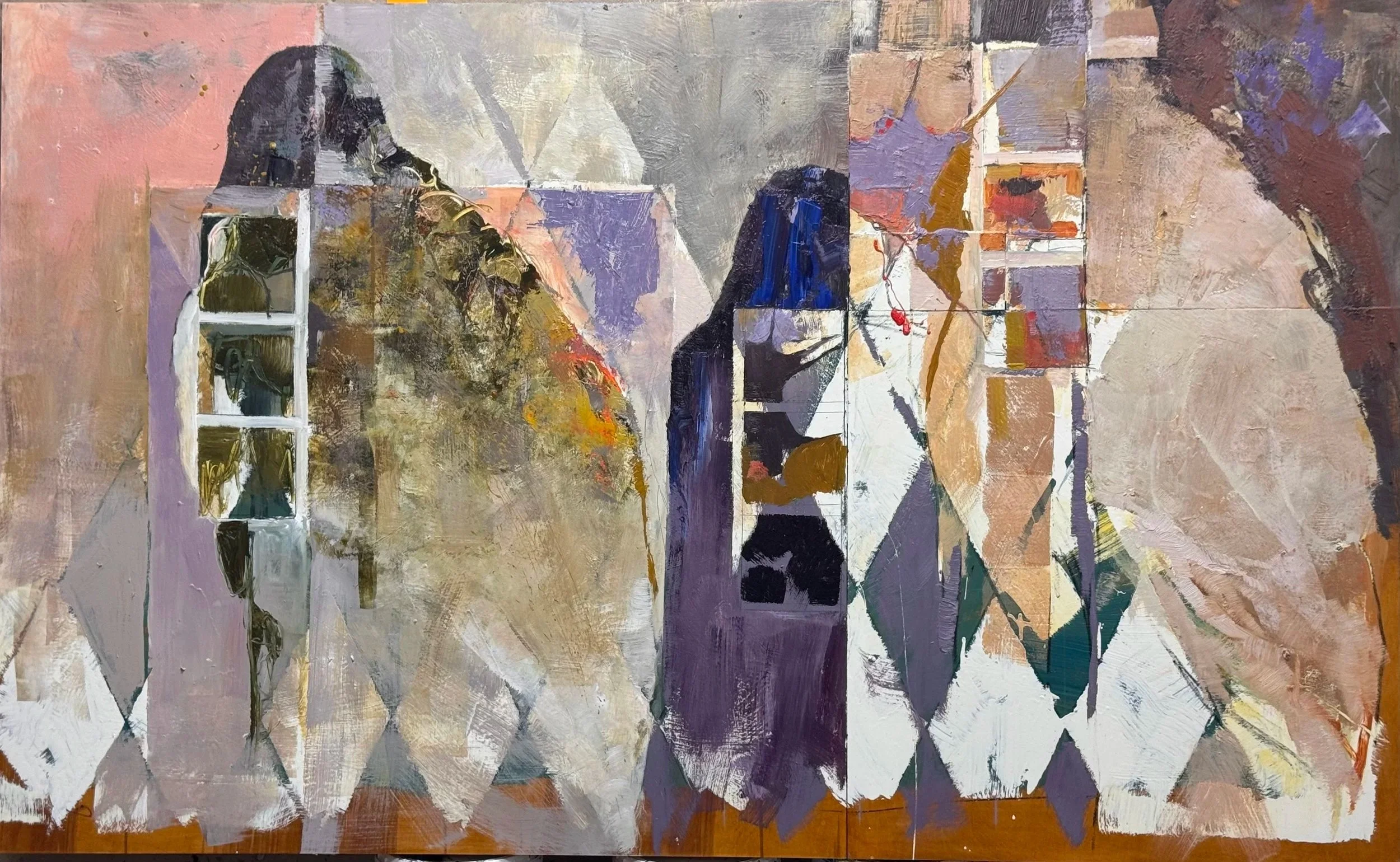
And here it is today. This is still building to an end that I am uncertain of but….I do have many years of playing with this alluvial form and its geometric compliments.
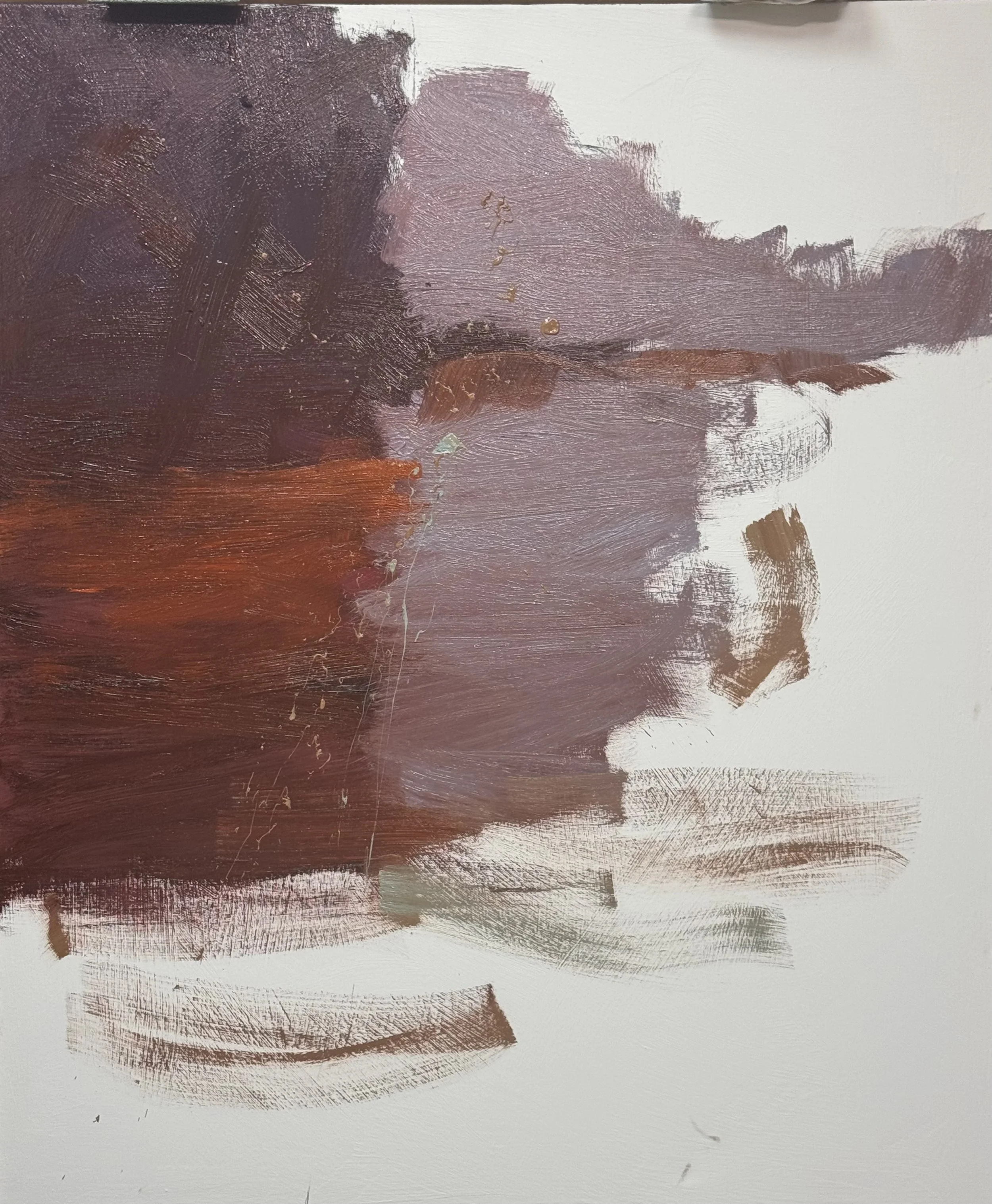
This is also my first layer on this 54 x 45 painting
And here it is at the end of the day today. Complicating the color