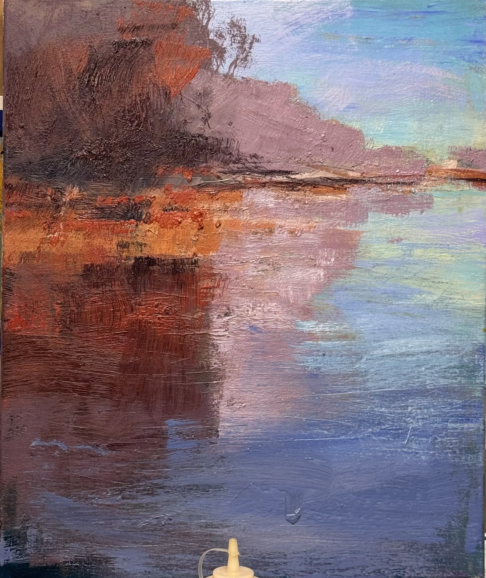
Today I was impressed enough with the small study's palette to ask a harder question: does it survive a change in proportion?
Same coral orange, violet-gray, aqua water. In the study they sit in calm horizontal bands, each color getting its own strip of canvas. Resolved. Maybe too resolved.
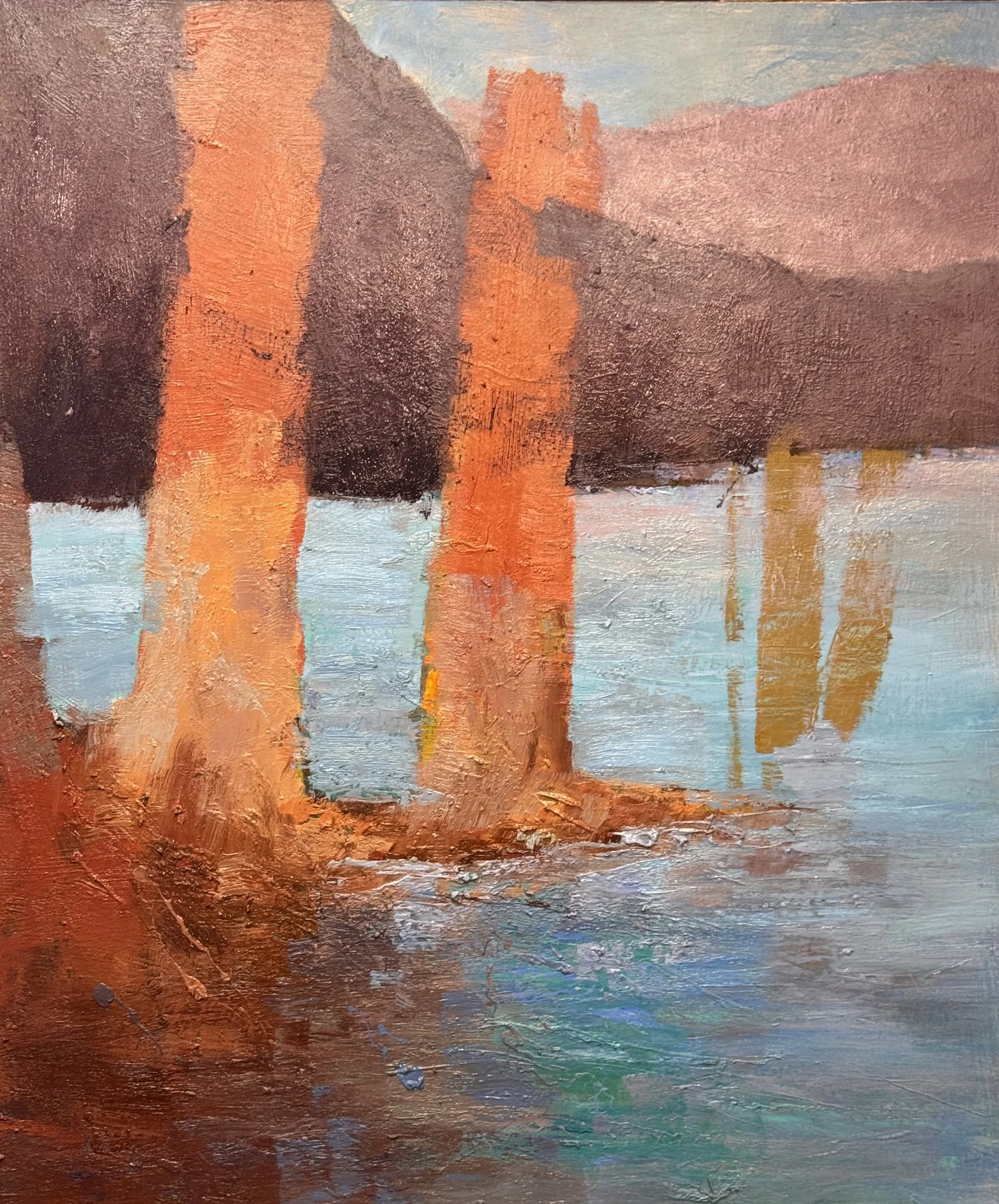
So I pushed the same palette into the larger Savage Tree piece — verticals instead of horizontals, trunks instead of cliff line. The orange had to work differently. In the study it was atmosphere. In the tree painting it's structure — the thing the eye hits first and rides down. Same hue, different job.
What I'm relearning: a palette isn't a fixed deposit you carry from one painting to the next. It's a set of relationships, and the relationships change when the neighbors change. That violet-gray read as shadow on a cliff. Now, standing behind orange instead of beside it, it reads as distance.
Still deciding if the trunks need one more temperature shift to keep the eye moving back — or if I'm explaining the life out of it.
— Braitman
I also worked to resolve the color issues in this large horizontal painting 27 x 54 inches
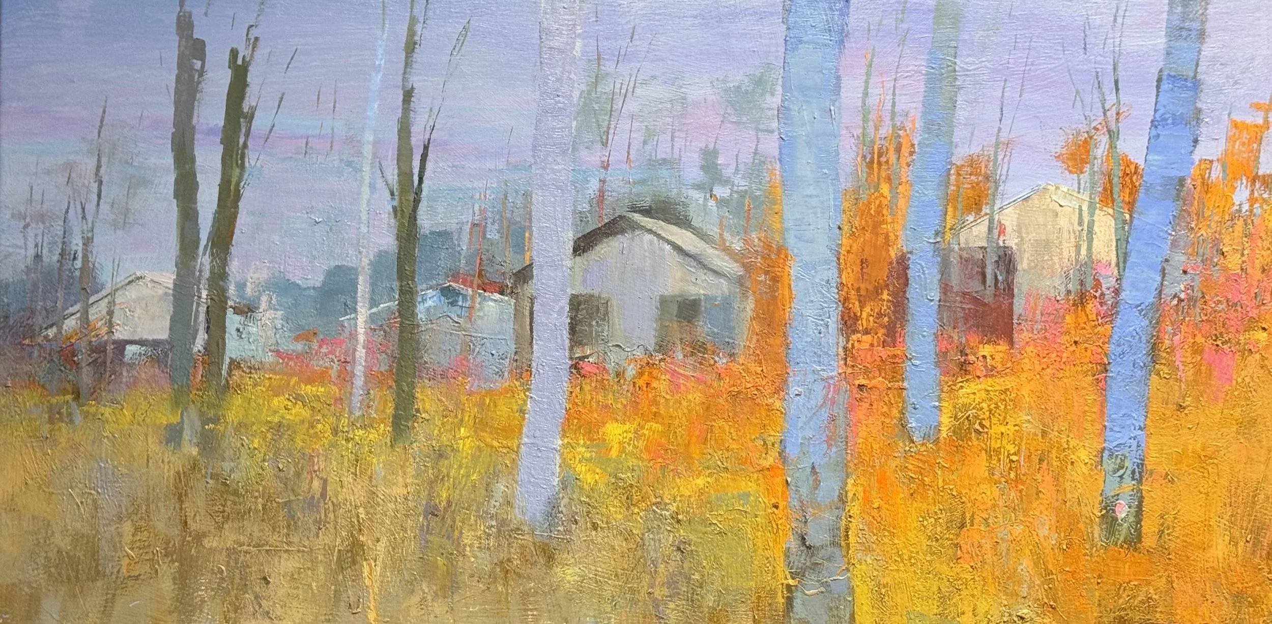
What's working: The temperature call is the whole idea, and it's a good one. Cool lavender-blue trunks against that hot gold field — that's the painting. The barns recede properly into pale violet atmosphere, gable shapes read clean, and you've got genuine front-to-back movement happening.
What's fighting:
The two blue trunks are too even — same width, same edge quality, same spacing rhythm. They're starting to read as bars on a cage rather than trees. Vary the width, let one edge go soft, kill the symmetry between them.
The foreground field is one value, one temperature, top to bottom. It's texture without hierarchy. Right now it competes with the barns for attention instead of setting them up. It needs a value break — something to say "this part is closer" versus "this part leads back."
The dark thin trunks on the left (the switchgrass-thin ones) are doing a different job than the fat blue ones and the orange ones — three trunk languages in one painting. Pick which vocabulary is carrying the read and let the others support it.
The bones are good. This is a "keep pushing" painting, not a "start over" painting — but it needs another session, not a signature.
— Braitman