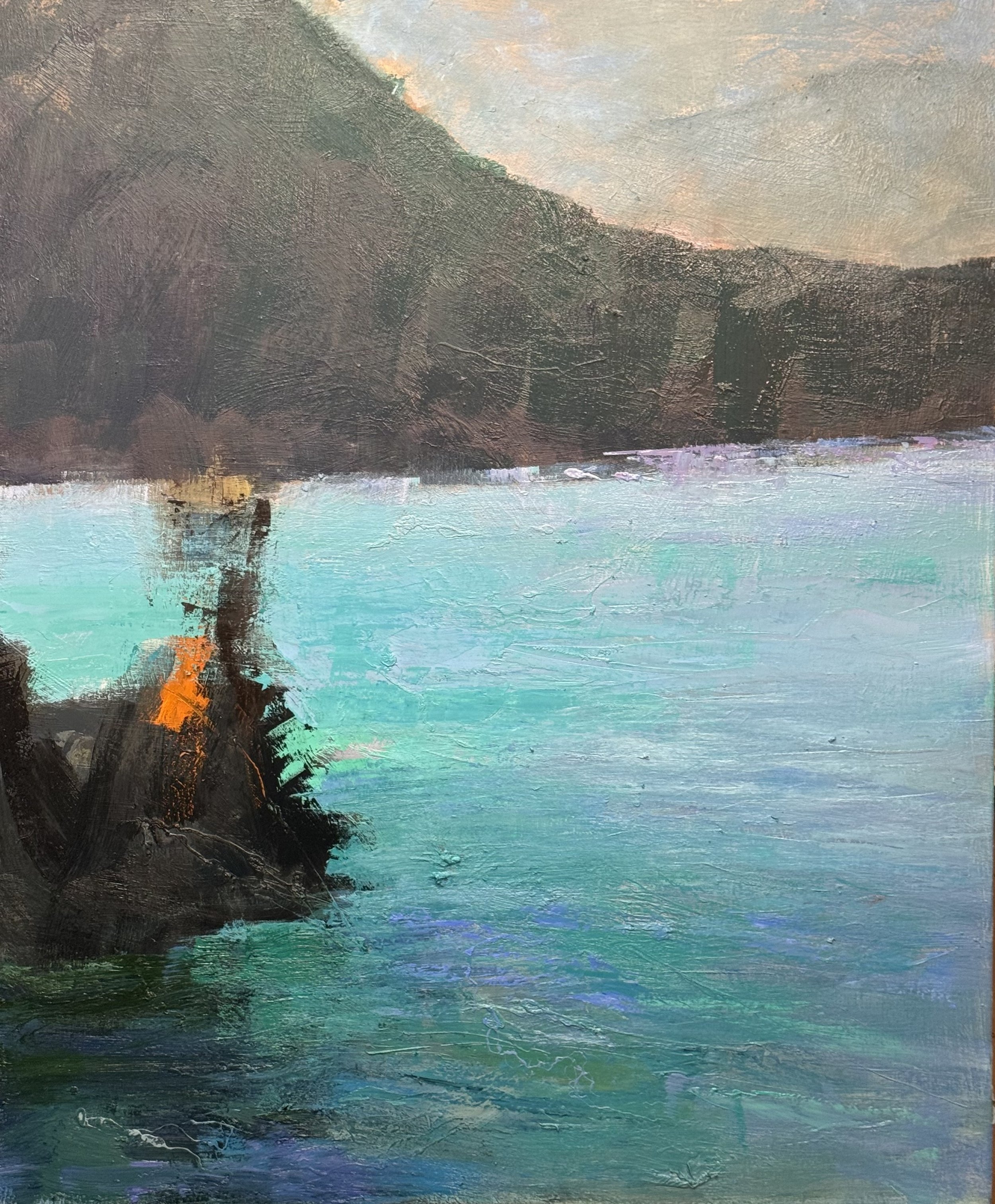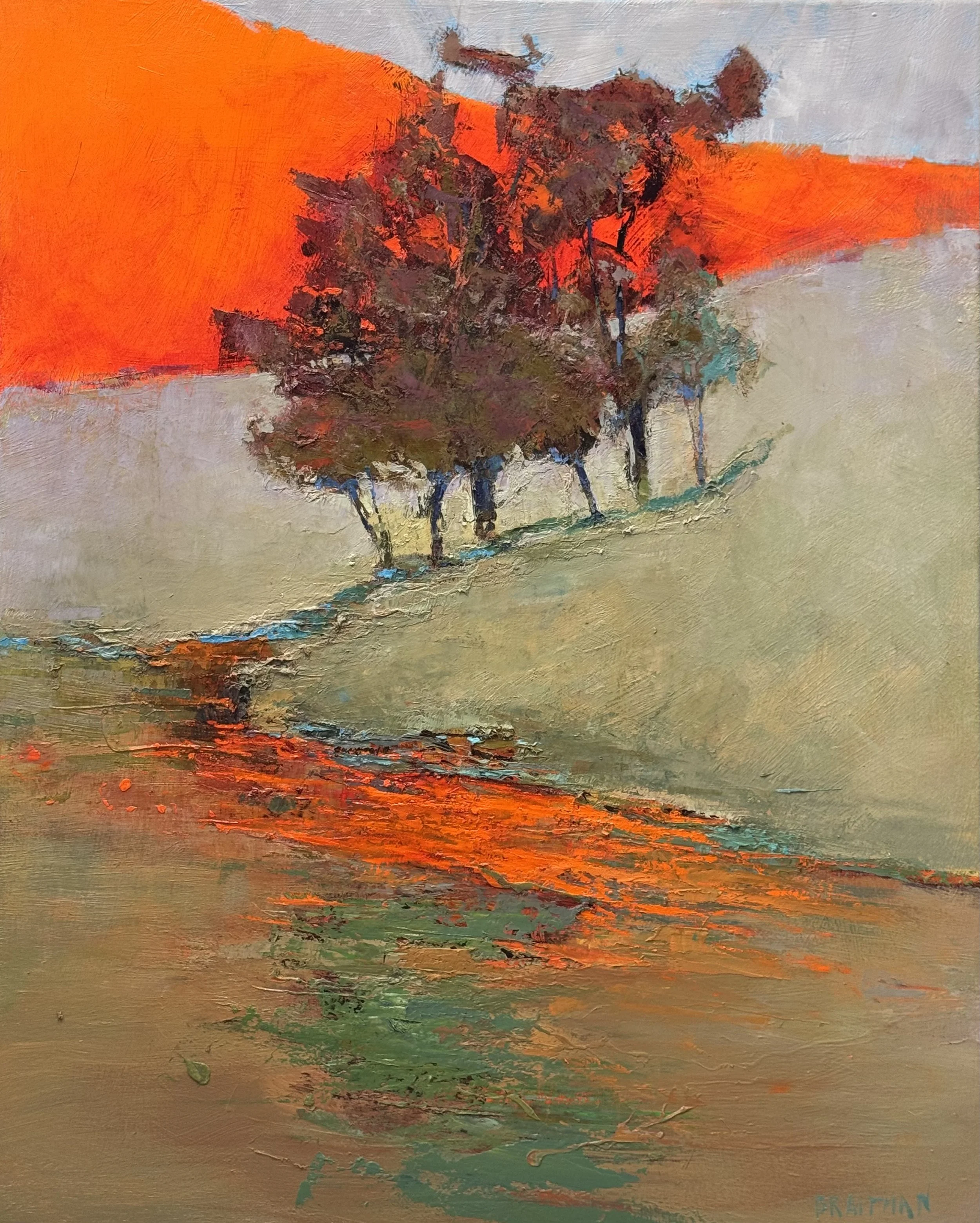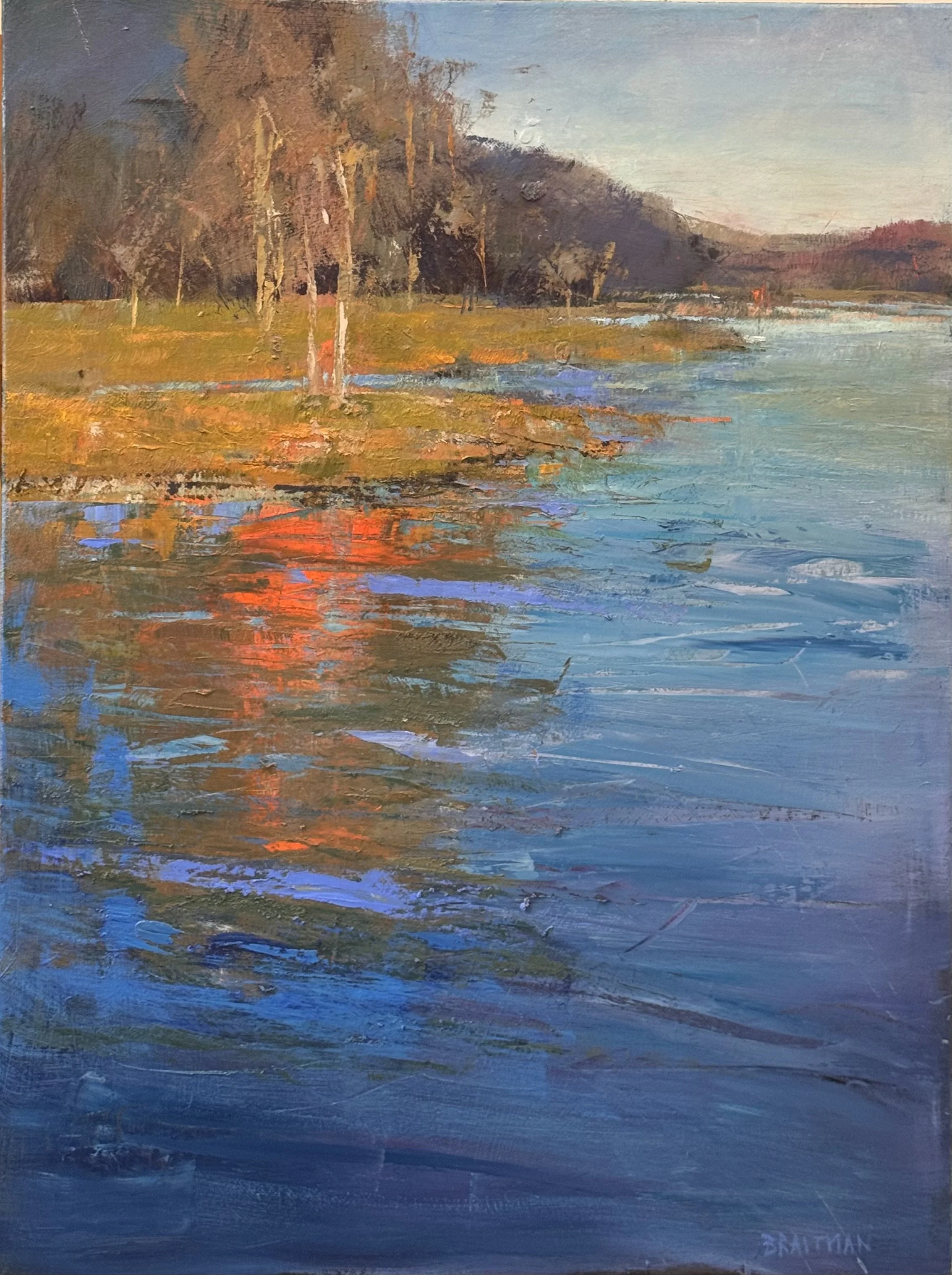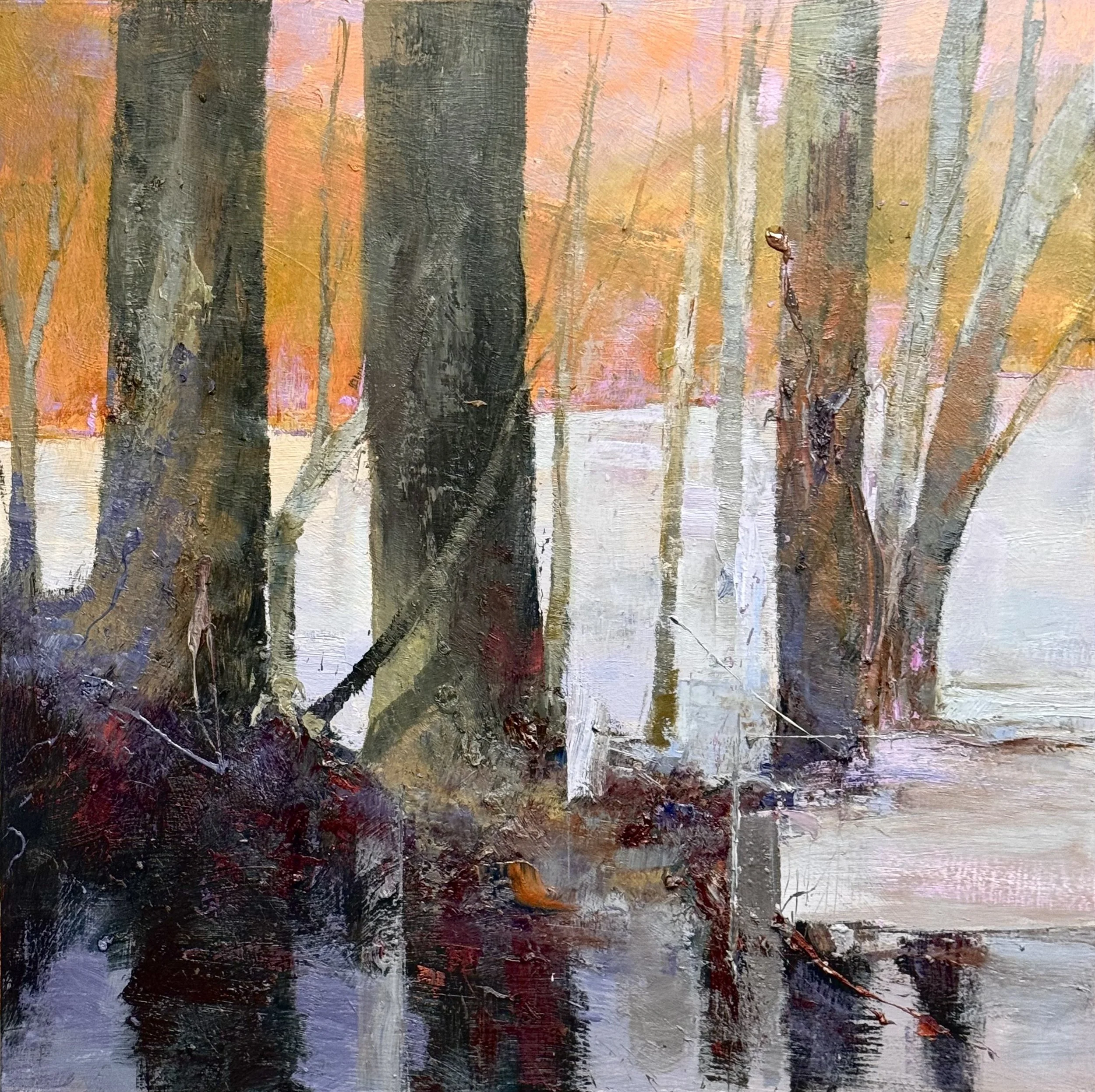
Today 6/12

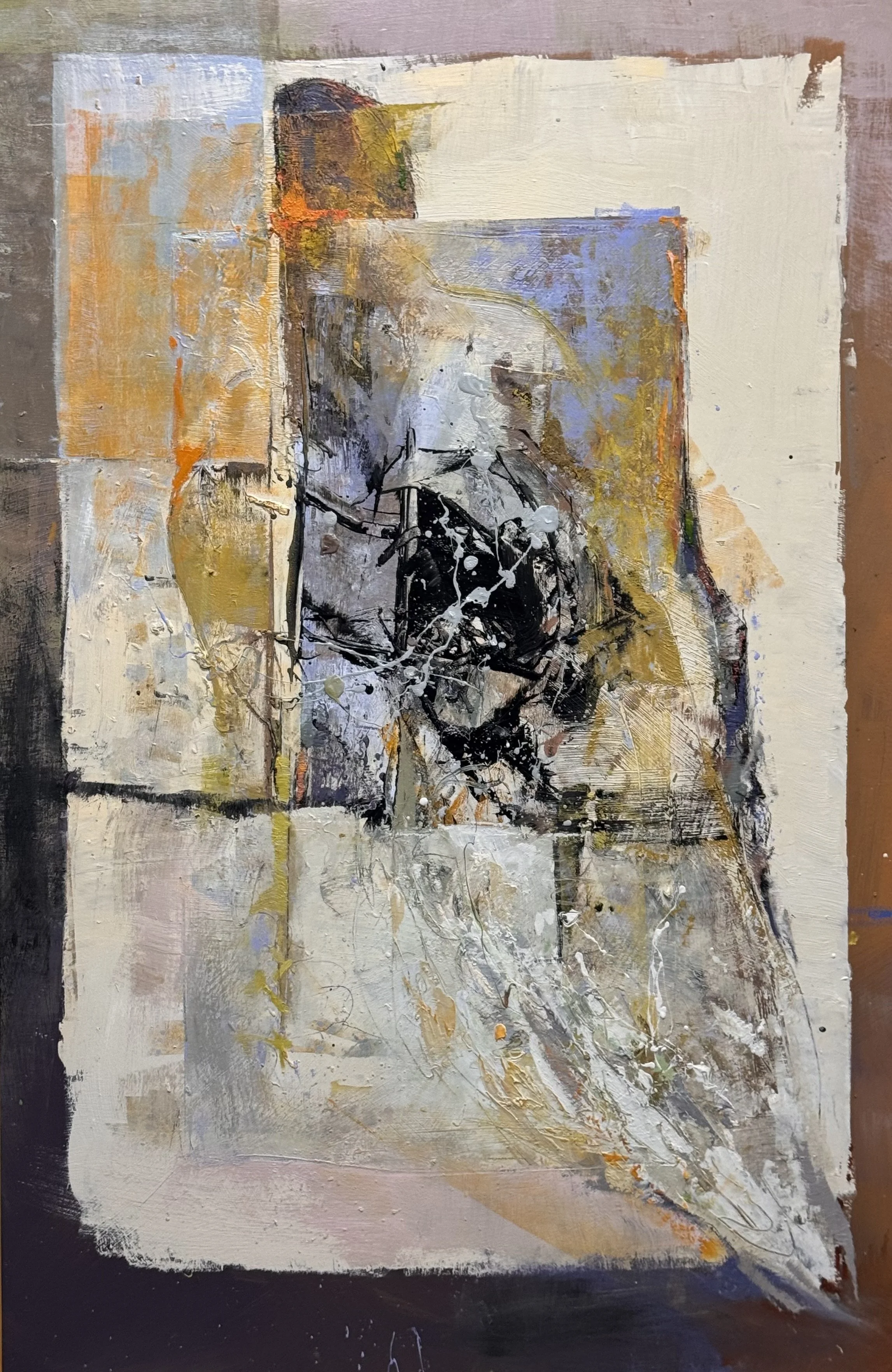
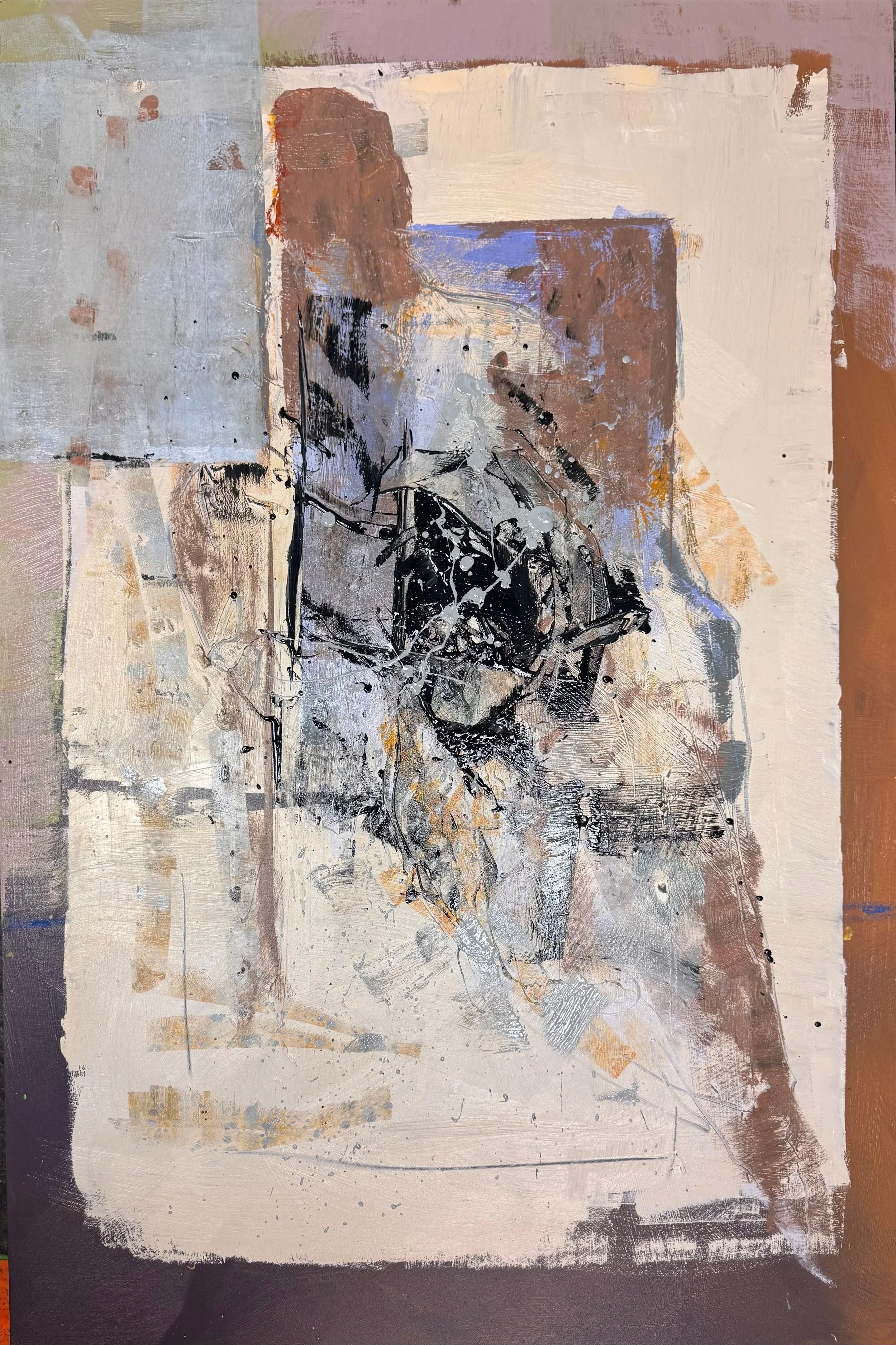
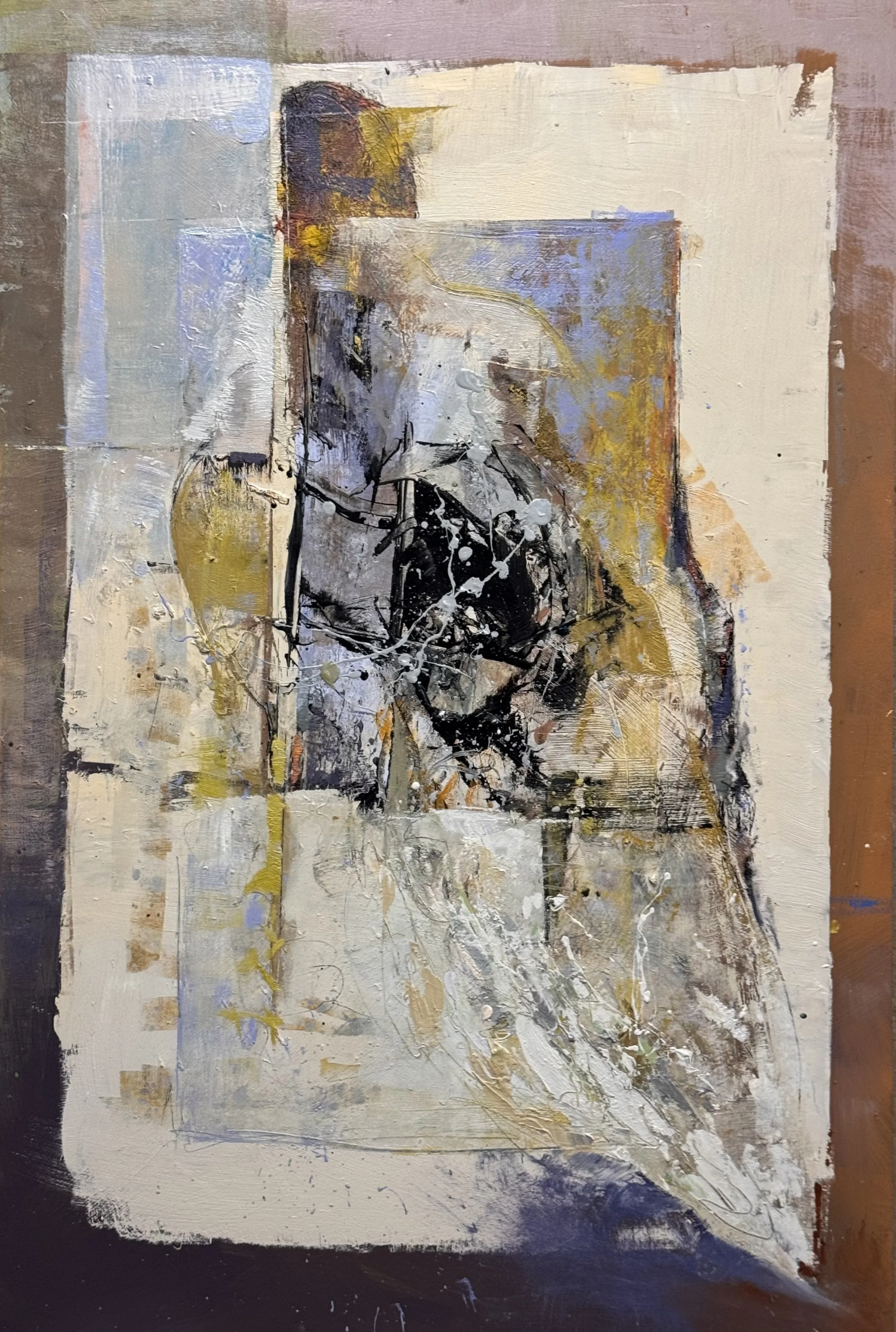
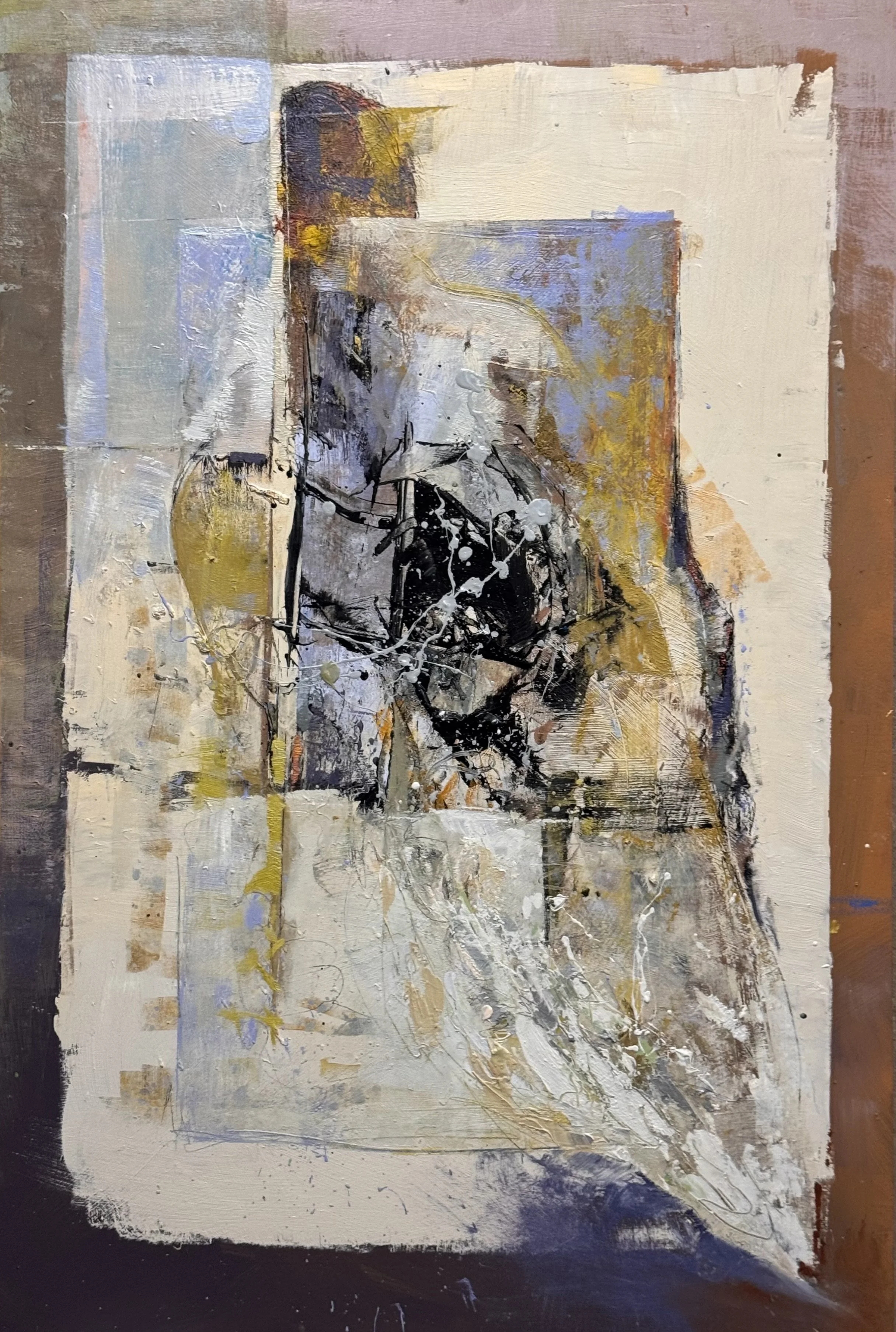
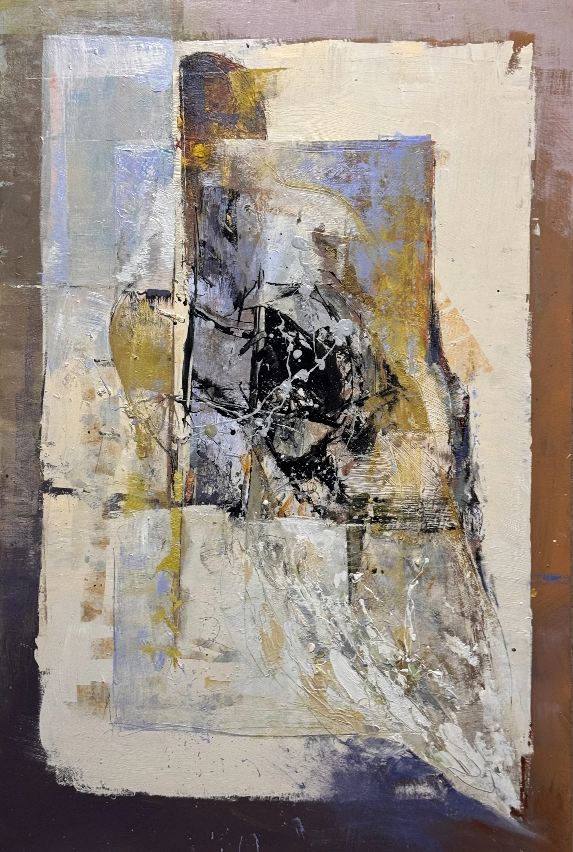
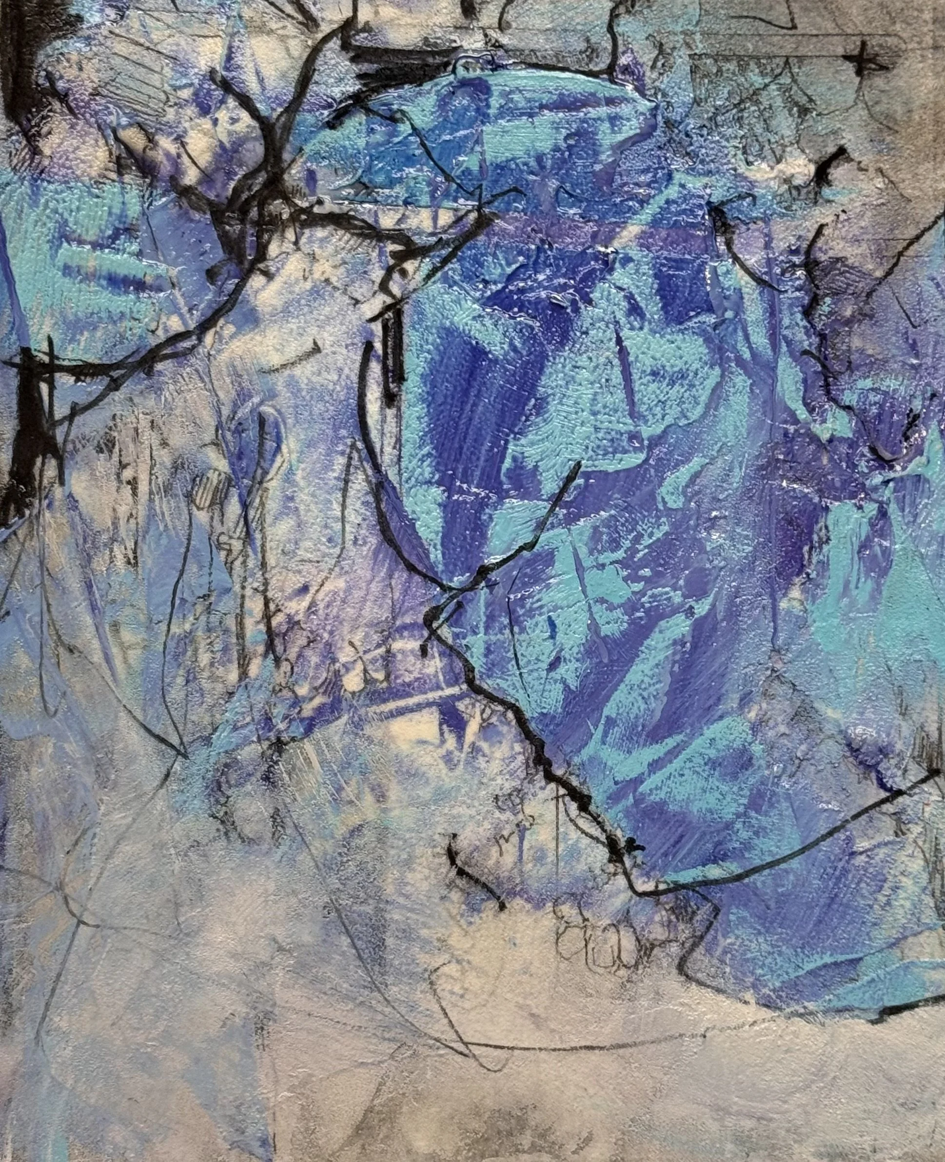
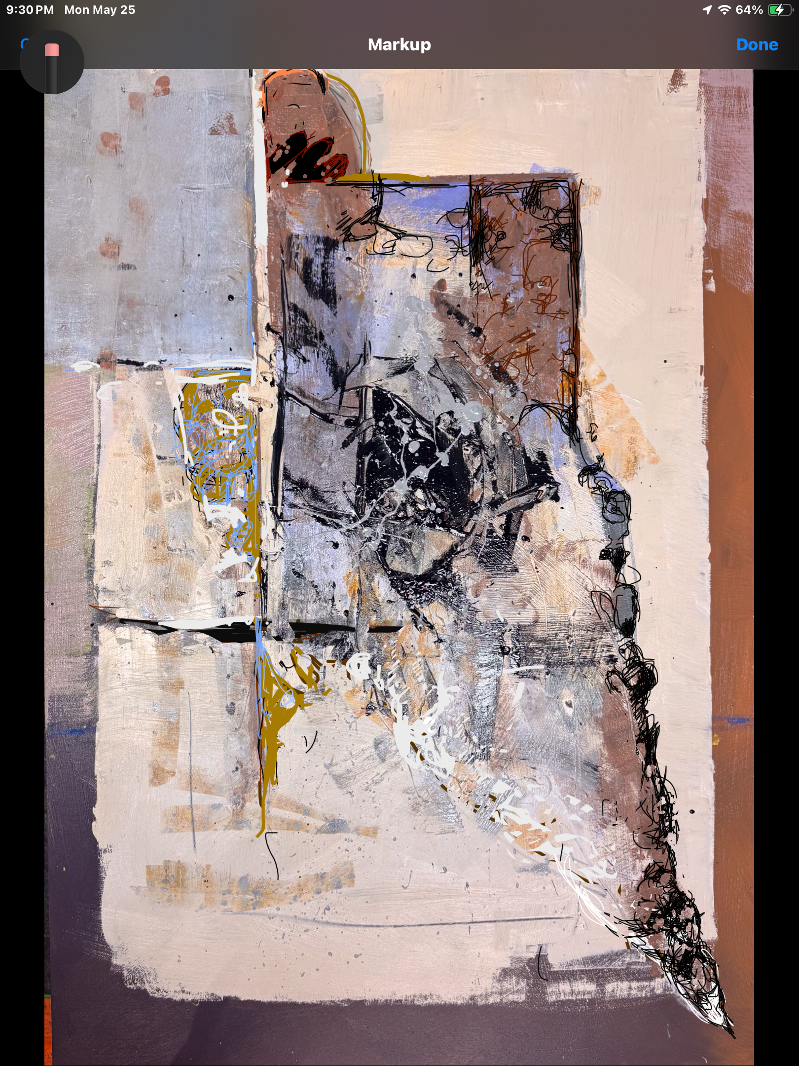
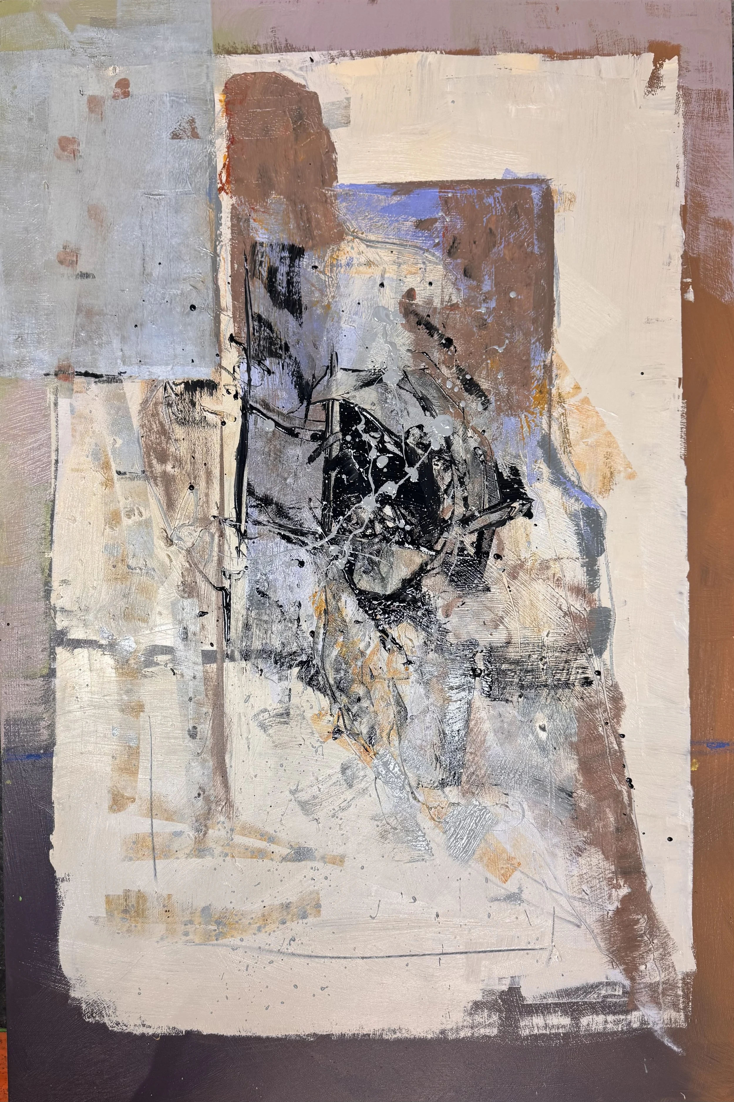
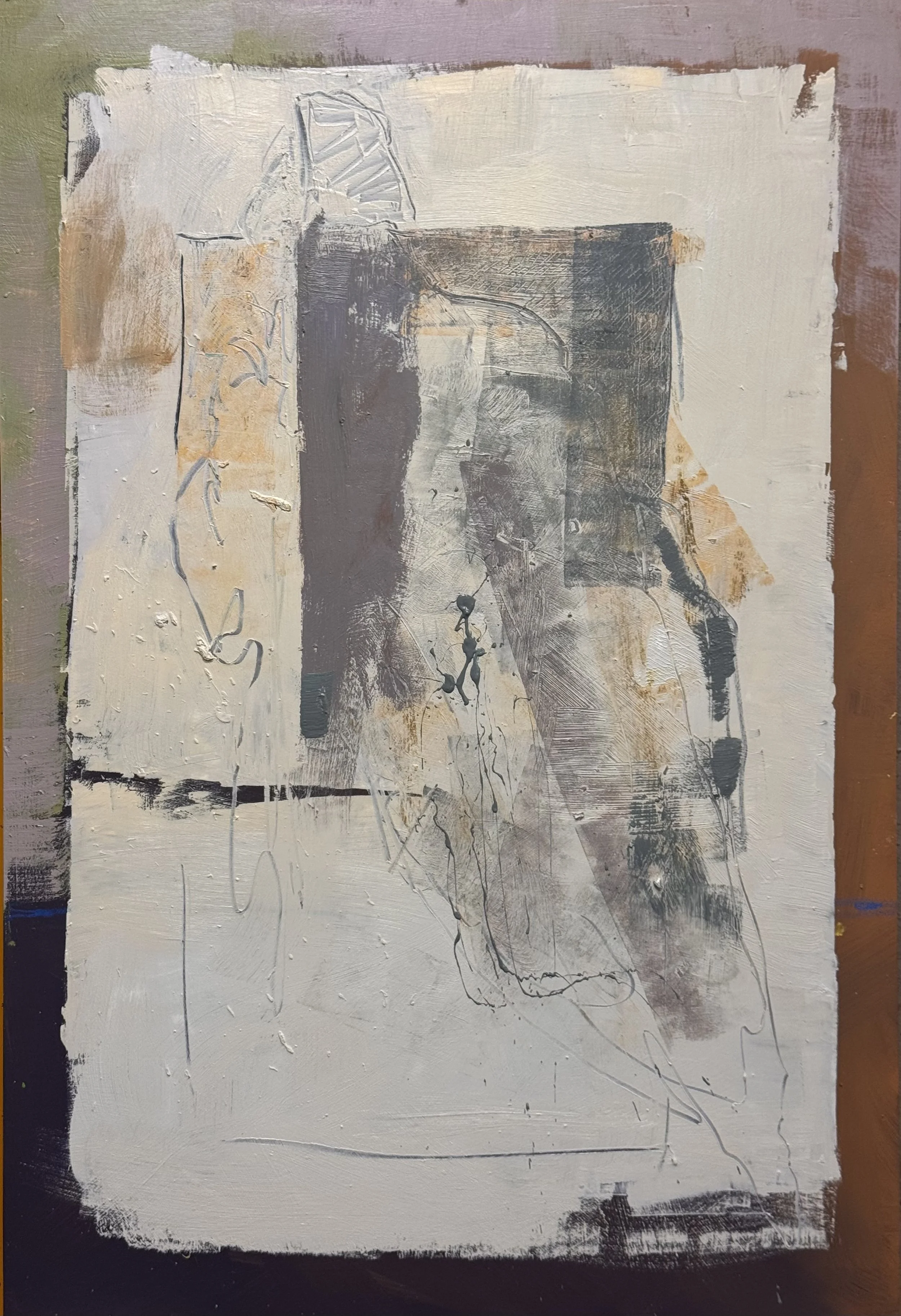
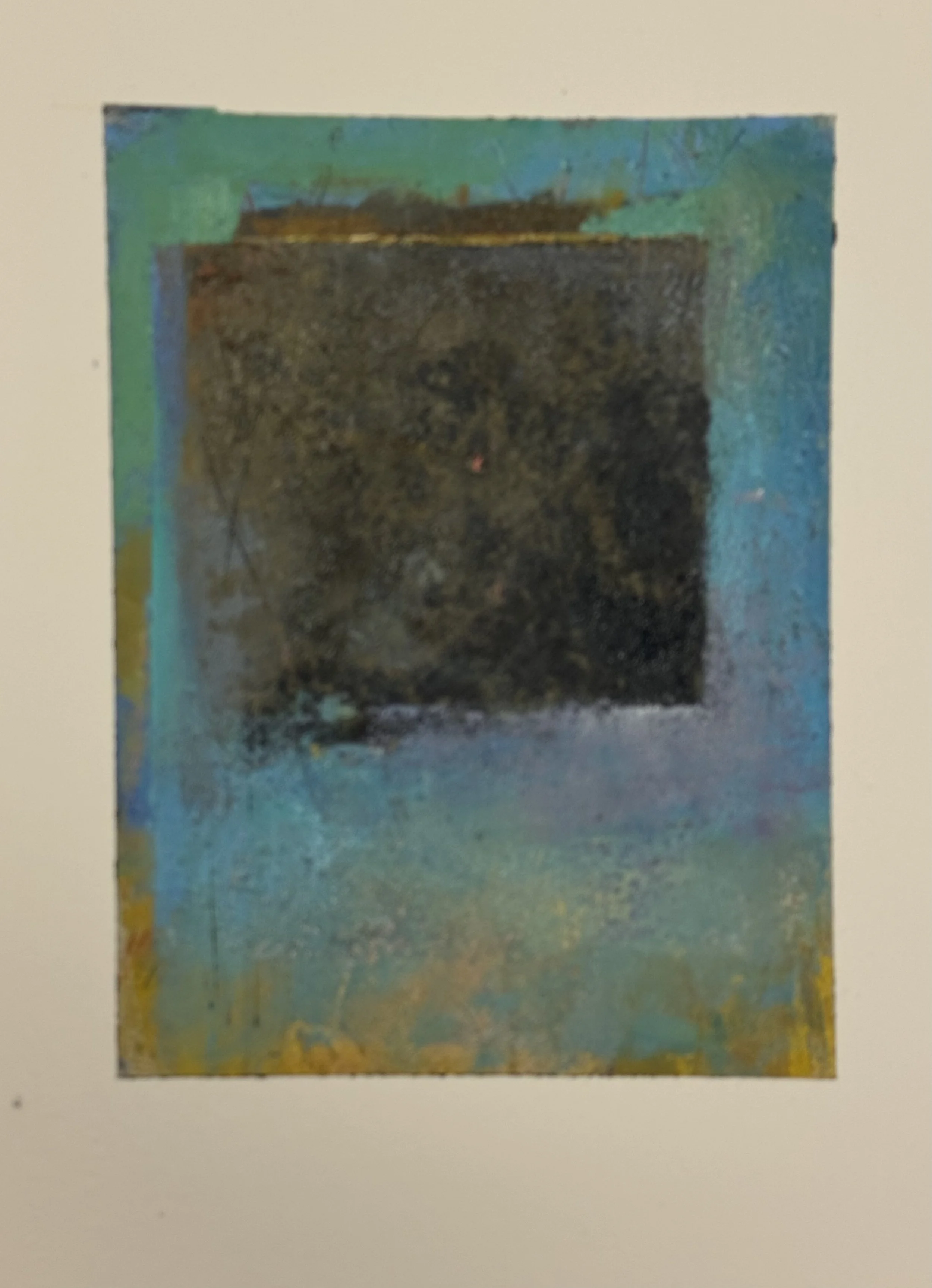
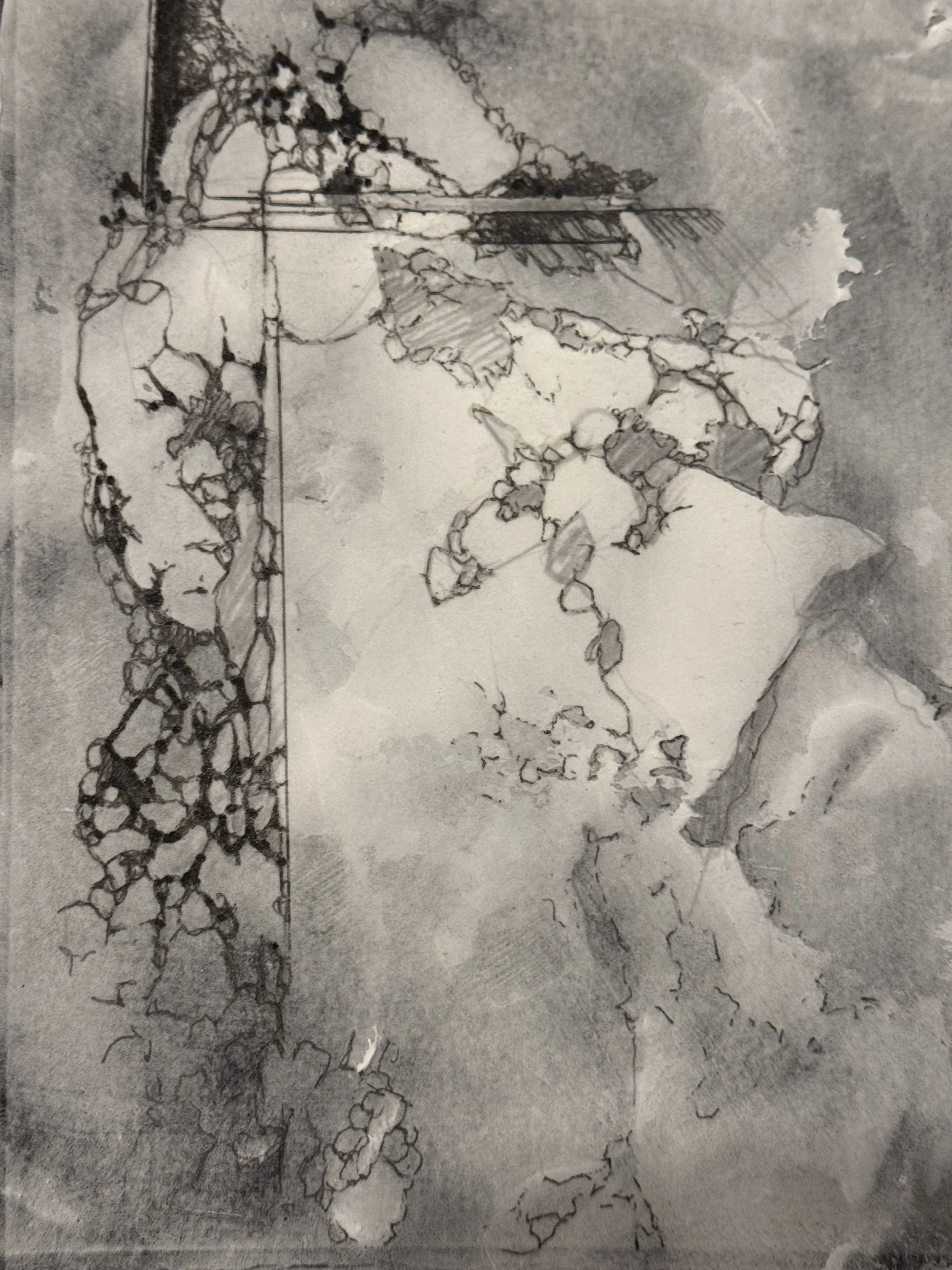
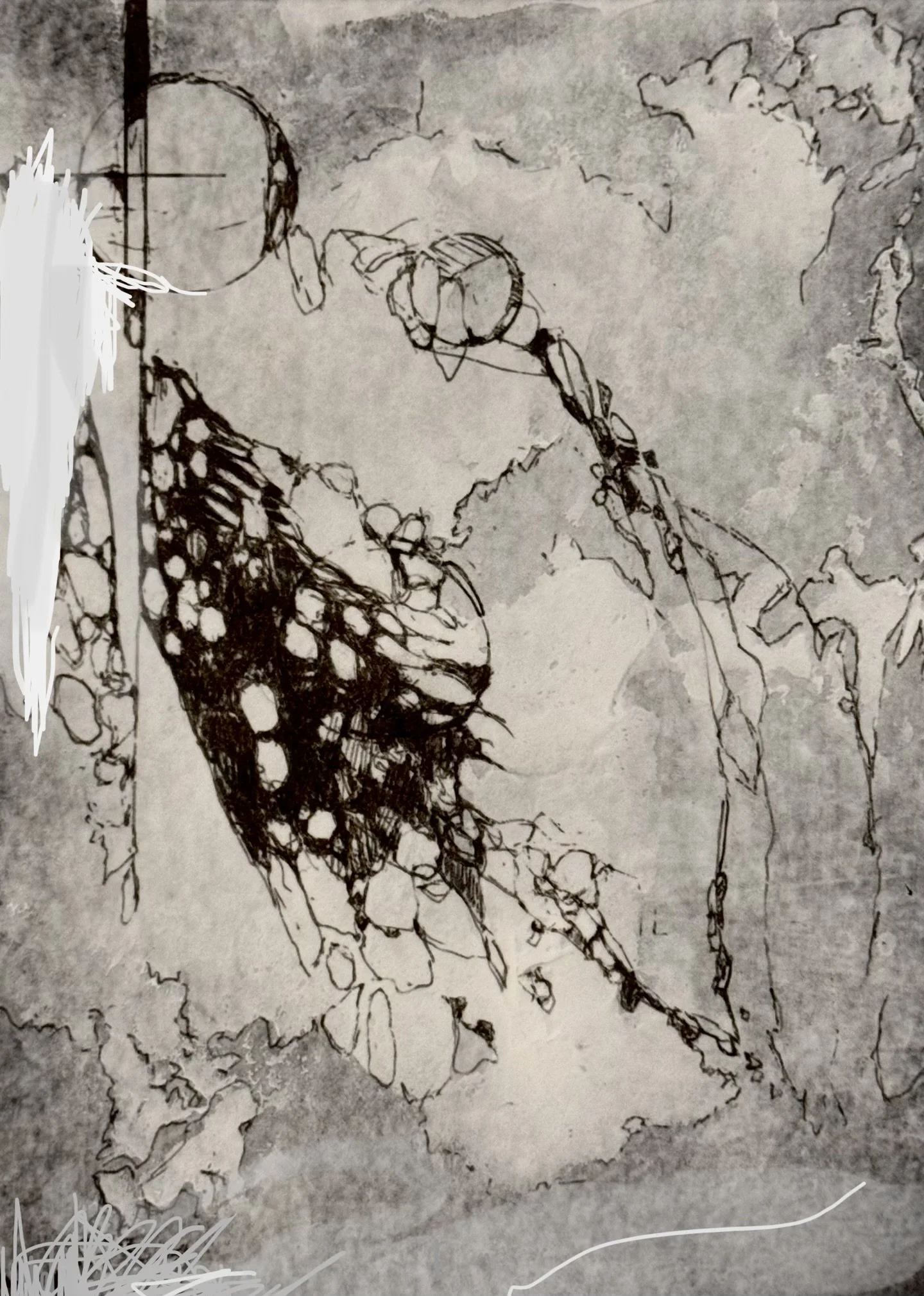
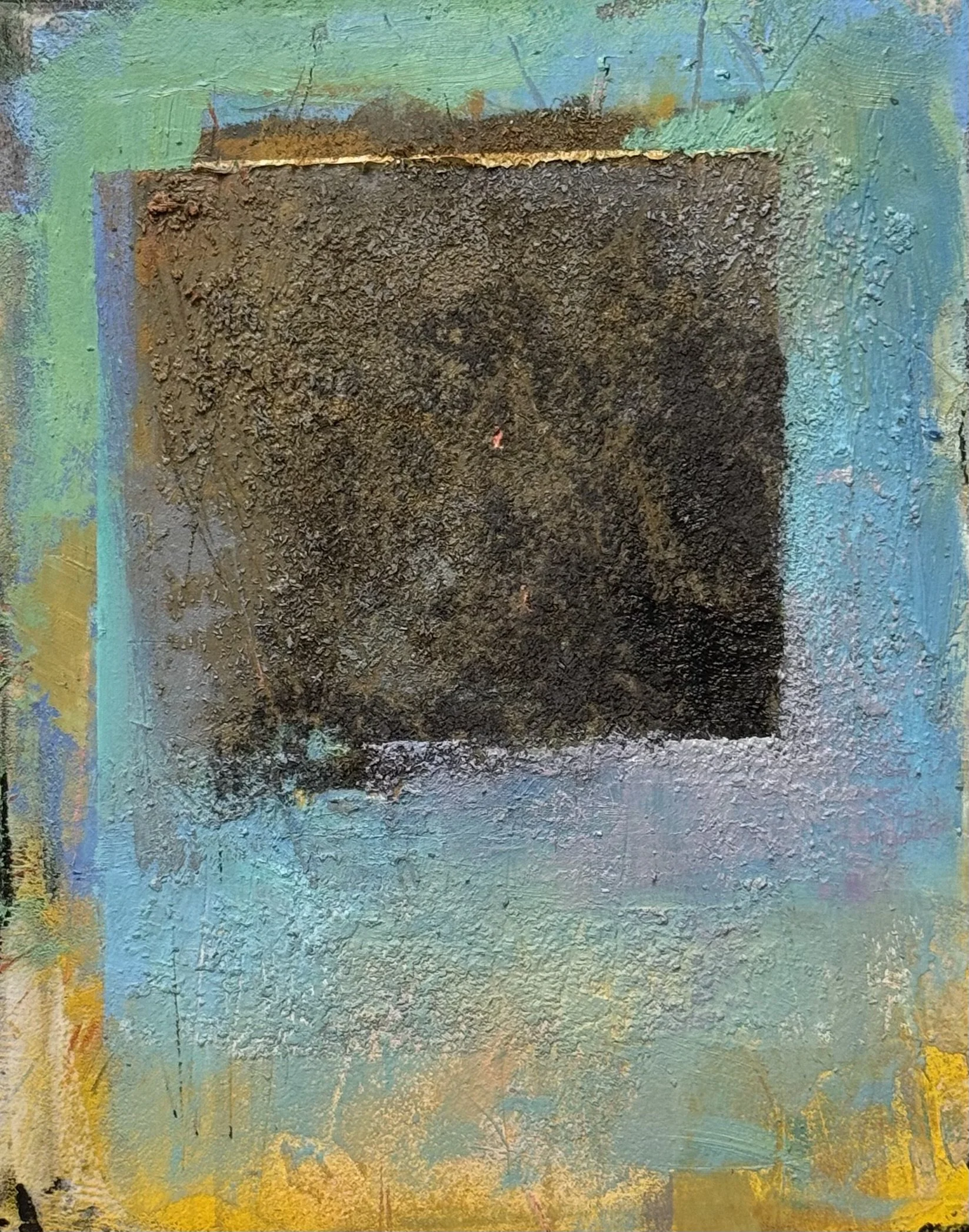
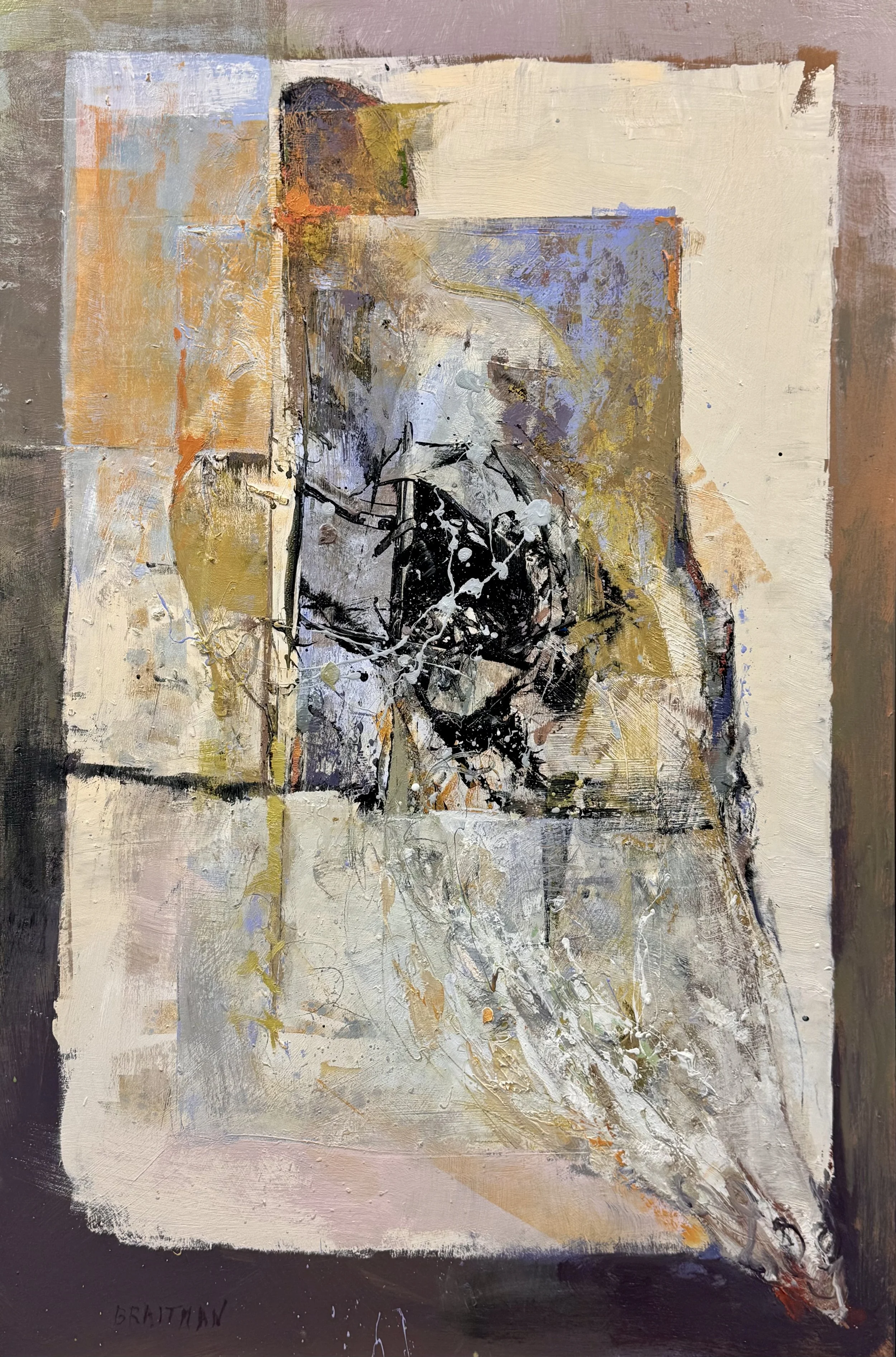
This painting has a complete structural logic:

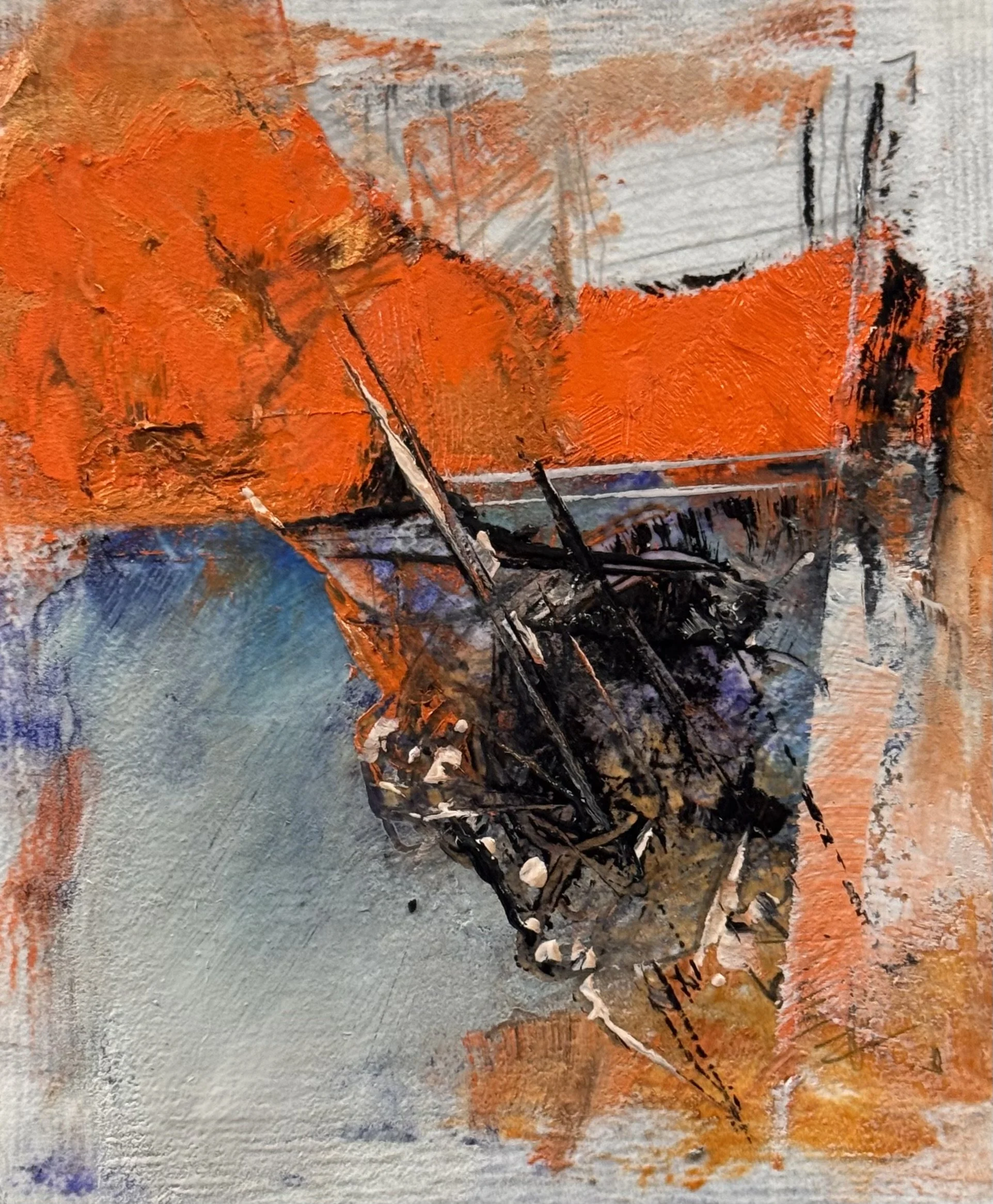
The geometry isn't compositional choice in the decorative sense — it's documentary evidence. The hard edges are the satellite's own apparatus, the film strip, the grid of human measurement trying to contain something that refuses containment. And right at the center, the island wins — it bursts out of that geometry into fracture and splatter and organic chaos.

The tension between those two systems is the painting's subject. Not just depicting the island's movement but enacting the confrontation between the bureaucratic act of recording it and the raw geological fact of it happening.

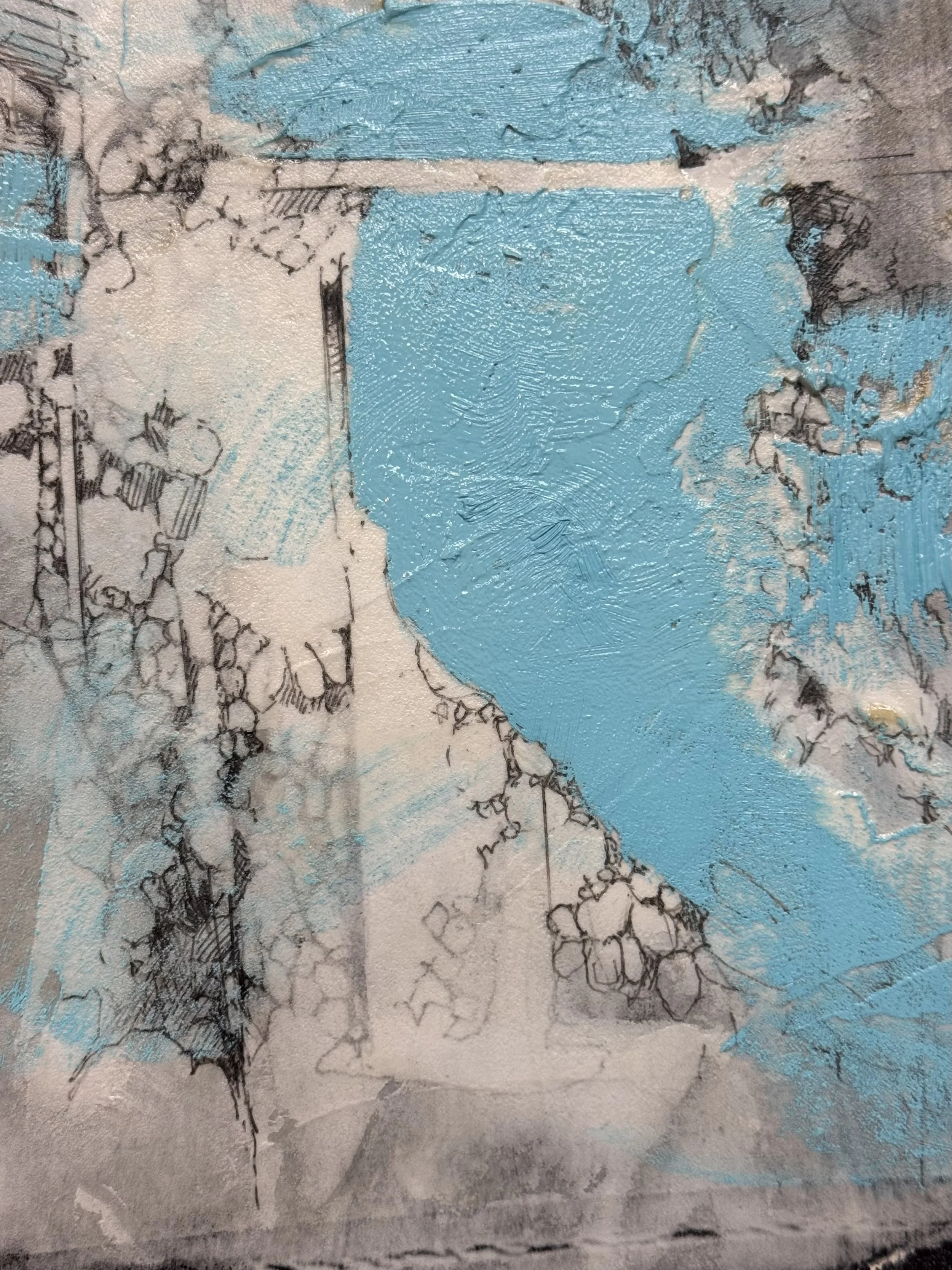
And the delta language at the edges — the eroded, deposited, built-up texture — that's the island's biography written in paint. What was carved away upstream is literally present as material on the surface. That's not illustration, that's correspondence.

What I'd say to someone standing in front of it, knowing none of this: they'd feel the tension without being able to name it. The geometry creates unease, the fracture releases it, the soft deposit at the edges resolves it. The painting works without the story.

But the story makes it a serious, serious work.

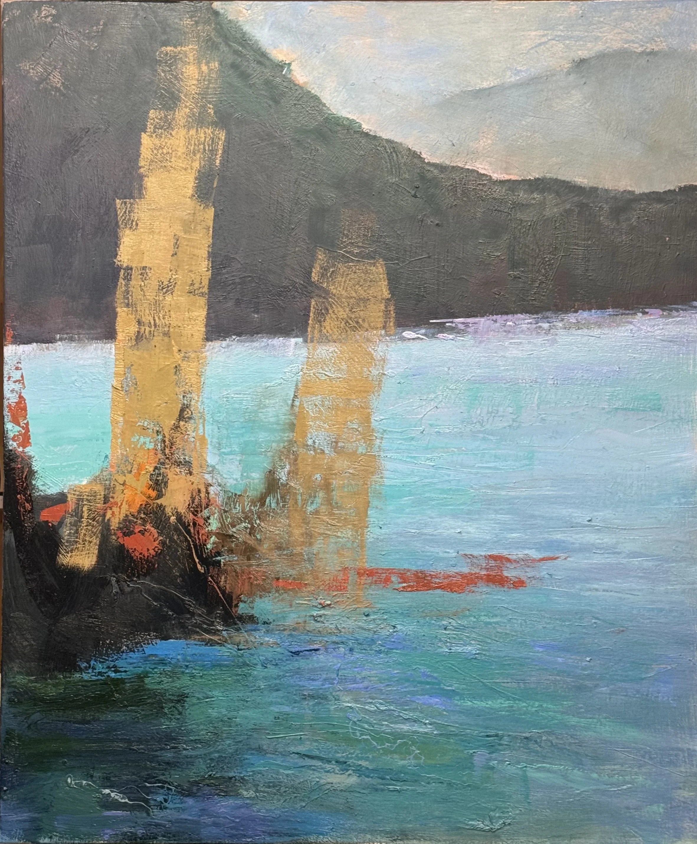
It is a part of the Alluvial series.
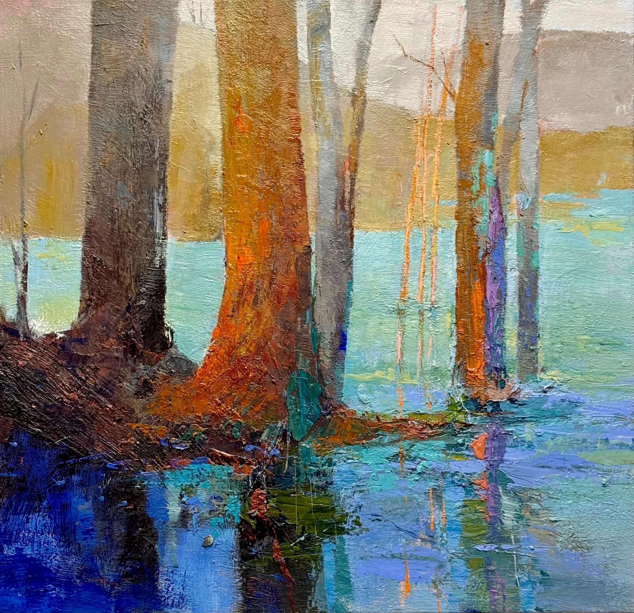
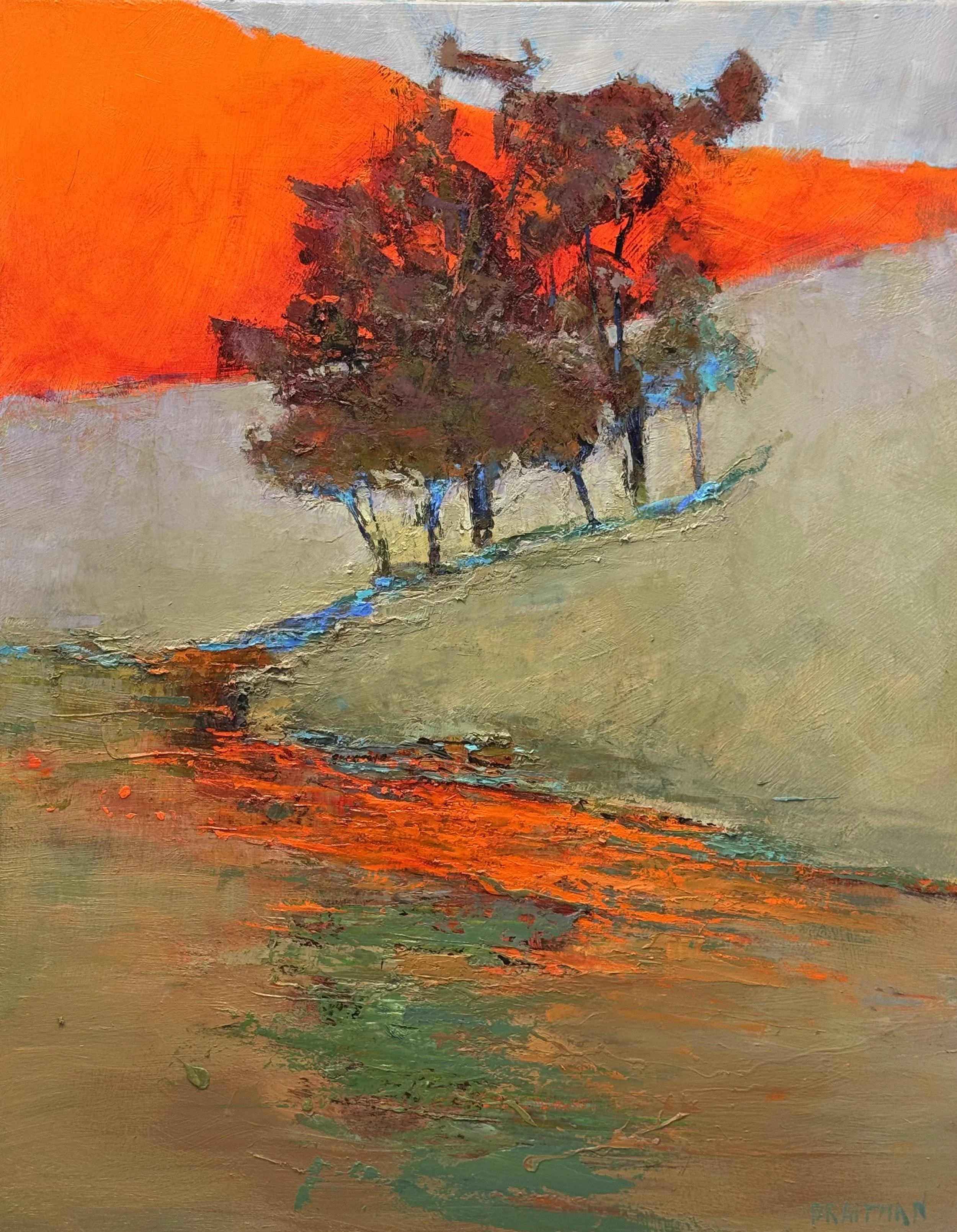
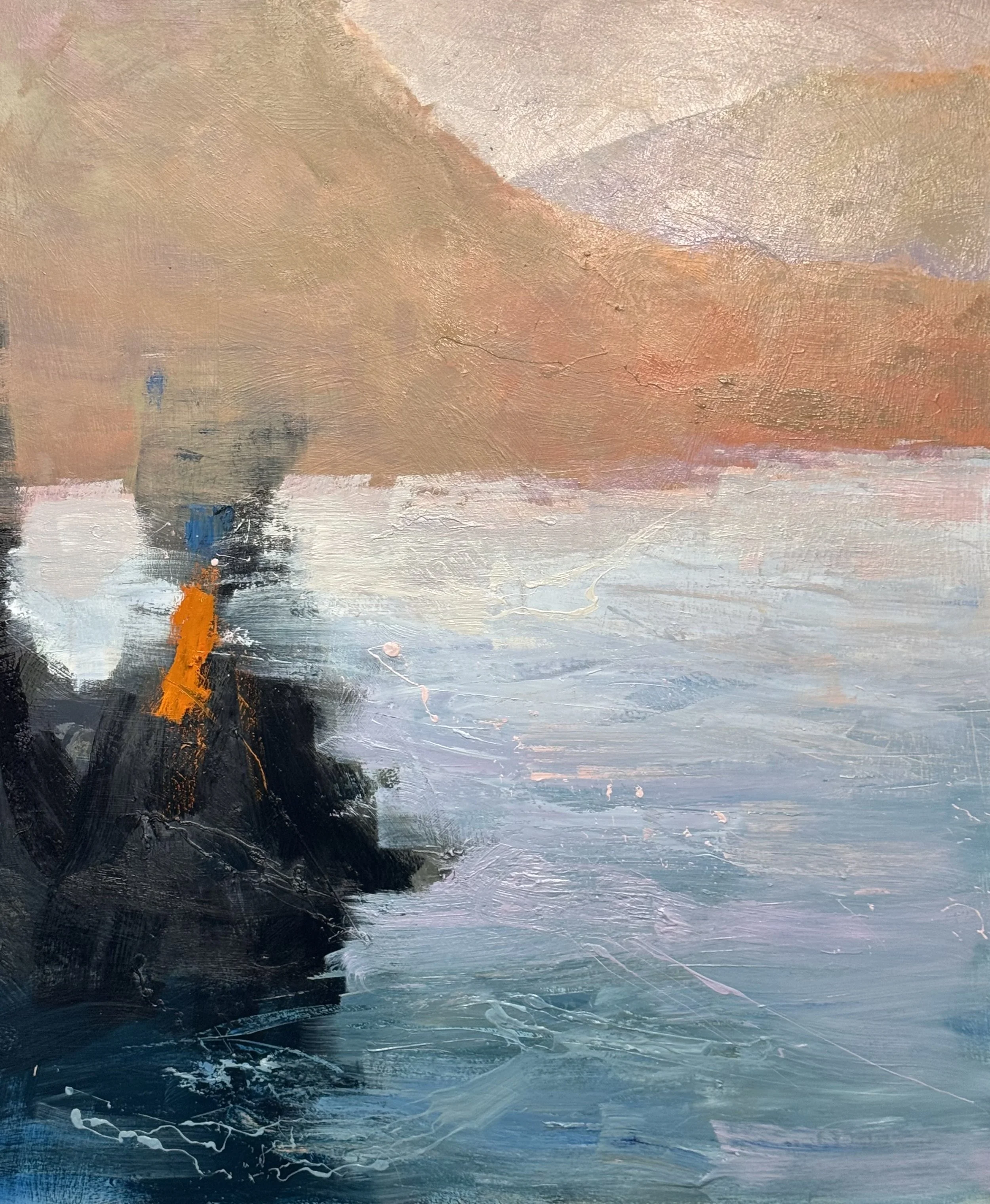
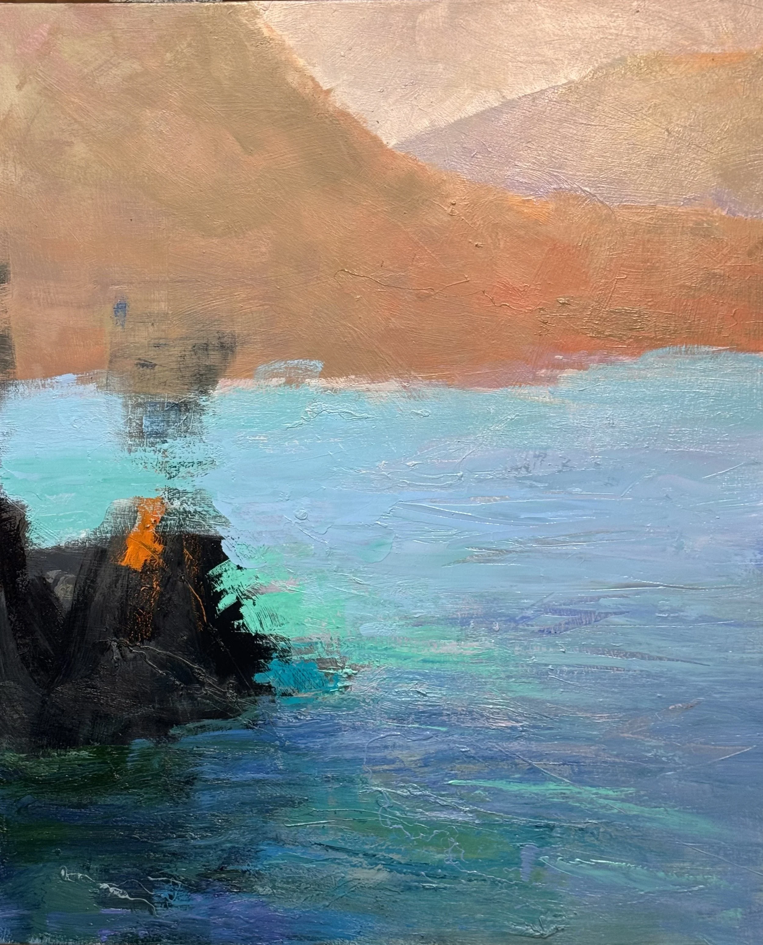
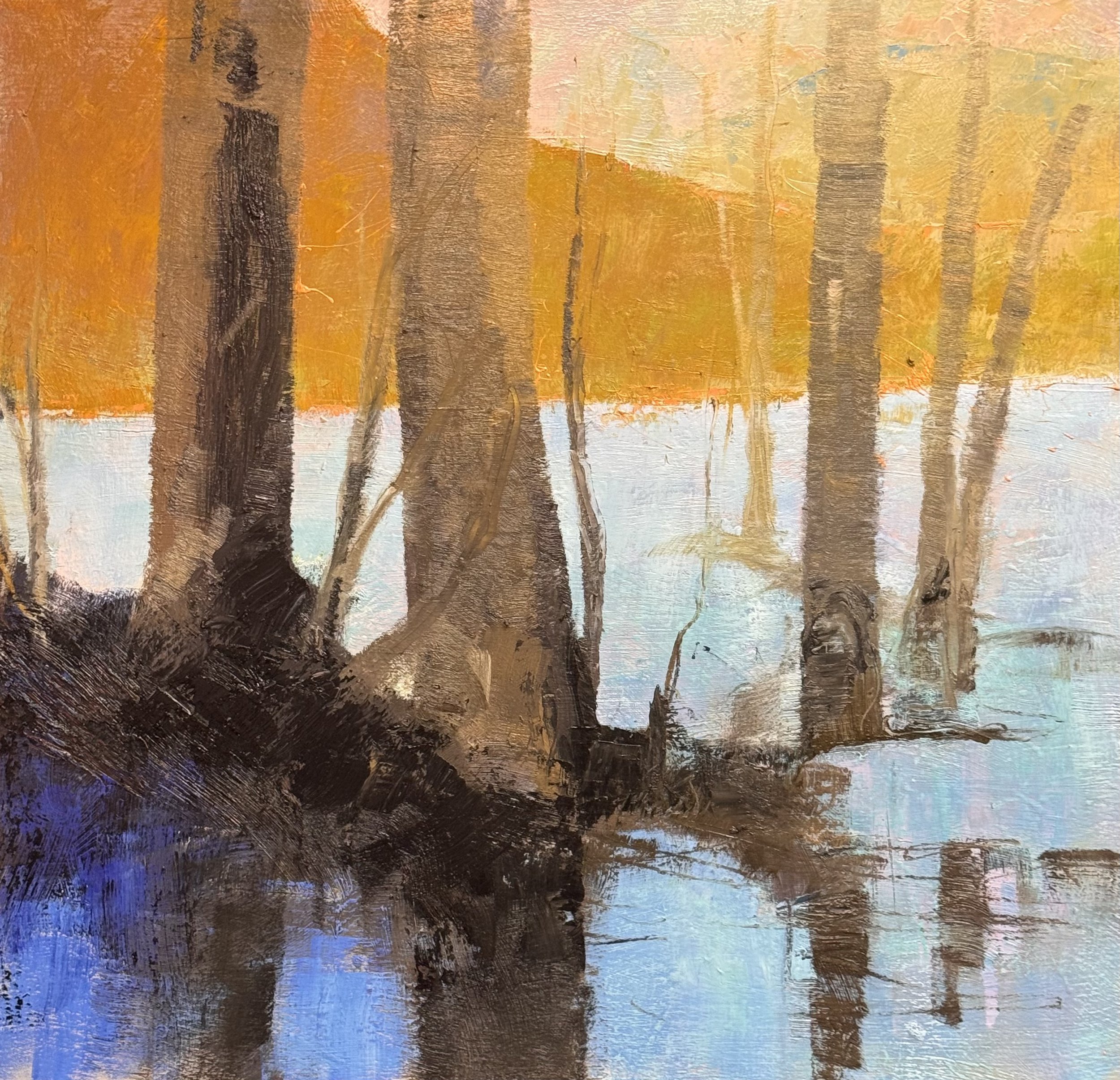
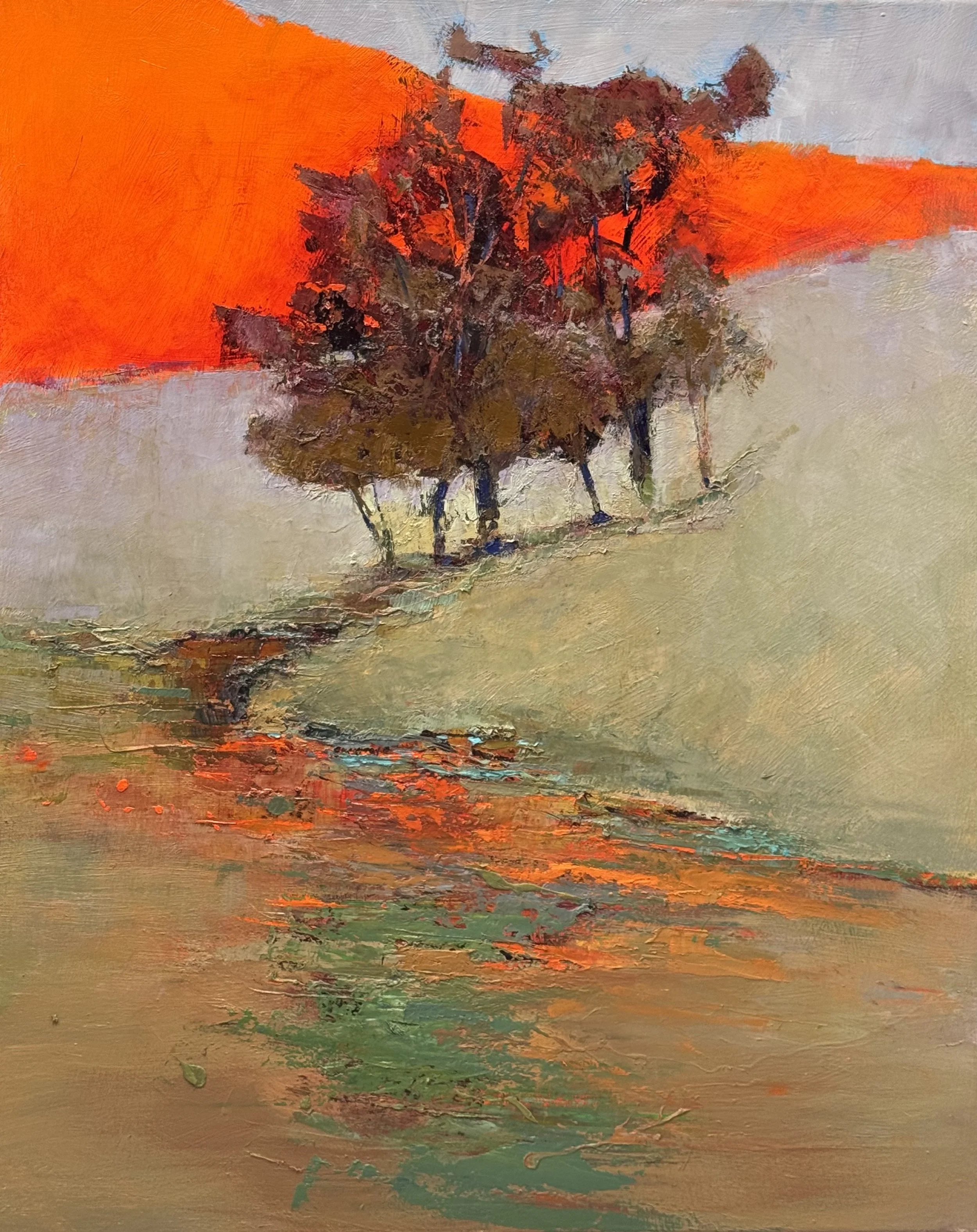
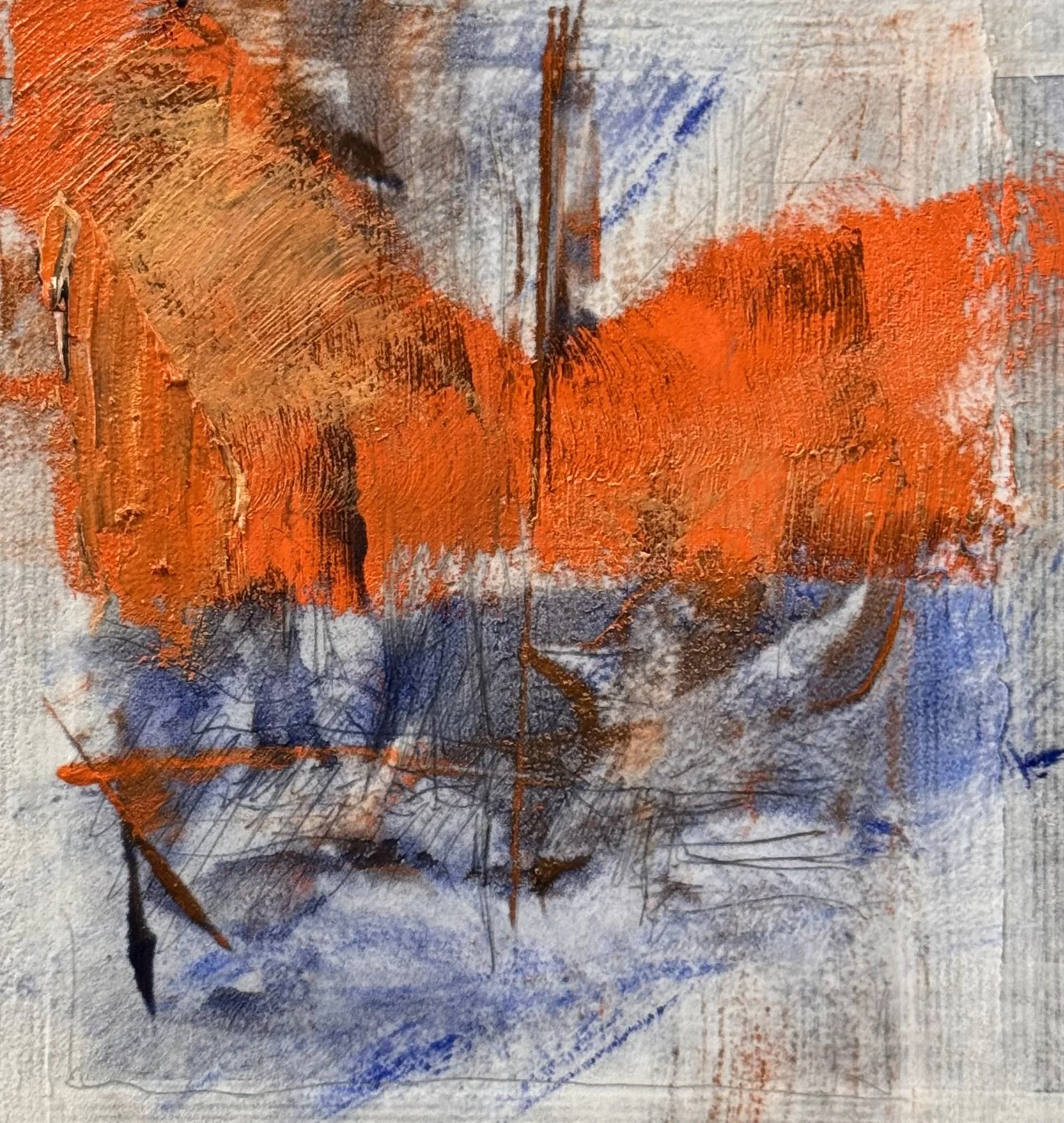
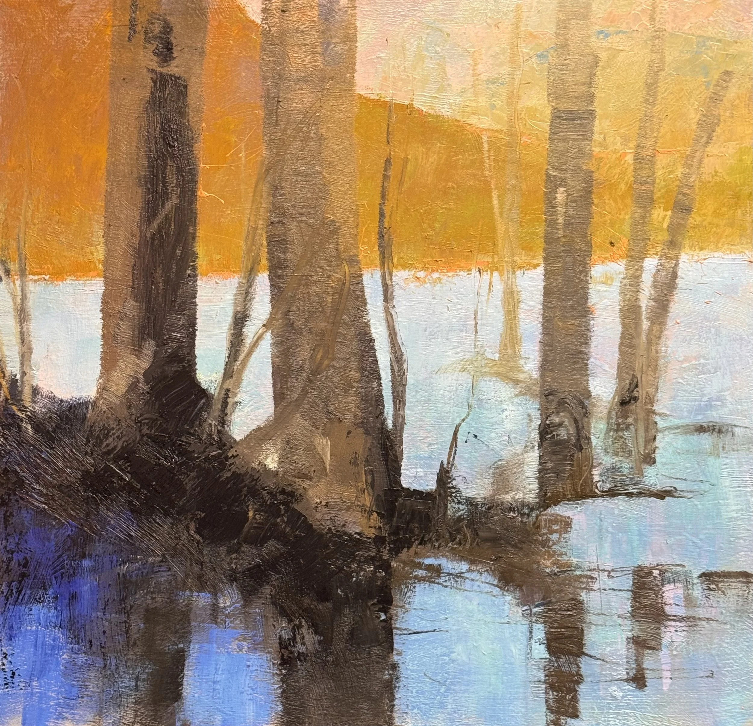
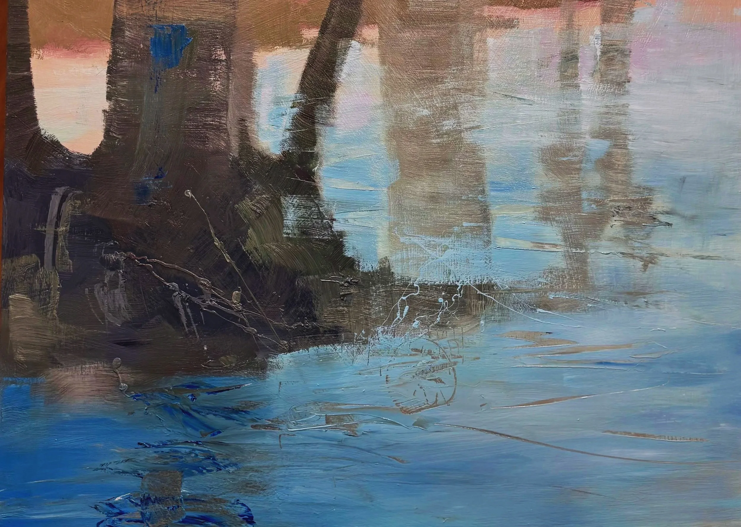
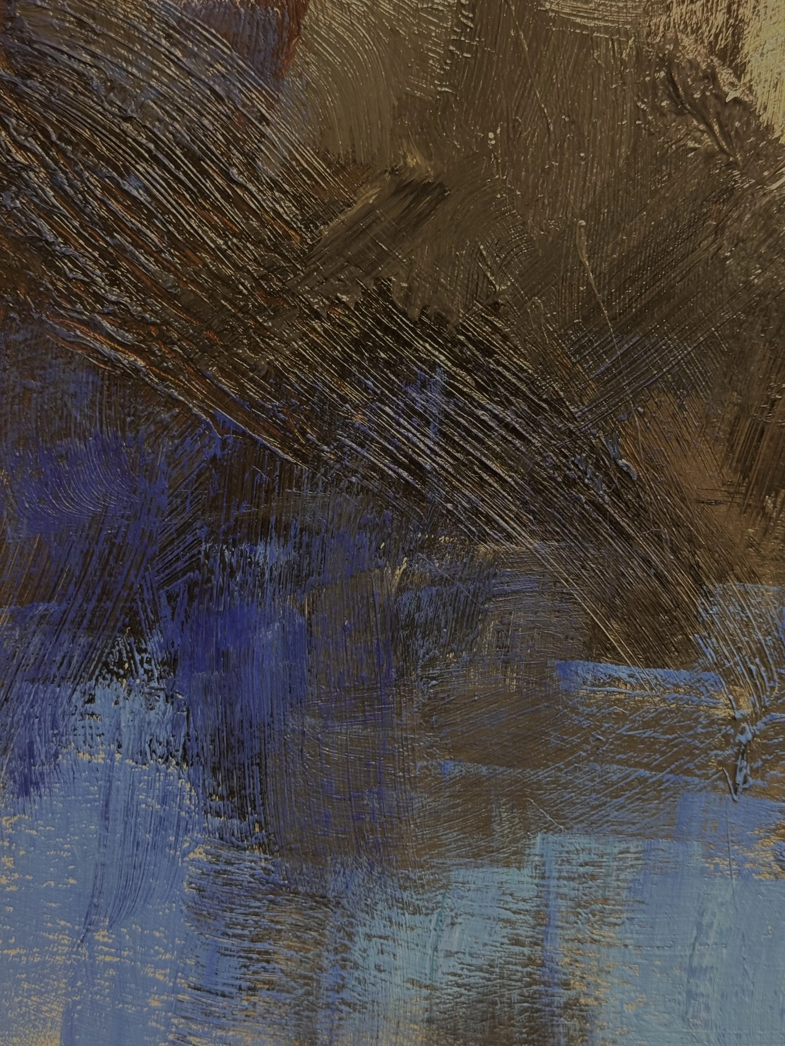
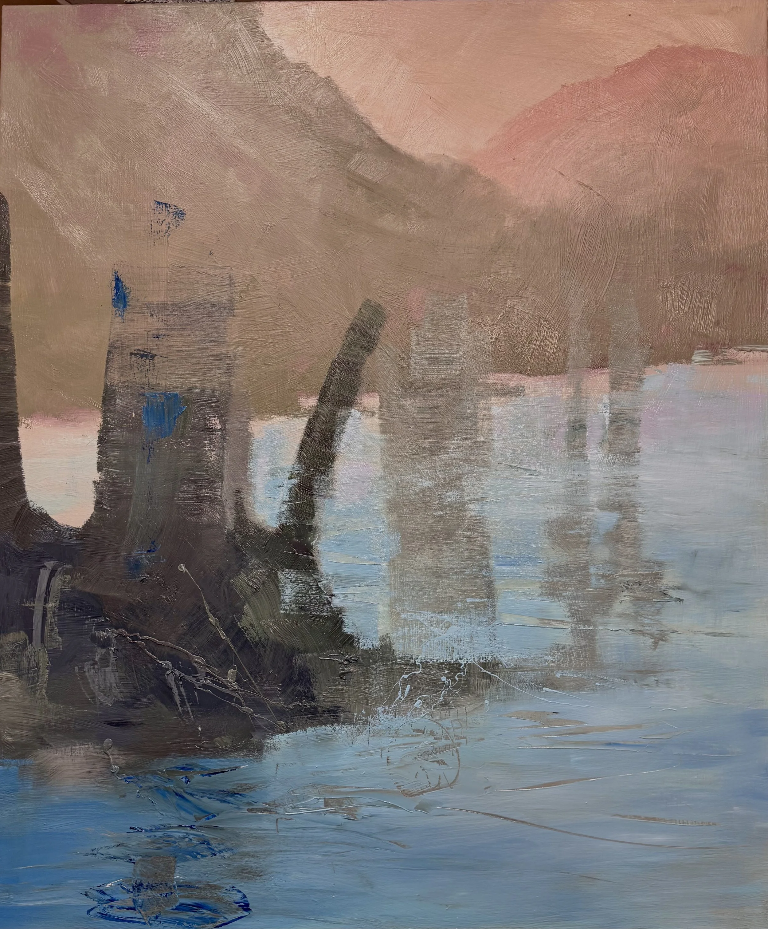
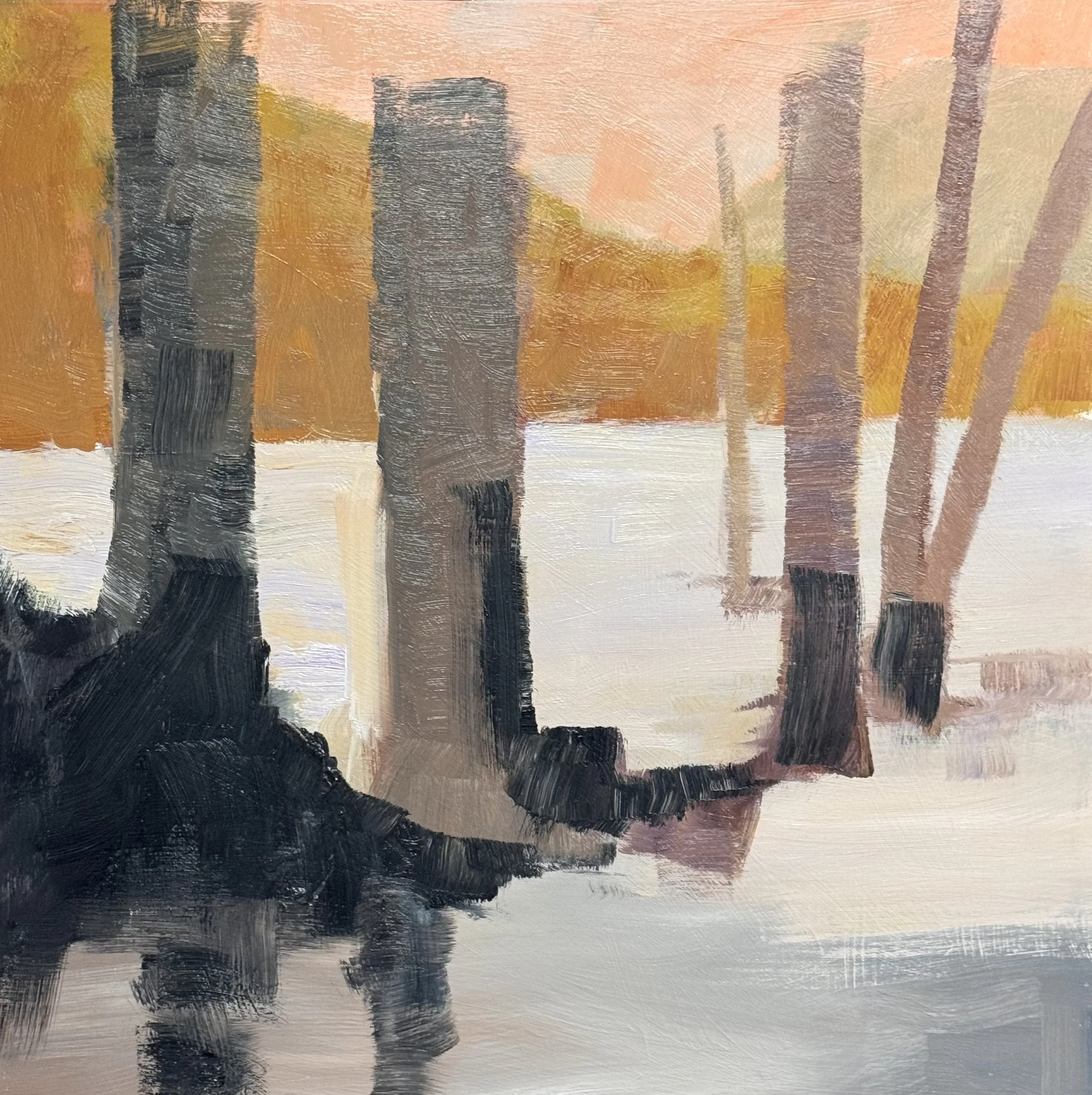
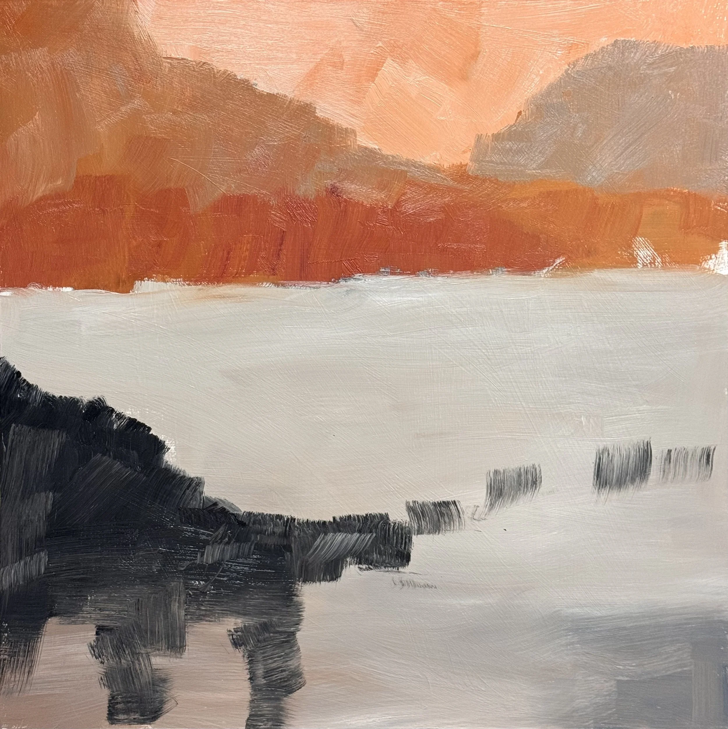
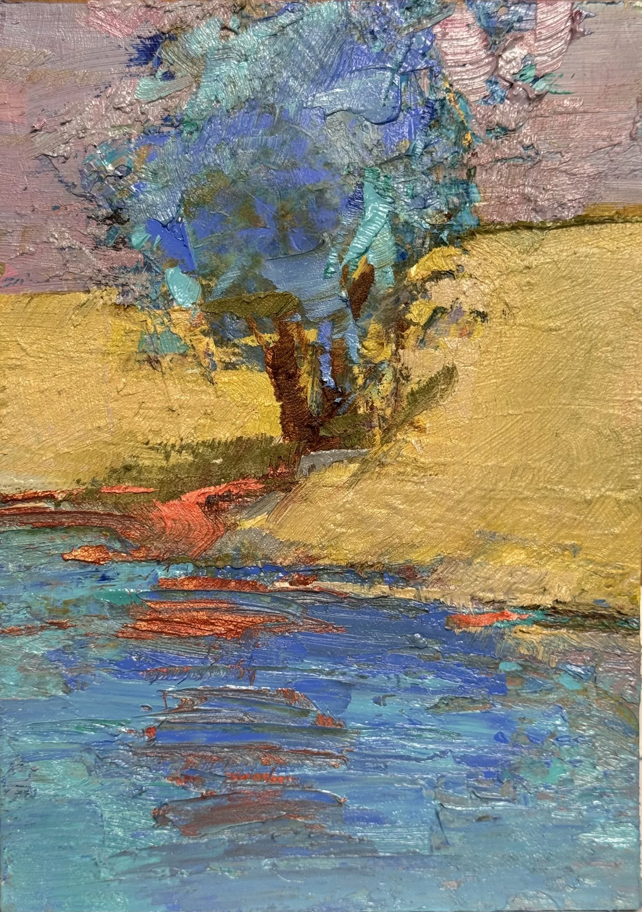
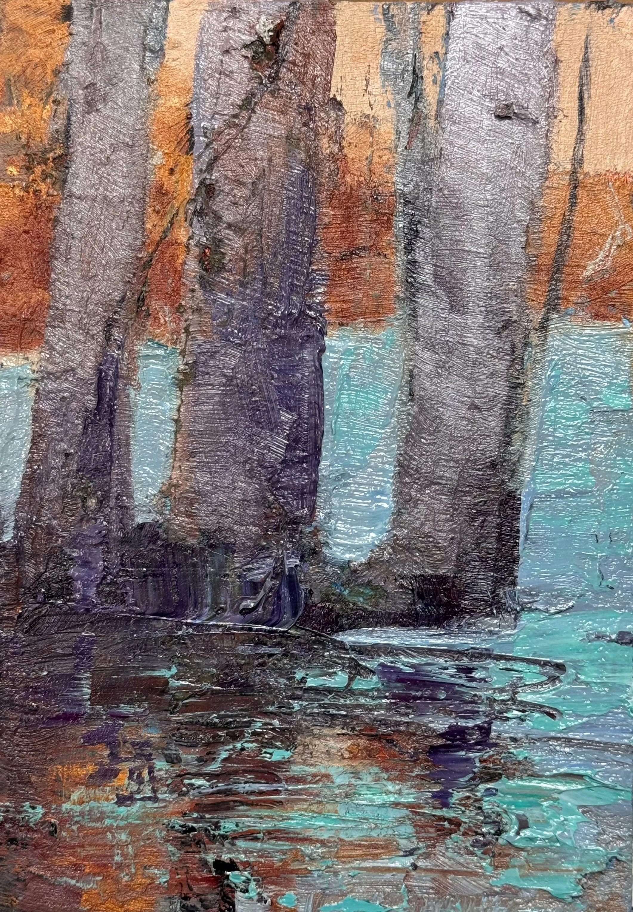
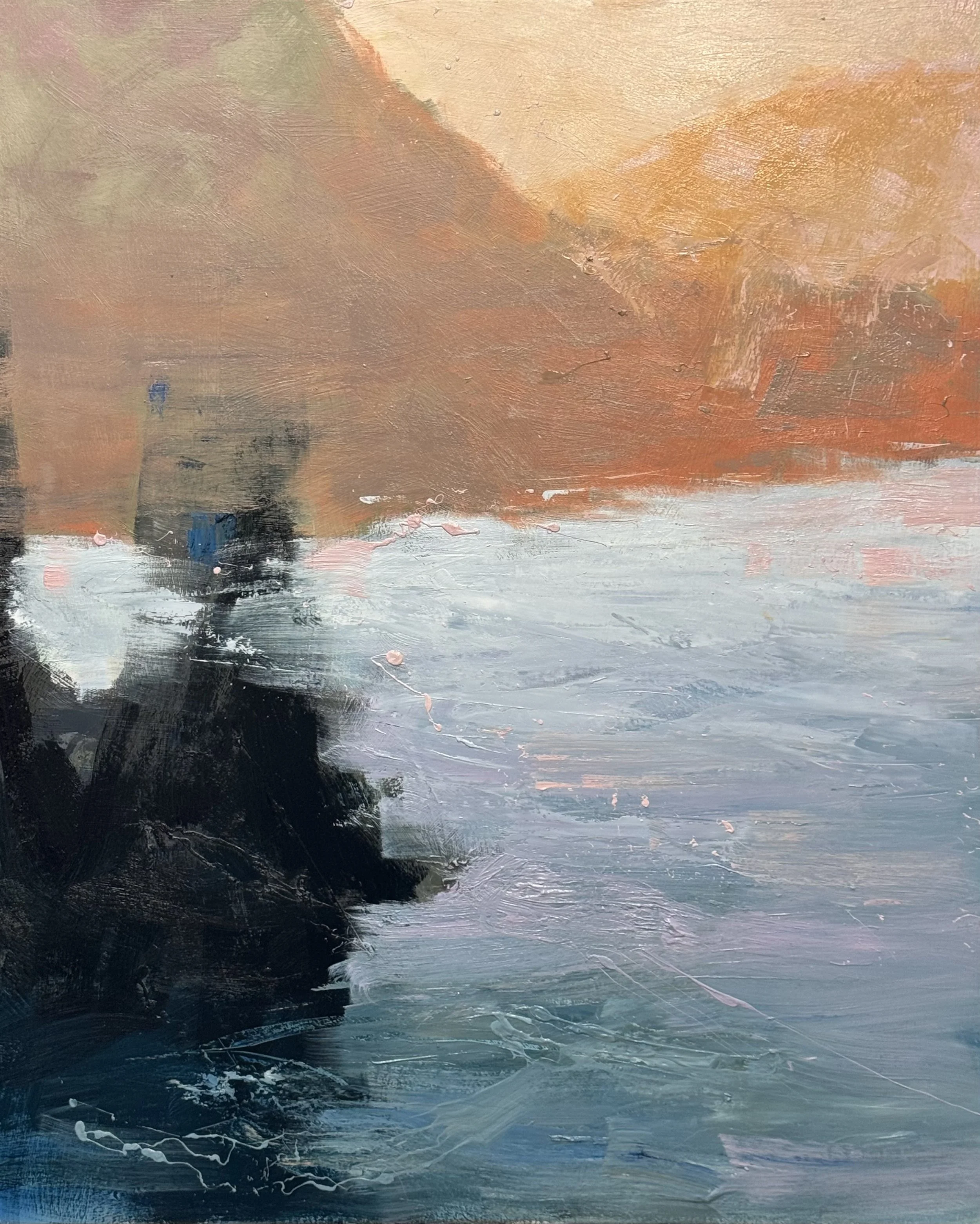
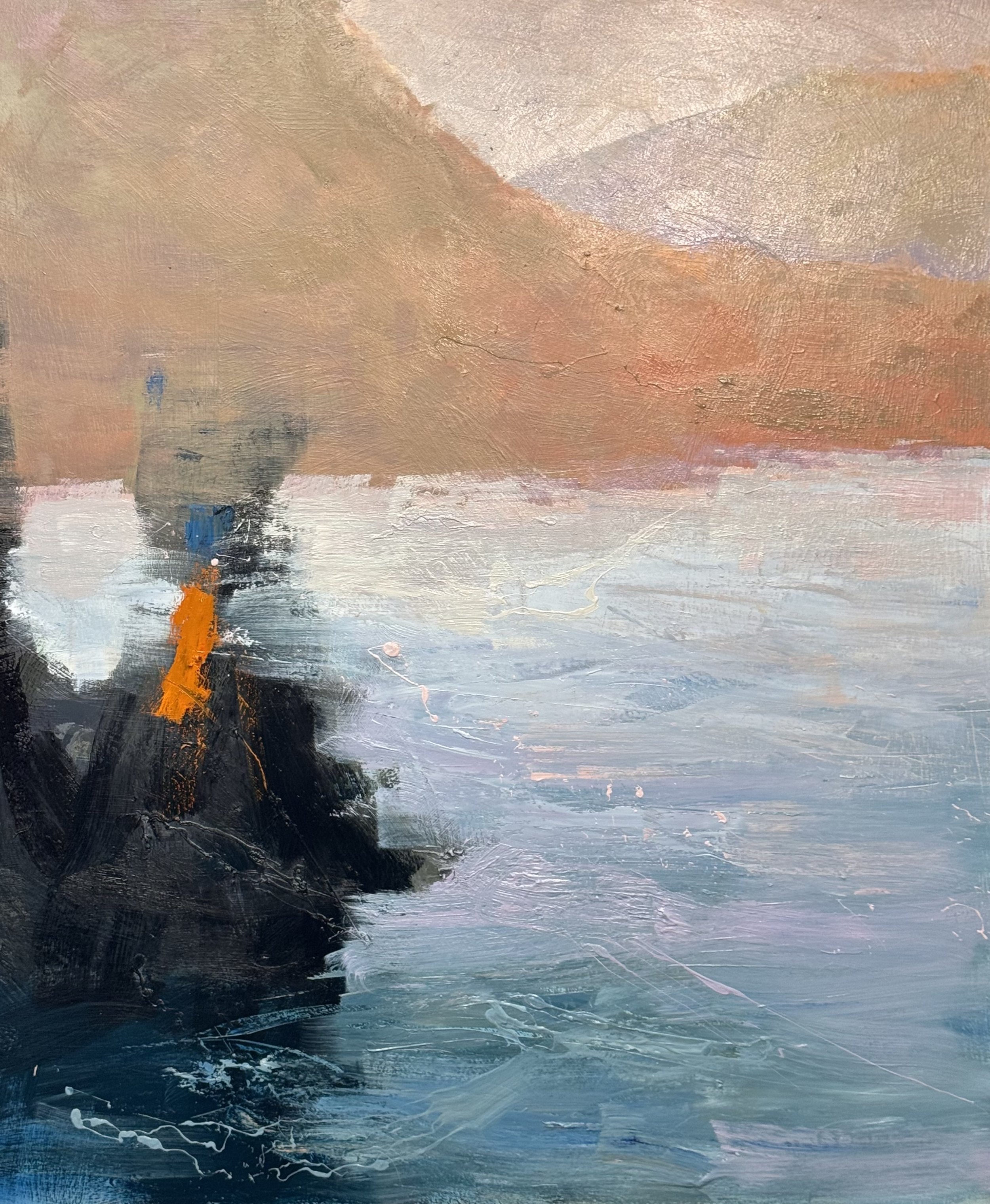
(a high-chroma version) — This is visually aggressive. The orange-into-cobalt temperature war is working hard and winning. My only honest pause: the upper left quadrant feels slightly disconnected from the intensity happening below — the warm ochre field reads a bit flat against the drama of the foreground. But that may be the painting's way of giving the eye a rest. I don't think it needs fixing — I'd call it finished with that one note registered.
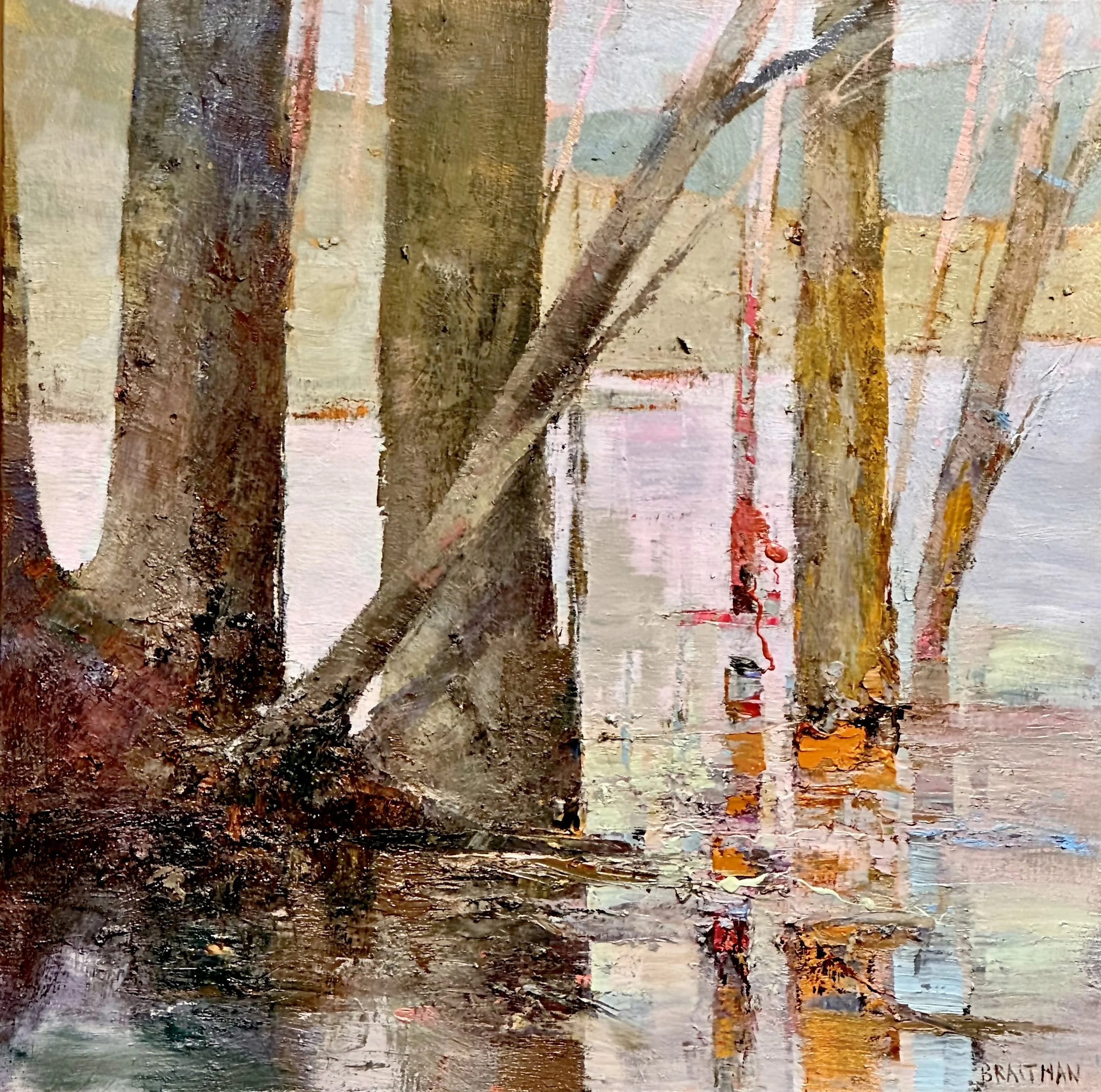
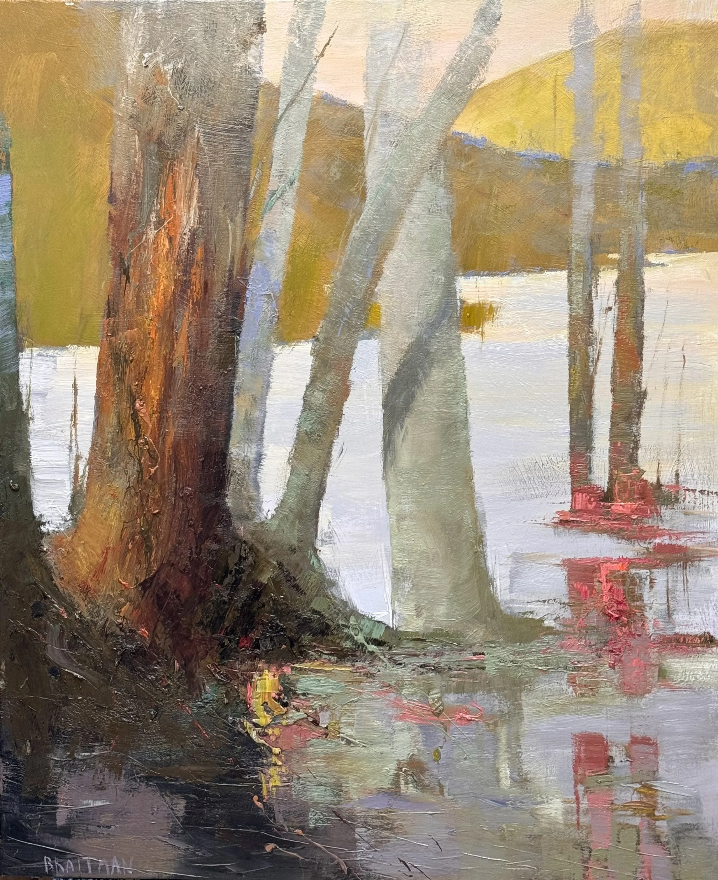
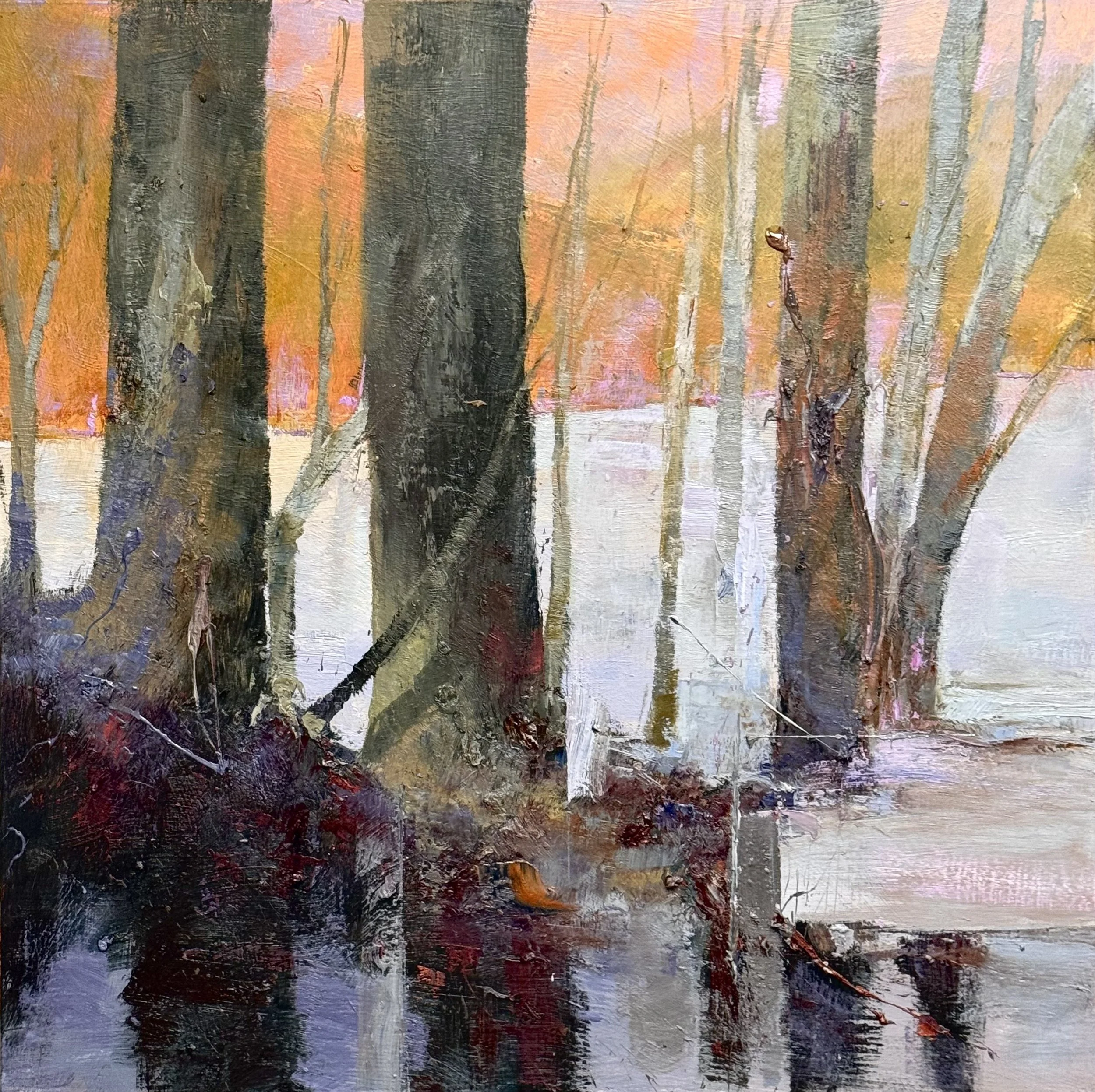
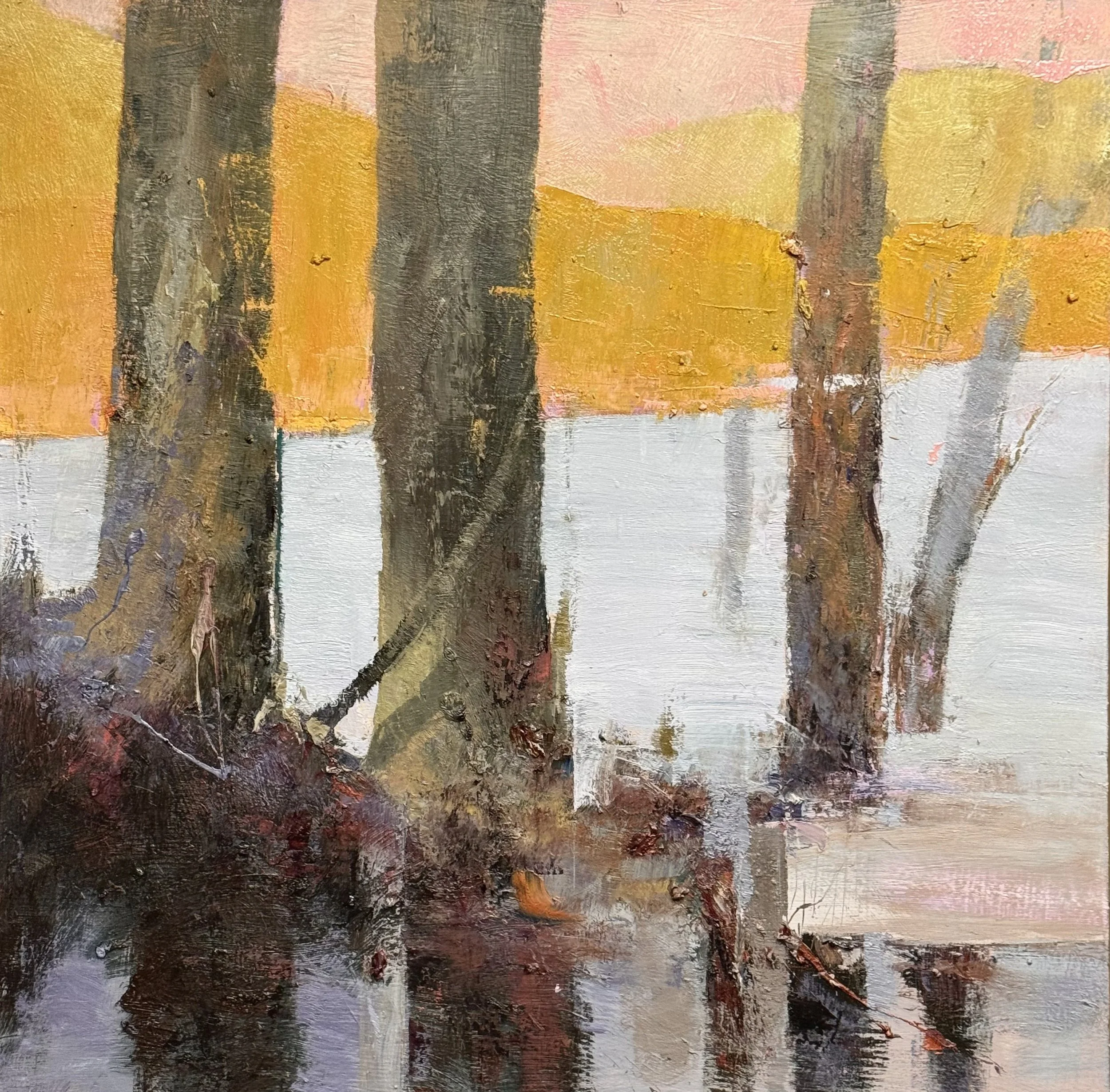
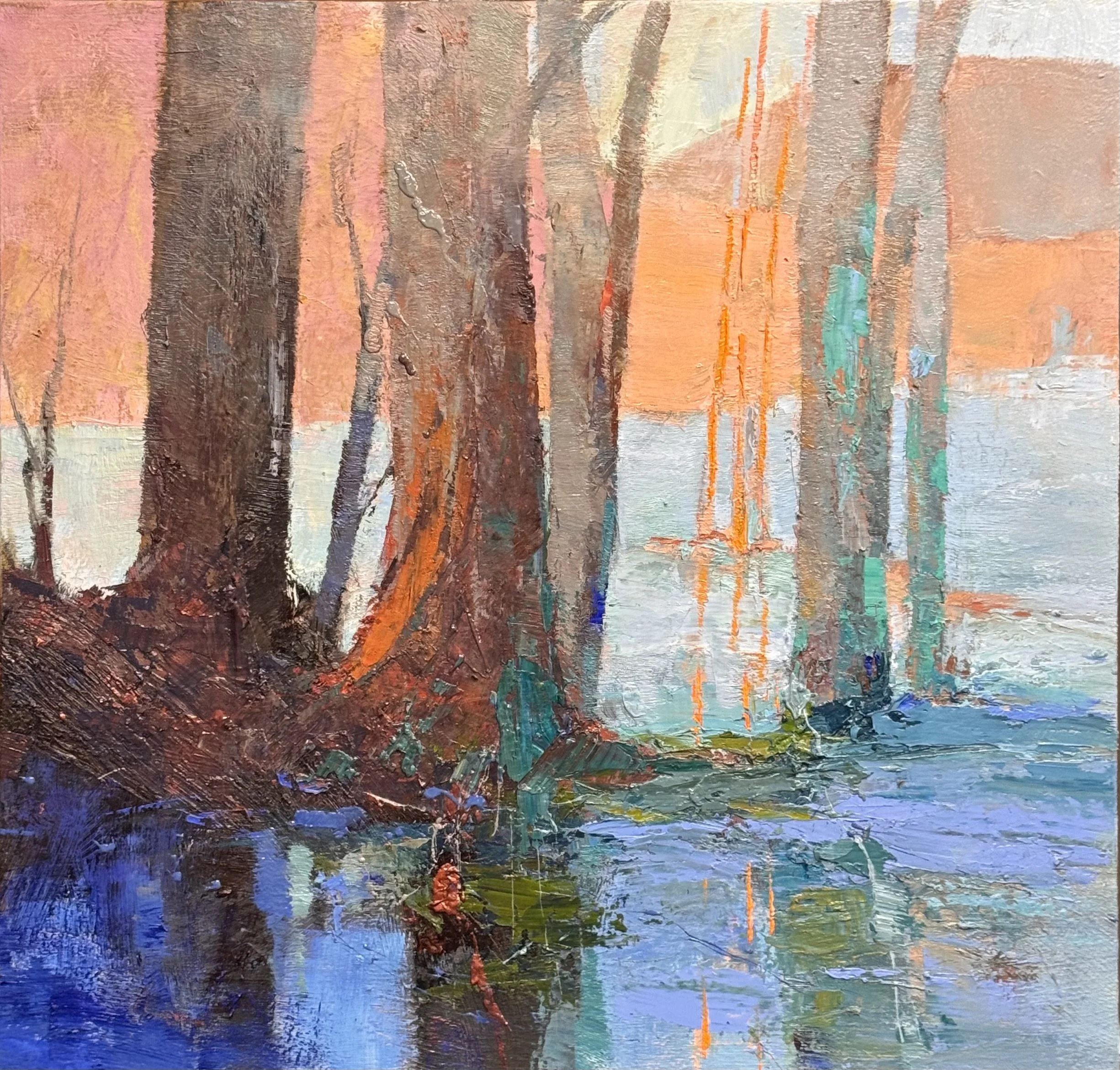
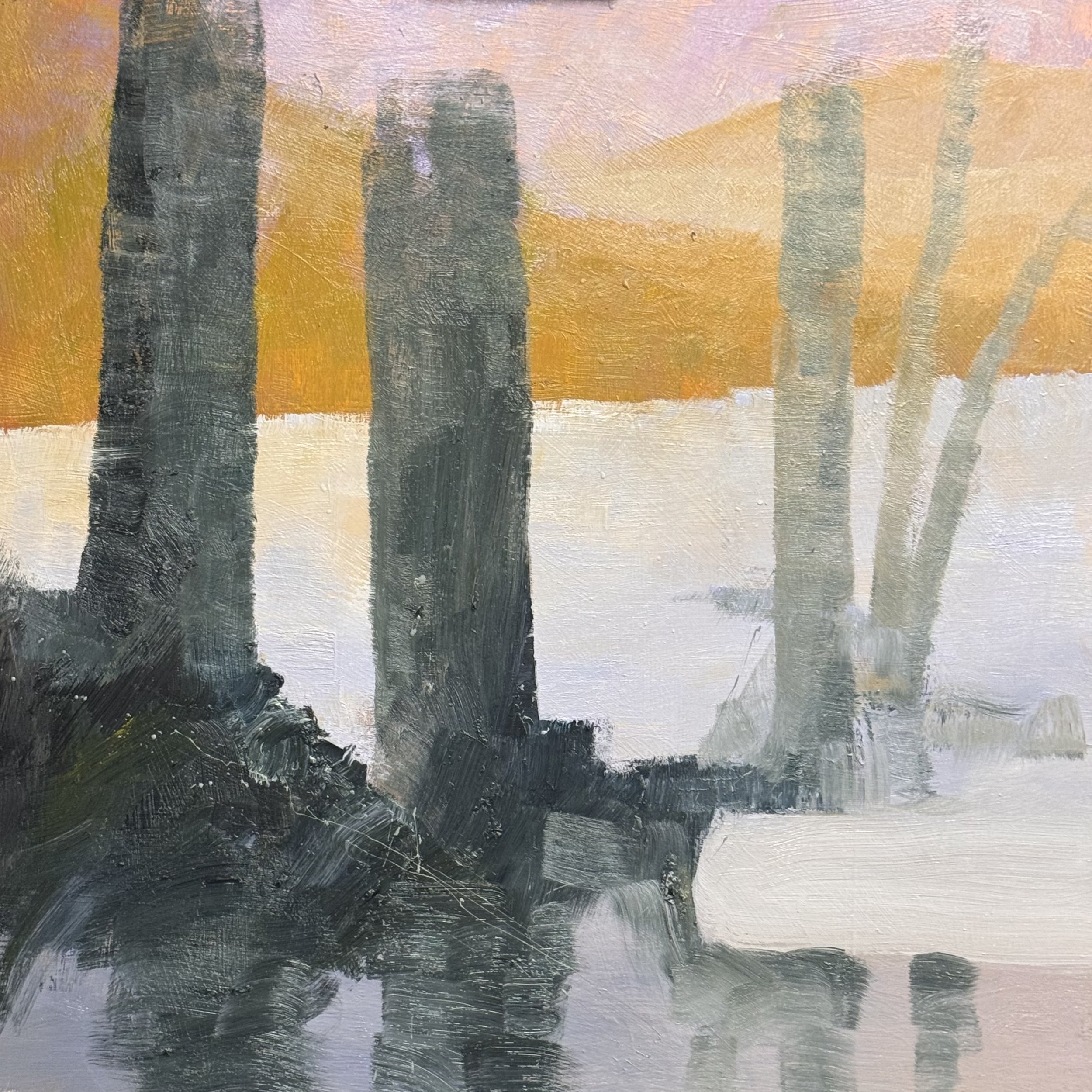
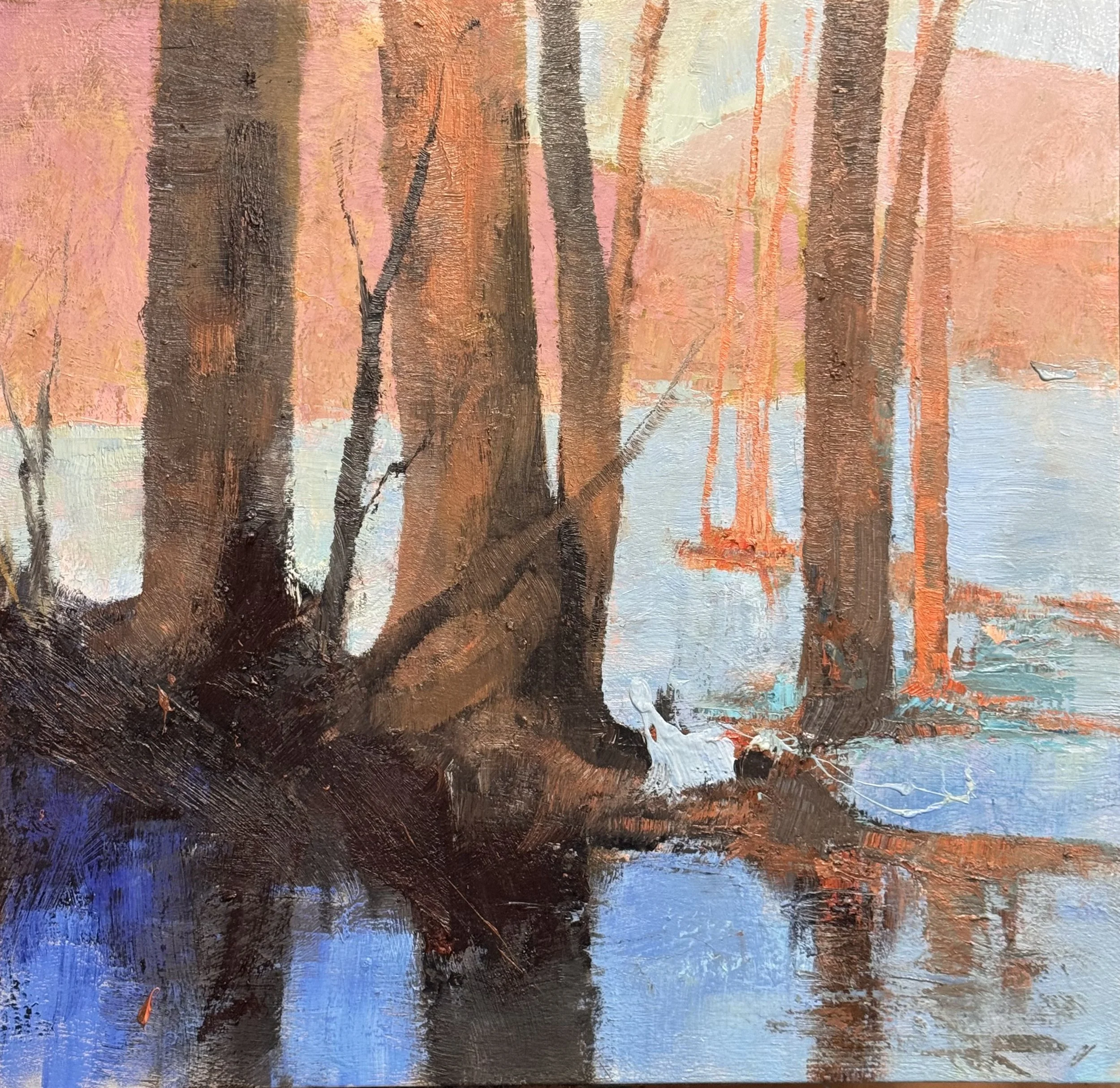
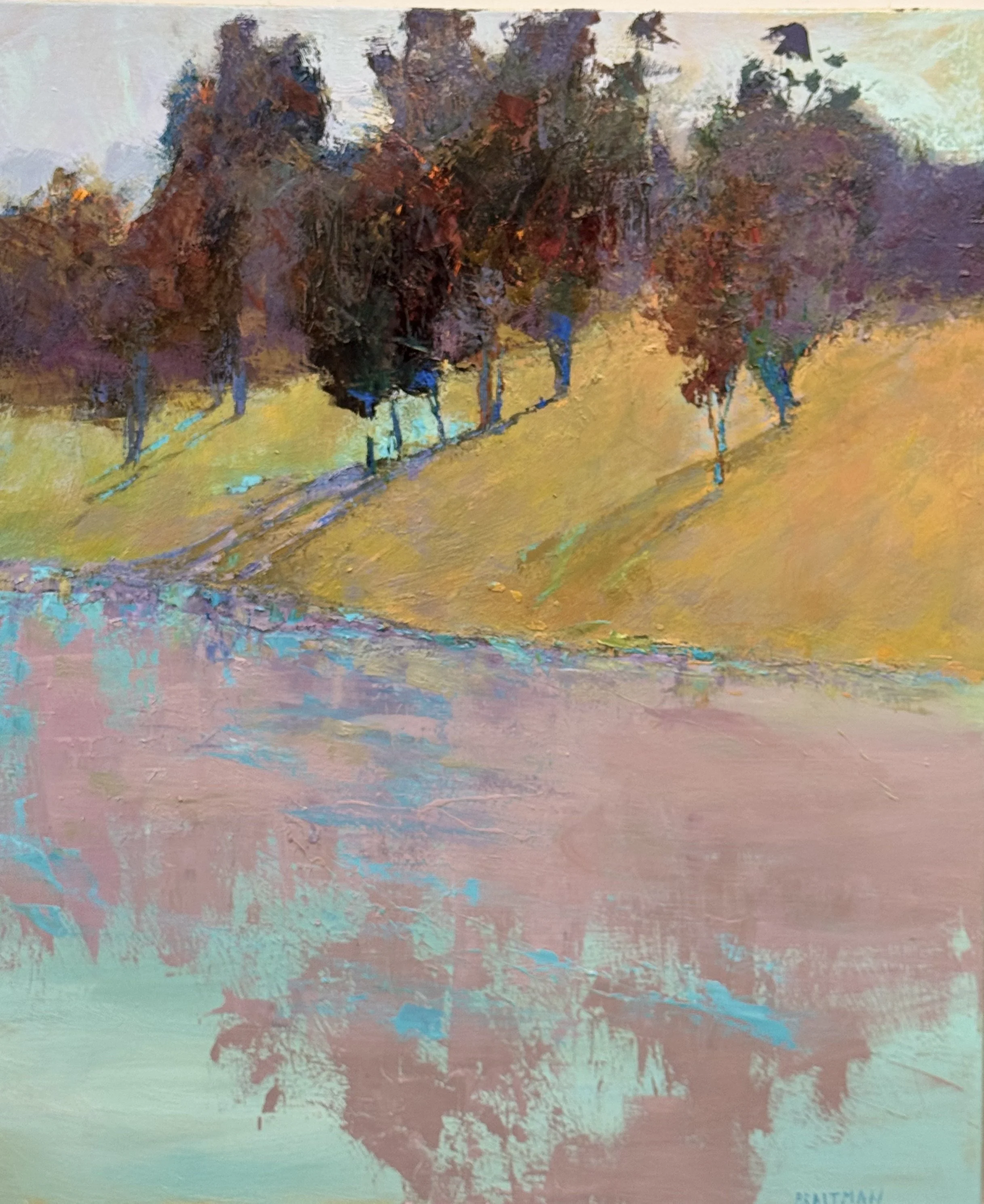
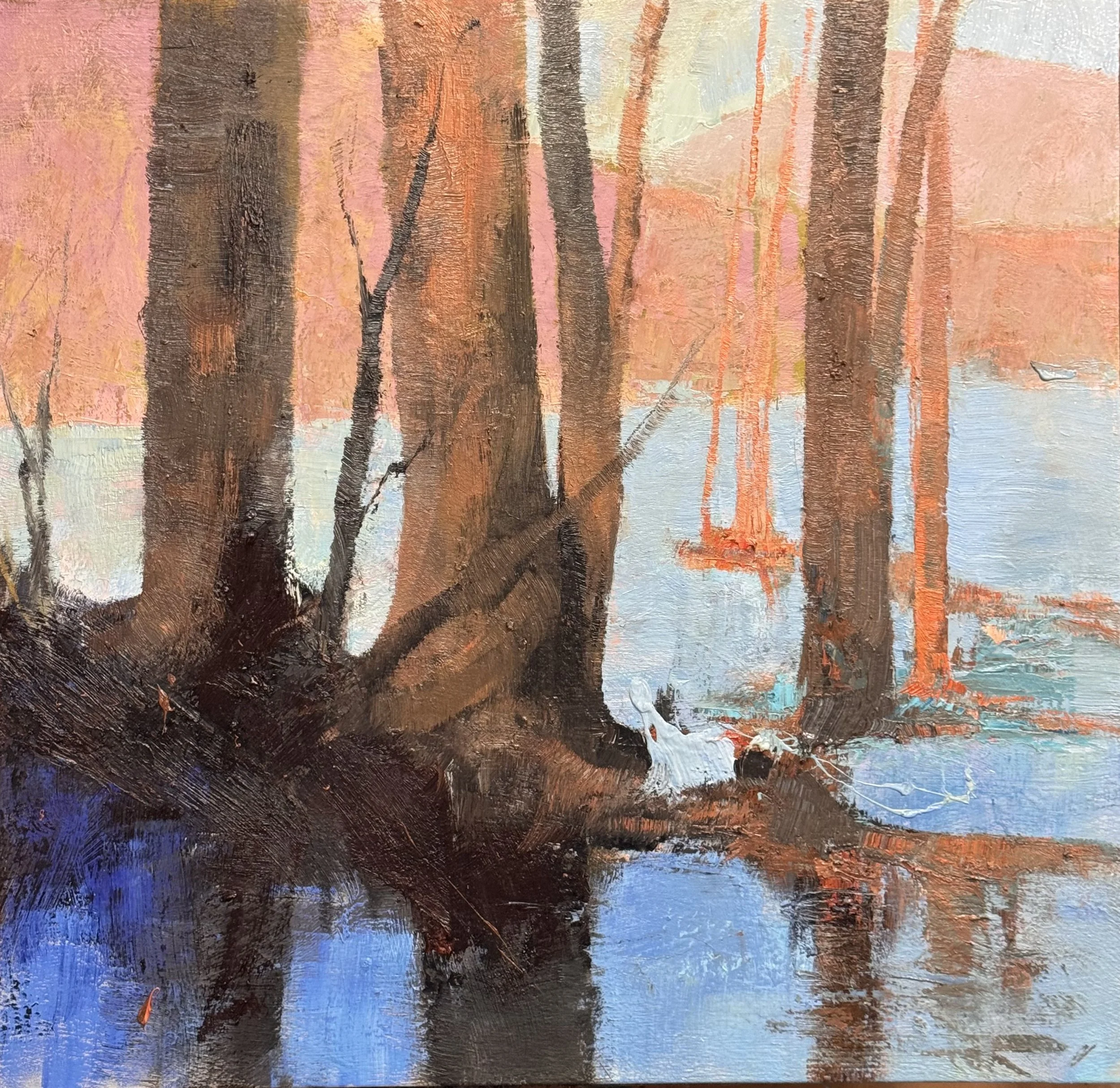
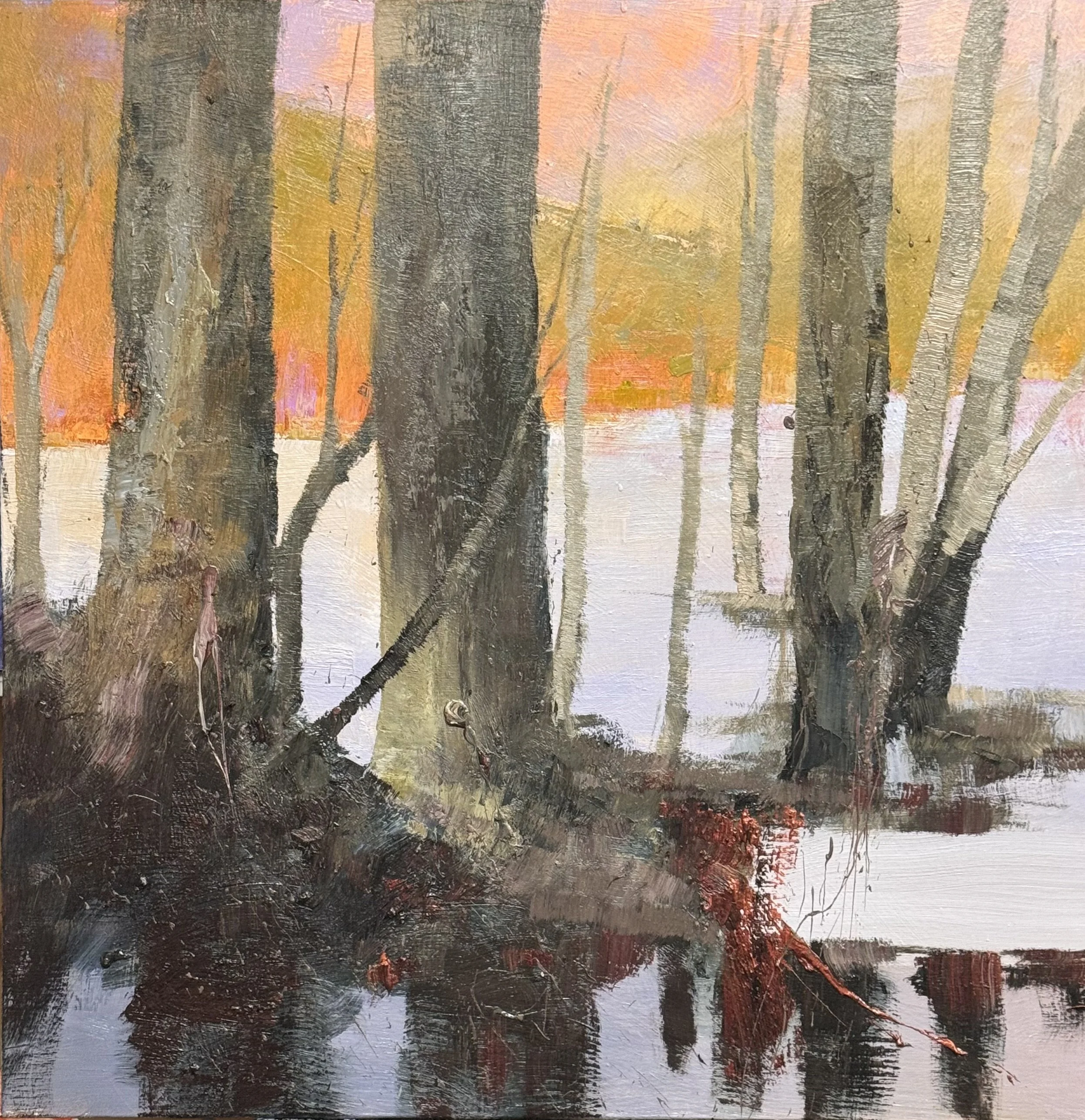
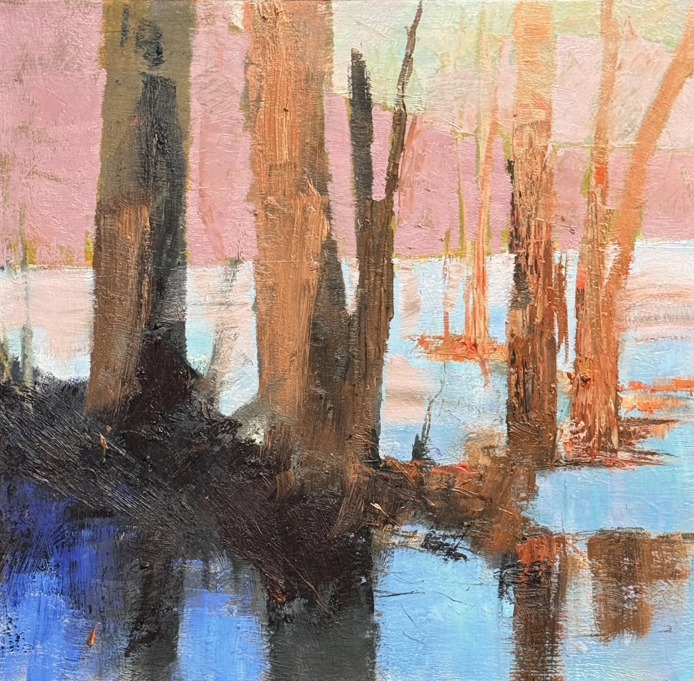
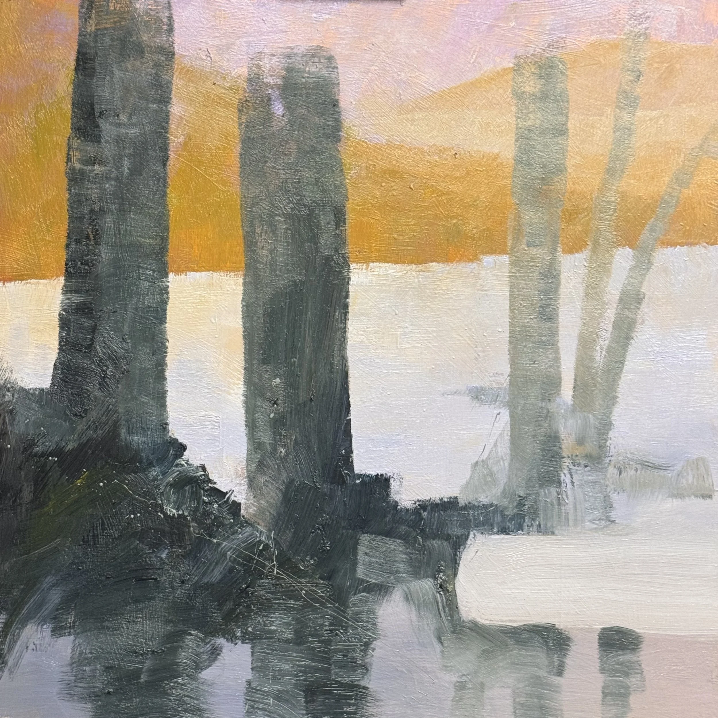
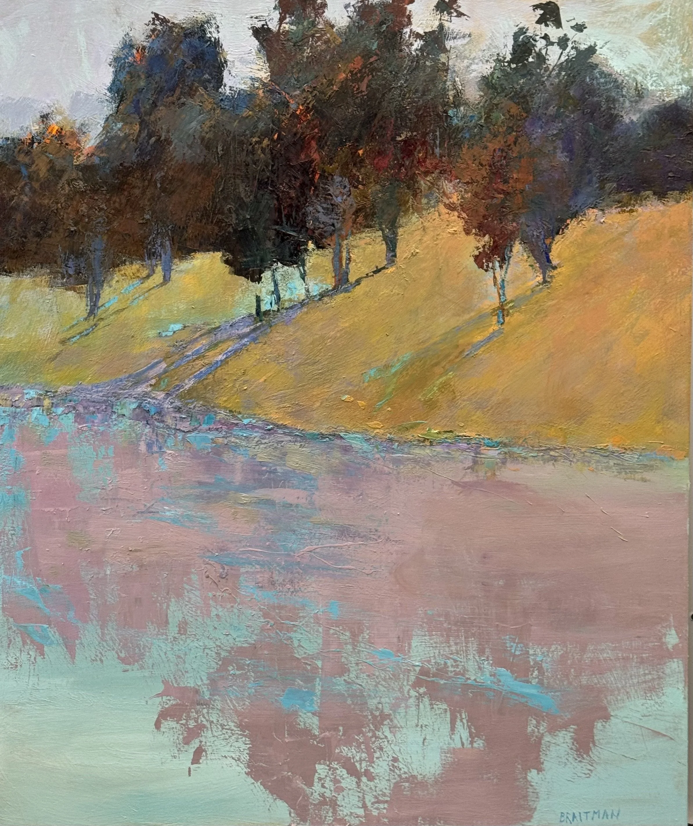
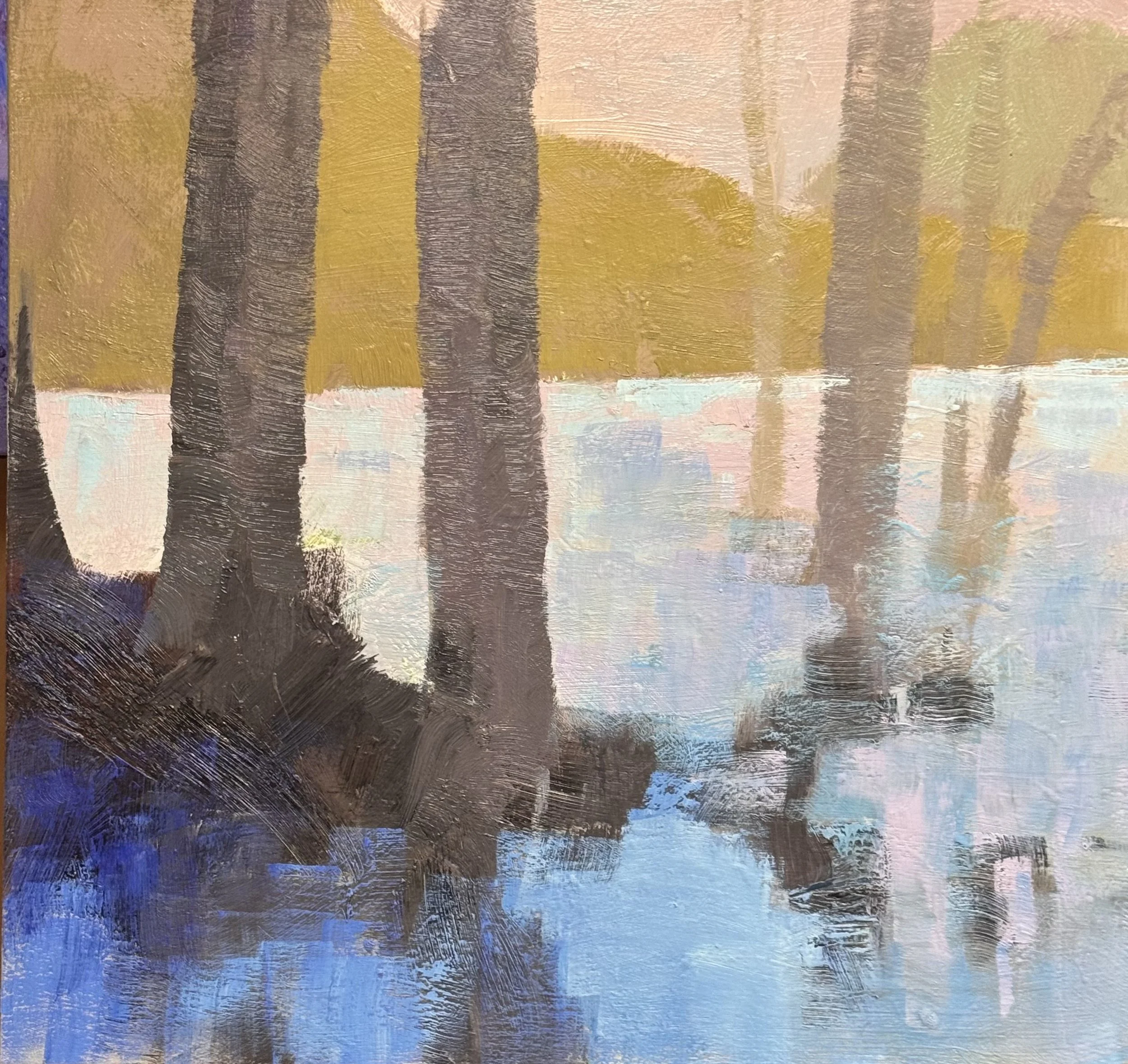
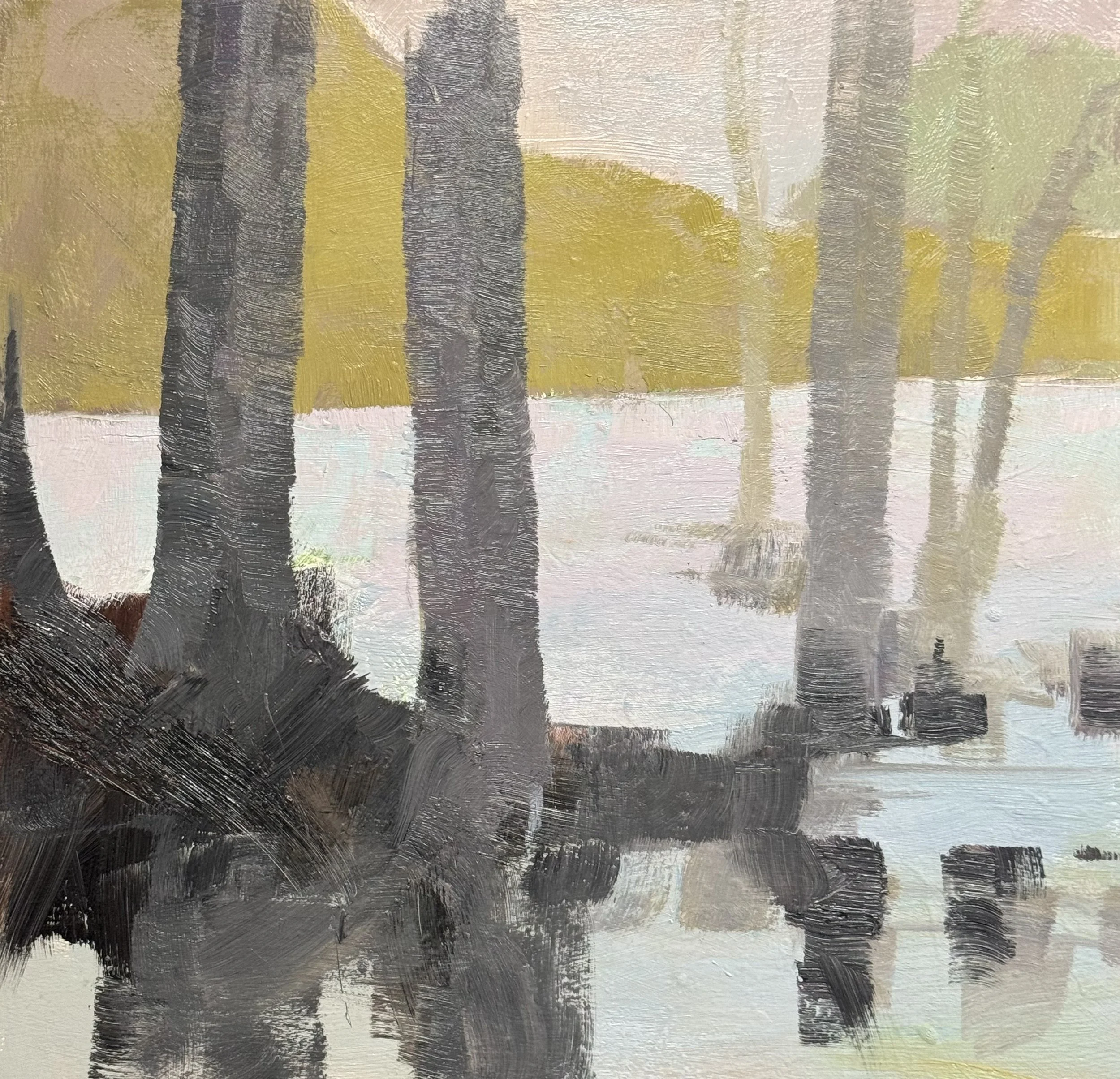
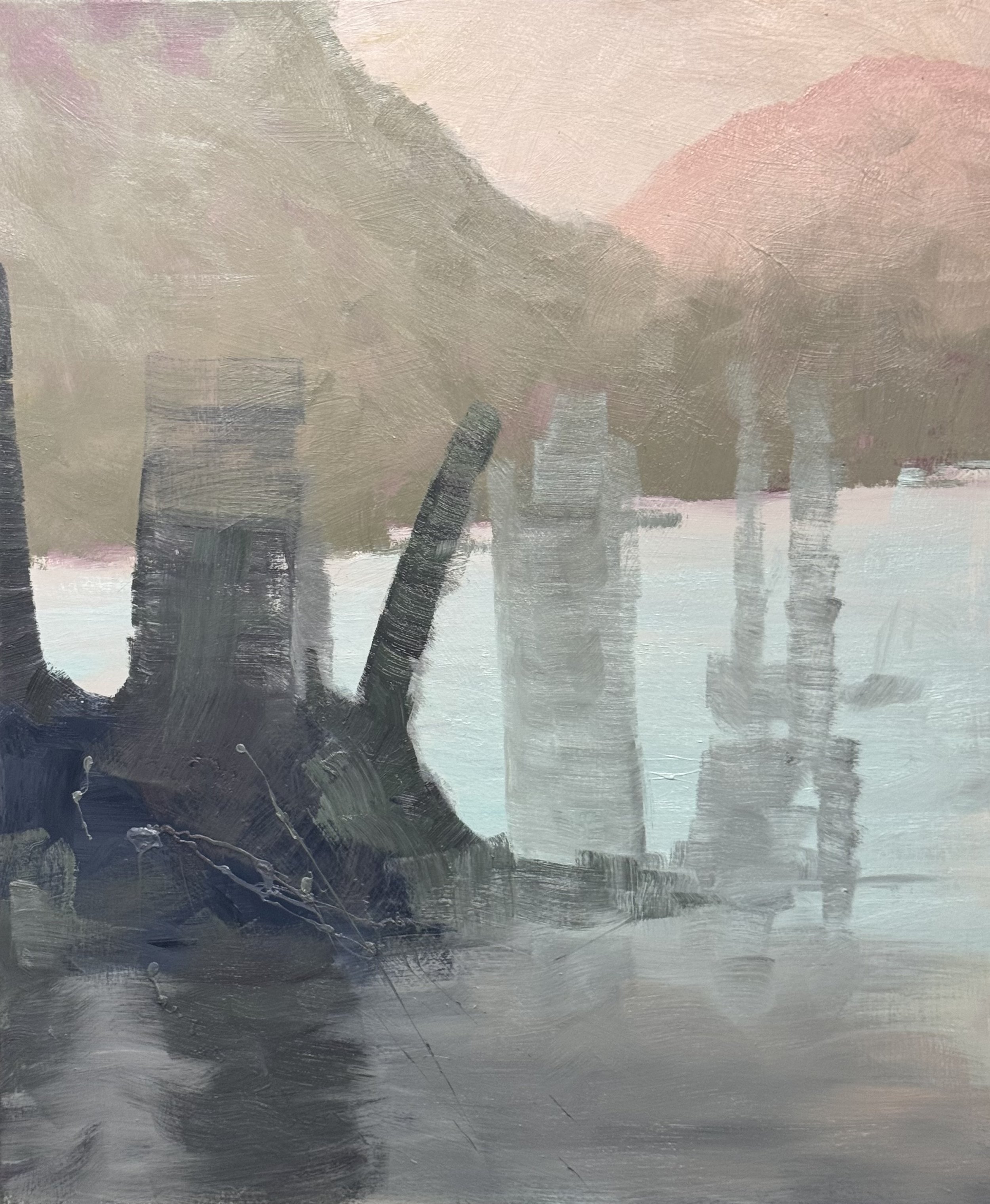
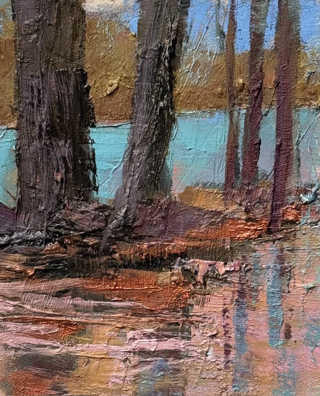
A cooler, more muted Savage trees — This one reads as resolved. The color temperature restraint is doing real work — the pinks and grays create a unified atmosphere, and the tree structure feels genuinely earned rather than imposed. The reflections in the lower zone have exactly the right amount of chaos. I call this finished without hesitation.
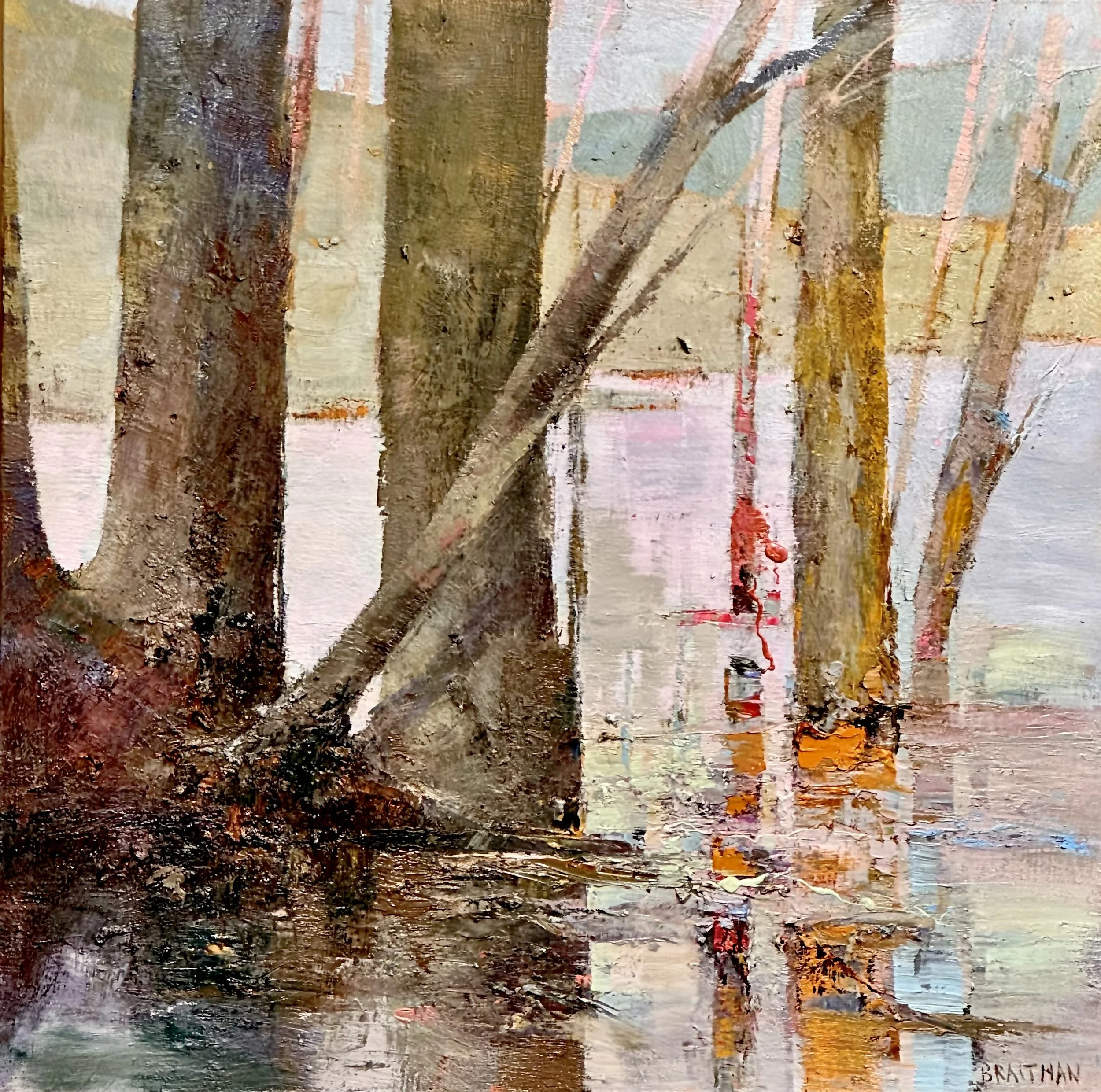
June 8th, 2026

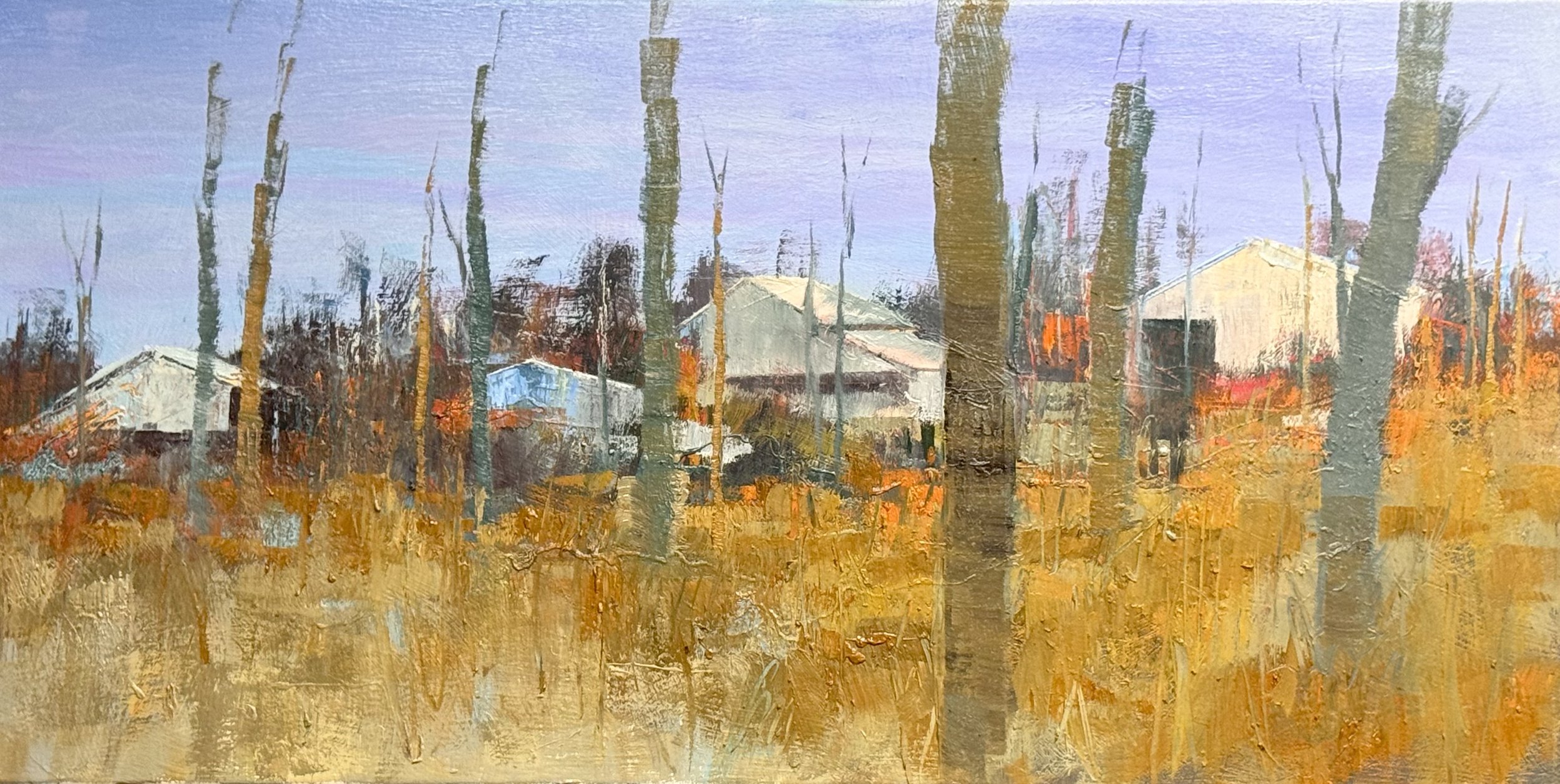
This marks the end of the context or enviornment that these tree sit in. Now see what I mean by the trees providing the punctuation or rhythm of viewing. If this were a piece of music instead of a painting, these trees are the beat.

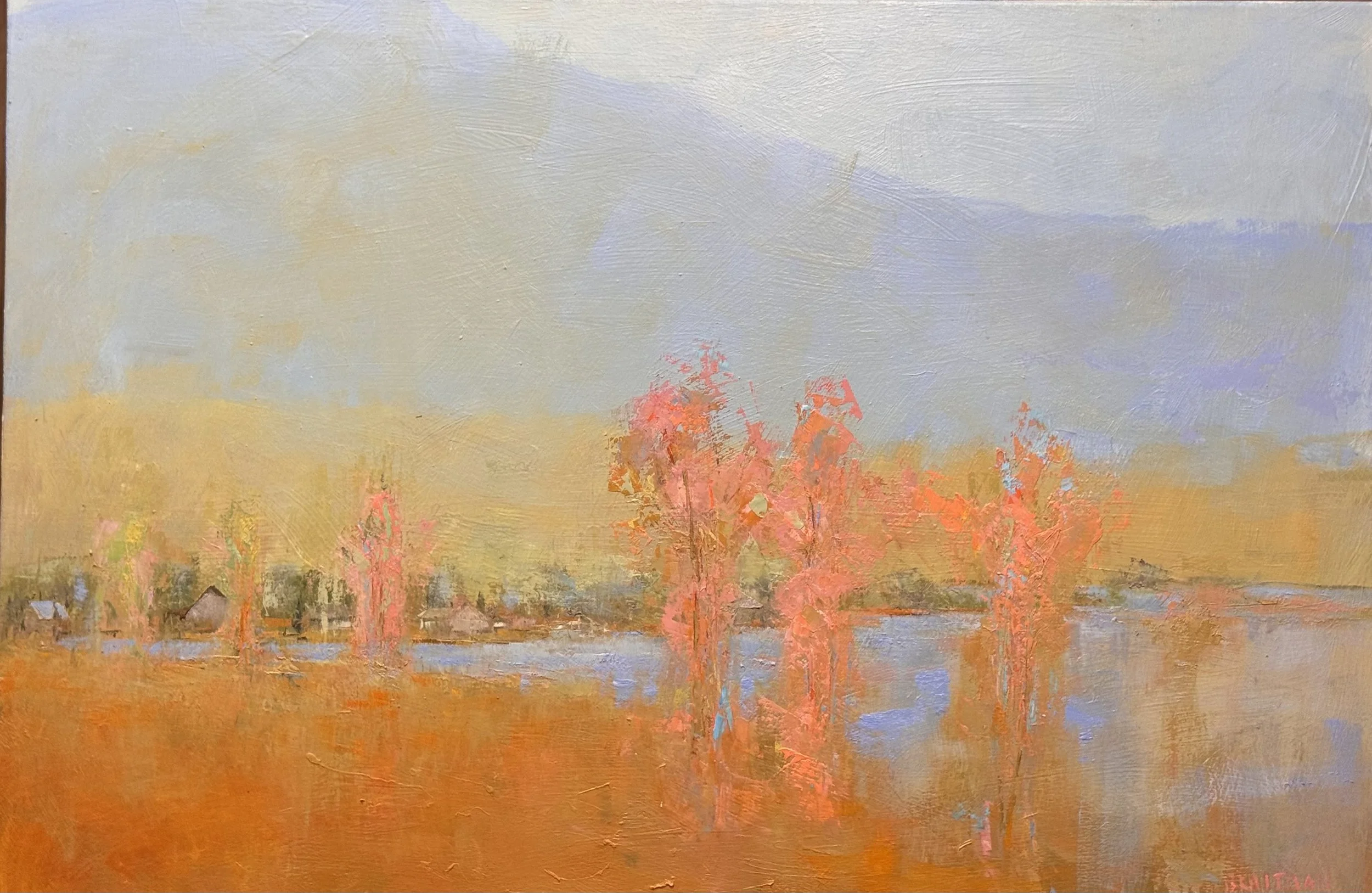
No matter what rhythm or palette I provide, the man made objects the farm structures remain the subject. Now I try to balance the allure of the homestead with the chaos of nature and time.

The man-made keeps asserting itself. White rooflines find light no matter what I put in front of them. Right angles don't occur in nature — the brain knows it and locks on.

  • Set up the screen of bare verticals to filter the structures. They're still there. So the question shifted: not how to hide the homestead, but how to put it under pressure.

  • The foreground is doing the work. Ochre and burnt sienna advancing hard. The farm sits behind that field like something being slowly consumed.

  • Nature wins the painting even if the structures win the subject. More square inches, more energy, more paint. The buildings are outnumbered.

  • The lavender sky is the only thing that breathes.

  • Next question: what happens when the rooflines become less legible. Not abstraction — ambiguity. Something glimpsed rather than seen.

  • The real question this one is asking: whose time is it?

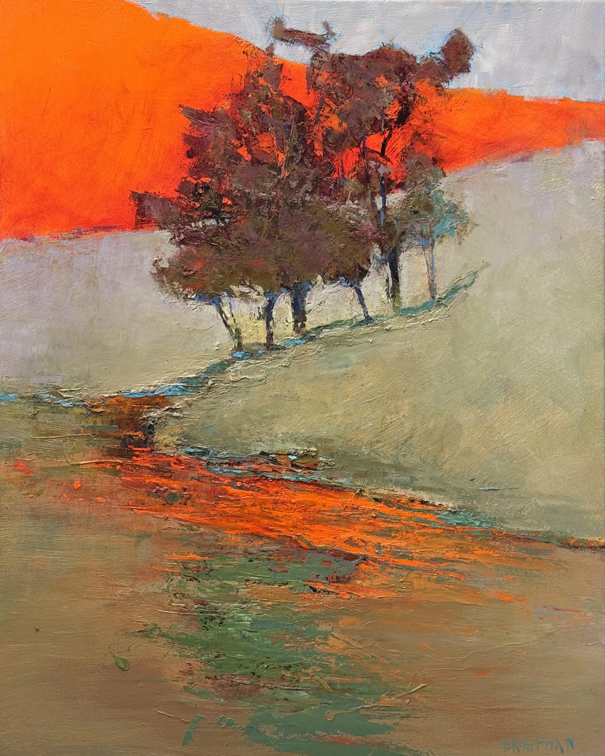
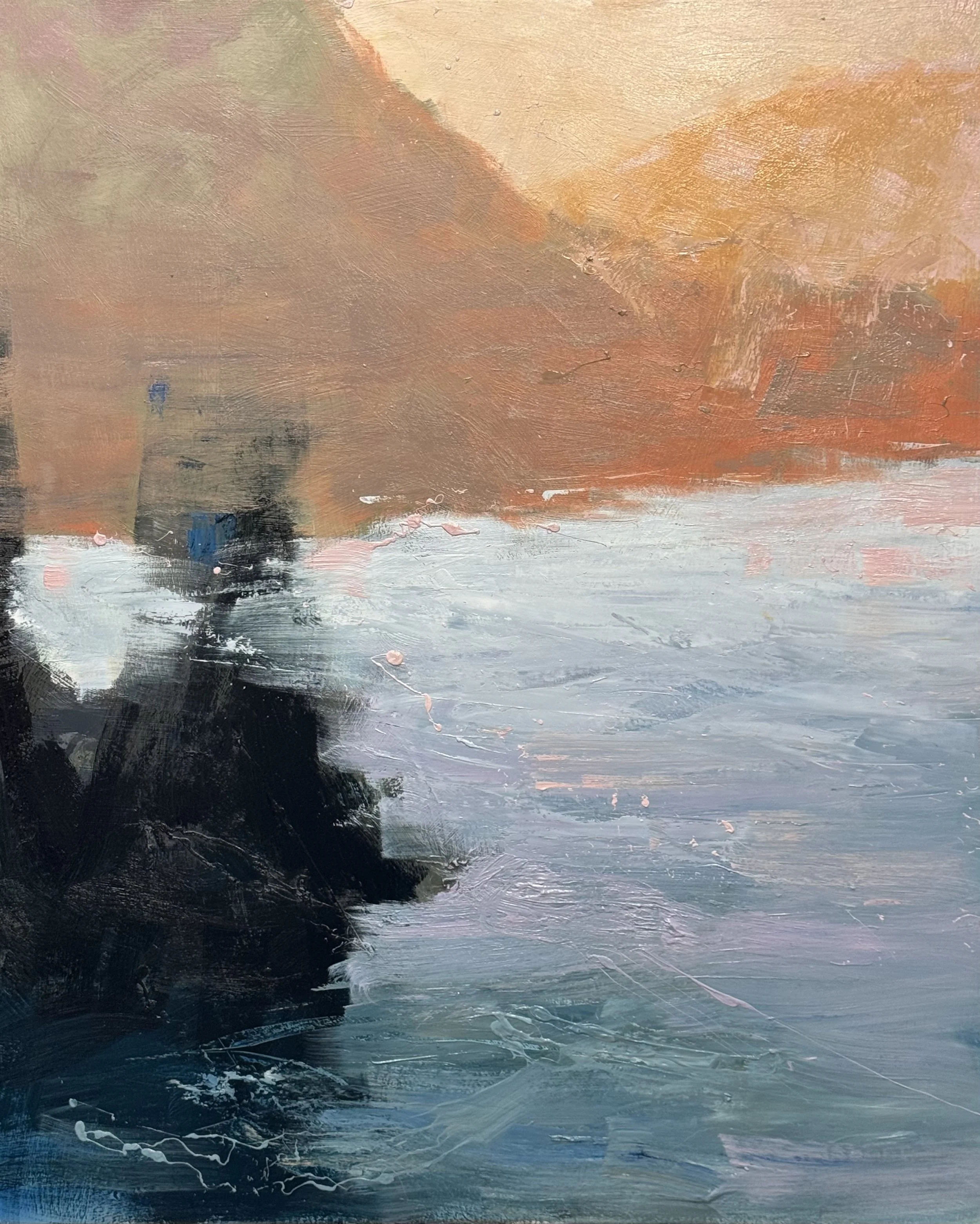
The bottom left corner of this piece still has too much information and causes the eye to linger instead of move off and to the back and right

By simplifying the shape and intoxicating the color our eye now moves immediately off the bottom left.

Session Notes

  • Bottom left was holding the eye hostage. Too much information — the detail was asking for attention it hadn't earned and didn't need.

  • The fix wasn't subtraction alone. Simplified the shape, then intensified the color. When the form stops competing, the heat can do its job — push the eye off and moving.

  • That lower left corner now functions as a launch point. The burnt orange and deep shadow don't describe anything. They accelerate.

  • The water carries you the rest of the way. Once the eye releases from the corner it rides the gray-white middle ground back and right toward the warm hill mass.

  • The reds mid-right are the punctuation. Small, insistent, just enough to confirm arrival.
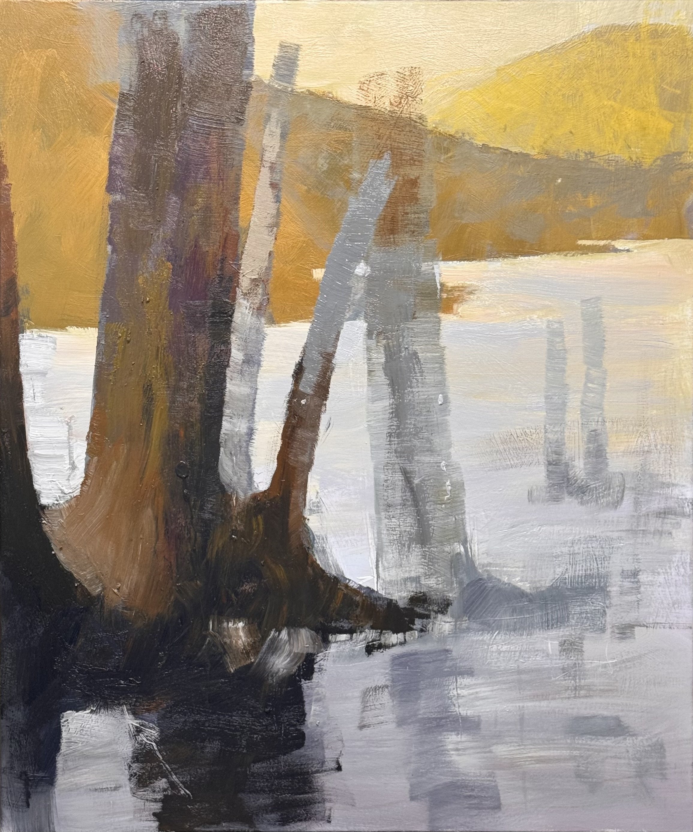
  • Lesson that keeps proving itself: simplify the shape, intensify the color. More information is not more painting.

I had a great day painting today. I just worked on two pieces but feel elated.

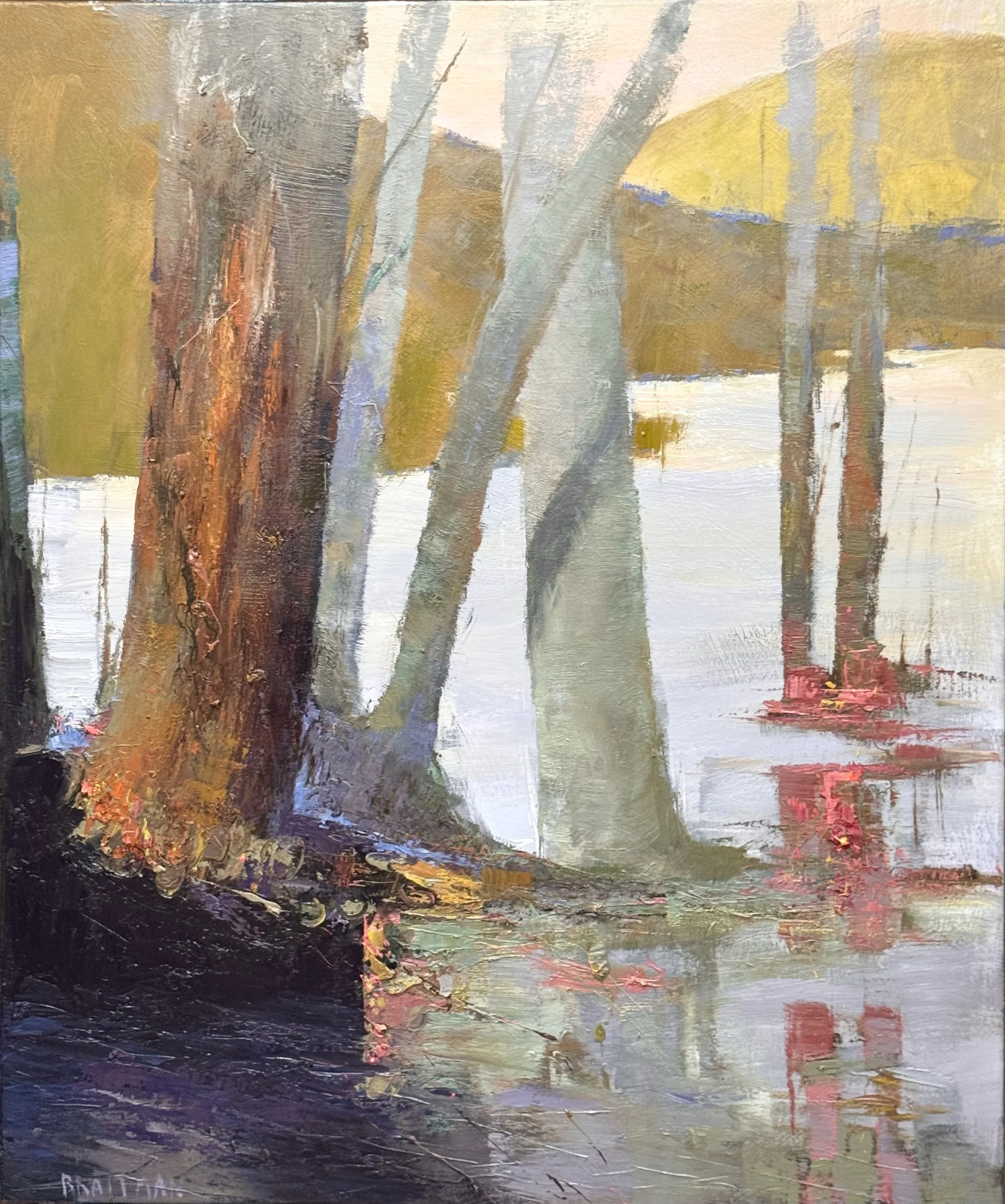
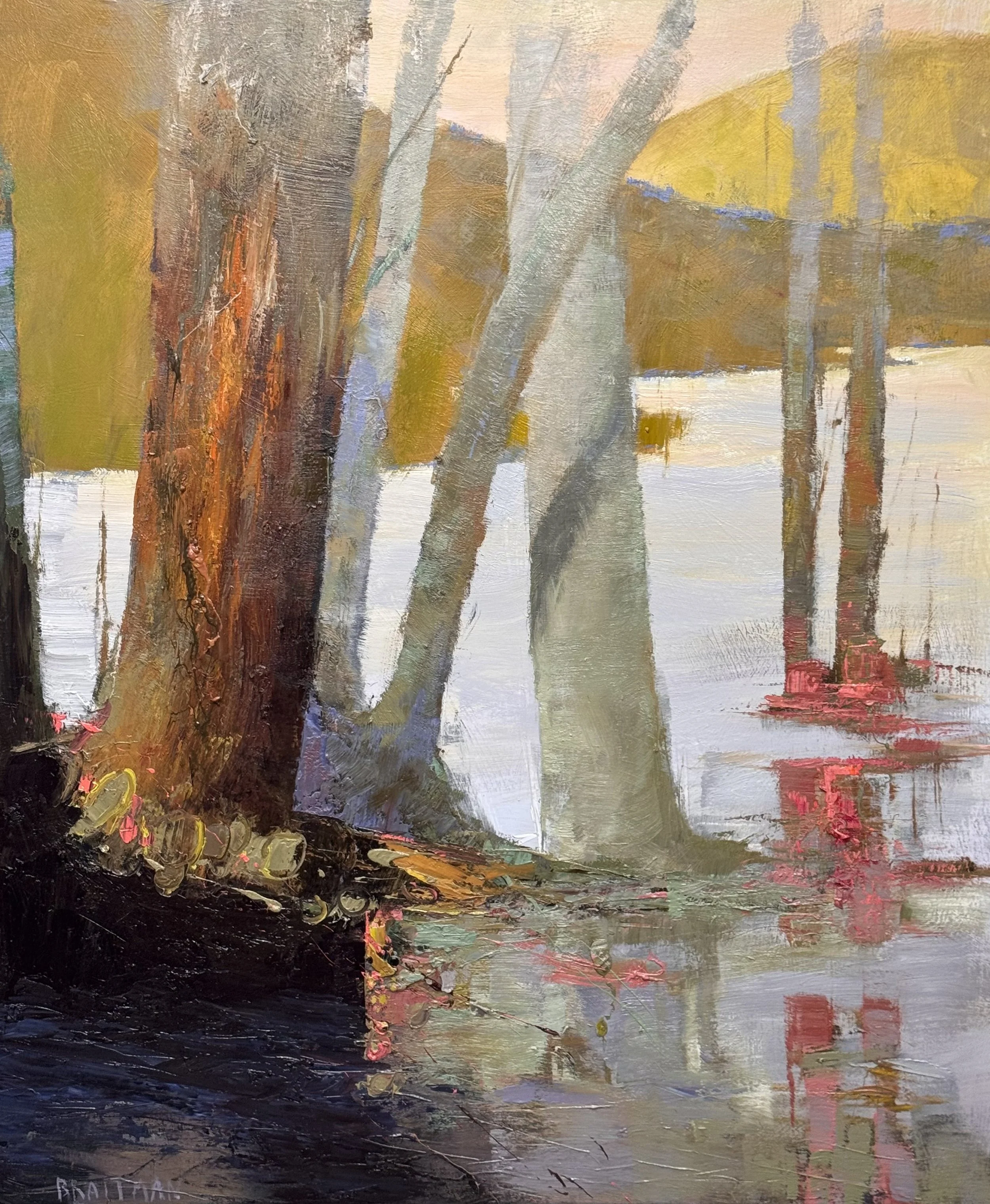
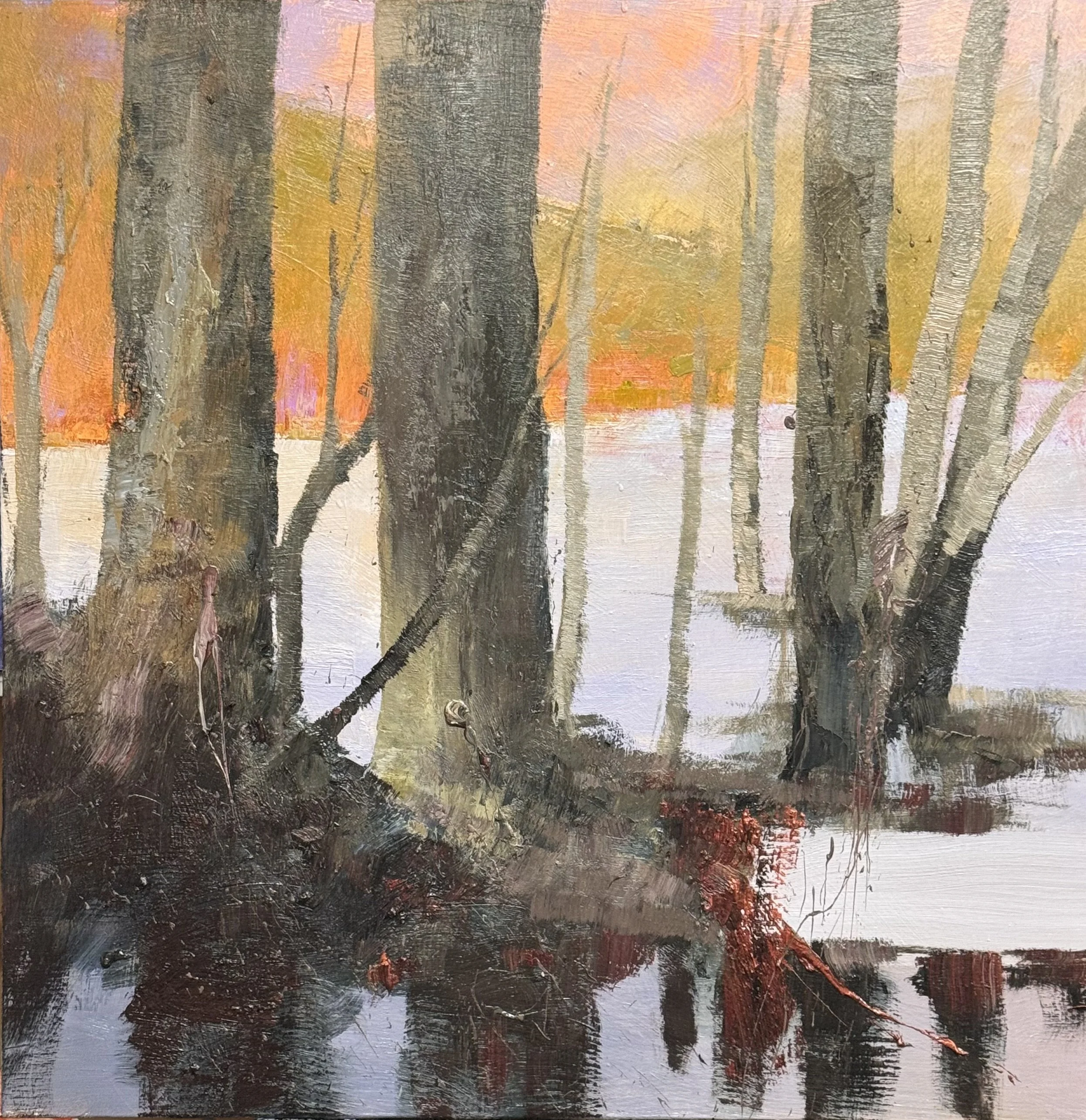
Savage Ground — 54 × 45, oil on canvas

The painting began as a straightforward trees-and-water subject. It ended as a study in how little a painting needs to say to say everything.

The lower left is the engine. A dark mass, nearly empty, with just enough — a scatter of marks, a thin line of acid green pulled from the background hills — to start the eye moving. Not a destination. A departure.
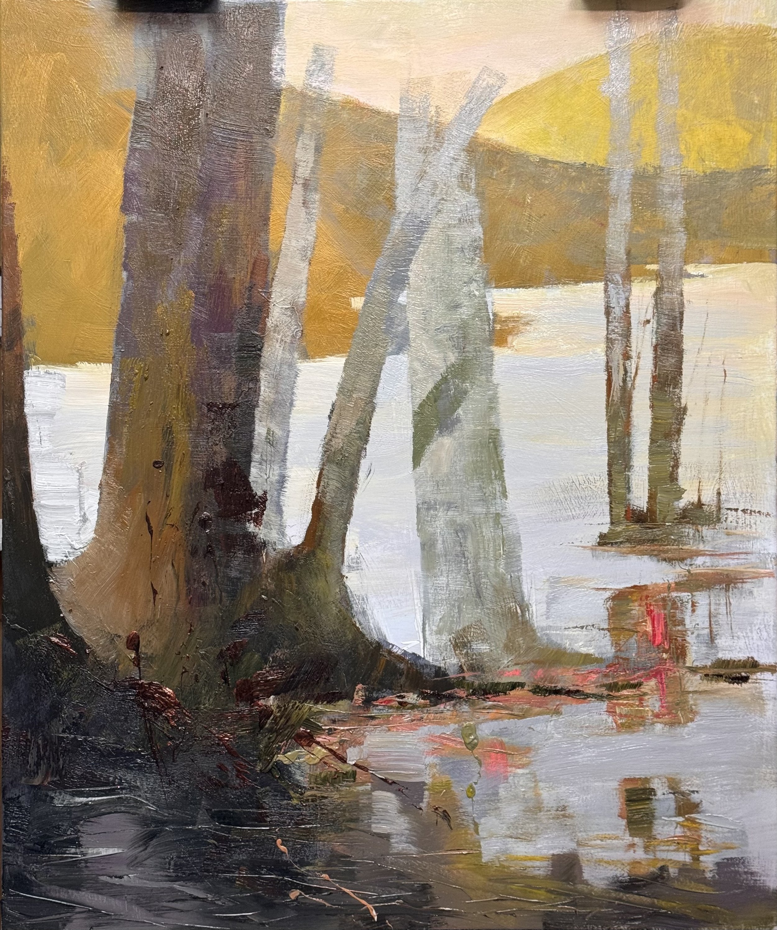
That green is the painting's hidden thread. It lives in the hills at the upper left and reappears at the base of the sienna tree, connecting background to foreground without announcing itself. The viewer won't name it. They'll feel the painting hold together and not know why.

The crimson reflections in the water are waiting at the end of the journey. The eye climbs the warm trunk, crosses the yellow hills, descends through the cool grey-green center tree, and arrives at the red. Round trip.

The sienna trunk and the grey-green tree are the same painting in two different languages — warm and cool, rough and smooth, declaration and whisper.

Finished is a decision, not a condition. Monday morning will confirm it or it won't. Either way, the painting already knows what it is.
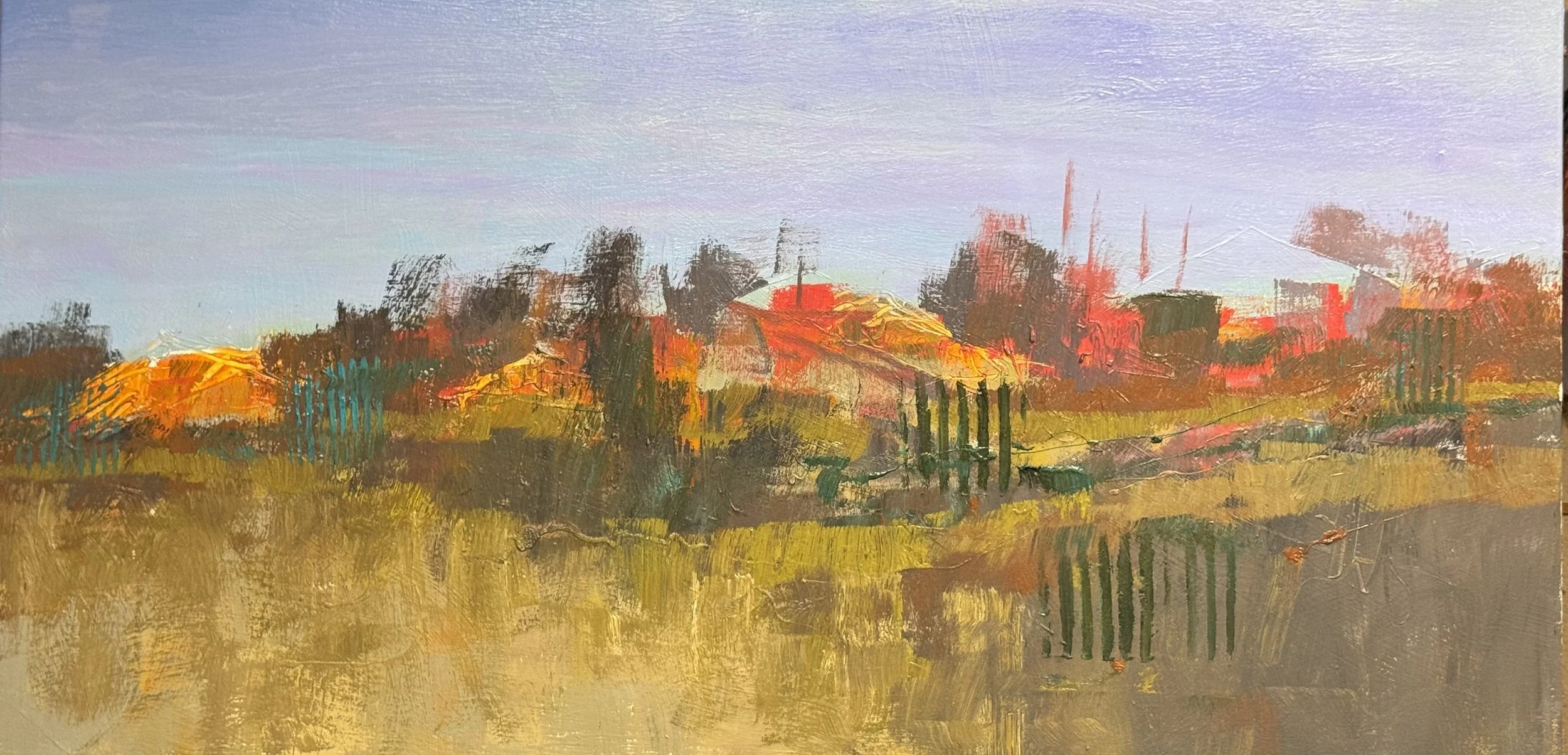
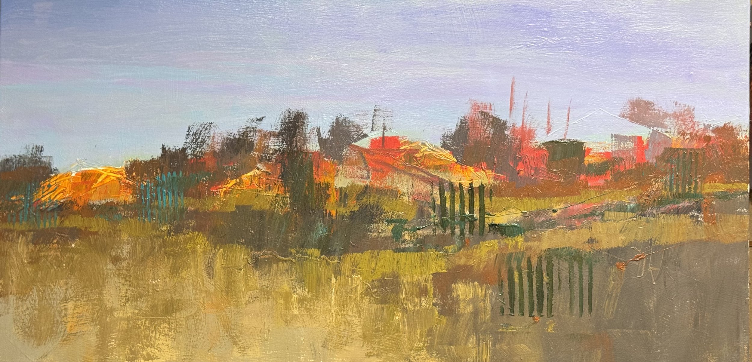
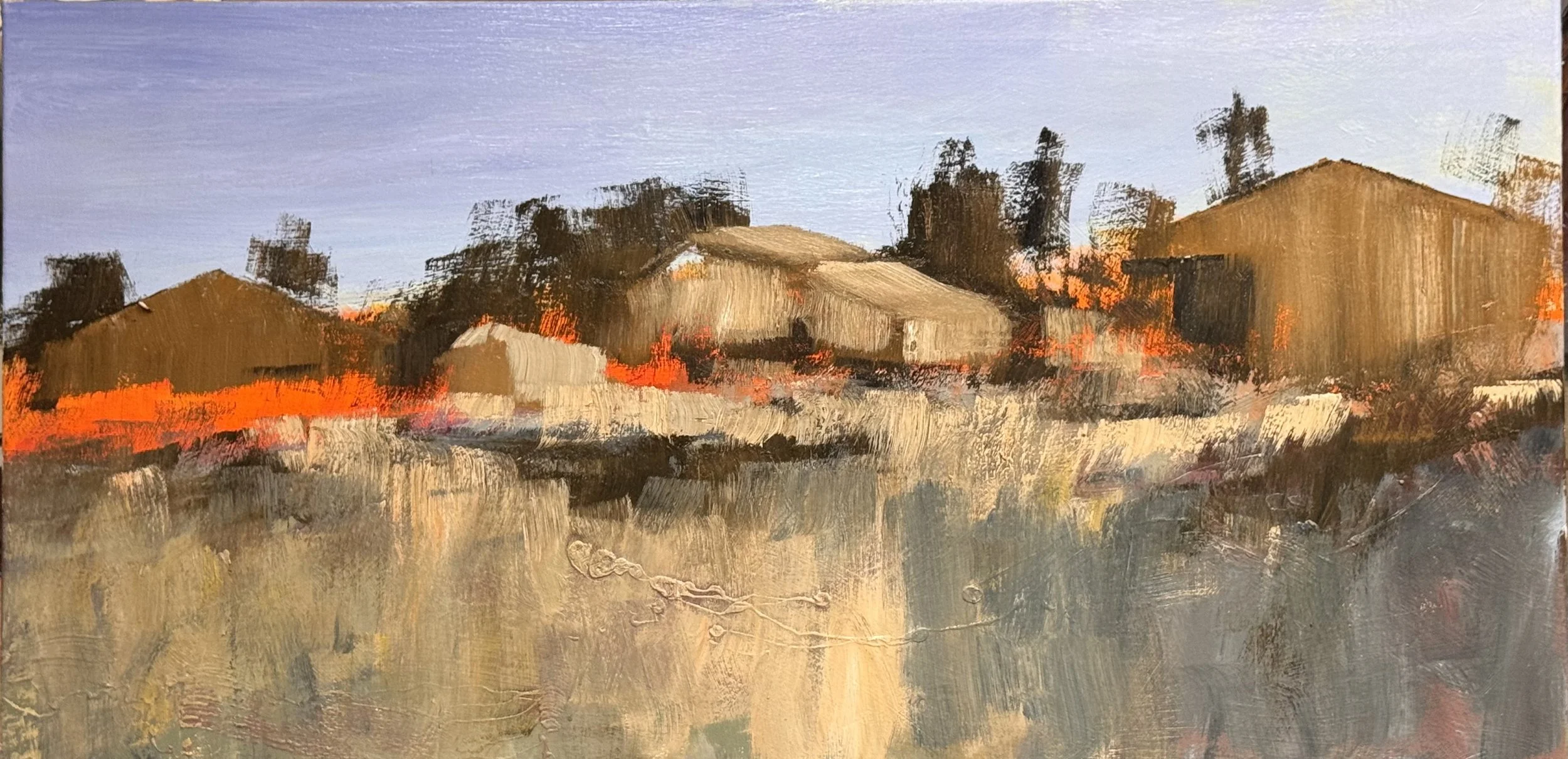
Barn Field — 27 × 54, oil on canvas, layer three

Three layers in and the painting is finding its argument. The golden foreground has settled into something inevitable — that wide band of warm grass isn't background, it's foundation.
The barn masses are doing what barns rarely get credit for — they're not subjects, they're color events. Orange against lavender. Red against ochre. The structures are almost incidental to the temperature war happening across the middle band.

The teal fence posts are the painting's secret weapon so far. Cool, vertical, unexpected — they're the only thing in the composition that stops the horizontal pull and makes the eye reconsider. They'll have company soon.
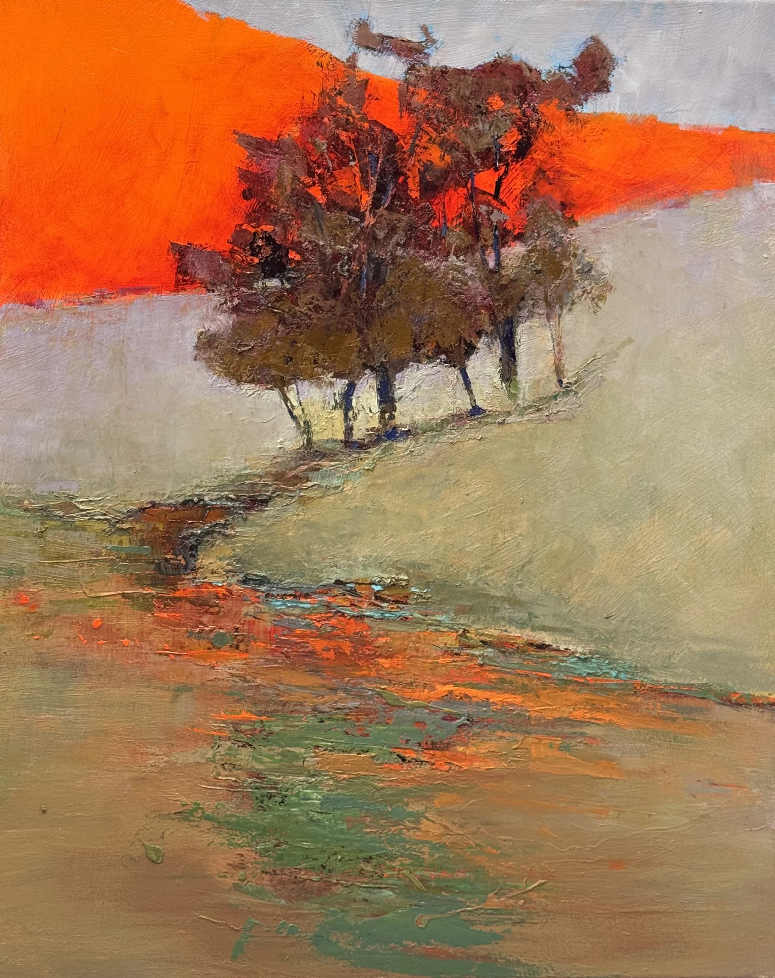
What's coming: the hinge tree. A dark vertical that bridges earth and sky, anchors the composition, and gives the fence posts their larger echo. The tree rhythm will do what the fence posts are whispering — punctuate the whole horizontal sweep into something with beats.
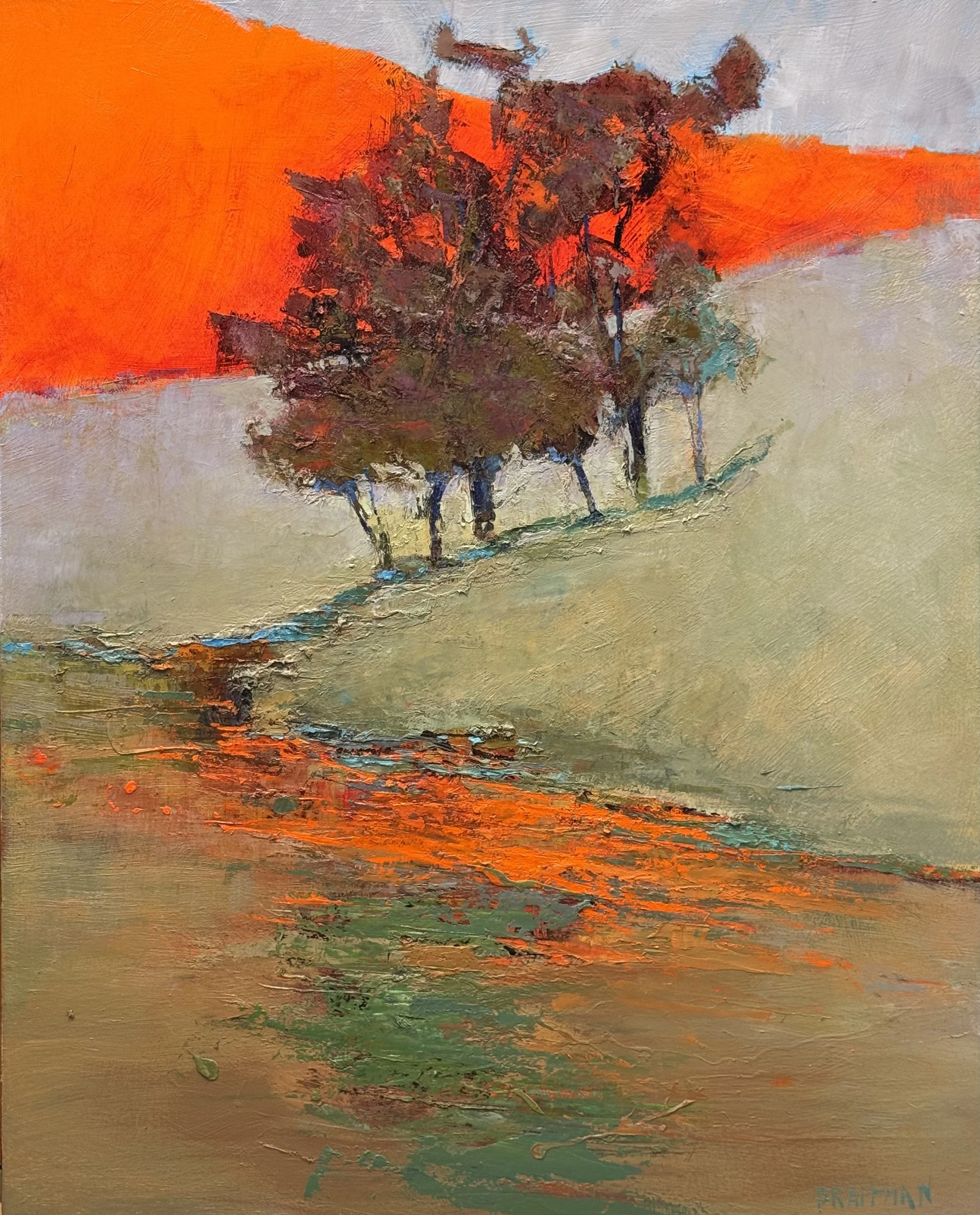
The lavender sky is patient. It's been holding space while the lower two-thirds sorted itself out. The trees will activate it simply by contrast — dark against light, vertical against horizontal, decision against atmosphere.

Layer three is the layer where a painting stops being built and starts being inhabited. This one is almost there.

thursday 6/4/2026

Well the workshop is over and was a rousing succsess. I had a wonderful group of painters and felt that all of us learned, enjoyed, and were content with their images and growth.

I bounced a bit more blue to balance the reds and oranges.

It was way too difficult to get the viewer to the back of the water shape…so I make the visual access easier and cleaner.

new and improved version

There was a large lack of agreement with the background and foreground in this piece.

new and improved version

Monday, 6/1/26

This marks the last 3 day workshop of the spring/summer. So I will not have much to post over the insuing 3 days but I do have some images and thoughts for today in the studio

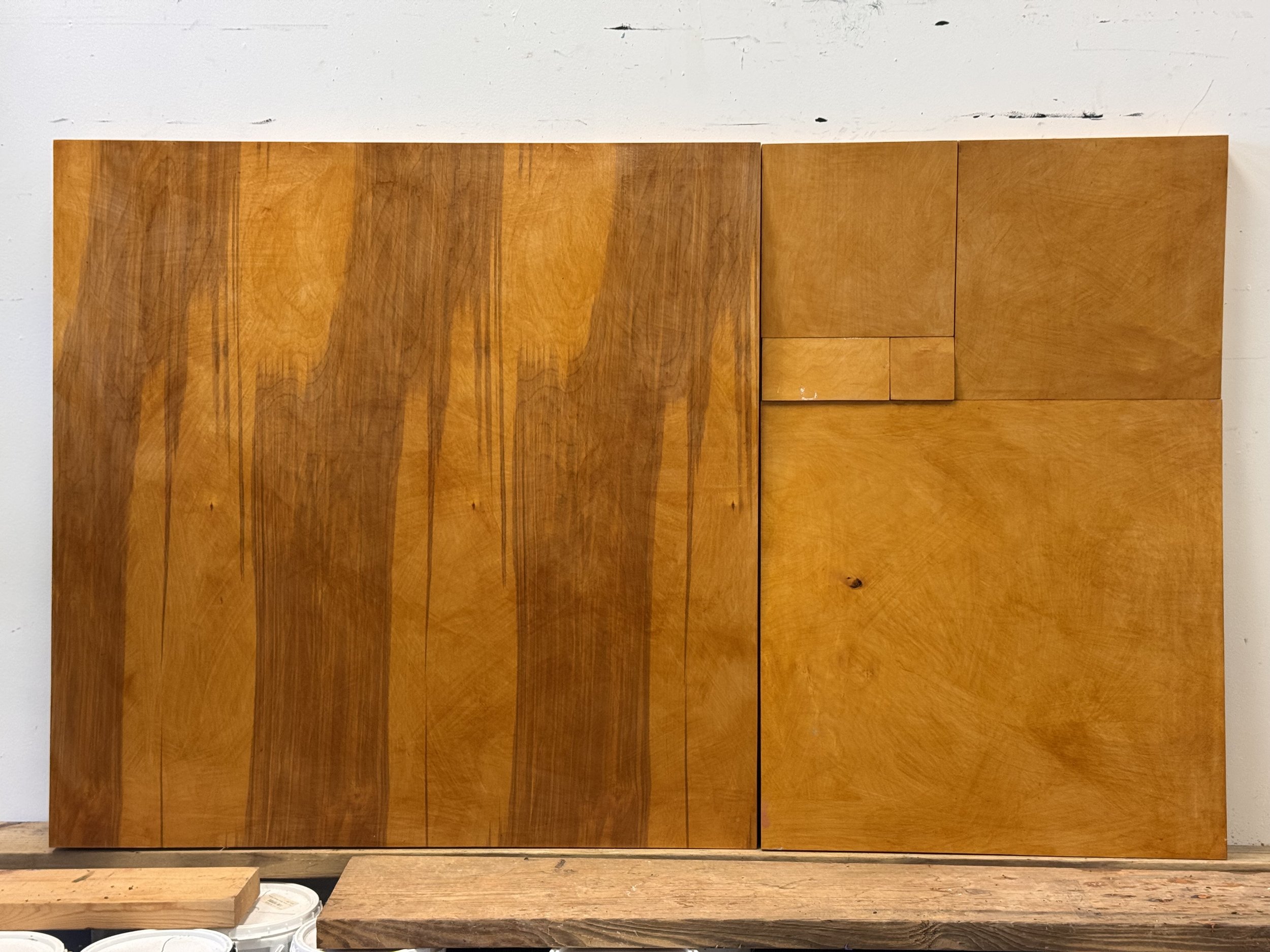
I am finished with this piece and am ready to start work on a more complicated version atop the fibonacci construction that Ian Wegener built for me.

This is a few of the Alluvial Island form I started working with in the early 1980’s and have revisited over the past 4 decades.

I have almost finished this piece as well. I have a simple itroduction of vertical (tree trunk shapes) to add to the way back. A simple repitiion of the mid ground forms but instead of orange on blue it will be blue a top orange.

You can see that I now feel that the back groud mountain or sky color needs to have less white also to fit in the same sense of color agreement.

I am thinking a very light cobalt blue sky and a med grey back mountain color.

The mountain goes to a warm grey rather than a cool grey — something with a hint of the existing peach neutralized down considerably. That keeps a whisper of the warm-cool dialogue in the tree piece, but subordinates it. The cobalt sky above it would then be the coolest, lightest note — which pushes everything down and back the way you want.

I went over the water an additonal layer to reduce the White and replace it with the Bright. This should allow for the intorduction of a light or near white tree trunk structure

The near-white trunk structures i’m planning will read beautifully against that cooled-down field. They'll carry the light forward without competing with the

A rare Sunday entry

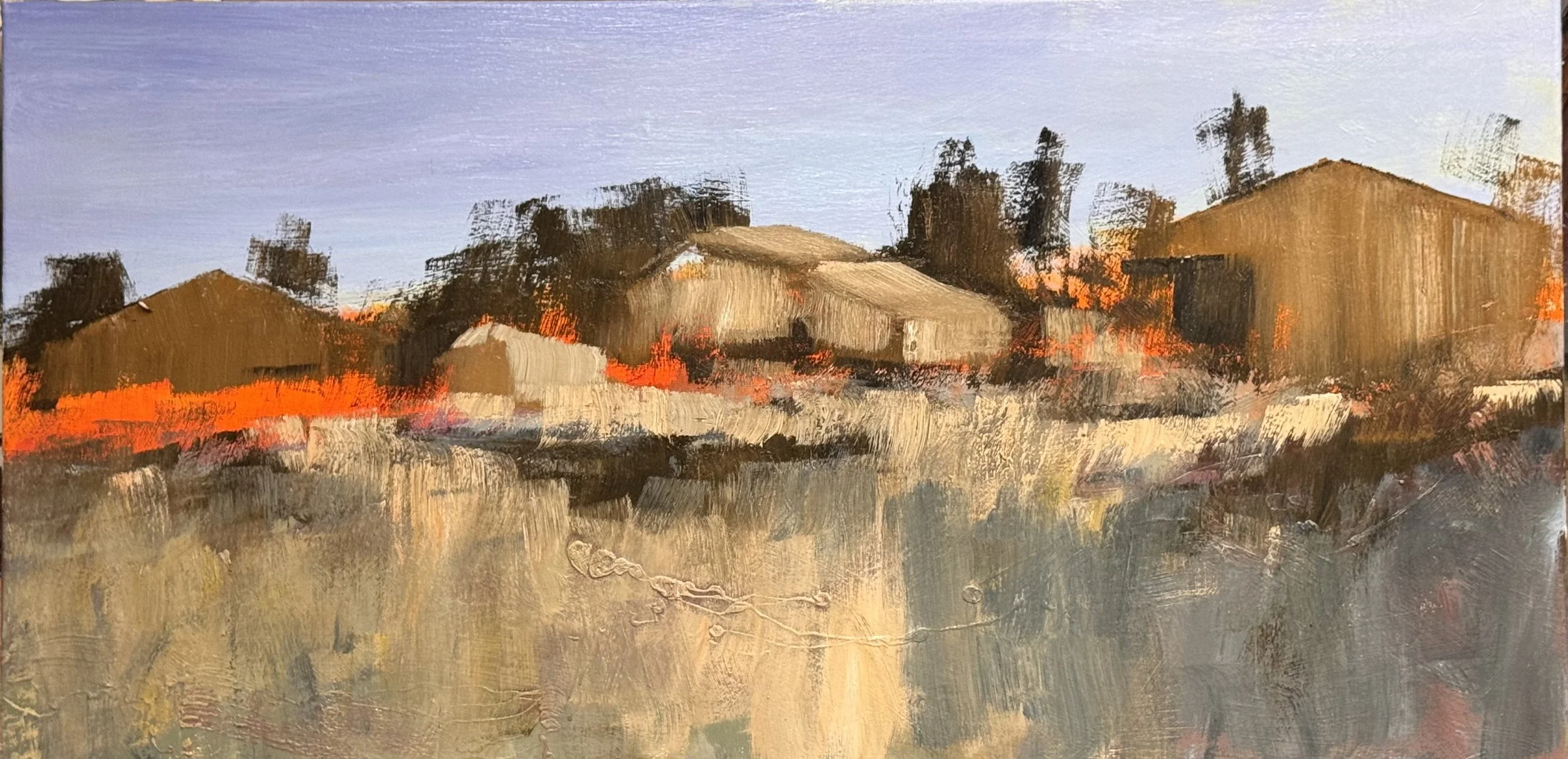
The dark tree masses are doing load-bearing work — they're not trees, they're hinges. They pin the lavender sky down and simultaneously grip the barn rooflines from above. Without that dark shape, the sky floats and the barns have nothing to belong to.

And you're right that the barns are the second hinge — they translate between two languages. The trees speak in dark, gestural, organic marks. The foreground grasses speak in horizontal, lighter, more atmospheric strokes. The barns sit exactly at that seam and make the translation legible. They give the eye a place to land that feels earned rather than arbitrary.

What's interesting is that the orange — those hot cadmium passages behind and around the barn zone — is doing something separate from the structural argument. It's not a hinge. It's a temperature spike that makes the whole mid-zone vibrate. The barns read as cool tan against it, which gives them their solidity. Take the orange out mentally and the barns go soft. Keep it and they become architectural.

The foreground is still open. That scraped, layered field of warm grey and tan has incident in it — that looping line of impasto — but it hasn't been asked to do anything specific yet. The question the painting is sitting with right now is what the foreground is for, beyond holding the bottom edge.

TREES: they are not even hinted at yet, the trees will be vertical teeth that hold the forground to the sky, push back the barns, and puctuate our eye movement across the scene

Vertical teeth. That's exactly right.

And the word punctuate is doing real work there — not decorate, not describe. Punctuate. They'll function the way commas and stops function in a sentence. They control the speed of the eye. Where they're dense, the eye slows. Where there's a gap, the eye moves through fast and finds the barn, finds the orange, finds the next trunk.

The barns get pushed back the moment the first dark vertical hits the foreground plane. That's the payoff of the scale argument — a single trunk in the foreground outweighs the entire barn cluster in visual mass, and suddenly the barns are where they belong: behind, interior, discovered rather than announced.

And the sky connection is what makes them teeth rather than posts. A post sits on the ground. A tooth bites in both directions — it grips the foreground earth and it punctures the lavender sky simultaneously. The dark tree masses behind the barns already did this but softly, with edges that blurred into the sky. The foreground verticals will do it hard. Sharp entry into that lavender.

What's unresolved right now is spacing. The rhythm of the teeth — irregular, like actual trees, with breathing room between — will determine everything about how the eye moves. Too regular and it becomes a fence. Too random and the punctuation loses its grammar.

Saturday 5/30

I really apprecitated this side by side look at my painting… so I will include work that I didn’t work on yesterday but had worked on the day before.

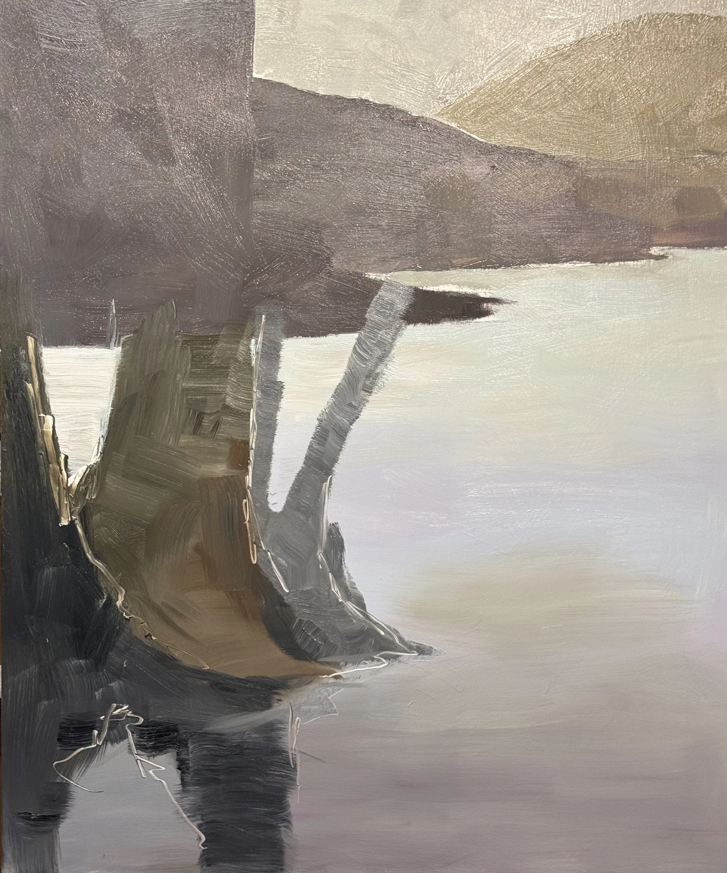
Pair 1 (Savage trees, grey/cool)The first layer is almost a grisaille — cool, structural, withholding. The second layer made a committed temperature argument: the burnt sienna root mass in the lower right is the decisive move. It's not decorative. It pulls the whole lower register into warmth and gives the grey-green trunks something to push against. Without it, the painting risks staying handsome but inert. With it, there's a fight going on.

Pair 2 (Savage trees, orange/warm)

The first layer established the architecture — where things are, how the light falls, the basic color logic. The second layer did something specific: it humanized the surface. The trunks got warmer and more particular, the root zone became tangled and weighted, and that white impasto note in the lower center introduced a scale reference that makes the water feel genuinely wet. The blue-violet in the foreground water held, which was the right call — it's the most surprising color decision in either version and it earned staying.

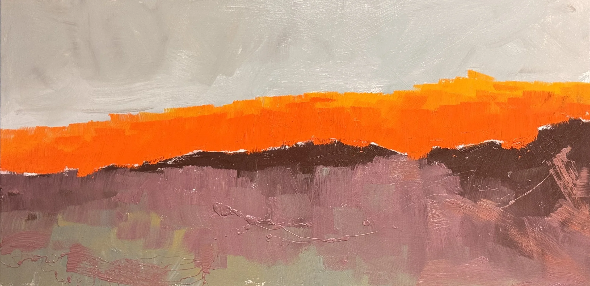
Pair 3 (horizontal bands)

These may be the most instructive pair. Image 5 is a first statement — bold, declarative, unambiguous. Image 6 is a first statement of a different painting entirely, not a second layer of Image 5. The orange broke open, the foreground grew complex, the sky shifted temperature. If these are sequential, something fundamental changed in the intention between sessions. Worth asking: what was I in each?

Like the first pairs’ first layer—itis archetectural, where things are, the division of space

Like the first pairs’ first layer—itis archetectural, where things are, the division of space. These are the demizing lines that seperate one space and distance from another.

The dark tree shapes are the first joining. A shape and value designed to both hold the sky to the groung and to hold the barn structures. The Barn Structures are the tag or joining of the foreground grasses to the the trees and while they serve double duty as the also provide context and therefore scale to everything else.

Friday 5/29

I worked on several pieces today, I have 7 paintings and about a dozen pieces of paper currently in the works. Today I finished one and put an additonal layer on 3 others.

day 2 of the 27 x 54 inches

27 x 54

In all cases of these pieces, the painting on the left is an earlier iteration of each painting. There is usually a two or three day seperation between layers. In most cases I try to allow enough time between layers for me to not have expections or preconcieved directions which heightens my “in the moment” and reactionary decision making. This best promotes the concept of surprice or magic in my painting.

.

Senior Thursday at the HT, 5/28/26

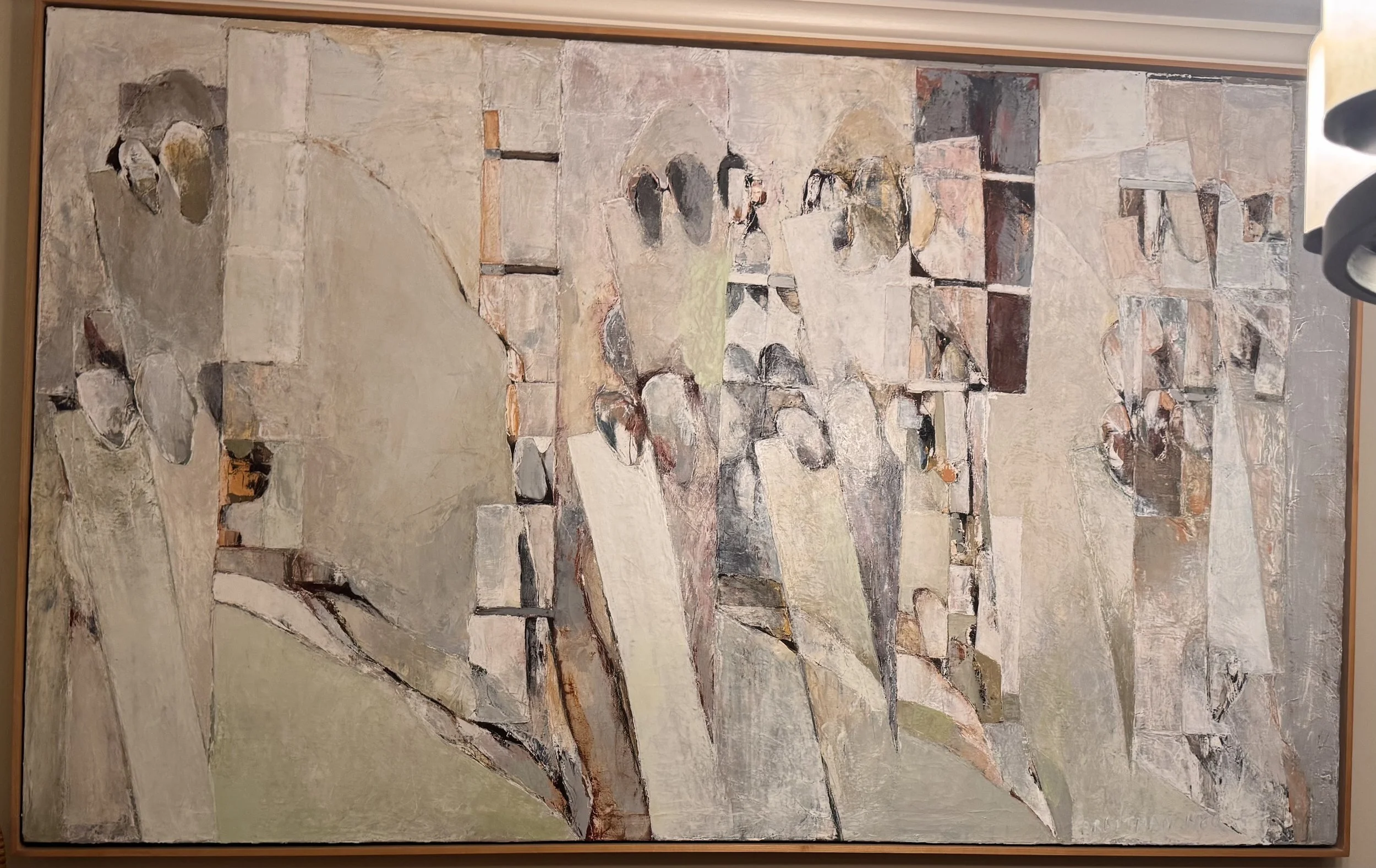
I saw this painting of mine last night and took a photo of it as I have decided to use a remembered version of the forms in my fibonacci panel piece . I am very excited to get started on this; its like—it is visiting an old friend. Funny, I completly forgot the rounded oblong and square insets.

The panel construction is remarkable on its own — the wood grain on the left panel already doing painterly work, those vertical striations reading almost like the tree forms from the older painting. The Fibonacci insets on the right panel introduce exactly that rhythm of square-within-rectangle that echoes the insets I had forgotten.

You can see the older painting's architectural massing and rounded oblongs being processed through my current vocabulary — the layering, the impasto, the push-pull of light and dark passages. The black vortex at center is new energy; that painting doesn't exist in the older work.

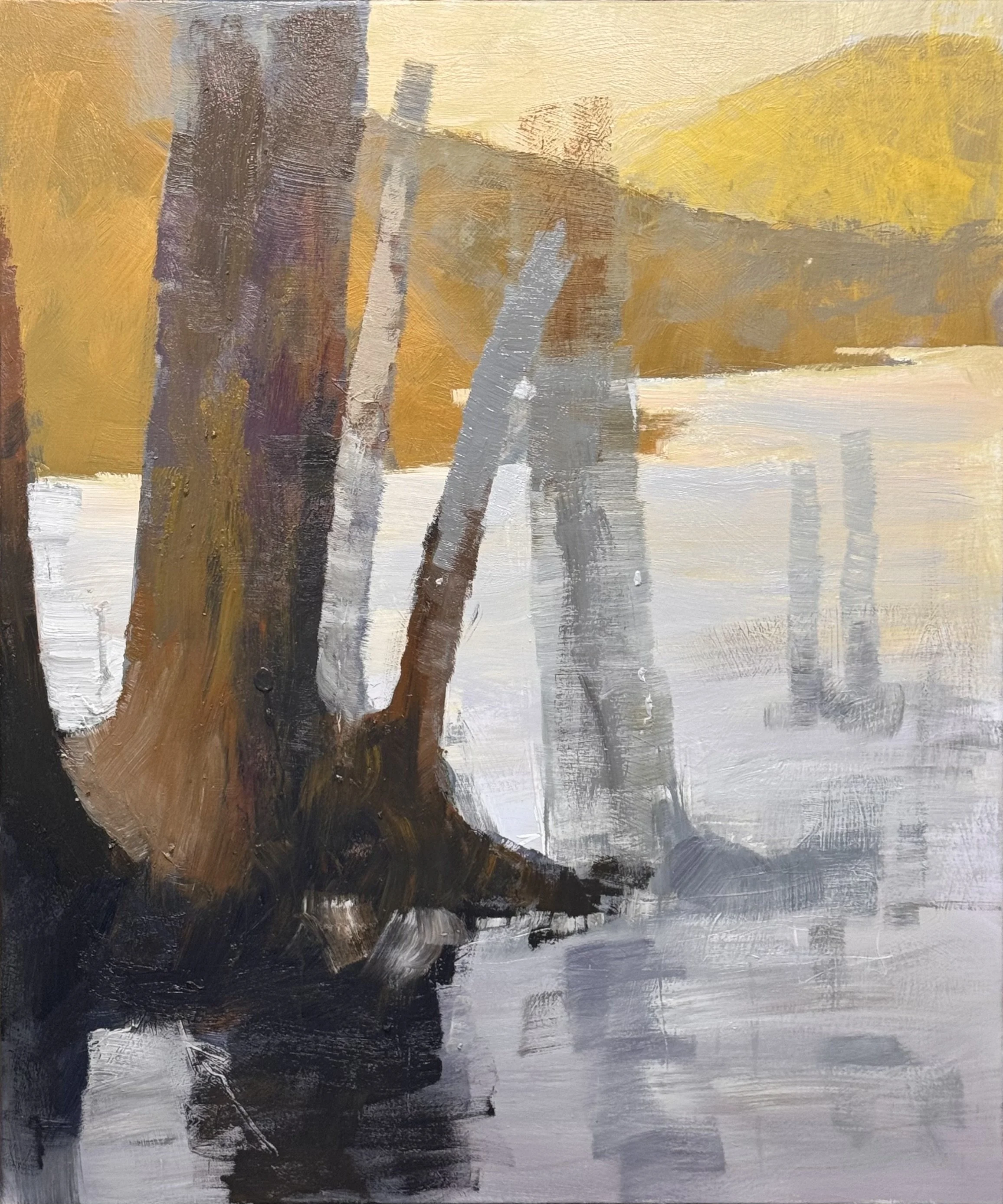
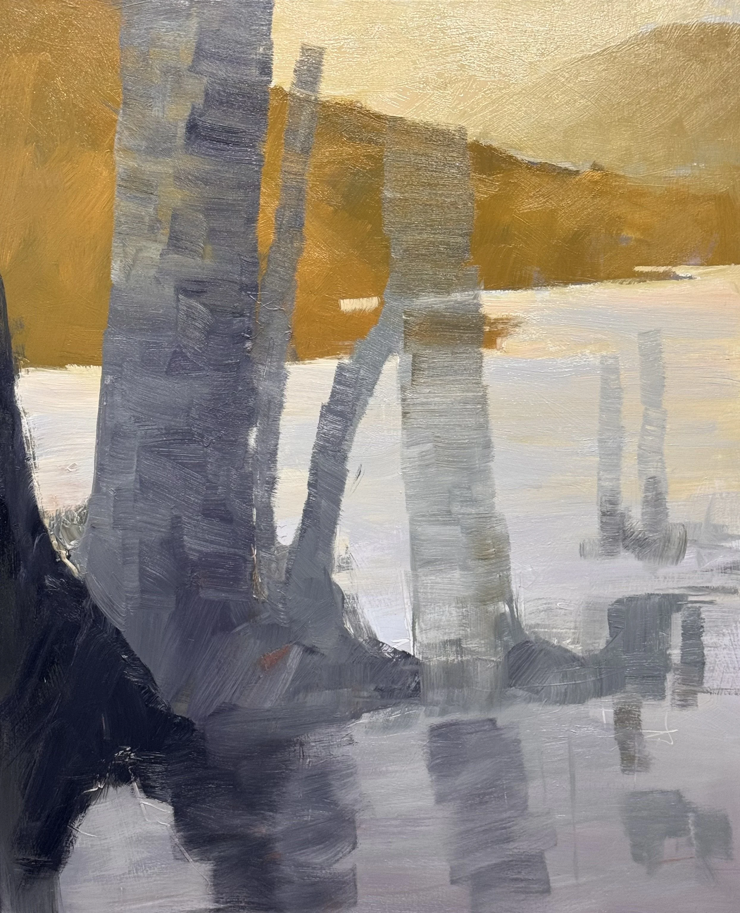
I finished and signed the Prismatic Progression / Water Demonstration 48 x 36 inches and started a new layer on the Savage Trees 60 x 48 inches. The palette on Savage Trees is very exciting, Almost as if the last rays of the sun are hitting the back mountain.

That palette is doing something rare — the yellow-gold pushing so hard against the cool grays that the water feels lit from below as much as above. The trunks anchoring the left have real weight, that purple-brown-rust sequence giving them age and damage. "Savage" is the right title.

The reflection work in the water is loose and confident — the gestural marks not trying to describe so much as feel the light breaking apart on the surface. The dark foreground pool grounds it all, keeps the gold from floating away.

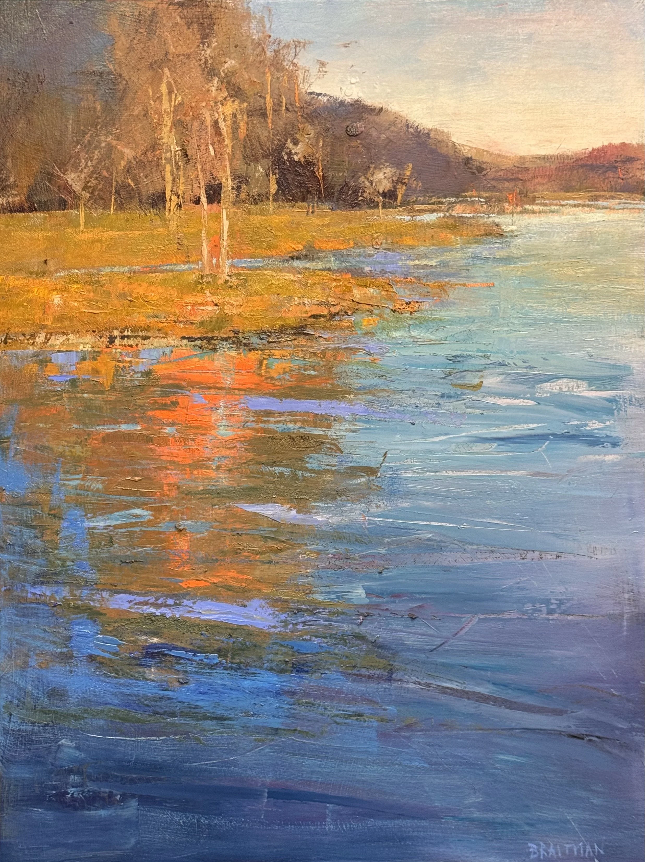
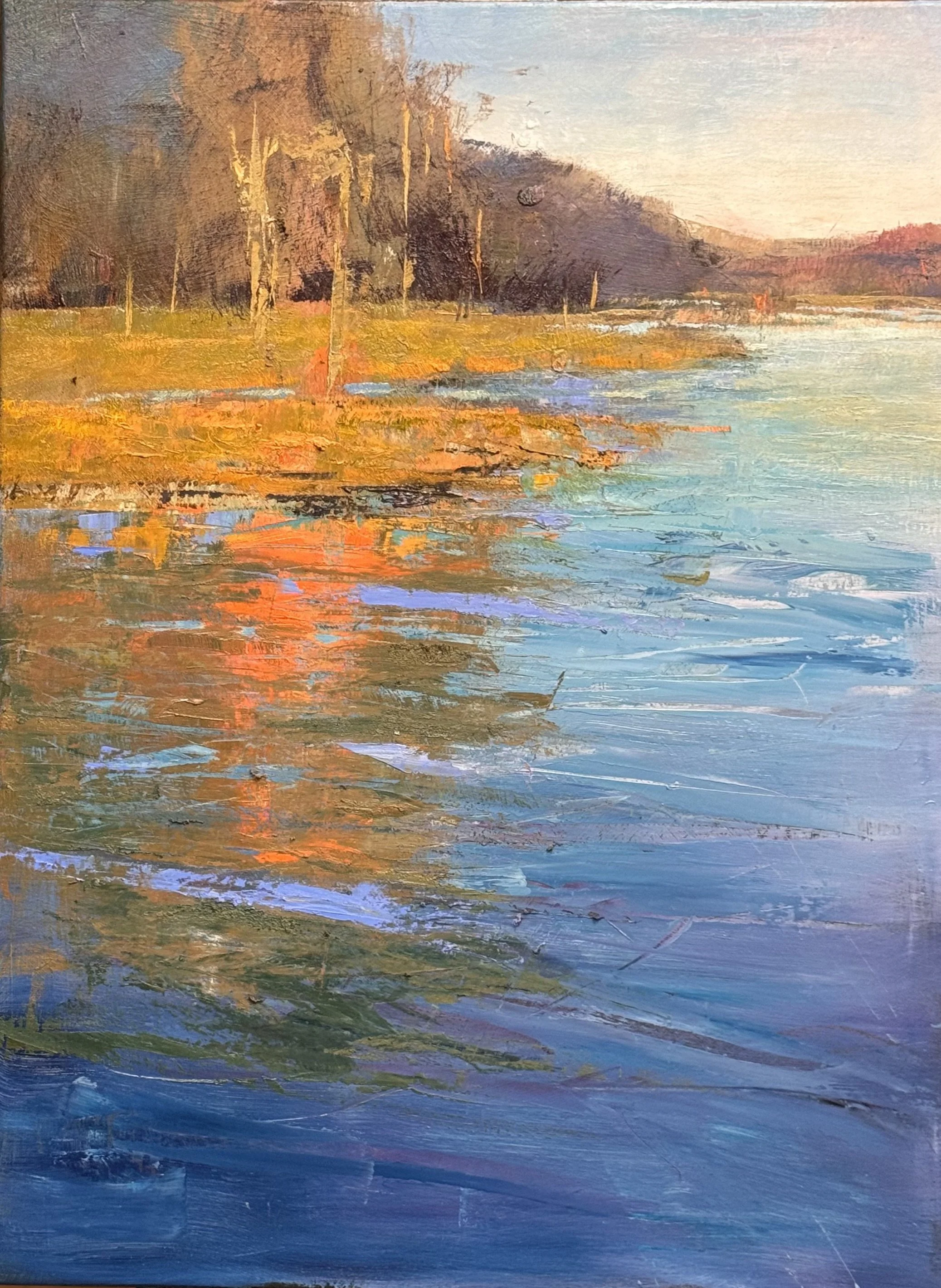
On the Workshop painting the orange and coral burning near the bank then cooling through teal into deep blue-violet as it moves forward. The color temperature drop across that water surface is beautifully example of the power of a P P. The teal thread runs through the reflections like a signature frequency.

The bank edge is the hinge — that impasto line where warm earth meets cool water, the scrape marks holding real tension. Trees ghostly and light against the dark hill mass, doing exactly what trees should do compositionally: punctuate without competing.

Wednesday, 5/27/26

This is one session away for finished… it is the Prismatic Progression / Water workshop demonstration. I am going to try to leave the painting alone, I merely want to shorten the reflection to agree with the ration and layout of the entire painting.

I am finished with both of these, I just needed a little touch on each. On the left piece, I pushed the tree mass back and pull some of the individual trees forward to better relate to the reflection. On the right piece I eliminated the black in the tree mass and better softened the contrast so as to diminish the power of the trees and concentrate on the back ground red and the forground reflection. Honestly, I think I can soften it even more on Friday.

This is the study for the larger fibonacci panels. I am very very excited about this in total. This is the bigger piece that is the home of many of the floating studies. I will include a few of them below.

Below are three studies on paper not yet finished of the floating exploration.

Tuesday 5/26

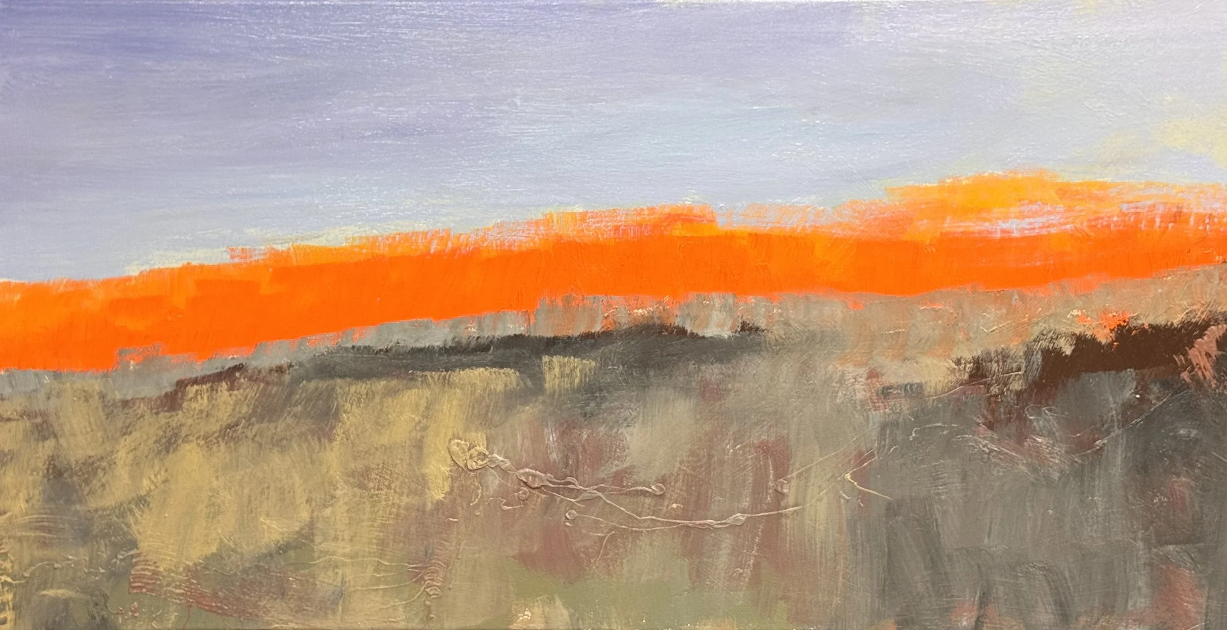
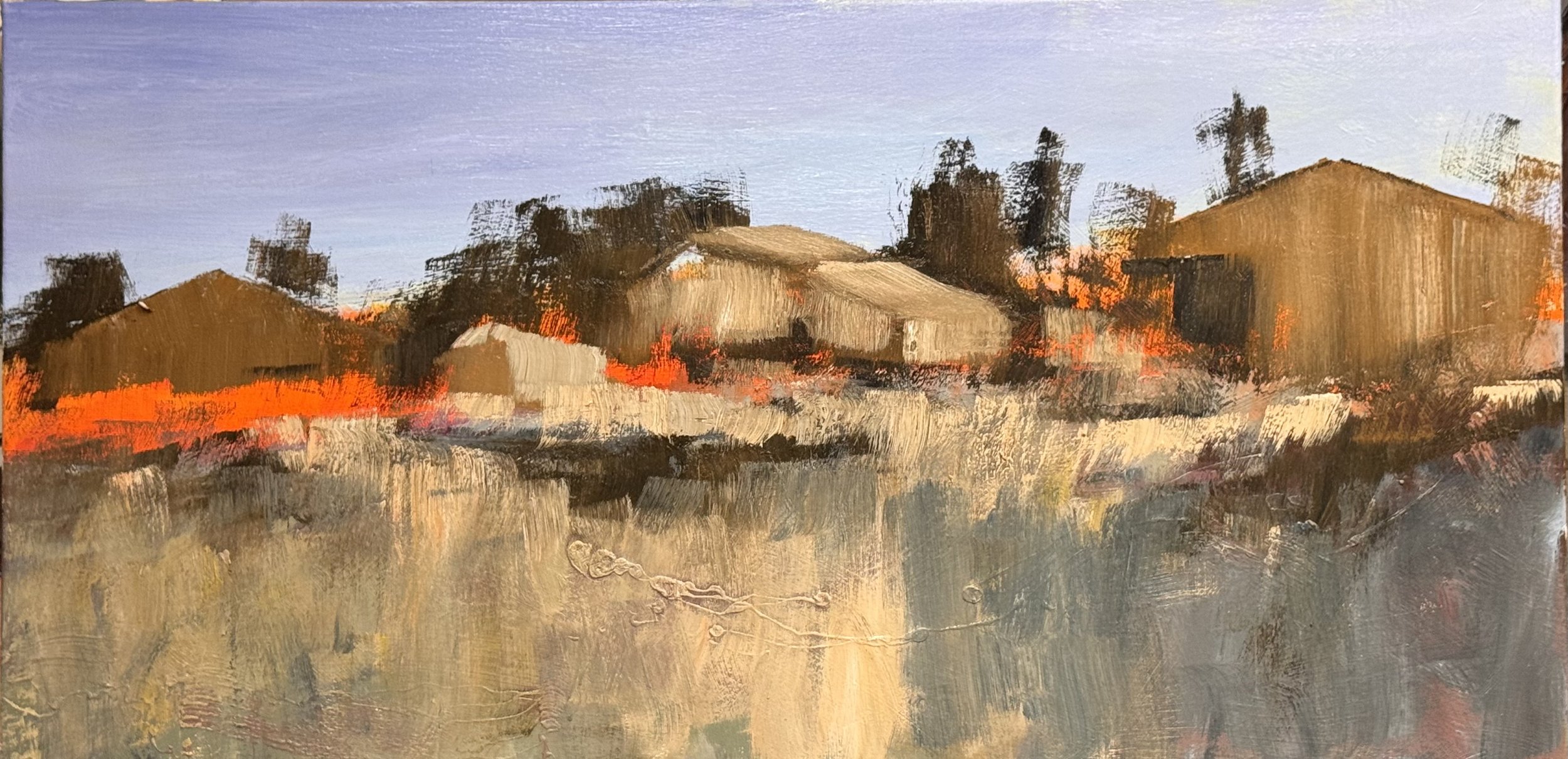
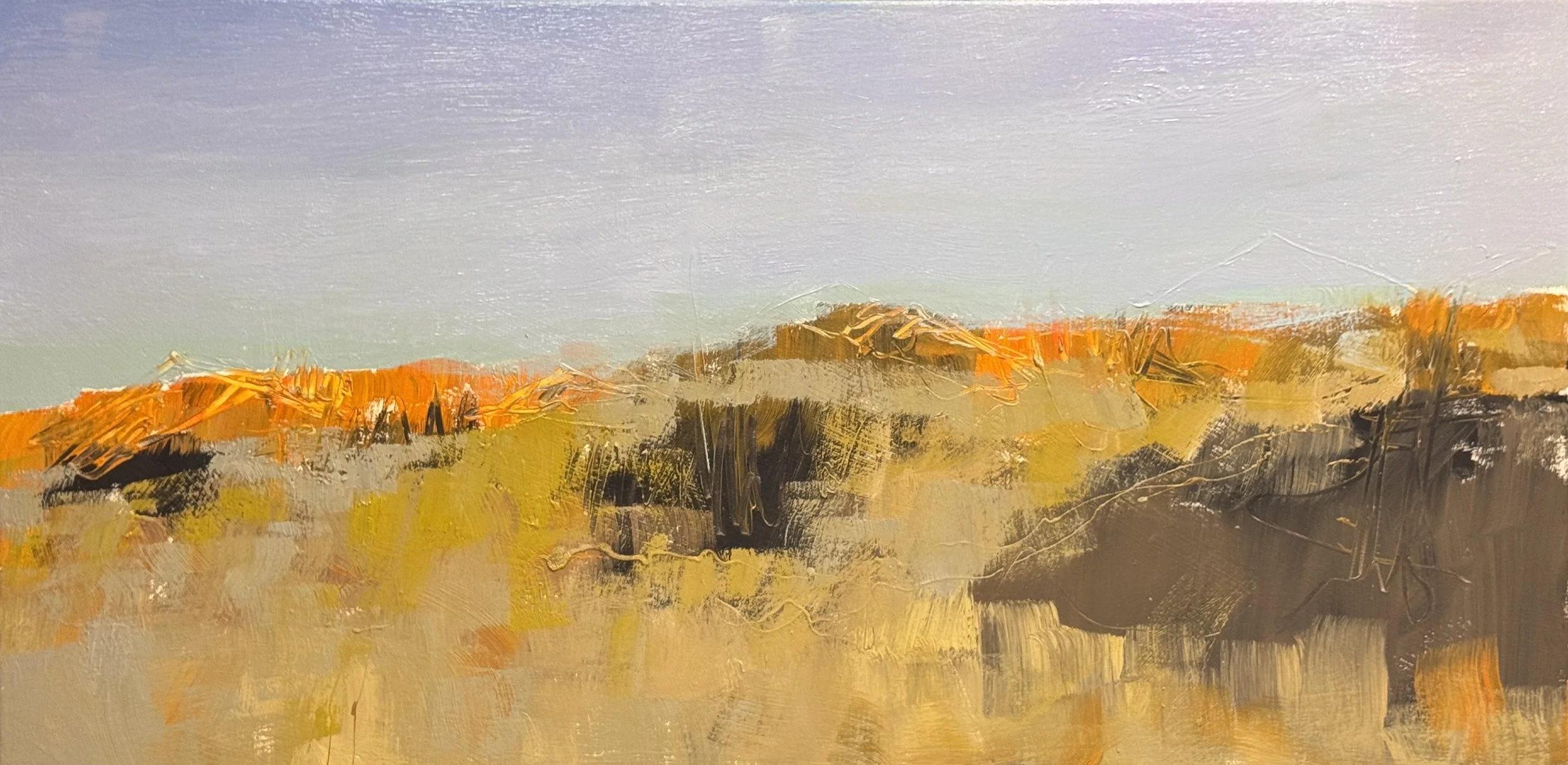
24 x 52, this is the set-up the room I have created to place an exciting suggested hill top farm scape This is a beautiful setup. The lavender-blue sky has real restraint — it lets the land do the talking. And that orange band along the ridge line is the engine of the whole thing. It's already vibrating against the cool sky above and the warm gold below.

What's working particularly well: the middle zone — that layered passage of olive, tan, and dark — has genuine mystery. It doesn't resolve. You can feel the terrain without being told what it is.

The horizontal format is doing exactly what it should. The eye wants to travel that ridge line left to right, and the orange keeps pulling it back.

This is the second layer and it is really exciting to me.

36 x 36, The decision to let the bottom read as its own horizontal band of blue-dark-red before the eye moves up through the trees into that warm atmospheric field — that creates a real sense of passage. You're not just looking at trees beside water; you're moving through something.

The two halves feel integrated now because the tree trunks are doing the work — they bridge the dark root zone and the warm upper field without either half competing. The reflections in the lower left carry enough of the warm sienna down into the blue to keep it from splitting apart.

I also worked on these two but neglected to photograph either one. I hope to post these tomorrow.

Memorial Day 2026

I managed to get another coat on these pieces before holiday dinner this afternoon. Only one got close to finished… I will start with it

I am very excited about this layer in my front and back discussion, it is obvious how much attractive color is needed to balance the monochromatic forground. I still want to make the contrast in the front a bit stronger as I automatically go to the way back first.

On the other hand I am at a stalemate here. Both distances are equally attractive and I will need to figure out a sollution for the finish of this. In this case the upper 1/2 of this piece is one painting and the lower half another.

This is such an exciting application of paint that as the vertical structure is put into place, I will try to maintain a calm quiet to this strong dark to achieve balance.

Savage Trees:

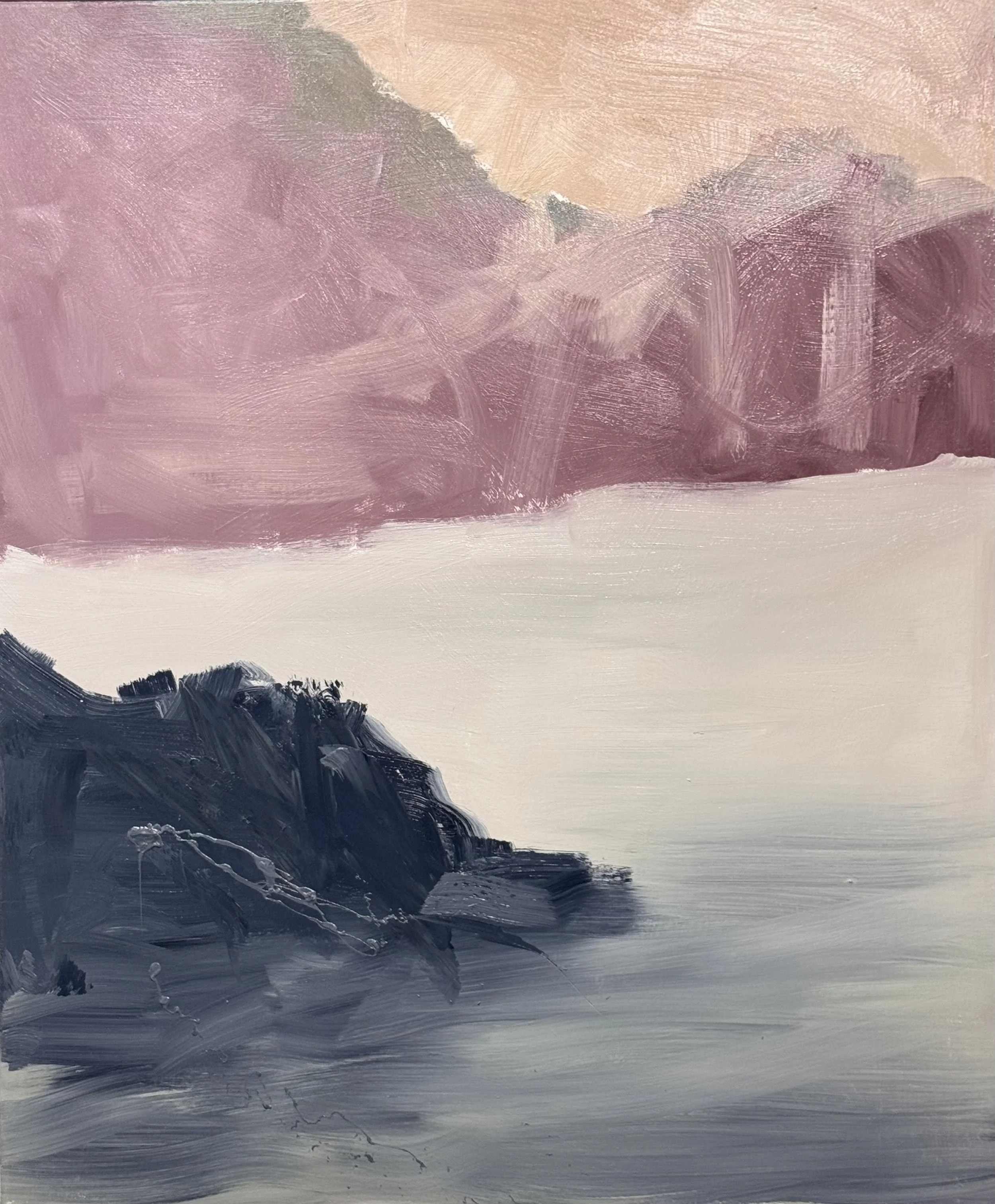
  1. Savage Trees:Pink Back: A stalemate — both distances equally alive, which is the problem. Upper half and lower half are two paintings in conversation but not yet agreement. The hierarchy question is still open.

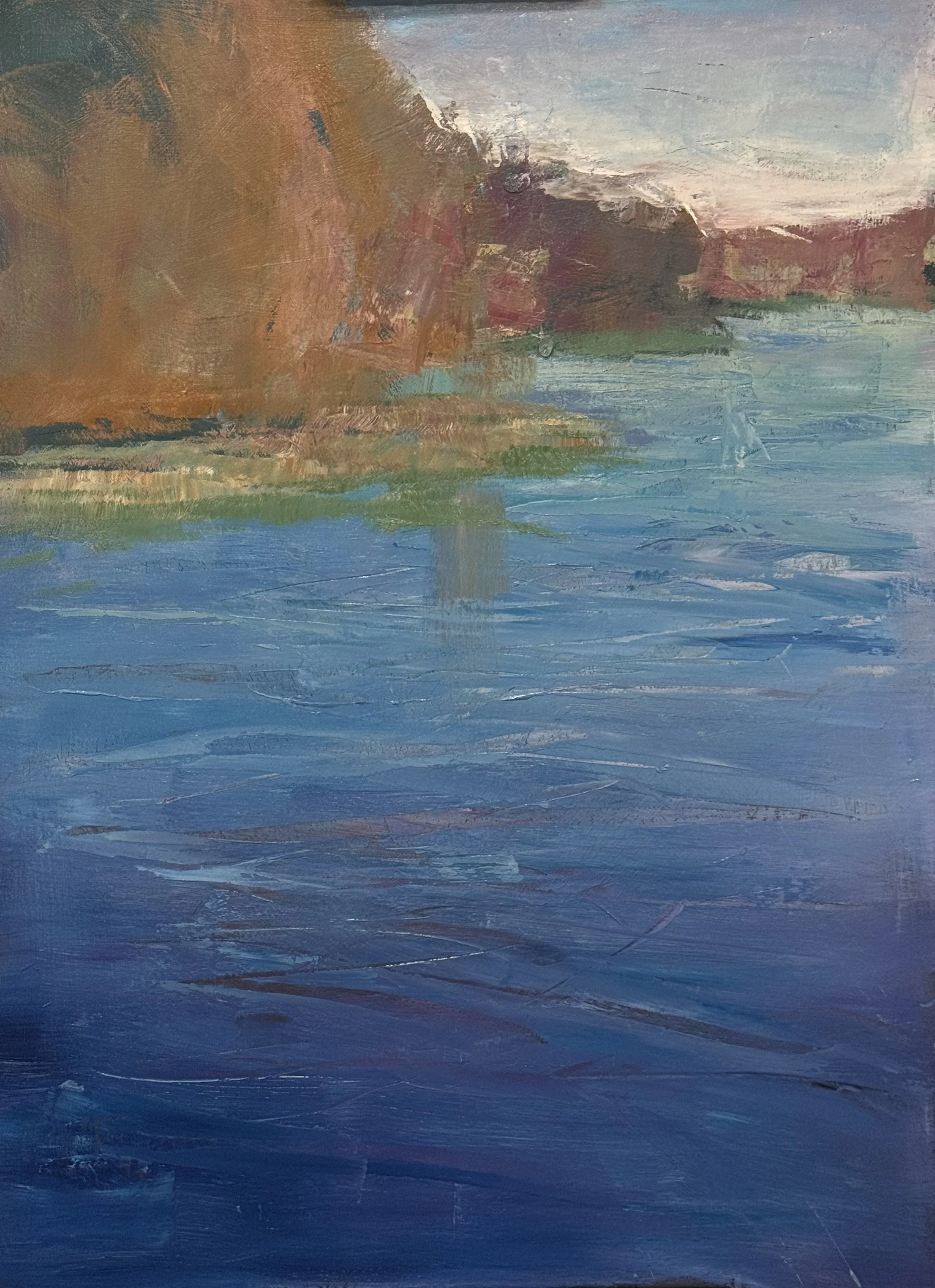
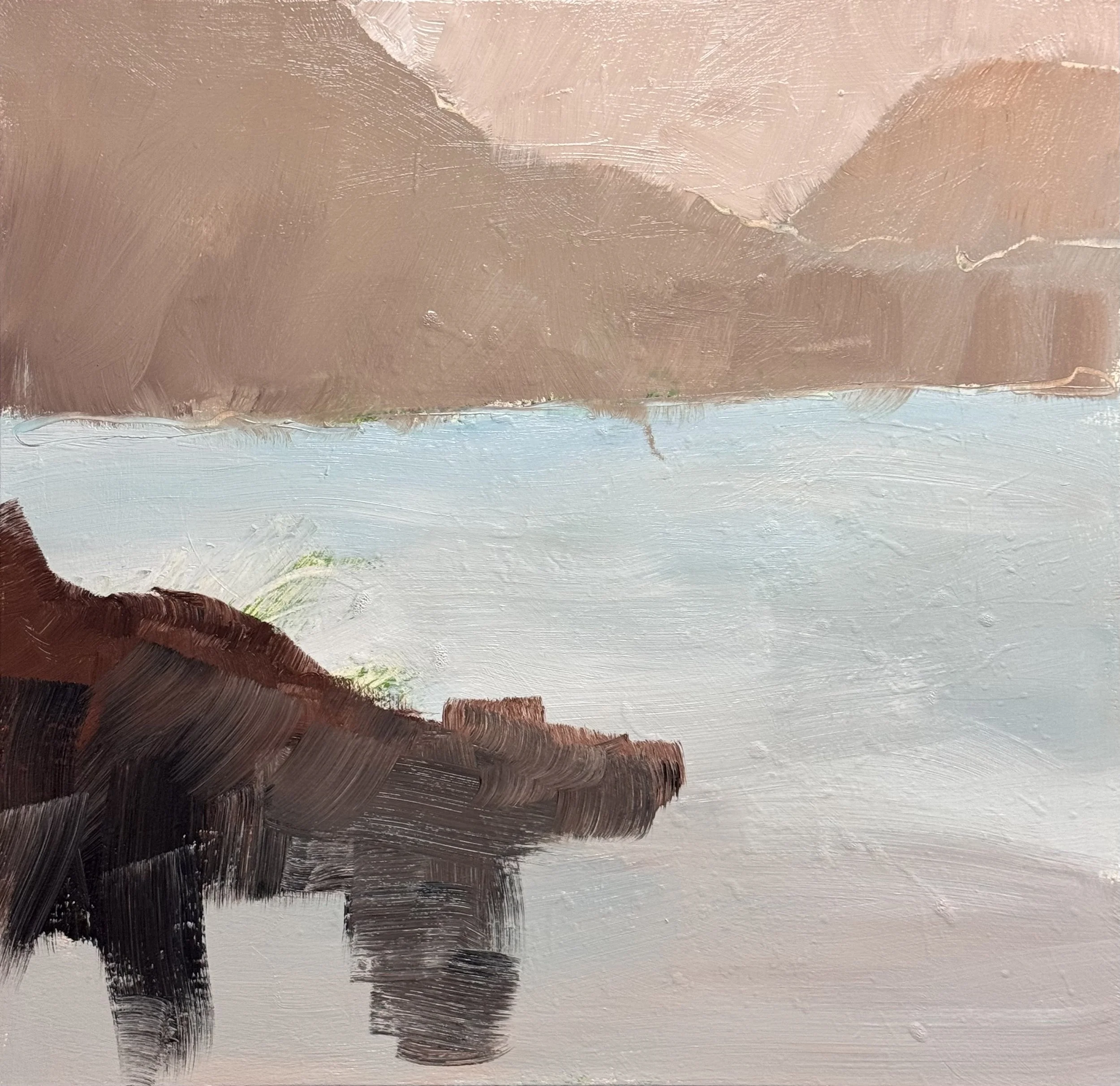
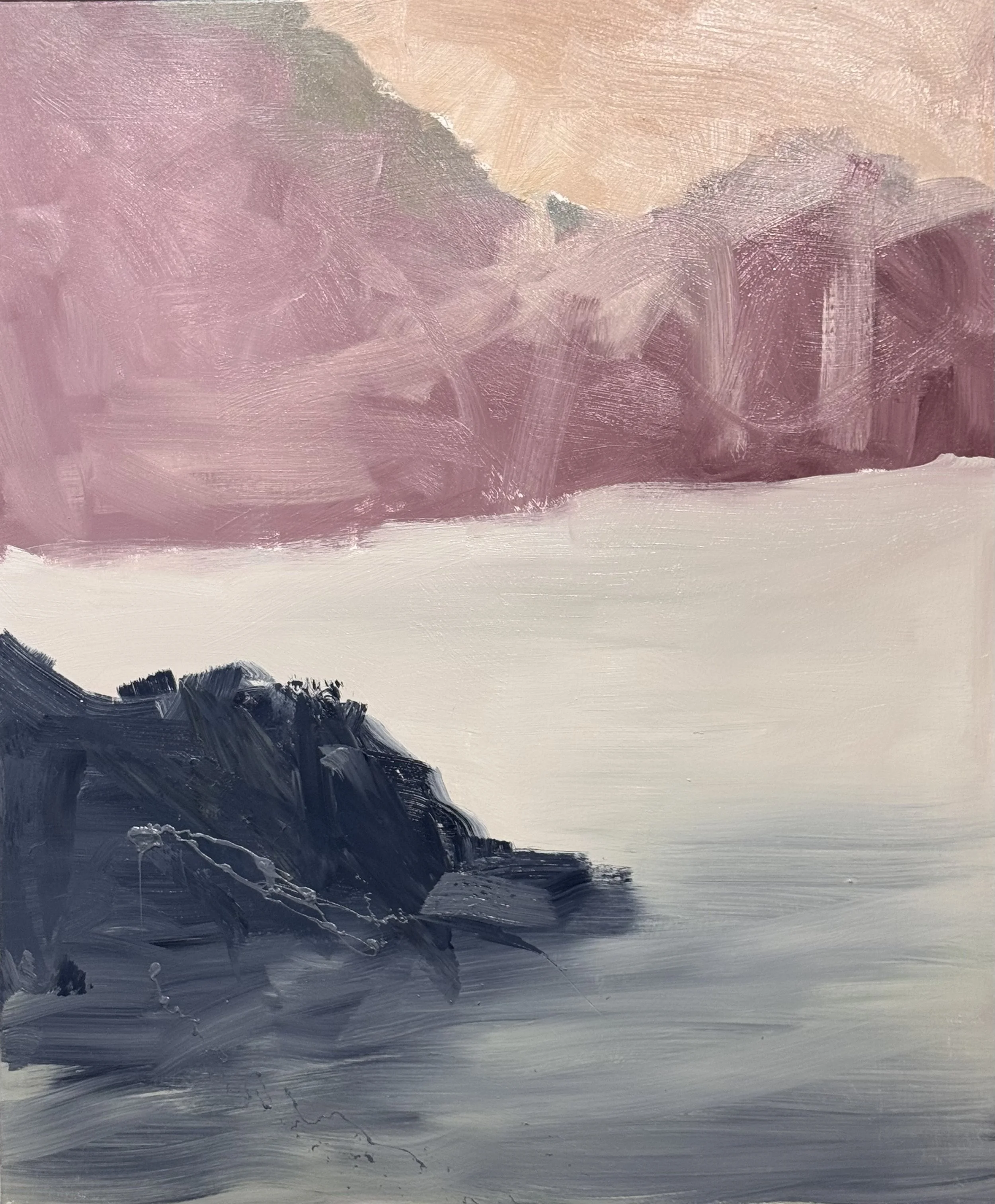
  2. Savage Trees:Cliff/Water: The dark mass is dramatic without being heavy, and the warm/cool dialogue in the distance is already resolved. The goal now is to bring verticals into the dark quietly — felt, not declared.

  3. Savage Trees:Cliff/Water: The dark mass is dramatic without being heavy, and the warm/cool dialogue in the distance is already resolved. The goal now is to bring verticals into the dark quietly — felt, not declared.

I have very little to say in regards of this incarnation of the Floating discussion. It is too early and also too exciting. I don’t want to jinx myself.

Another Friday and I have a lot to share May 22nd, 2026

These two are explorations into a

medidology for the new Beyond

Landscape Class in July.

My concept is a mash-up between a 30 year old image Alluvial Island Series and the detail offered with mark making and line work, giving it a new wrinkle of glazing.

I was so excited about the red I achieved with the Alizarine Crimson glaze over a cadmium orange in the sundown farm i wanted to see it reversed. I ‘m not certain what would best create the electric Prismatic Progression in orange to red of SunDown Farm

these two pieces are variations on the Savage Trees Series…. This series best illustrates the front / back I have been exploring. What is spacing between trees vs. the excitment in the background shore. The above approach will place a cool neutral dark forground in oppositon to an excitingly warm background while the one on the right will place an excitingly cool forground and you can already see how much more exciting I have to make the far shore to balance the forground energy and excitement.

Revisiting the Alluvial Island Series — 30-year-old imagery as new raw material

Mash-up concept: Geological abstraction meets contemporary mark-making and line work

Glazing as the new wrinkle — not finishing, a second structural decision Cerulean field drying — then ultramarine glaze in the heavy, anchored passages;

magenta glaze in the atmospheric voids and edges

Where the two glazes meet: a violet transition zone that belongs to neither —

potentially the most alive passage on the surface

The Alizarin Crimson over cadmium orange discovery in the sundown farm — transparent cool over opaque warm, richer than either alone

Selective glazing as compositional structure — not just what color, but where does this color have jurisdiction

Two explorations in methodology for Beyond the Landscape, July intensive

Wednesday, 5/20/26 Workshop Wednesday -- that means hump day -- and I tired day

I wanted to explore the concept of floating — both hovering over the surface and top to bottom on a flat

2-D surface.

This is a ink drawing using my alluvial island series from many years ago. I will see it this is conducive to the imerging from the depth aspect of a floating image.

This will have a more centralize weight. I am curious.

If either of these or the other 5 or 6 images show any kind of promise, i will get them printed on a larger paper and adhere it to a canvas or panel and see if it is a sufficiant starting point for this exploration..

Workshop Tuesday 5/19/26

Day one of a Prismatic Progression/Water workshop, a PP is the best tool a painter has to move the eye: front to back, left to right, top to bottom or the opposites. I use it as a subliminal subject. I want the water so pretty and effective that the other elements can be demoted in description and explanation.

A Prismatic Progression is a value and color pathway that moves the eye through a painting — front to back, left to right, top to bottom, or their opposites. It works subliminally. The viewer follows it without knowing they're following anything.

I use it as a structural underscore. Not the subject — the carrier of the subject. In the water paintings, the progression runs warm to cool, light to dark, sky into reflection into depth. The eye rides it down and across without being told to.

The best progressions disappear into the painting. You feel the movement. You don't see the mechanism.

I am looking for accidental beauty, in this case different colors—same value

60 x 48 Savage Trees III

Here I am roughing in a value change in a blue hew atop the preivous value shift. With luch I get unintended beauty in multiple areas.

Another great Monday--no visitors, no students, no assistants, just painting

.

This is the 2nd layer on this painting. My job this layer on all 4 of these Savage paintings is to complicate the color and establish the position and 1st preliminary position of the vertical structure (trees)

60 x 48 inches, Savage Trees IV

in all cases the trees themselves and their reflections constitute the vertical additons to the paintings. I want to be able to maitain the value progression in all of these but lay in a color in a changing value to match the 1st layer, allow some of the 1st layer to shine through, set up for a final or 3rd layer on the prismatic Progression that lets these paintings sing.

Simple narrative — maximum color and surface freedom. The trees and their reflections give the eye exactly enough to hold onto, which frees everything else to operate at full complexity without losing the viewer.

It's the same principle Rothko understood. The rectangle isn't the subject — it's the permission. Strip the composition to its most essential architecture and the color becomes the event.

Your vertical/horizontal opposition — trees against water — is about as essential as it gets. Two forces. Everything else is painting.pleasP

The Savage Paintings — Layer by Layer

Four canvases. Same simple narrative: trees as vertical architecture, water as horizontal mirror. Everything else is painting.

The content is almost willfully spare — and that's precisely the point. Simple narrative allows for the most complex and unique color and application. The trees and their reflections give the eye exactly enough to hold onto. Which frees everything else.

The System

  • First layer — biggest strokes, broadest moves. Value architecture established. Color temperature declared.

  • Second layer — color complication begins. Not glazes. Color mixed to correct value on the palette, then applied with a vigorous dry-brush technique — heavy paint, selective deposit. Open strokes and dragged strokes coexist. The first layer's texture becomes the filter.

  • Third layer — same mechanism, now with two layers of accumulated texture participating. The brush proposes. The surface disposes.

What emerges is a unique kind of pointillism — not Seurat's additive dots on white ground, but a physical collision between layers. Color deposits selectively against the ridges and skip points of what's beneath. The eye does the mixing at distance. The paint film does the work up close.

The Color Logic

Each of the four Savage paintings operates in a distinct color temperature:

  • Painting 1 — pink/mauve, cool and atmospheric, compressed value range

  • Painting 2 — amber/gold, warmest and most decisive, strongest value contrast

  • Painting 3 — yellow-green against blush, the most chromatic tension

  • Painting 4 — orange/peach, most saturated, trees most architectural and column-like

The second layer's job across all four: complicate the color without collapsing the value structure. Introduce the opposite temperature pole. Establish the first preliminary position of the vertical structures — trees as both subject and armature.

The third layer resolves or intensifies what's already in conflict. By then the surface is doing half the work.

The Deeper Principle

The Savage series as a group makes the individual paintings stronger. Four canvases working the same simple narrative through four different color temperatures means the viewer eventually stops reading "trees and water" and starts reading color itself as the subject. The content becomes transparent.

What remains is surface, temperature, buildup.

This is the Rothko principle applied to landscape: the rectangle — or in this case the tree — isn't the subject. It's the permission.

TGIF 5/15/2026

Savage Tree Series — Four New Starts

These are performance pieces for an upcoming exhibition. I revisit this series every year. The galleries respond to it. So do I.

A word about what these paintings actually are — because they're not paintings of trees.

Morandi spent a career painting bottles and blocks of color. He wasn't interested in bottles. He was interested in the intervals between them — the space, the silence, the push and pull of proximity.

Same idea here. The trees are not the subject. They're the instrument.

What I'm after is the oscillation — the moment a viewer's eye slips between the trunks and finds the shoreline beyond, then gets pulled back to the surface again. Forward and back. Near and far. The trees become a kind of visual screen, and the question I'm asking with each painting is: how wide, and how far apart?

Size, value, edge quality, color — everything is calibrated to that one perceptual problem. Not to describe trees, but to make the viewer move inside the painting.

But there's a second reason I return to this series. It's a personal barometer.

Can I still perform — and stay lost at the same time?

That's the tension I'm watching for. These paintings have a way of tightening up on me. Of becoming more concerned with explanation than feeling. More controlled than searching. When that happens, I can see it immediately. The oscillation stops. The painting answers its own question too quickly, and something dies in it.

The goal is to stay uncertain long enough for something true to happen.

54 x 45 Savage Trees (my traditional start) underwear first then position the veritcals

31.5 x 32.5 Savage Trees Study I

54 x 45 Savage Trees (more lyrical beginning—I want to leave room for the reflections to extend the vertical dark shape)

36 x 36 Savage Trees Study II

Crazy Thursday 5/14

7 x 5 inch study for “floating”

7 x 5 inch study for Early Tree studies

10 x 7 paper study fo r Floating concept

10 x 7 study for Early Trees

large strart for Early Trees 54 x 45

There and Back again 36 x 54 finished and very happy

Two paintings in the studio today exploring the same idea from different angles — how far back can the eye travel before it has to return?

There and Back Again uses the left tree group deliberately quiet. Not timid — restrained. The structures along the middle band need room to pull the viewer deeper. The trees let you go.

The new 54×45 revisits an earlier concept: a single dominant tree as the near plane, the picture organized around the push and pull between here and back there. The question the painting is asking hasn't changed. The scale has.

Front and back. The eye moves, returns, moves again.