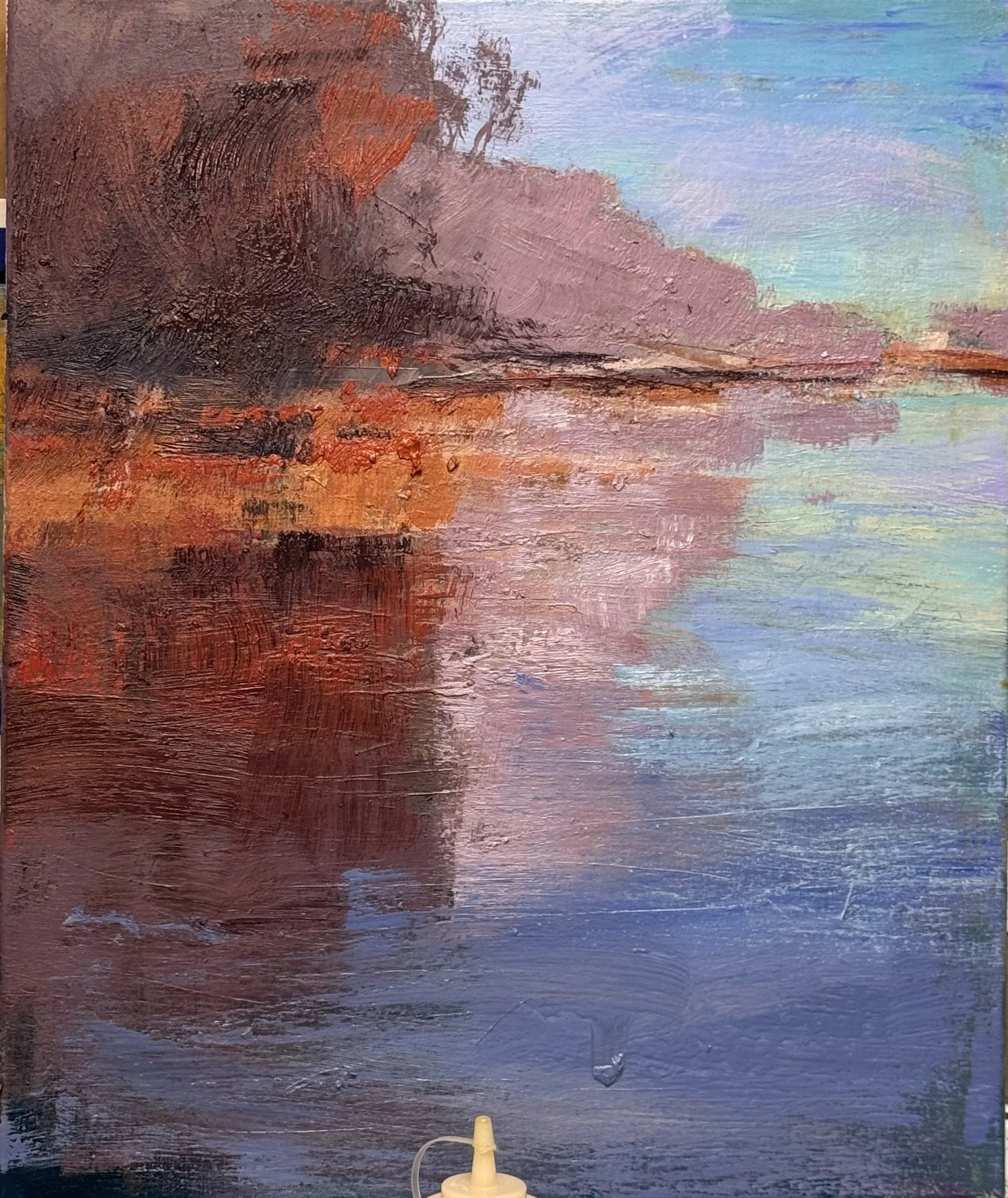
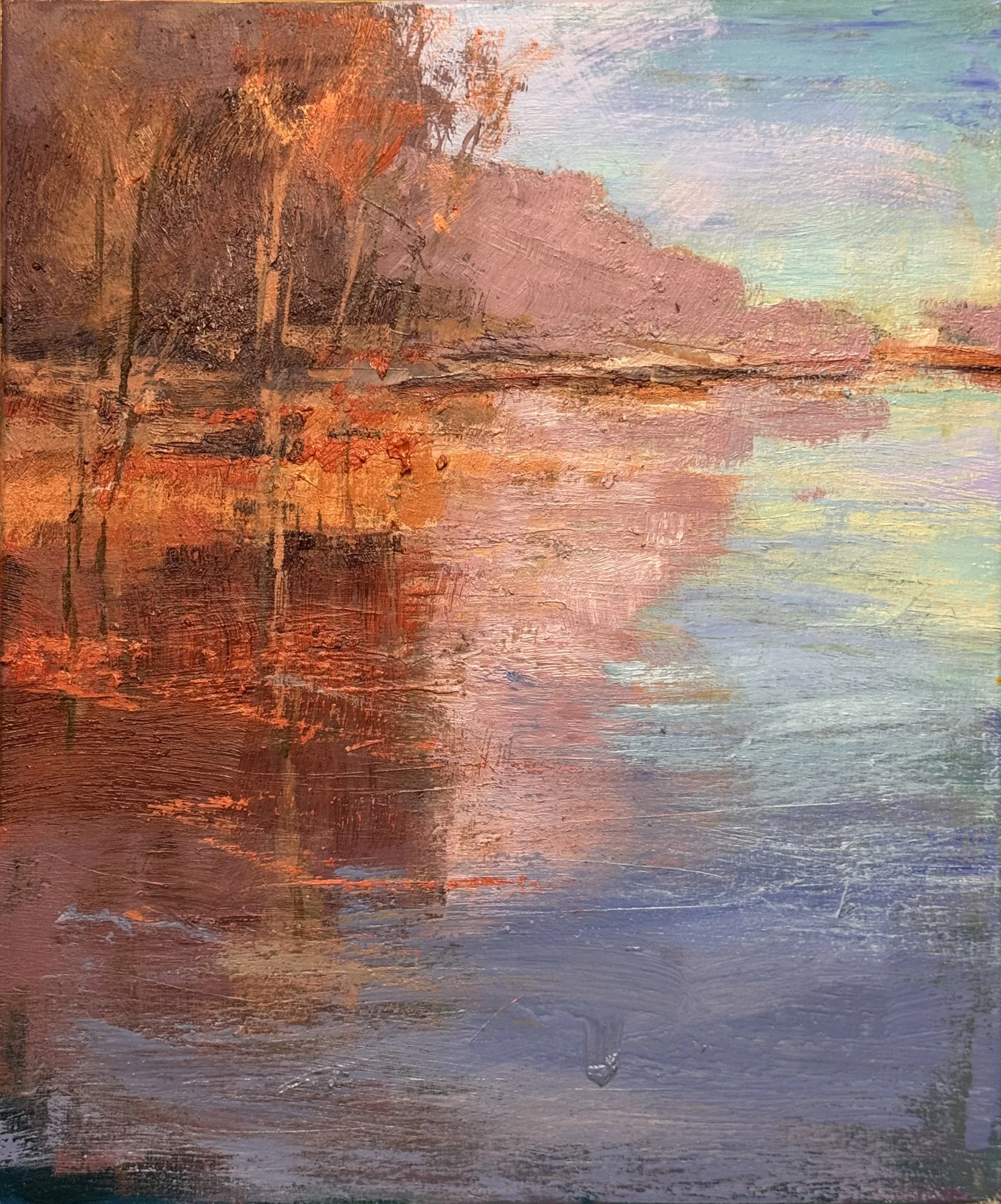
I Just finished this little 30 x 20
YOu can just see the change and the importance of accurate photos in terms of color and light
No Title Yet
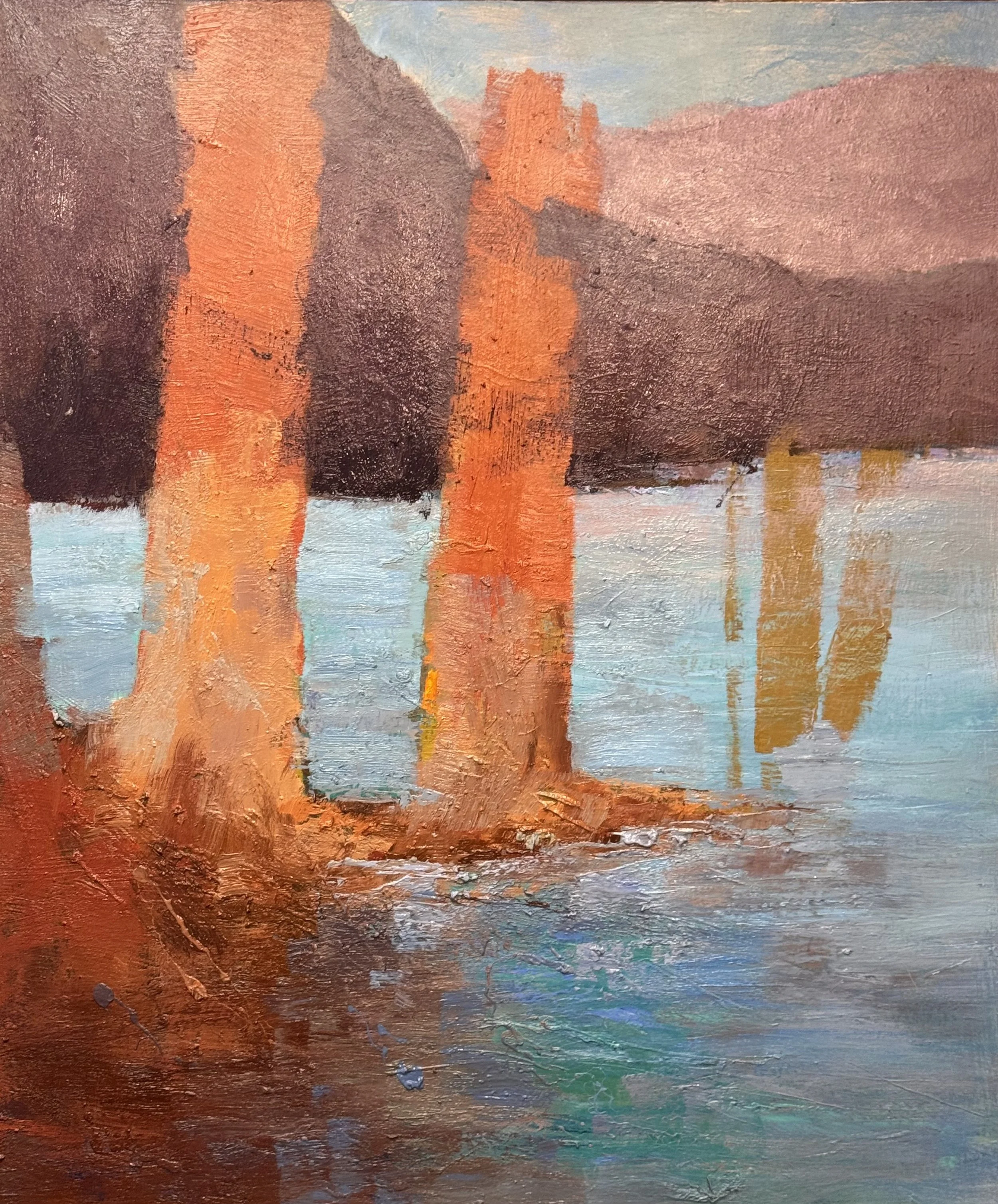
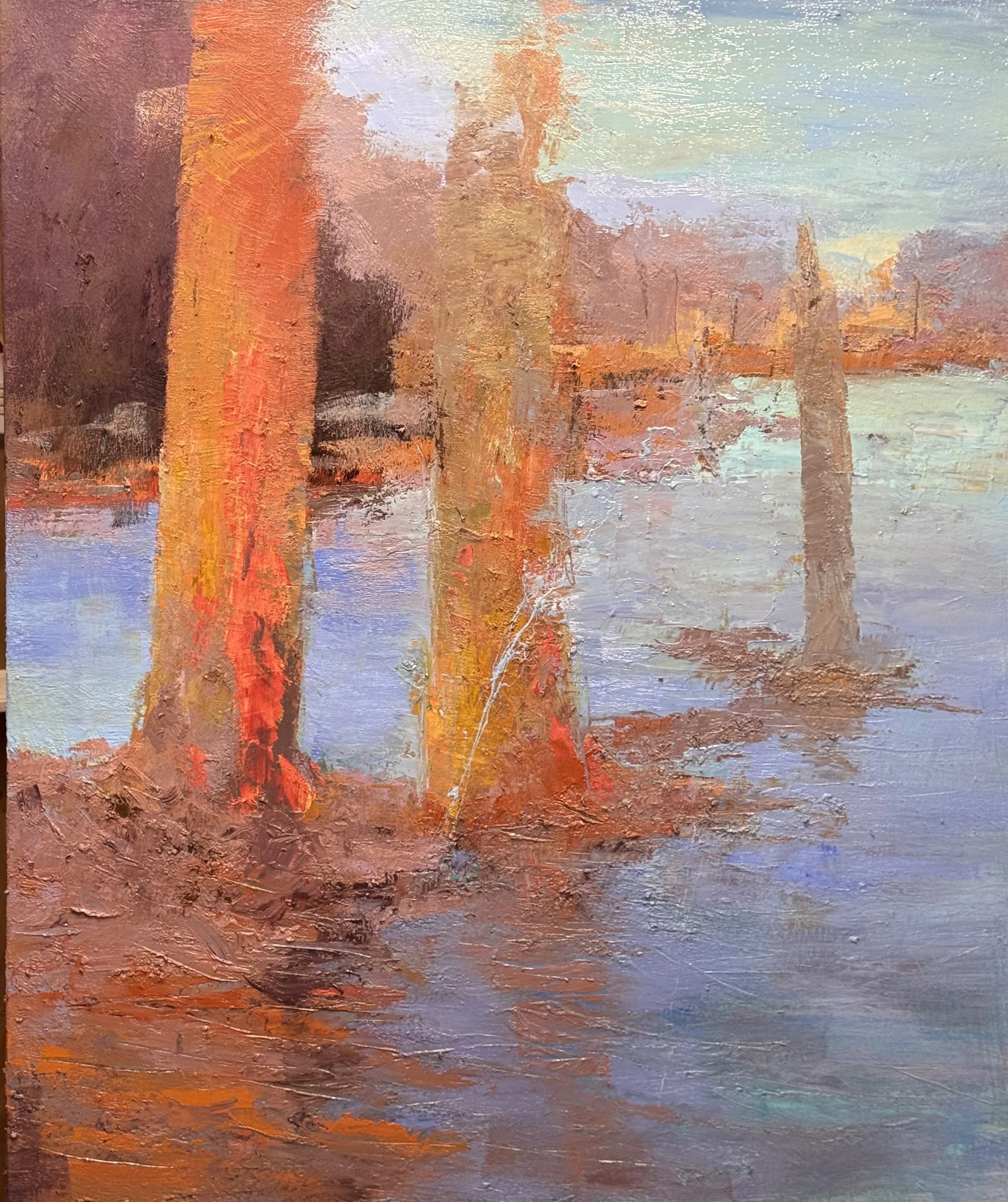
A big alteration in this layer…I wanted to increase the visual depth to allow for a greater front/back experience and less of a left/right experience
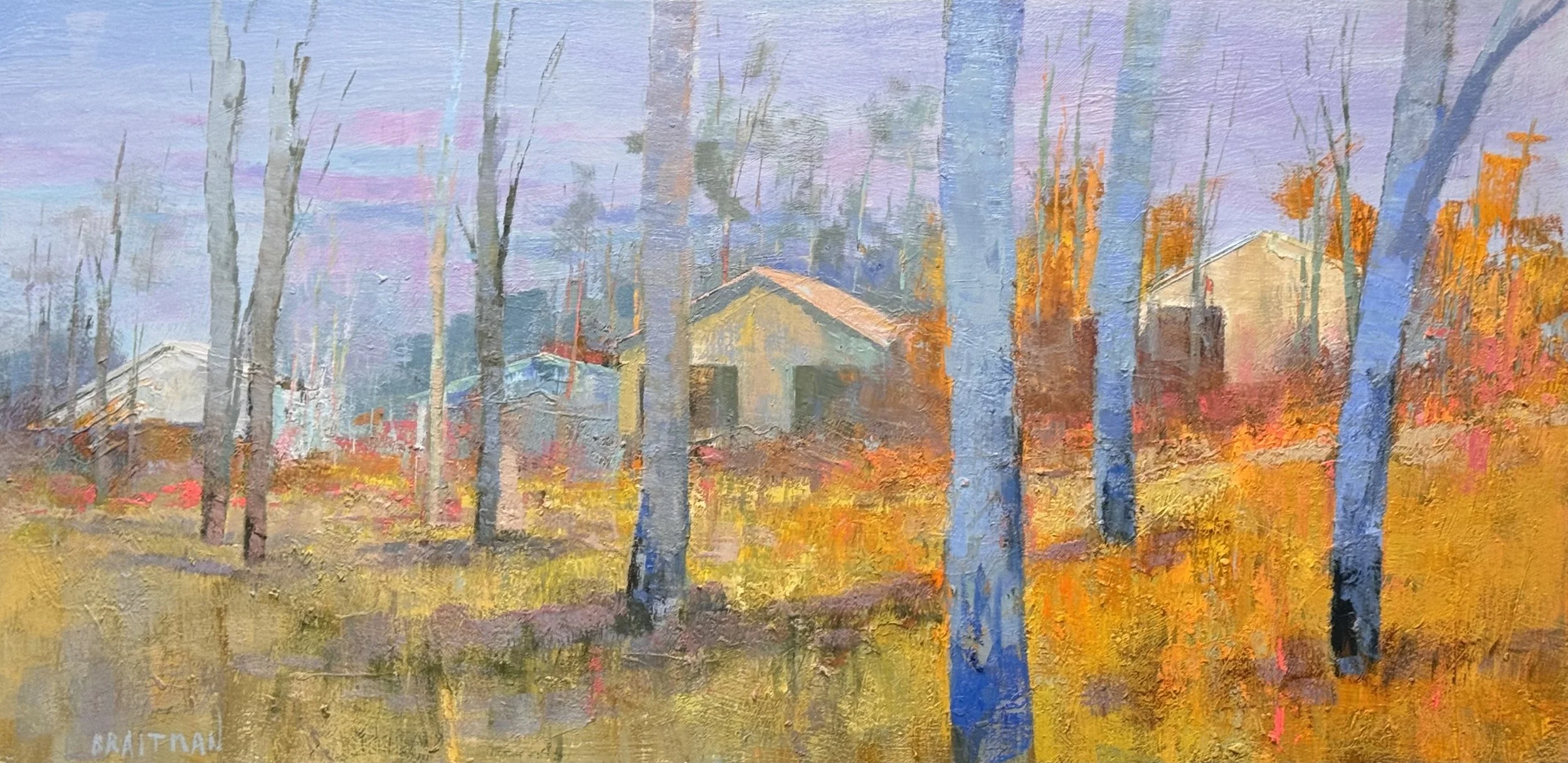
I also finished this gem 27 x 54 inches (no title yet)
The grass works. The gold doesn't.
Not as an argument, anyway. That mass on the right — dense, rich, unapologetic — has no real job in the front-to-back structure I built. It doesn't move the eye the way the trunks do. It doesn't rhyme with anything the way the violet in the grass rhymes with the sky. By every compositional rule I've spent forty years teaching myself, it's excess.
And it's going to be why someone buys this painting.
I know that sound before I've even hung it. That unguarded richness stops people. It doesn't ask to be understood, it just wants to be looked at, and looked at again. Structure is what I trust. But color like that is what a room remembers.
So here's the honest part — the part I'm not going to resolve with a tidy compositional fix. The eye that builds the painting and the eye that buys the painting don't always agree. I used to think that gap was a failure of discipline, something to correct. Tonight I think it might just be true. Explanation is the enemy of feeling — and maybe justification is the enemy of selling.
The grass earned its place by rhyming. The gold earns its place by refusing to.
Both can be right.
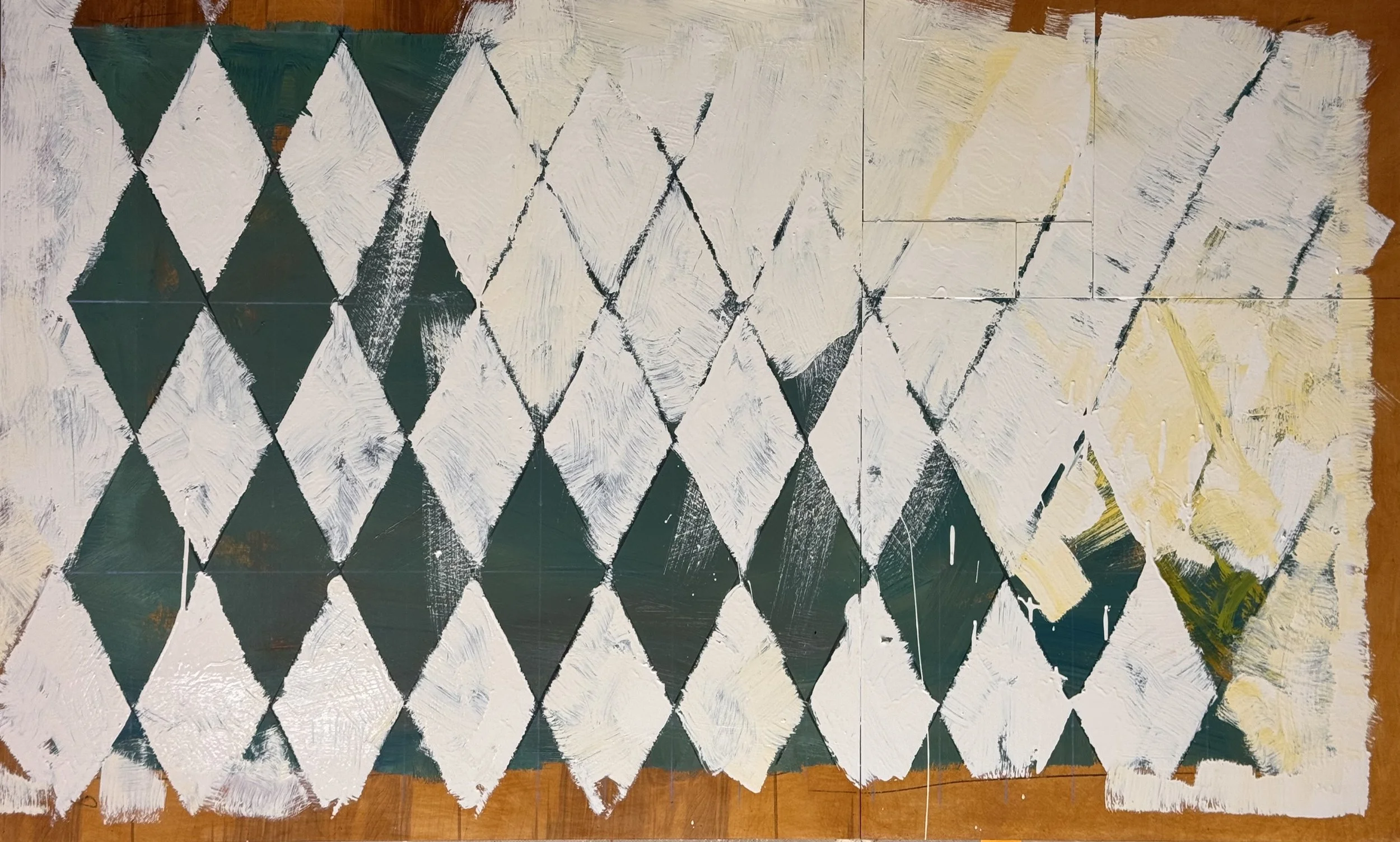
another layer developing the sub-text of this Alluvial Island Piece