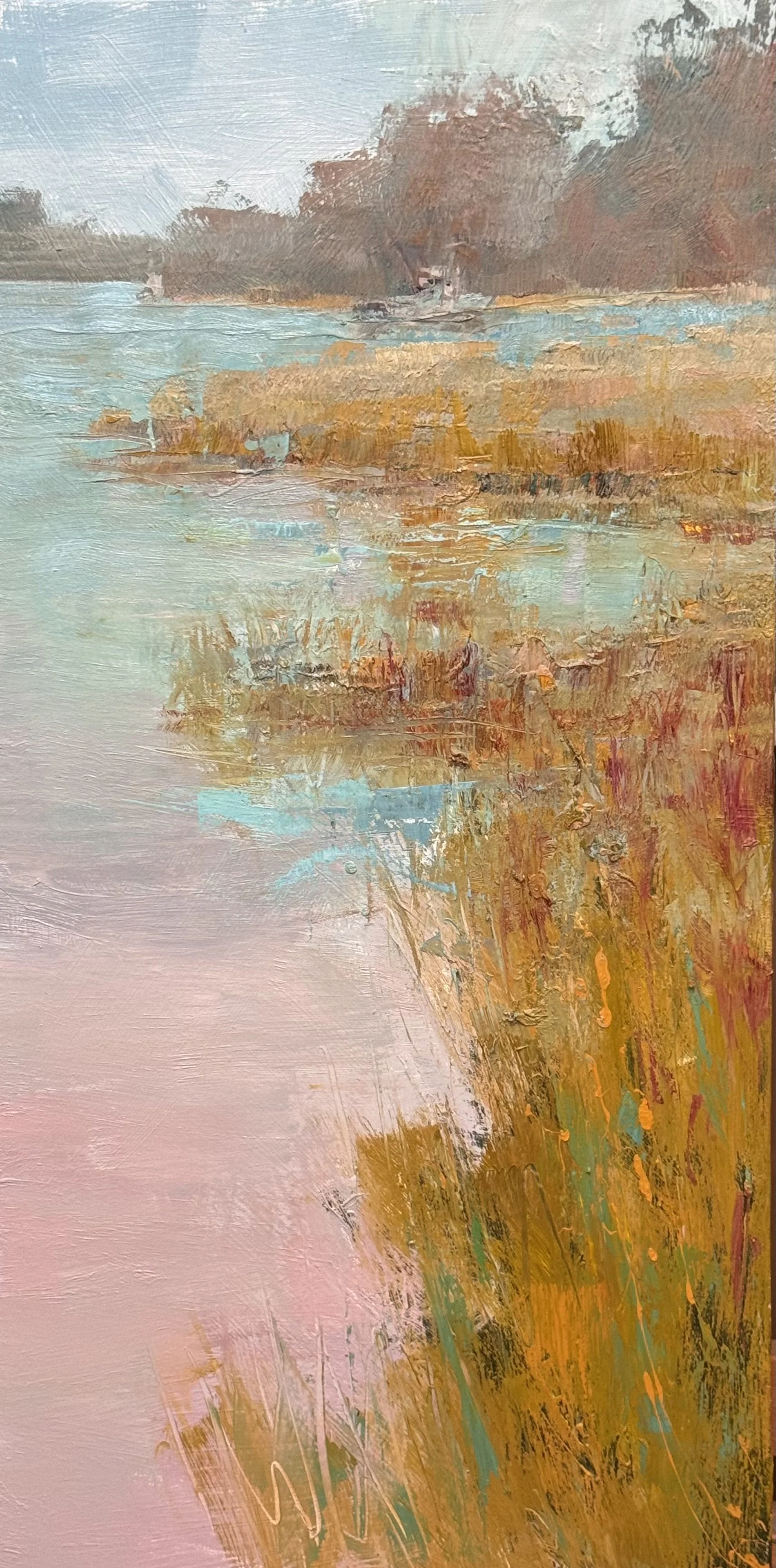
I was unable to get into the studio until today. I worked on 4 pc.s and feel satisfied with my work. See them below.
hese three are working in a completely different register: legible water, legible reed banks, legible tree mass, a boat that reads as a boat. The explanation is doing real work here, not just holding the composition together — it's carrying the content the client is presumably buying: a specific, recognizable place at a specific hour.
A few things worth flagging with a day of work still ahead:
Image 1 is the most spatially resolved of the three — the channel of water pulls you straight back to that lavender tree mass on the horizon, and the bank reflections (the little flags of orange, the lavender ghosting in the foreground water) are doing legitimate color work without undermining the read. This one's closest to "done" in feeling.
Image 2 is the boldest of the set — that band of red-orange marsh grass against the lavender-to-peach water is a real value/color event, and it's the one place explanation and feeling aren't fighting each other; the description of the grass is the emotional charge. I'd watch the transition where the orange masses meet the water — right now the reflection is nearly as saturated as the object, which flattens the space a touch.
Image 3 feels the most unresolved of the three — the reed bank reads a little more diagrammatic (rows of vertical strokes) rather than grown, and the small boat/dock shape in the middle distance is ambiguous enough that it's pulling attention without paying it back yet. That's probably where tomorrow's session earns its keep.
Given they're meant to resolve into a pair, is the plan to push two of these toward final and treat the third as the study that doesn't survive — or are you still deciding which two speak to each other?
Want to be notified when Claude responds?
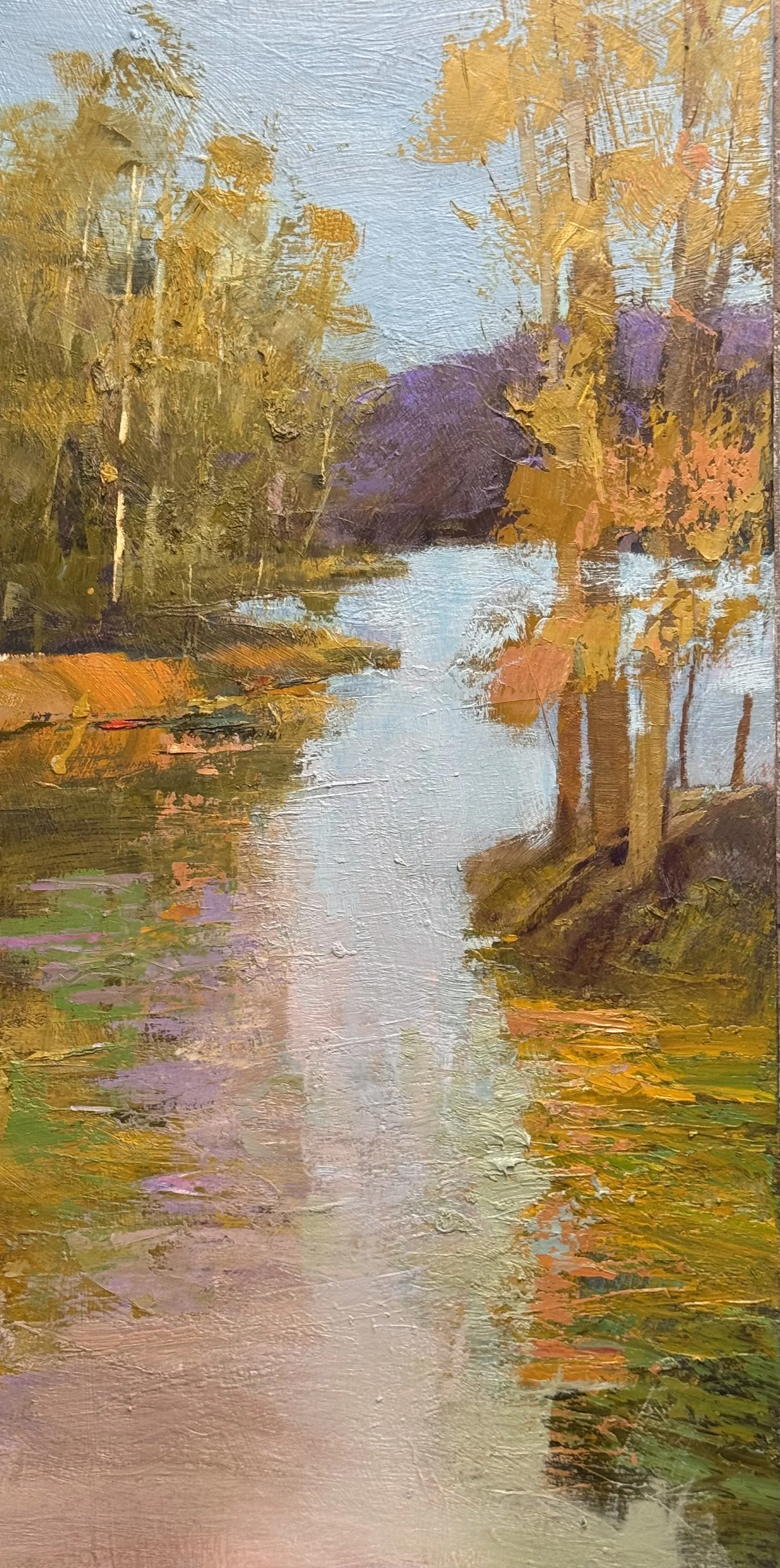
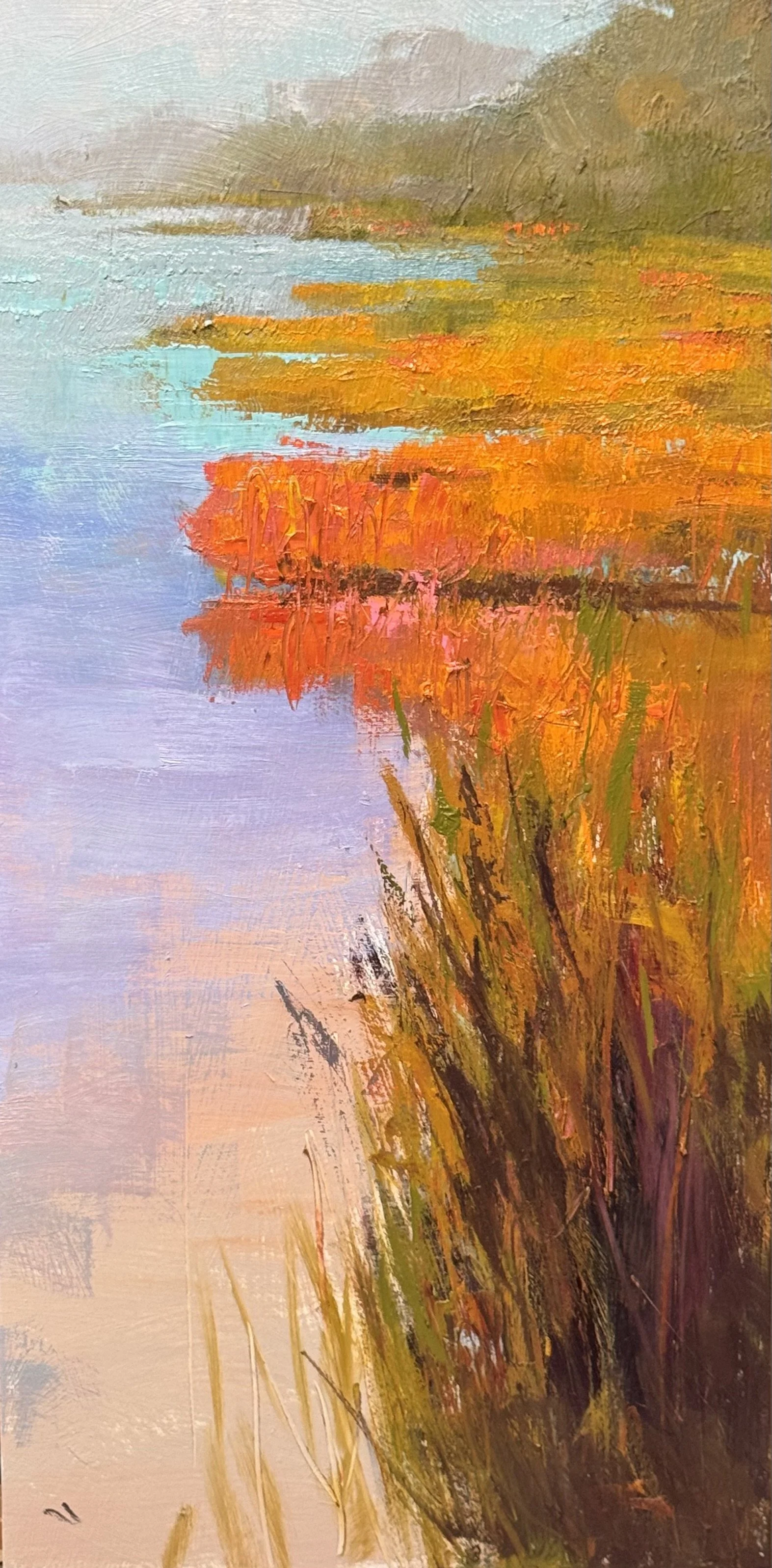
The top three are 36 x 18 inch studies for a planned 48 x 24 inch pair. The 4 study is being considered still. I will post it asap.
Color Study, Pair. 40 x 30 each.
Painted as a pair, same site — testing how much explanation a painting needs before feeling starts to leak out
Bottom two-thirds: pure sensation. Teal, blue-violet, olive, moving without justifying itself
Small ochre rectangle in the water — doesn't fully resolve into an object. Good
Tree line above: the one place description is let in — trunk, value shift, warm color at the base — enough to give the eye a place to organize around
Everything else rides on that narrow ledge of legibility
Explanation is the enemy of feeling. But feeling with nothing to stand on dissolves
This pair is me finding the ratio
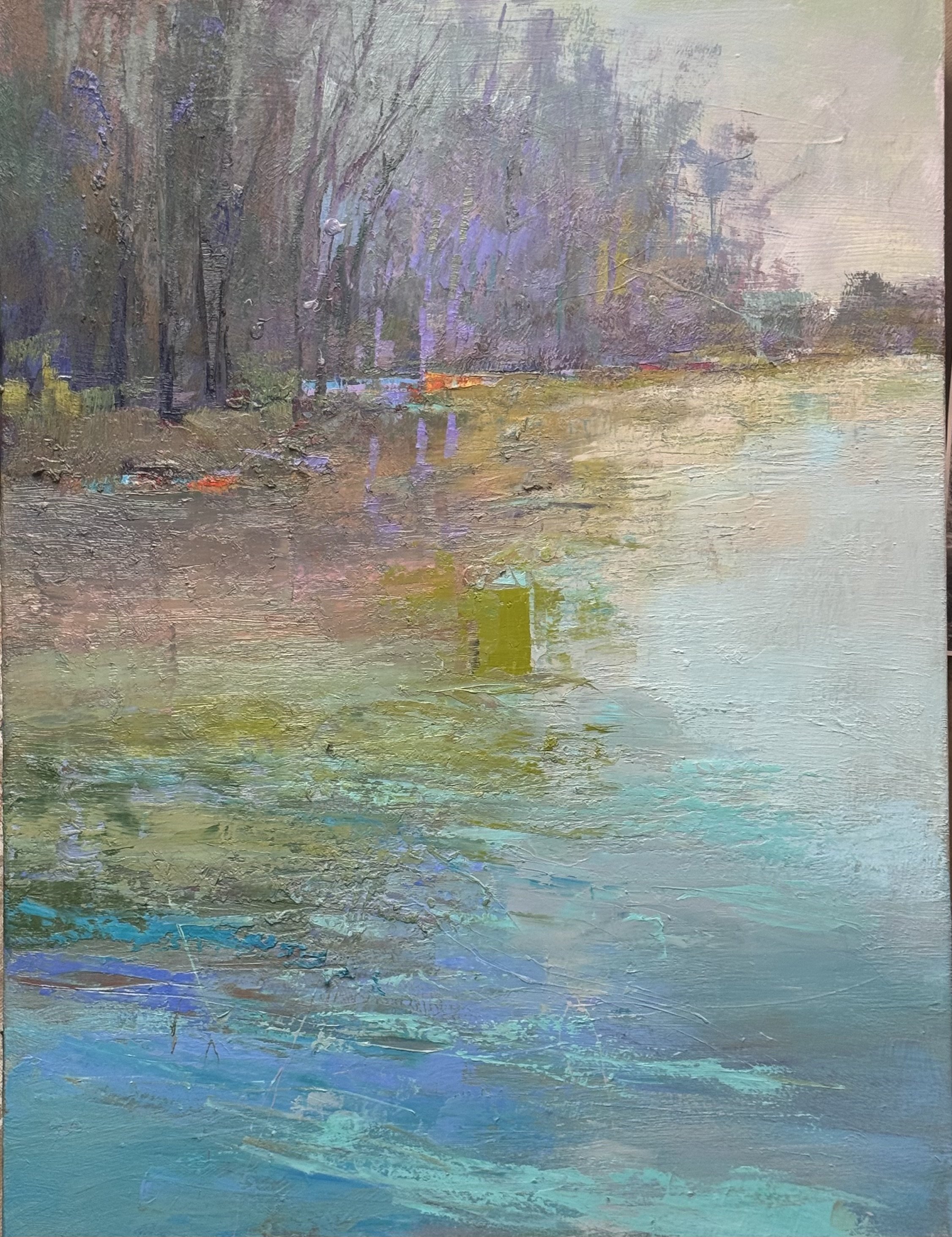
40 x 30 Confluence Study Tonal (sort of)